The network for creativity
Join 1.25M professional creatives like you
Connect with clients, get discovered, and run your business 100% commission-free
Creatives on Contra have earned over $150M and we are just getting started
Back to feedPost

Testimonials section built in Framer ✨
Clean and smooth transition animations, one of my cleanest testimonial sections yet.


The network for creativity
Join 1.25M professional creatives like you
Connect with clients, get discovered, and run your business 100% commission-free
Creatives on Contra have earned over $150M and we are just getting started

Challenges
View all


Related posts

Custom liquid interaction built in Framer.
Turning a static hero into a responsive visual surface through cursor-driven distortion.


How do you adapt the cursor-driven effect for touch screens?

I usually don't stop at 3 breakpoints when building a website.
Most people think about: Mobile, Tablet, Laptop
I like adding one more: Desktop
Because what looks great at 1440px can feel completely different at 1920px...
- The layout gets too wide.
- Spacing starts feeling off.
- Content loses its balance.
So I like testing the system across: Mobile → Tablet → Laptop → Desktop
Not because every website needs exactly 4 breakpoints. But because responsive design isn't about making a few screen sizes work.
It's about making the whole system work.
Follow Rushabh for more website fundamentals, experiments, and things I learn while building for the web.
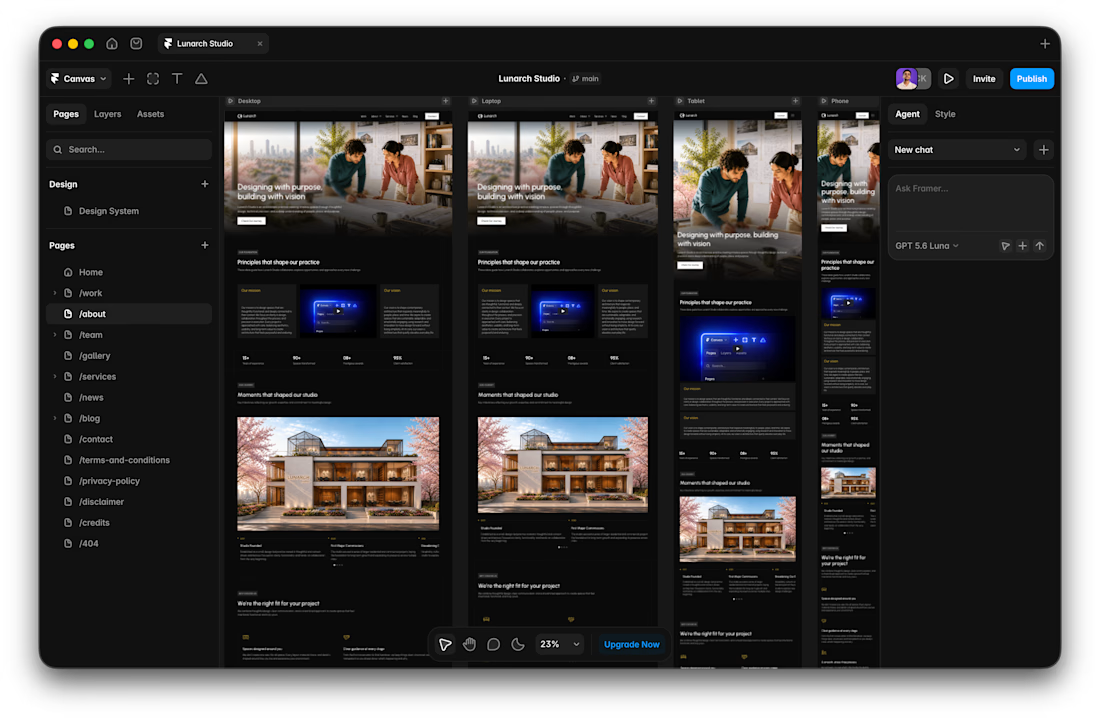
Wide screens expose spacing issues that laptop previews can hide.

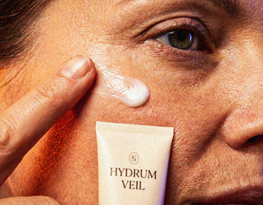
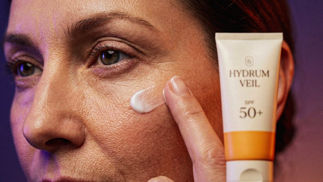
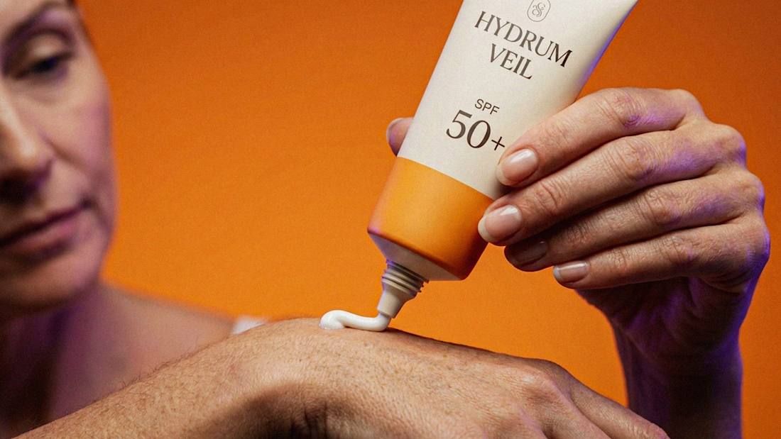
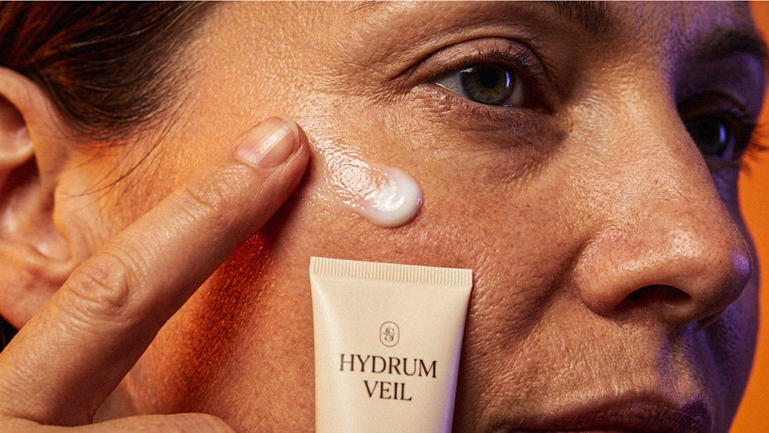
I Just Created HYDRUM VEIL 🔥
HYDRUM VEIL is a skincare brand built around a premium SPF 50+ sunscreen, developed as a complete brand identity, packaging design, and seasonal advertising campaign.
The project explores a question most seasonal beauty work gets wrong: how do you make a limited-edition campaign feel festive without making it feel cheap?
Instead of stacking decorative props, the campaign holds a strict visual system - vivid pumpkin orange, deep twilight violet, warm cream, and restrained black and lets a single product carry every frame.
Drop your replies in cmnts.....!!!!! 🙌
branddesignertastetestBrand DesignGraphic DesignPackaging DesignAdobe IllustratorAdobe PhotoshopClaude