The network for creativity
Join 1.25M professional creatives like you
Connect with clients, get discovered, and run your business 100% commission-free
Creatives on Contra have earned over $150M and we are just getting started
Back to feedPost

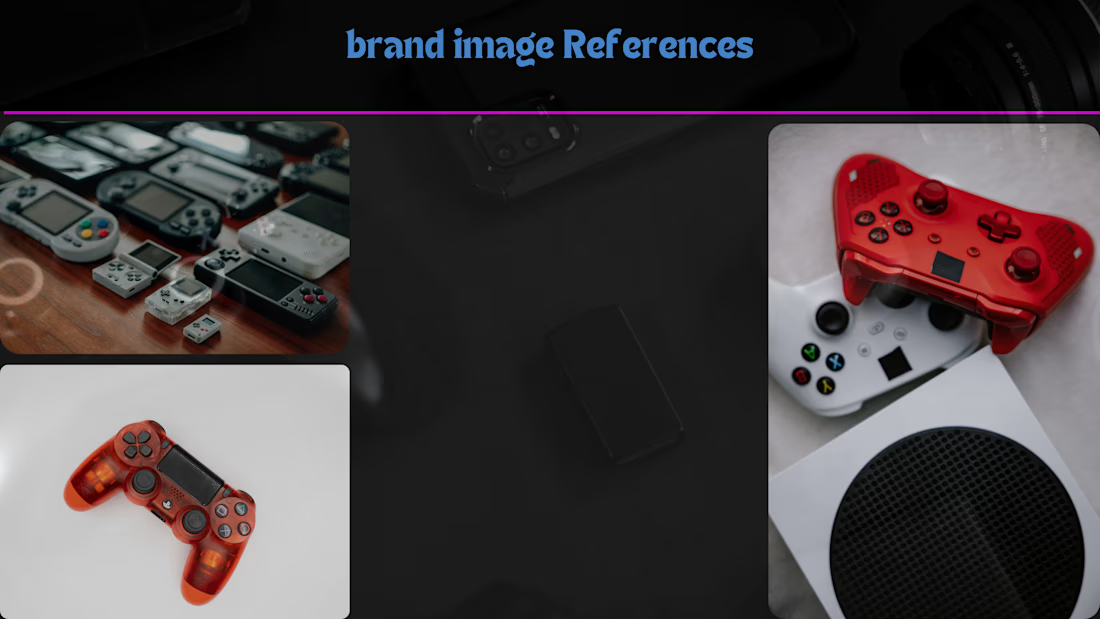
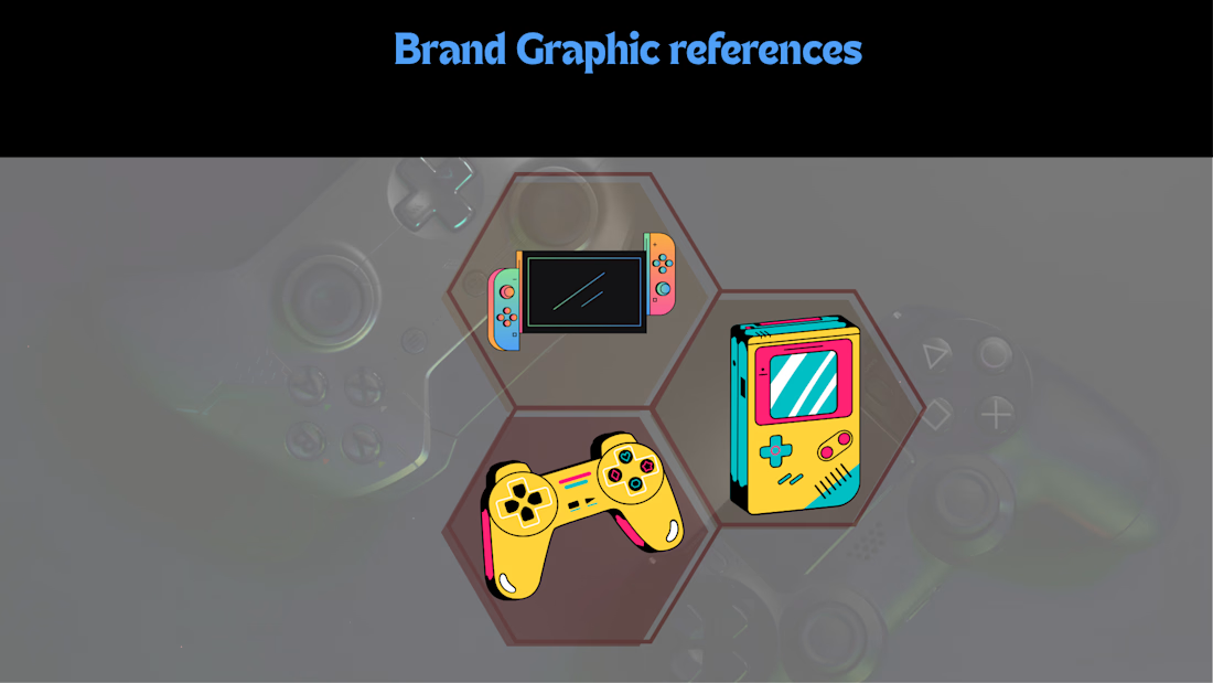
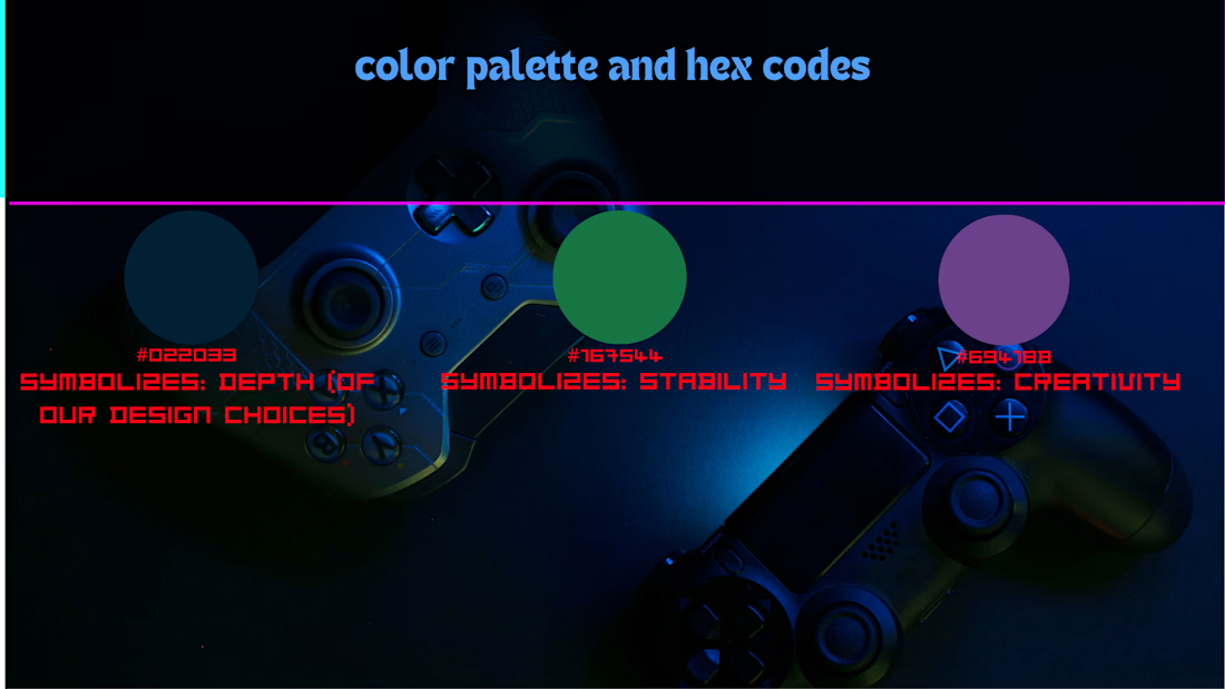
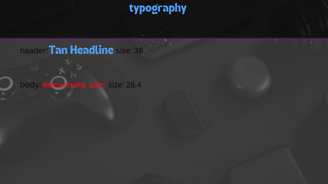
I have continued making the Fictional Case Study Brand Kit for Hex & Kanvas, so here are my Tips when making a Brand Kit:
1. When choosing Brand Image and Graphic References, choose images and graphics of other inspirational brands, in my case, I used images and graphics of Nintendo, PlayStation, and more.
2. When choosing colors for color palette and Hex codes, you should choose colors that (1) contrast, (2) are related to the specific genre, (3) are colors that have symbolism related to the specific brand shown, in my case I used (3).
3. When choosing fonts for Typography, choose fonts that either look similar (better if you want them to blend and look related), or fonts that are contrasting (better if you want the heading to stand out in the hierarchy)
(Note: in my last post about this i made a tiny mistake and called it a brand identity, but after a bit of research i found out that a brand identity is different from a brand kit, that's why i called it a brand kit on this post and a brand identity in the last post, i would rather point out my mistakes rather than simply edit the post)

The network for creativity
Join 1.25M professional creatives like you
Connect with clients, get discovered, and run your business 100% commission-free
Creatives on Contra have earned over $150M and we are just getting started
Trending
retrofuturism
Share your favorite designs from the past exploring the distant future. Or your own take on the aesthetic 🚀
halftone
Dots. Texture. Grain. Let's see your designs using the halftone technique.

Midjourney
Creatives are showing off what they're making with Midjourney.
colorgrade
Video editors sound off: How do you enhance the mood of your video in color grading?





Related posts


Recent branding work for Stilta this weekend.
Got inspired by a few tools along the way. Happy to see it live.


Sick 🔥

A good logo doesn't automatically make a strong brand.
You can have a great mark, great clothes, and great photography, but if everything looks different from one piece to another, people won't remember the brand.
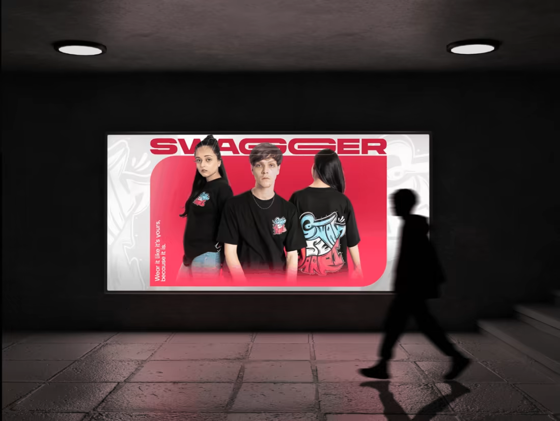
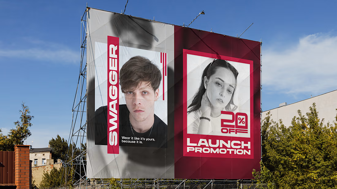
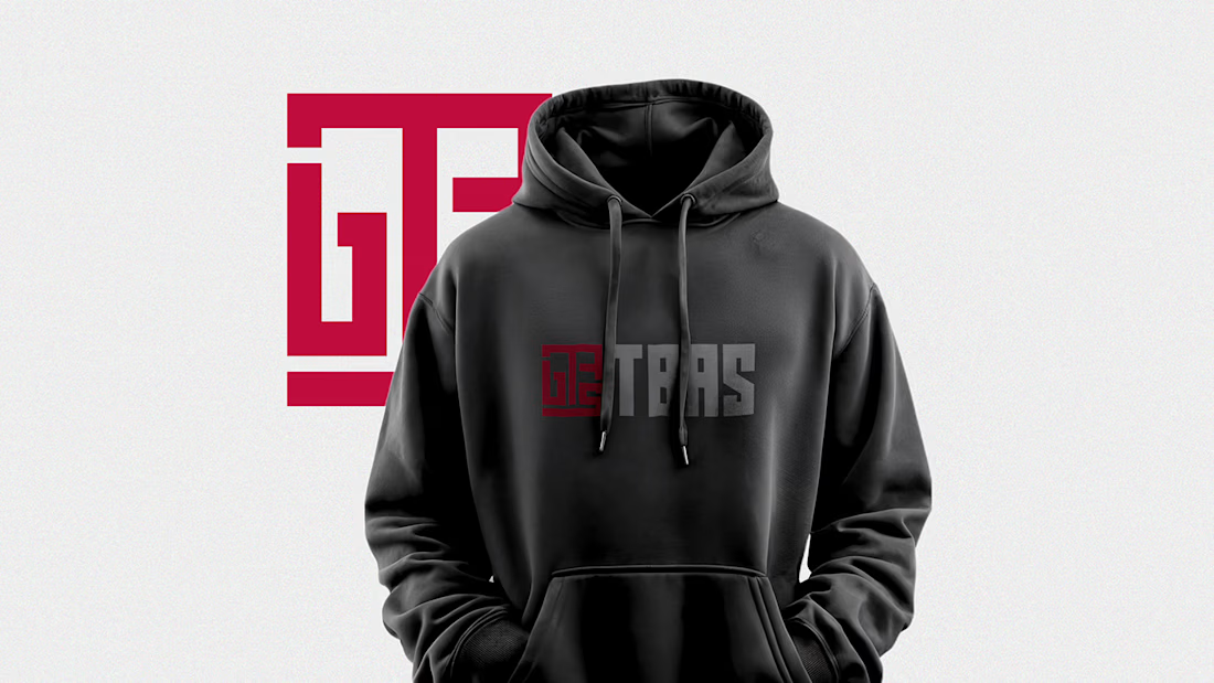
That was something I kept in mind while building the visual identity for TBAS, a modern streetwear brand.
I wanted the identity to feel bold without becoming noisy, and flexible enough to work across clothing, social media, banners, and other brand touchpoints.
So I built the system around a few simple things:
→ A recognizable logo
→ Strong typography
→ A consistent visual language
→ Graphics that still feel like TBAS without the logo being everywhere
Because brand identity isn't about making one design look good.
It's about making 20 different designs still feel like the same brand.
I put the full TBAS identity together on Behance:
What makes you remember a clothing brand: the logo, the visuals, or the overall feeling?
— Shayan Imran