The network for creativity
Join 1.25M professional creatives like you
Connect with clients, get discovered, and run your business 100% commission-free
Creatives on Contra have earned over $150M and we are just getting started
Back to feedPost
Taste Test

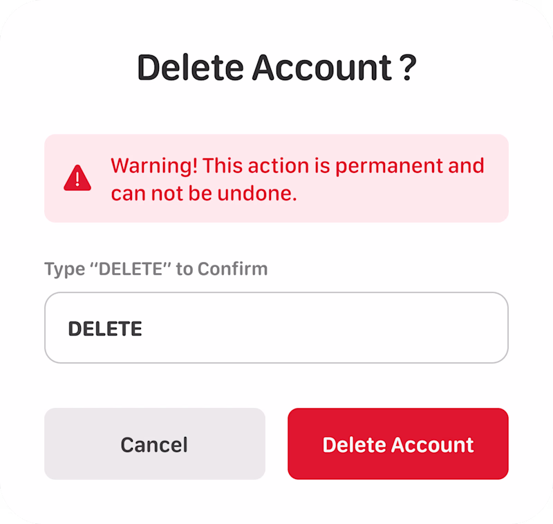
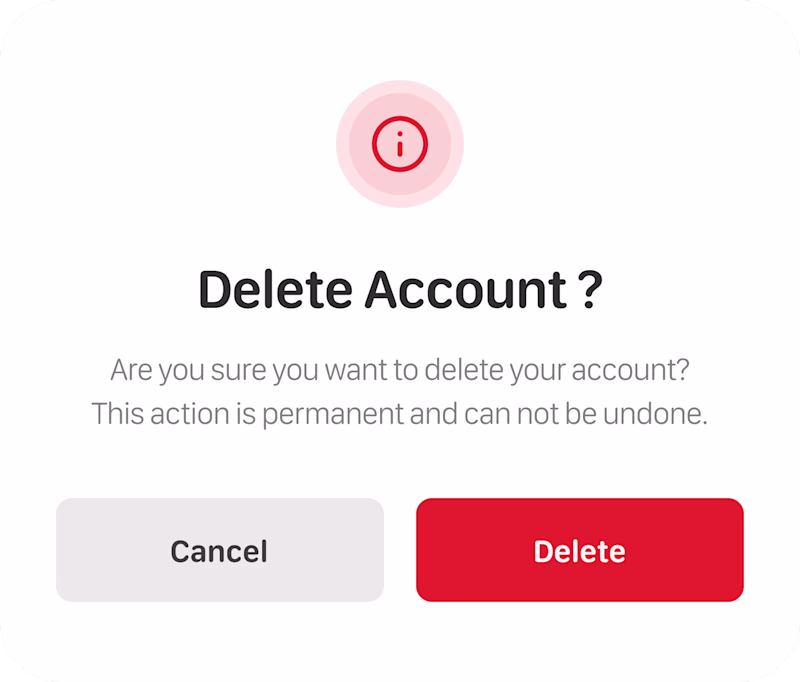
Delete Account Modal Design
Which is Better?
44 voted
47%
49 voted
53%
93 votes
Closed

Option 2 seems better and less friction. Also depends on the usage.


Option 2

Option 2 will be the best.

Option 1 is better, to avoid people deleting accounts by mistake

Option one is better, the warning sign and text shows...


It depends on the context.
1 is safer for critical products.
2 is better for normal/casual products.

Option 1 is better

Aesthetically, option A is good, but users centric, option B is better

Option 2
The network for creativity
Join 1.25M professional creatives like you
Connect with clients, get discovered, and run your business 100% commission-free
Creatives on Contra have earned over $150M and we are just getting started
Related posts

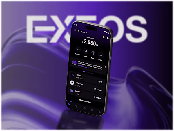
I designed the Exeos DePIN Web3 mobile app using a clean, modern approach grounded in Google’s Material Design system.


Good job


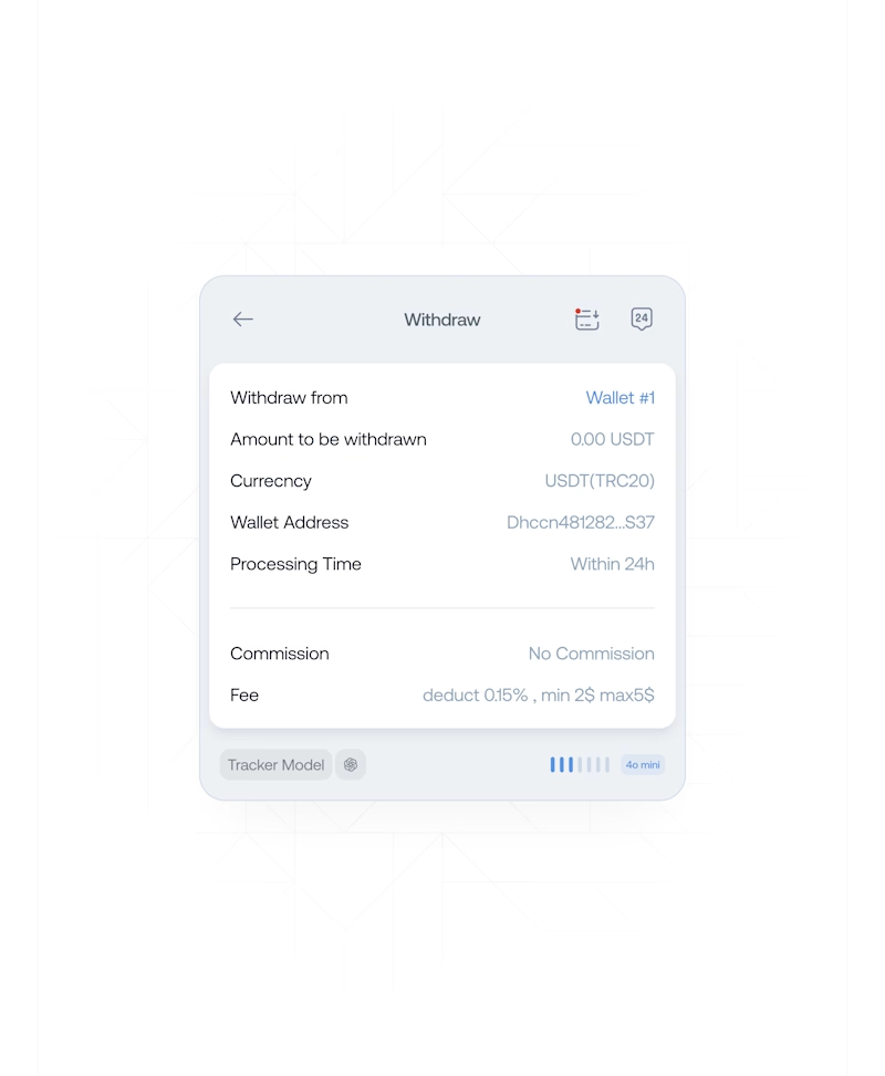
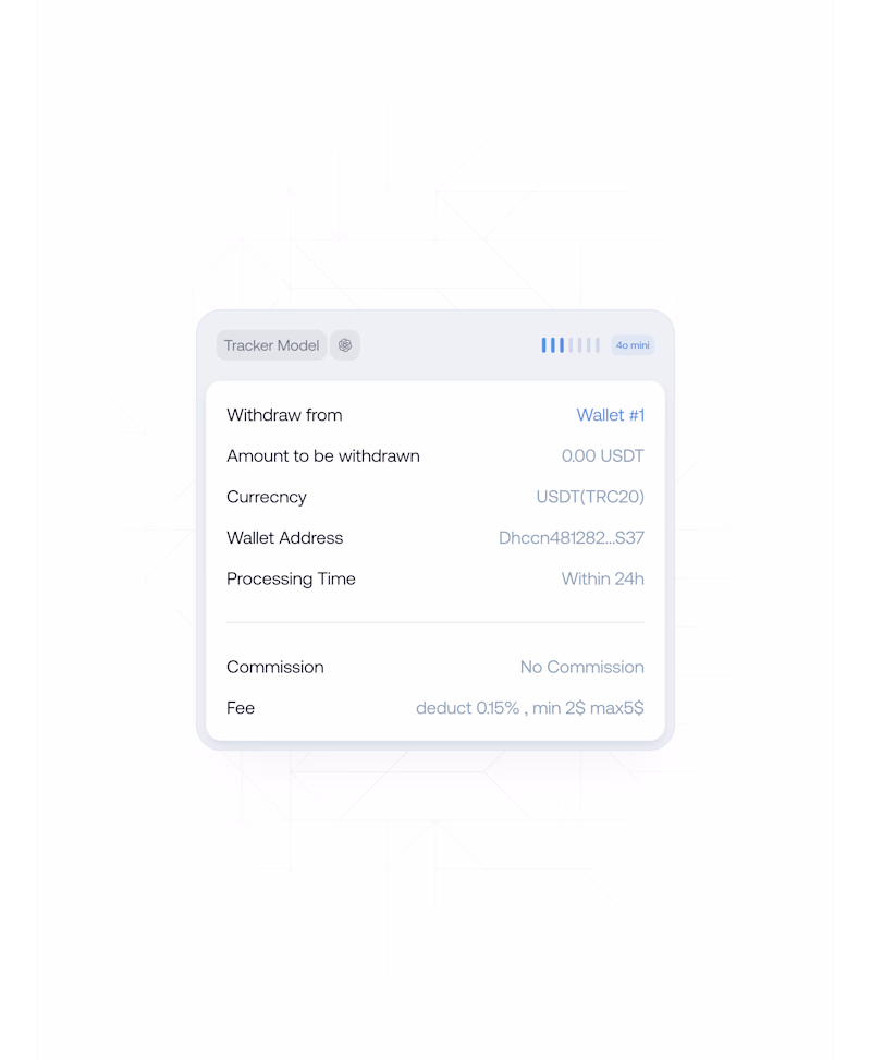
💯 This is how a good AI tracks your finances. Which do you prefer?
- Forex Broker Superapp
1 voted
50%
1 voted
50%
2 votes
Closed


Trending


Notion
Notion isn’t just where you work, it’s starting to work for you. What agents are you building?
portfolioreview
The best portfolios tell a story, not just show a grid. Share yours for feedback.
brandguidelines
Brand guidelines are becoming living systems, not static documents. What are you building for your clients?
aivideo
AI video tools are moving at warp speed. Which ones are you experimenting with?
freelancerlife
Freelancer life is wins, pivots, and everything in between. What’s yours right now?