The network for creativity
Join 1.25M professional creatives like you
Connect with clients, get discovered, and run your business 100% commission-free
Creatives on Contra have earned over $150M and we are just getting started
Back to feedPost
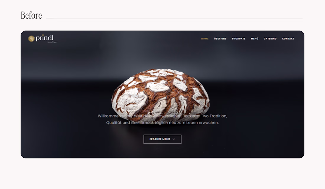
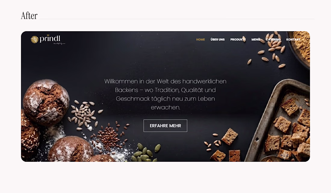
Option B won! 🏆 Thank you to everyone who voted on the layout.
For anyone curious about the original website, here is the quick before-and-after.
The main goal here was to fix the text contrast. Changing the background image made the typography fully visible while adding much-needed context; sharpening the hierarchy to increase the overall impact and drive actual conversions.
Drop a comment below. Did the right version win? 👇
That's nice. You're always welcome.
Looks great!
The network for creativity
Join 1.25M professional creatives like you
Connect with clients, get discovered, and run your business 100% commission-free
Creatives on Contra have earned over $150M and we are just getting started
Related posts
Spent an embarrassing amount of time on one thing today: the scroll behavior of a nav.
Third Framer template in the series.
Looks fantastic :😊
How are you with understanding your blood test results?
Aura is a personal health dashboard 📊 that organises your medical test results into a plain-language insights. You can also chat with Aura to go deeper on anything that concerns you.
Built on Bubble AI generated foundation and taken the rest of the way by hand:
→ Started with a single prompt to Bubble AI, shaped by Claude;
→ Bubble AI generated the foundation: pages, data structure, and UI;
→ Cleaned up the structure into a working app;
→ Redesigned every screen into a soft, light experience.
🎬 See full process walkthrough and comparison between Bubble's initial output and my design in the comments.
🔗 Try Aura
Process walkthrough:
The mobile app for Edge Hound is now live on the App Store 🎉
Not a chatbot with a finance theme, but actually a Bloomberg Terminal built for retail investors and traders.
Trade ideas with reasoning behind them, sentiment analysis, news and social buzz, deep fundamental analysis and more.. and we're just getting started 🔥
Currently supports Stocks, Forex and Commodities. Crypto and ETFs are coming soon.
Looks cool
Trending
Claude
Claude has entered the design space. How are you using Claude Design?
Contra University
Learn from expert creatives how to earn more using next-gen AI tools.
MagicPath
The canvas is infinite, and exploration is becoming the workflow. How are you using MagicPath?
creativeaiflow
Creative AI workflows are evolving. What tools do you use, and what are their strengths and weaknesses?
freelancerlife
Freelancer life is wins, pivots, and everything in between. What’s yours right now?