The network for creativity
Join 1.25M professional creatives like you
Connect with clients, get discovered, and run your business 100% commission-free
Creatives on Contra have earned over $150M and we are just getting started
Back to feedPost
How are you with understanding your blood test results?
Aura is a personal health dashboard 📊 that organises your medical test results into a plain-language insights. You can also chat with Aura to go deeper on anything that concerns you.
Built on Bubble AI generated foundation and taken the rest of the way by hand:
→ Started with a single prompt to Bubble AI, shaped by Claude;
→ Bubble AI generated the foundation: pages, data structure, and UI;
→ Cleaned up the structure into a working app;
→ Redesigned every screen into a soft, light experience.
🎬 See full process walkthrough and comparison between Bubble's initial output and my design in the comments.
🔗 Try Aura


Process walkthrough:

nice explanation kristine
Thank you :)

love it 😍


this is so dang useful!
Right? I for sure have plenty of data on my hands with all the blood tests I've done that no one has ever looked at holistically. 🤷🏼♀️

such a beautiful UI 💖😍
Thank you, Ingrid. 🫠 Still in my light and soft theme era.. 🤍


This is nice and useful
Glad to hear its not just me who finds this useful :))

So calming interface 🩵
Thank you Mara 🤍 happy to hear it resonates.

Love this approach. Medical data can be overwhelming for most people, so turning test results into clear, human-friendly insights is incredibly valuable. The combination of AI-powered foundations and intentional UX design is really interesting here. ✨


yeeeeah, cool!!!

Which icons may I ask?

this is the most beautiful web design I've seen done with vibe coding truly amazing. The 'Ask Aura' chat feeling so calm and clear next to the test results is such a smart touch. What was the trickiest part to get right in Bubble?
Thank you Muhammad :)
I find it tricky to animate elements in Bubble. You have to set conditions and interactions separately for every component, colour, placement, size, borders etc. AI agent can assist quite a bit but still ..
That makes sense sounds like Bubble's visual conditions approach trades code for a different kind of complexity. I hand-code most of my stuff, so I'm curious how the AI agent in Bubble compares to working with something like Claude/v0 directly does it feel more like a co-pilot...
Yes, it seems like the same level of detail that you would be handling in code Bubble has given user-friendly interface for.
AI Agent does the heavy lifting by creating a pretty solid foundation from the initial prompt. Then it's all about fixing it up and improving design. AI...

love the clean execution


Can you check mine and tell me what I did wrong


Nice

It sounds like a really helpful tool for simplifying complex medical data
Jeah, I'm tempted to setup the AI backend and all. Would be interesting to test how well AI handles the data from different inputs.
Smooth I'm rooting for u even my work is not as good, I'm jealous of your work🙂

We all learn. 😆

Great work

Nice design, I am impressed by this

Amazing!

Awesome

Love this! 😄 It's refreshing to see a health dashboard that doesn't make me feel like I need a medical degree and a UX degree just to read my blood work.
Clean hierarchy, thoughtful use of whitespace, and the data actually breathes instead of fighting for attention. Proof that...
Ahh, apreciate it. :) 'I don't want typical dashboard cards' was actually a very explicit point I made in the initial prompt.

oh wow this is cool

The network for creativity
Join 1.25M professional creatives like you
Connect with clients, get discovered, and run your business 100% commission-free
Creatives on Contra have earned over $150M and we are just getting started





Related posts

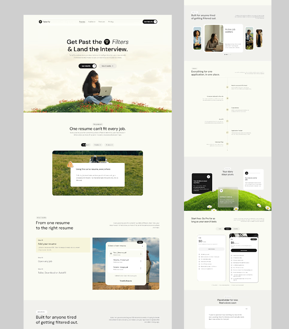
Talorify requested a high-converting landing page. Guess what?
Delivered the full design and development.
A high-converting landing page has one primary job, And this one is basically saying:
“Please get me from the store.” 🔥
Don’t overload your landing page with buttons that confuse your users. Give them one clear direction and make it easy to take action.
Check it out and tell me:
Would you call this design premium?
Hi, I’m Emmanuel Bliss, Product Designer (UI/UX).I bring clarity to what already exists and what is yet to exist.
Checkout the Live HERE


Definitely premium. Did they measure if this new design actually brought in more sign-ups and conversions compared to before?

Just created a cursor that transforms the content beneath it. It follows your pointer with a subtle delay, then settles precisely on it when you stop.
There are 9 effects: Invert, Monochrome, Fisheye, Duotone, Cyanotype, Embossed Paper, Solarized, Infrared, and Chromatic


This is the type of detail that shows the taste of the designer, well done!!