The network for creativity
Join 1.25M professional creatives like you
Connect with clients, get discovered, and run your business 100% commission-free
Creatives on Contra have earned over $150M and we are just getting started
Back to feedPost

Option B won! 🏆 Thank you to everyone who voted on the layout.
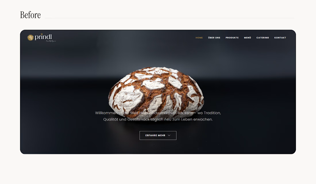
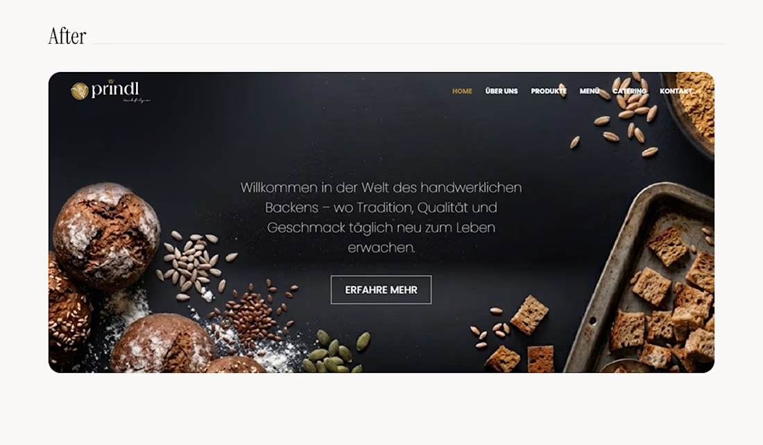
For anyone curious about the original website, here is the quick before-and-after.
The main goal here was to fix the text contrast. Changing the background image made the typography fully visible while adding much-needed context; sharpening the hierarchy to increase the overall impact and drive actual conversions.
Drop a comment below. Did the right version win? 👇



Looks great!


That's nice. You're always welcome.
The network for creativity
Join 1.25M professional creatives like you
Connect with clients, get discovered, and run your business 100% commission-free
Creatives on Contra have earned over $150M and we are just getting started





Related posts

Meriot personal portfolio Website Homepage showcase
A portfolio website designed to turn personal expertise into a strong digital presence.
The goal was to create a website that communicates experience, personality, expertise, and credibility within the first few seconds.
I focused on:
Clear positioning and personal branding
Strong visual hierarchy
Editorial-style typography
Project-focused storytelling
UX/Product Design service presentation
Testimonials and social proof
Clear CTA for potential clients
Responsive, conversion-focused layouts
The visual direction combines minimal typography, bold imagery, dark/light sections, and subtle interactions to give the portfolio a distinctive personality without making it difficult to navigate.


Top notch execution

Remove Liquidity component cards for a recent Web3 design project—what would be the best direction for readability and focus? Dark Mode or Light Mode? ⚡️
12 voted
40%
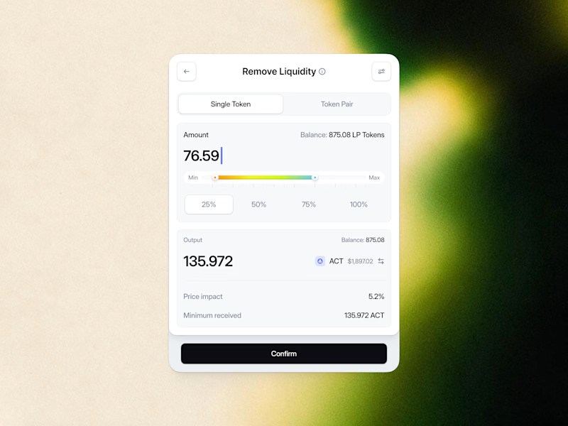
18 voted
60%
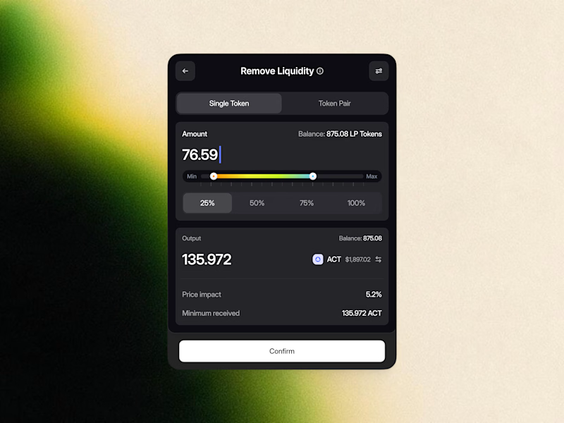
30 votes
Closed

White one need bit more darker bg on elements to make them visible like the dark more does.


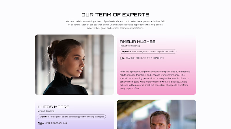
Team Sections: Professional Only or Professional + Personal?
A team section can build trust in different ways.
Version A - Professional. Focuses on the coaches’ professional experience - their expertise, years of practice, and approach to working with clients.
Version B - Professional + Personal. Keeps this information but adds a Weekend Mode with personal photos, interests, and small stories about life outside work.
For a coaching website, both sides matter: expertise shows competence, while personality helps visitors feel a human connection.
Which version would make you more likely to choose a coach?
22 voted
61%
14 voted
39%
36 votes
Closed

Upgoating version B