The network for creativity
Join 1.25M professional creatives like you
Connect with clients, get discovered, and run your business 100% commission-free
Creatives on Contra have earned over $150M and we are just getting started
Back to feedPost

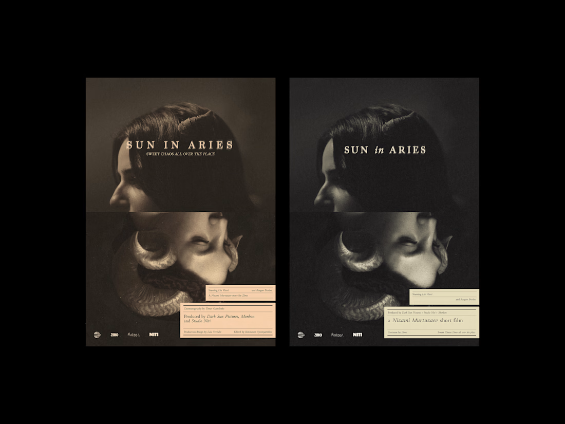
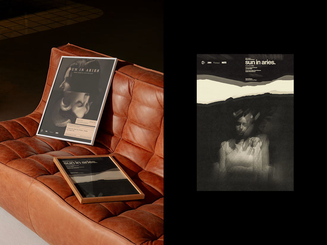
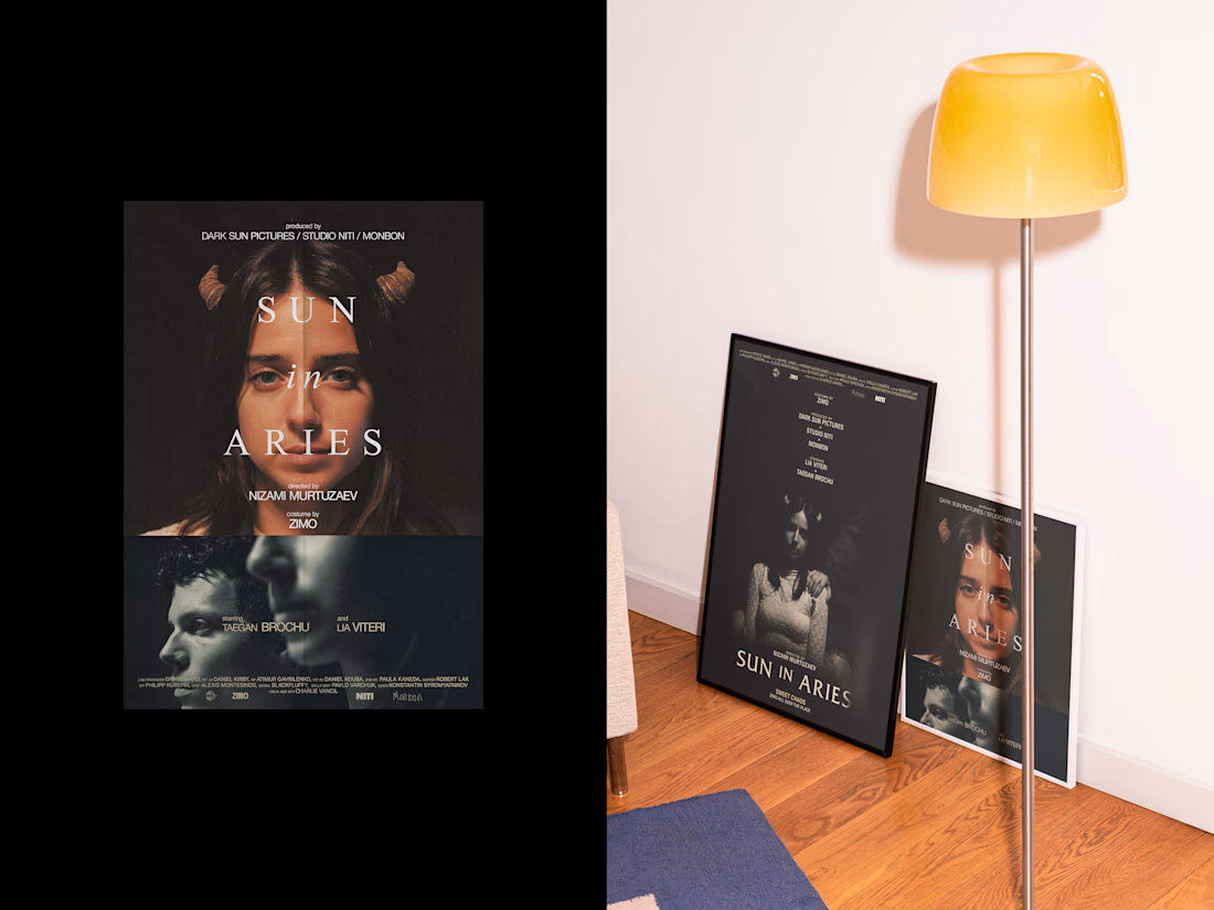
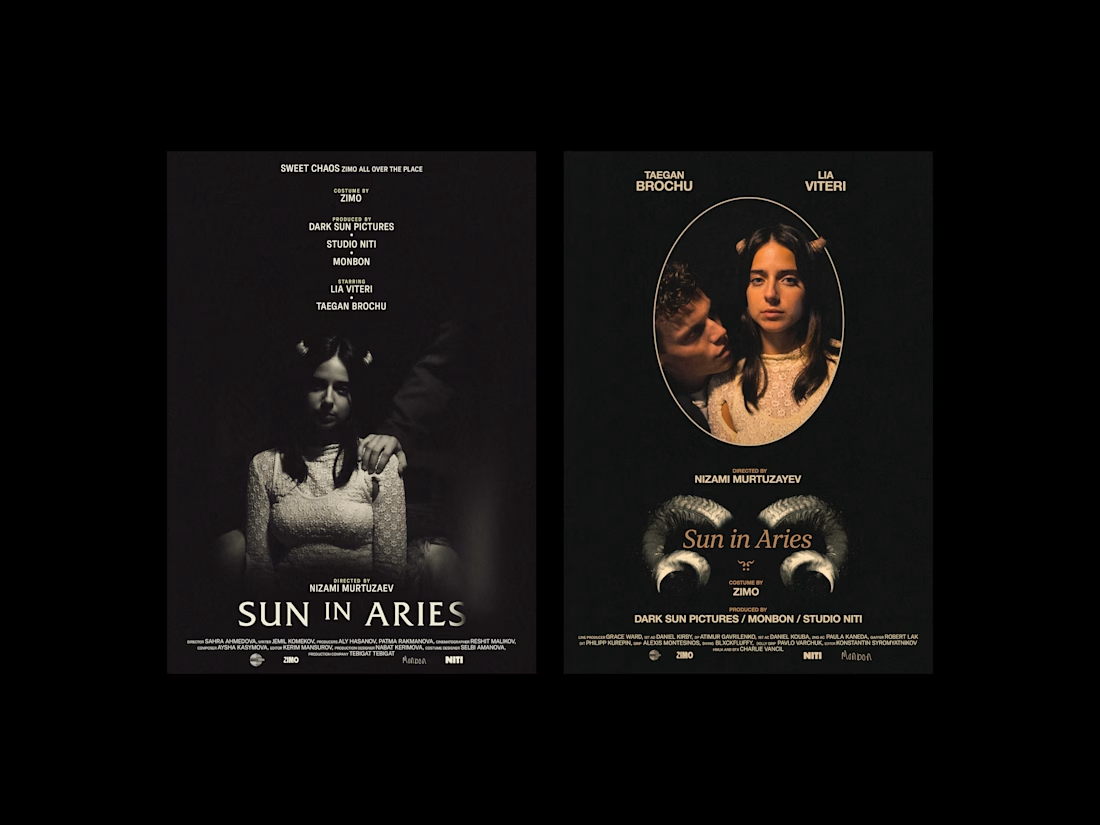
Sun in Aries.
The first treats the film as a classical object: serif type, centered hierarchy, restraint that lets the photography lead. The second applies Swiss grotesque and horizontal structure, the credits becoming typographic texture rather than information. Different systems, same photograph. The darkness in the image held up to both.


The network for creativity
Join 1.25M professional creatives like you
Connect with clients, get discovered, and run your business 100% commission-free
Creatives on Contra have earned over $150M and we are just getting started
Trending
retrofuturism
Share your favorite designs from the past exploring the distant future. Or your own take on the aesthetic 🚀
halftone
Dots. Texture. Grain. Let's see your designs using the halftone technique.

Midjourney
Creatives are showing off what they're making with Midjourney.
colorgrade
Video editors sound off: How do you enhance the mood of your video in color grading?



Related posts

Quick design vote 🐾
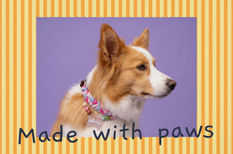
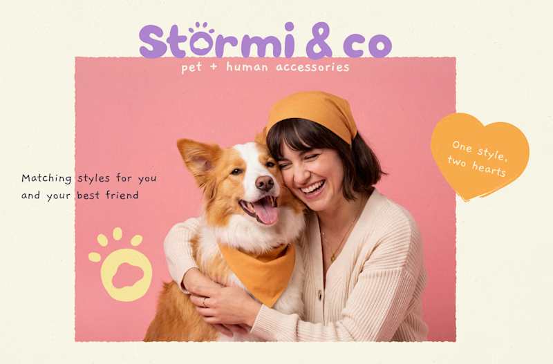
I’m working on the visual direction for Stormi & co., a pet + human accessories brand, and I’m curious:
Which direction would you choose?
🐶 A: Playful & handmade
💗 B: Warm & lifestyle-focused
Both are part of the same brand world, but they tell a slightly different story.
Which one feels stronger to you? 👇
You can see the full project here:
Stormi & co. — Brand Identity & Packaging

5 voted
24%
16 voted
76%
21 votes
Closed


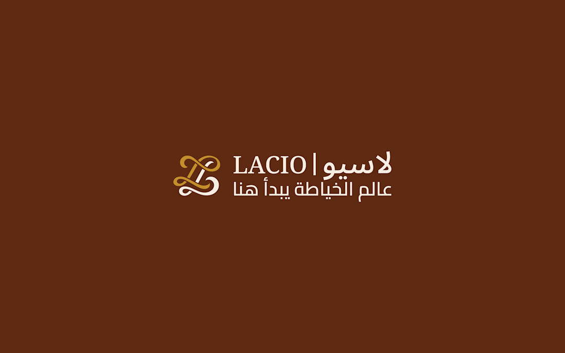
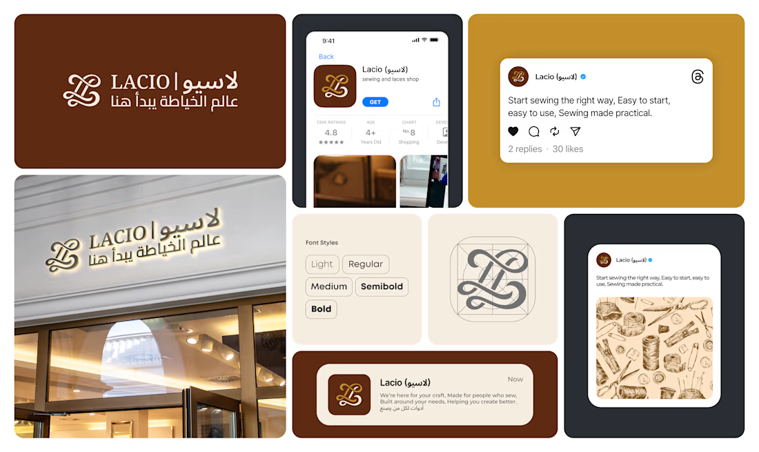
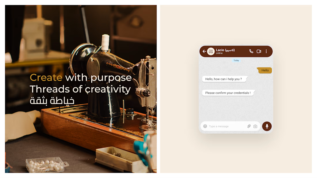
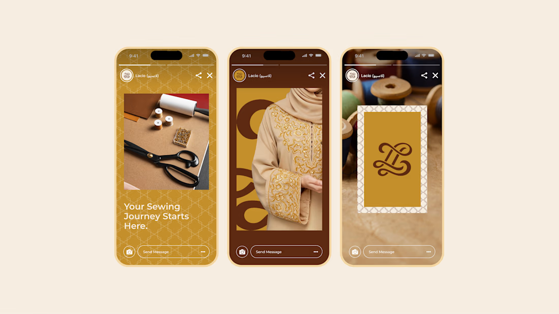
Lacio - a refined brand identity crafted for a modern sewing and tailoring brand.
From the signature monogram and Arabic-English typography to social media templates, storefront signage, and digital touchpoints, every detail was designed to make the brand feel elegant, trustworthy, and memorable.
A visual identity where craftsmanship meets contemporary luxury.
#BrandIdentity #BrandDesign #LogoDesign #VisualIdentity #FashionBranding #LuxuryBranding #ArabicBranding #BilingualBranding #TailoringBrand #SewingBrand #SocialMediaDesign #GraphicDesign #BrandingDesigner

Another unit from the Humlebæk, Denmark development 🏡 This one features a bright open kitchen, a calm sage-toned primary bedroom, and a playful kid's loft room with a raised sleeping nook - fully visualized before construction. For me, the most favourite part is kids room - would you like to have such a loft bed in childhood? 😍
#3DVisualization #InteriorDesign #ArchViz #ScandinavianDesign #CoronaRenderer


I wish I had a bedroom like this when I was a child 🤗