The network for creativity
Join 1.25M professional creatives like you
Connect with clients, get discovered, and run your business 100% commission-free
Creatives on Contra have earned over $150M and we are just getting started
Back to feedPost

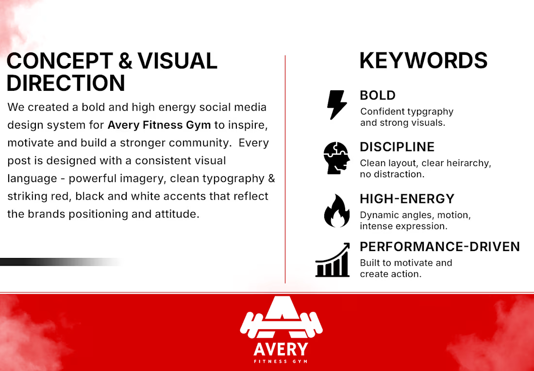
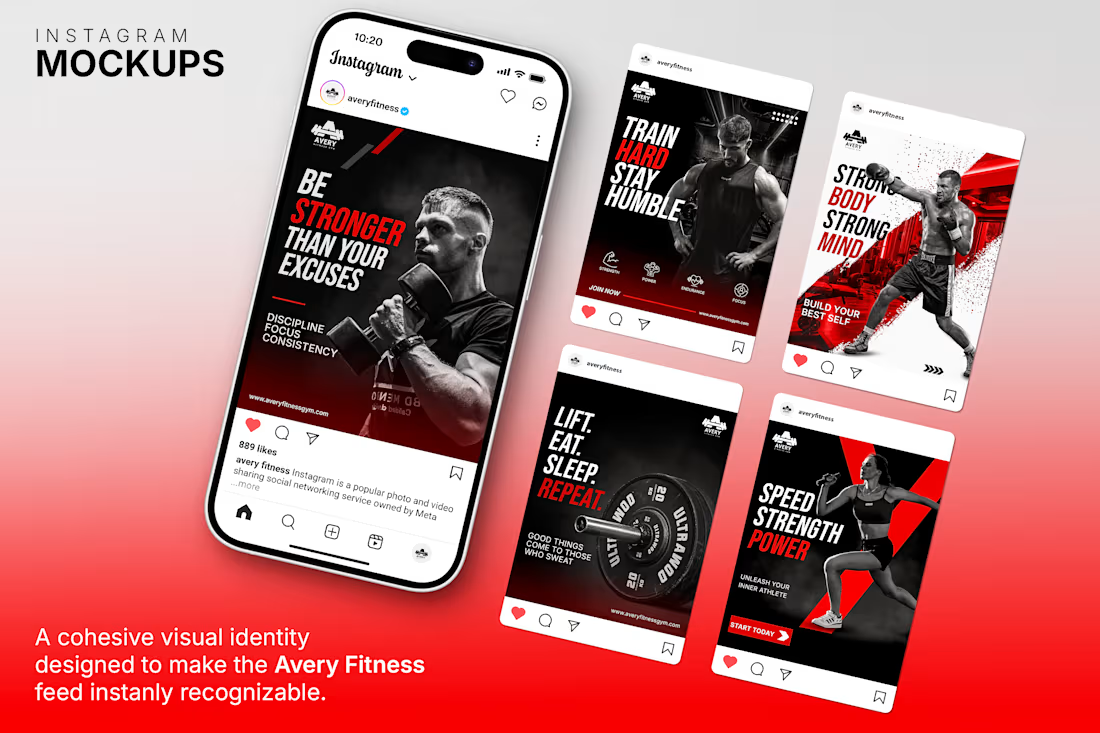
Created a cohesive social media design series for a fitness gym using a bold black, red, and white color palette with Bebas Neue and Montserrat typography. Maintained a consistent visual identity across all designs for a unified and professional brand look


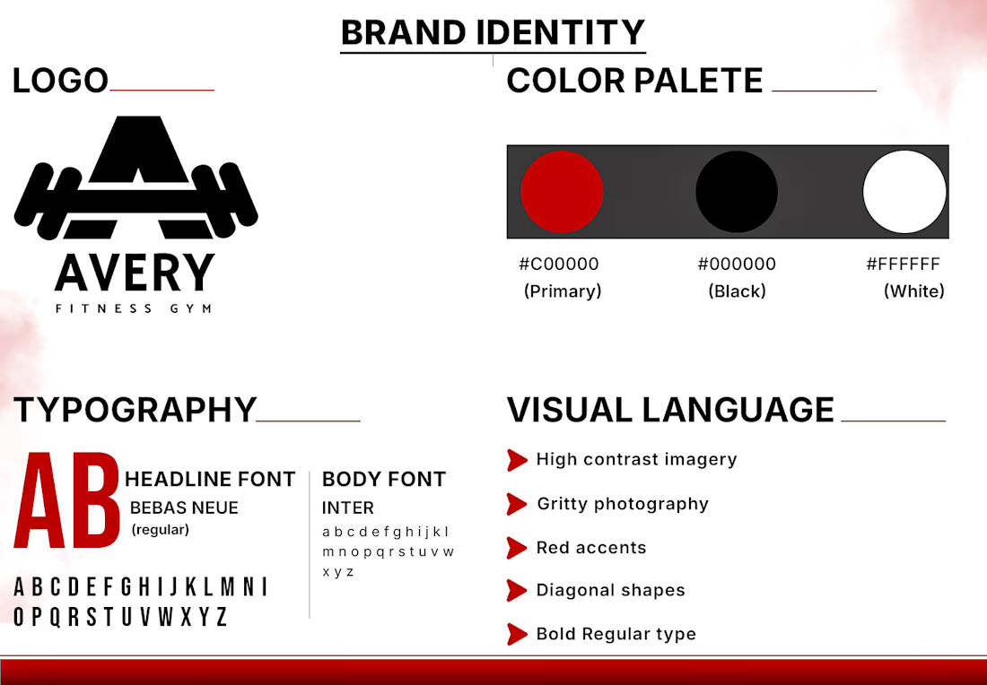
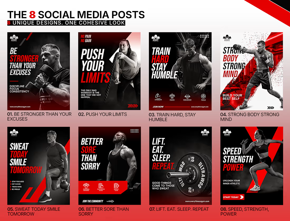

Bebas carries the shout, but the moment a post in the series has to hold a class schedule or the terms of an offer it falls to Montserrat — and that's usually the post where a set stops looking like one set. Did you fix a size relationship between the two up front, or let each layout decide?
The network for creativity
Join 1.25M professional creatives like you
Connect with clients, get discovered, and run your business 100% commission-free
Creatives on Contra have earned over $150M and we are just getting started

Challenges
View all


Related posts

Brand identity design for Adventum Fitness, a fitness and personal development brand built around physical performance, mental fitness, and personal growth.
The challenge was to create a visual identity that could bring strength, movement, discipline, and personal development together without falling into the usual fitness branding clichés.
The identity was developed as a cohesive visual system across logo design, typography, color, graphic elements, and supporting brand assets, giving Adventum a distinctive and consistent presence across digital and marketing applications.
Full case study available on my Contra profile.
#BrandIdentity #BrandDesign #FitnessBranding #VisualIdentity #LogoDesign #BrandStrategy #GraphicDesign #BrandDesigner #FitnessBrand #PersonalDevelopment


More visuals from the rejected brand direction I shared earlier.
Really good to see this direction resonating with so many of you. It was one of our favourite explorations to build, from the narrative behind it to the visual world that brought it to life.
Great work doesn’t always make the final cut, and sometimes the reason has little to do with the quality of the direction.
Curious why this one was rejected? I’ve shared the story in the first comment✨

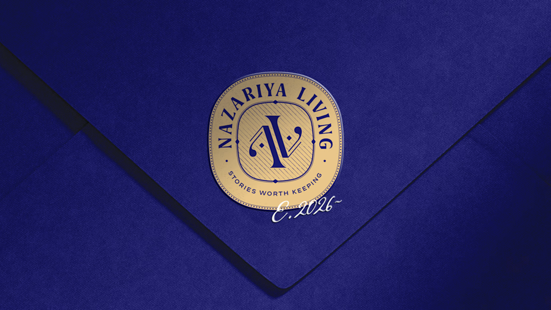
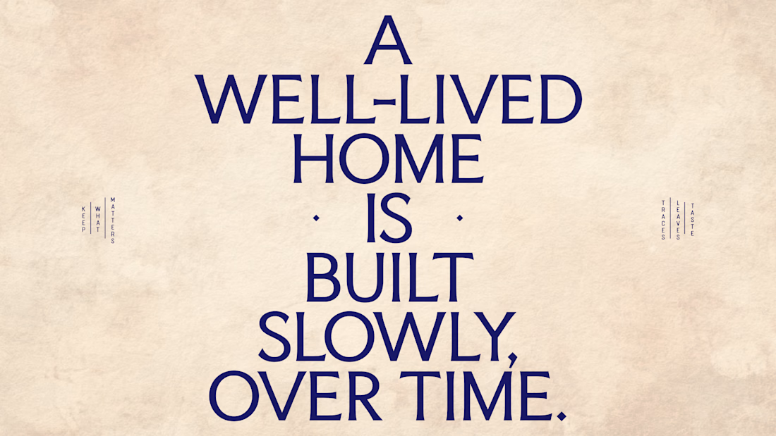
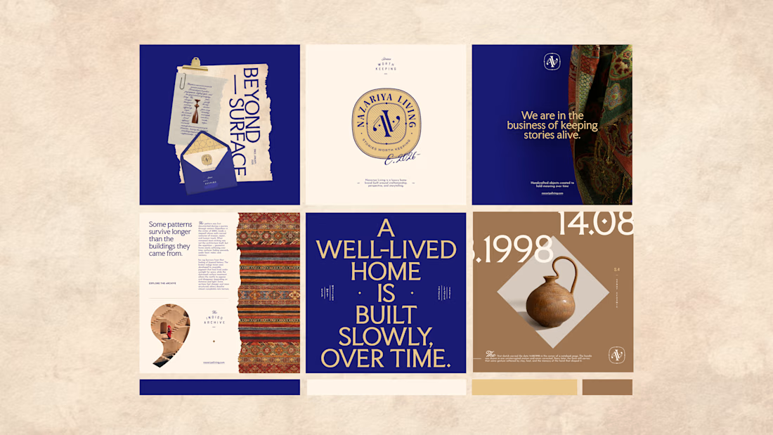
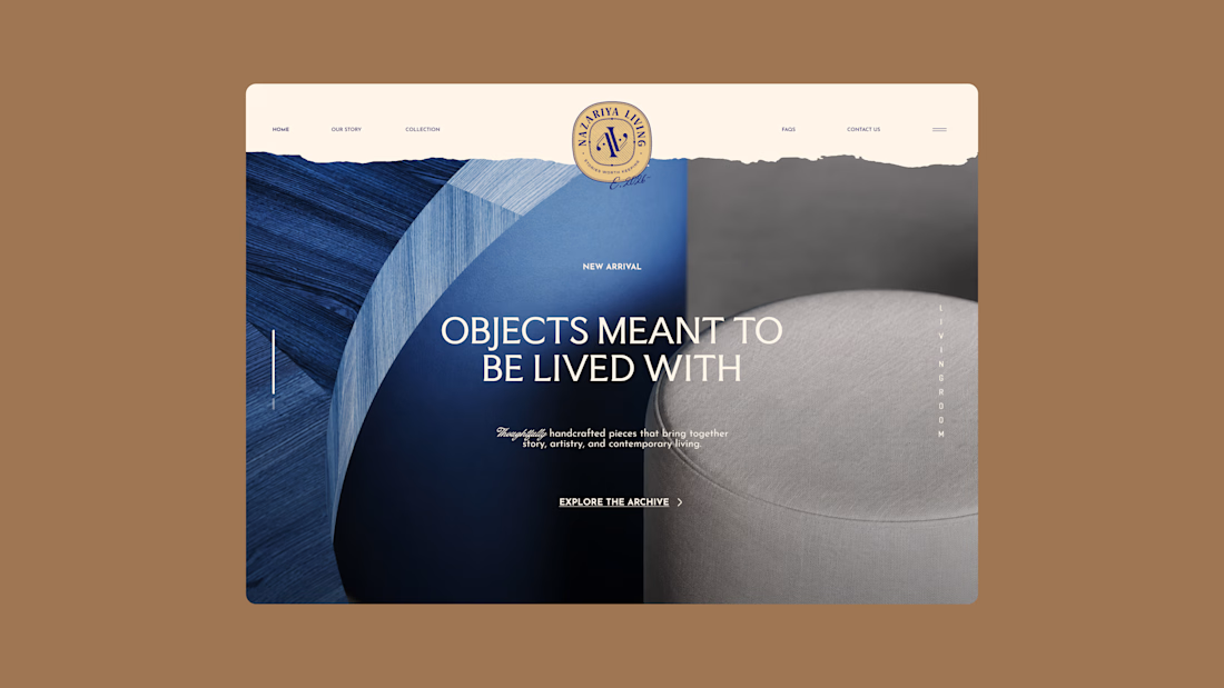
Nazariya Living is a premium carpet and home décor brand shaped by craftsmanship, culture and the stories objects carry into our homes.
This direction brought that idea to life through a seal-inspired logo, archival textures, unexpected colours and editorial typography, creating...

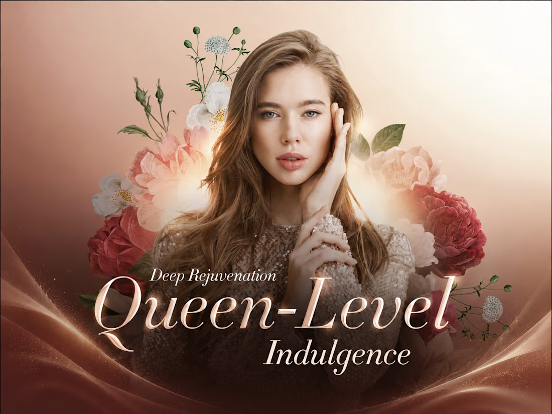
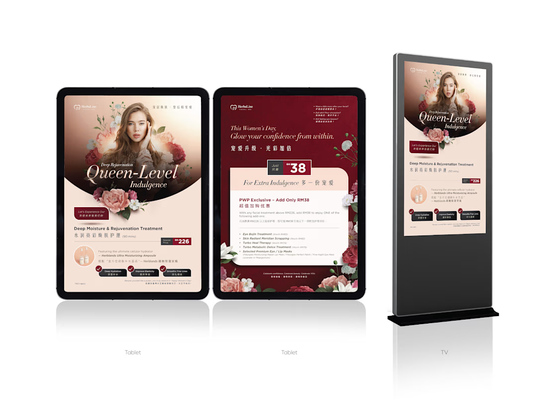
HerbalLine Women’s Day — Treatment Menu Design
Feminine & Luxurious Soft blush tones, floral elements, and elegant portrait photography create a sophisticated feminine aesthetic that complements the Women’s Day campaign.
Premium Visual Direction The combination of warm gradients, deep burgundy accents, and refined serif typography enhances the sense of indulgence and positions the treatment as a premium spa experience.
Strong Visual Hierarchy The campaign headline, treatment name, promotional price, and key benefits are clearly structured, allowing customers to quickly understand the offer and treatment highlights.
Floral Art Direction Layered botanical illustrations frame the model and create visual depth, reinforcing themes of beauty, rejuvenation, and self-care without overpowering the promotional message.
Clear Benefit Communication Key treatment benefits — Deep Hydration, Improved Elasticity, and Smoother Fine Lines — are presented in a concise and accessible format to support quick decision-making.
Overall Concept A promotional treatment menu that combines feminine elegance, premium beauty aesthetics, and clear commercial communication, designed to make the Women’s Day offer feel both exclusive and inviting.
Credit: HWG

The soft blush, burgundy, and botanical direction creates a strong premium spa mood without losing clarity. I especially like how the treatment benefits are structured for quick scanning.