The network for creativity
Join 1.25M professional creatives like you
Connect with clients, get discovered, and run your business 100% commission-free
Creatives on Contra have earned over $150M and we are just getting started
Back to feedPost


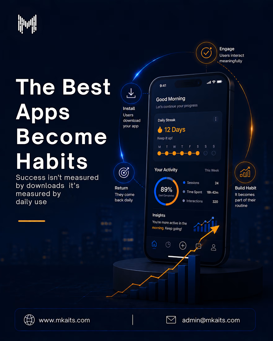
Anyone can build an app that gets downloaded.
The real challenge is building one that people keep coming back to.
The most successful apps become part of a user's daily routine by delivering value through simplicity, speed, and seamless experiences.
Because lasting growth doesn't come from installs.
It comes from habits.
#MobileAppDevelopment #AppDevelopment #UserExperience #UXDesign #ProductDesign #DigitalProducts #SoftwareDevelopment #TechInnovation #BusinessGrowth #MkaitsTechnologies
The network for creativity
Join 1.25M professional creatives like you
Connect with clients, get discovered, and run your business 100% commission-free
Creatives on Contra have earned over $150M and we are just getting started











Related posts

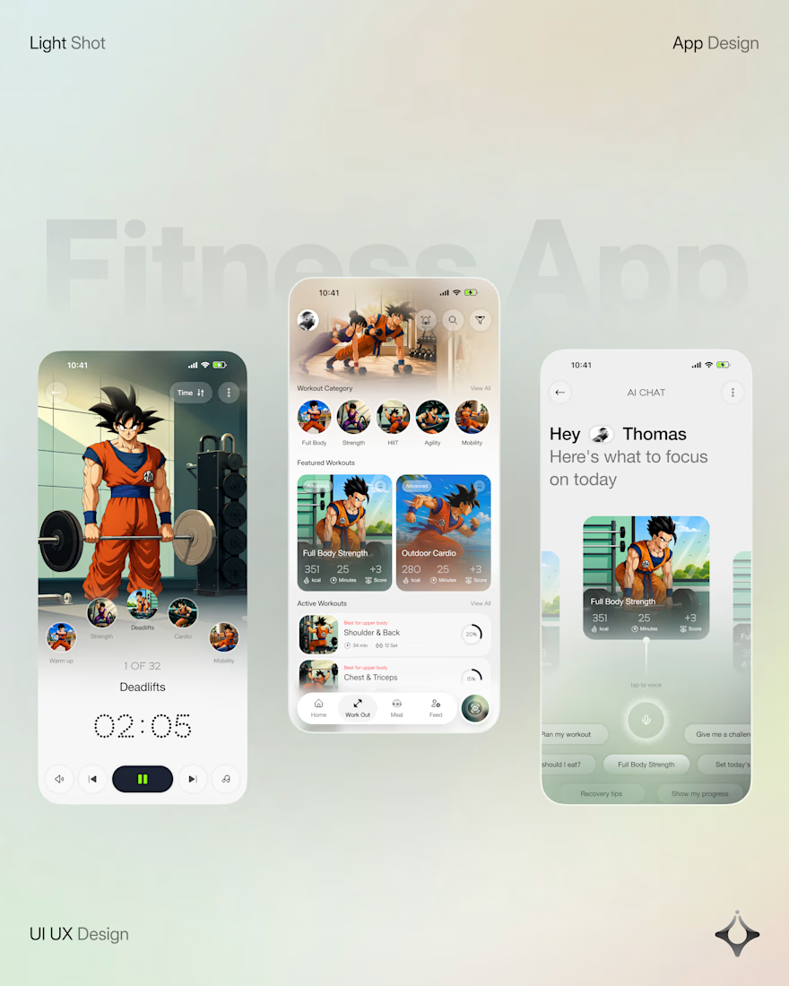
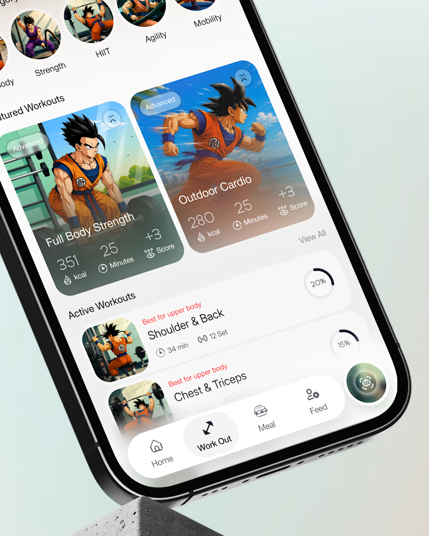
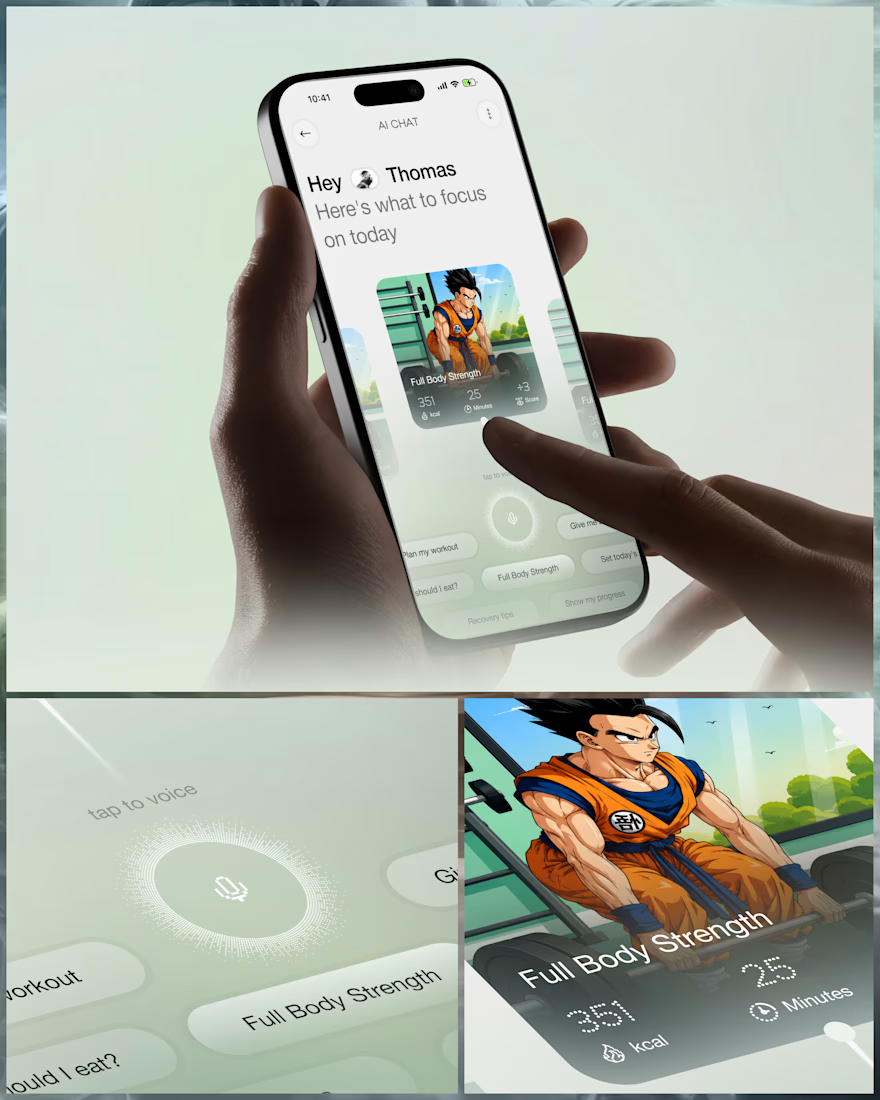
What if your fitness app felt like having a personal trainer in your pocket?
Meet your new workout companion. A bold fitness app concept combining personalized workouts, AI coaching, and a seamless mobile experience to make every session count.
Would you use this to level up your fitness journey?


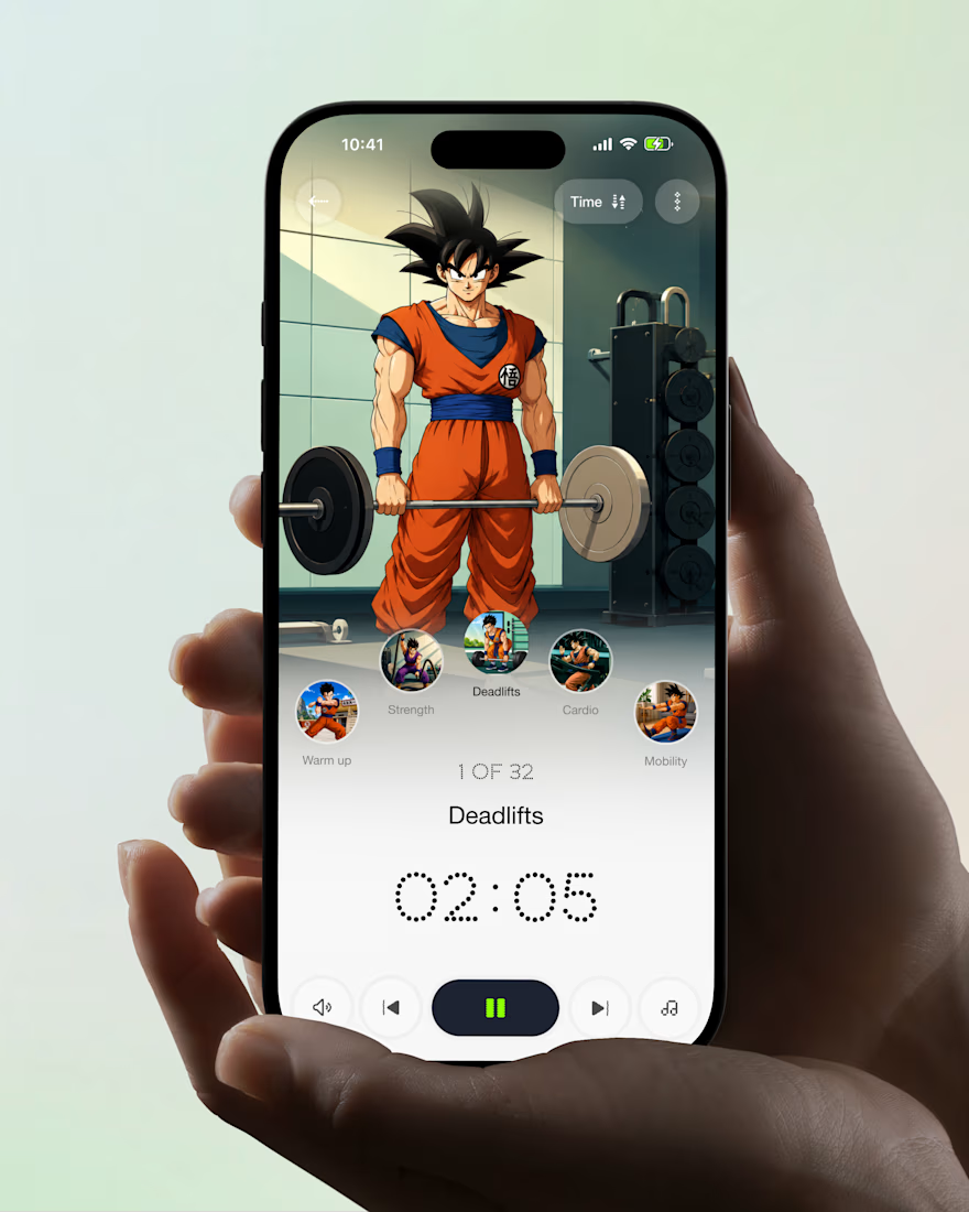

Ye le Jani Juice Lab wali post ke liye copy-ready:
Love this concept Juice Lab! A fitness app that feels like a personal trainer in your pocket is exactly what's needed — combining personalized workouts with AI coaching and a seamless mobile experience is a great approach. The...

The Good Times website is live 👀
Most app sites start with a phone mockup and a list of features. This one starts with the problem, so you can see yourself in it first. The app shows up after that, as the answer.
https://goodtimestimer.com/
Built with Astro.


Great concept

love the health performance app...💡
We designed Health Performance, an app for a nutritionist and his personal clients. He wanted it simple and basic, built only for the people he works with. The app is invite only, so he tracks data just for his clients and uses it to help them build a healthier lifestyle. Meals, measurements, training, blood tests and body scans all live in one place, and every consultation starts with the full picture.
Things i'd change if we'd make this public, is work on smaller interactions to make app likeable and fun to use + make the interface a little less generic:)
What do you think?🧠✨
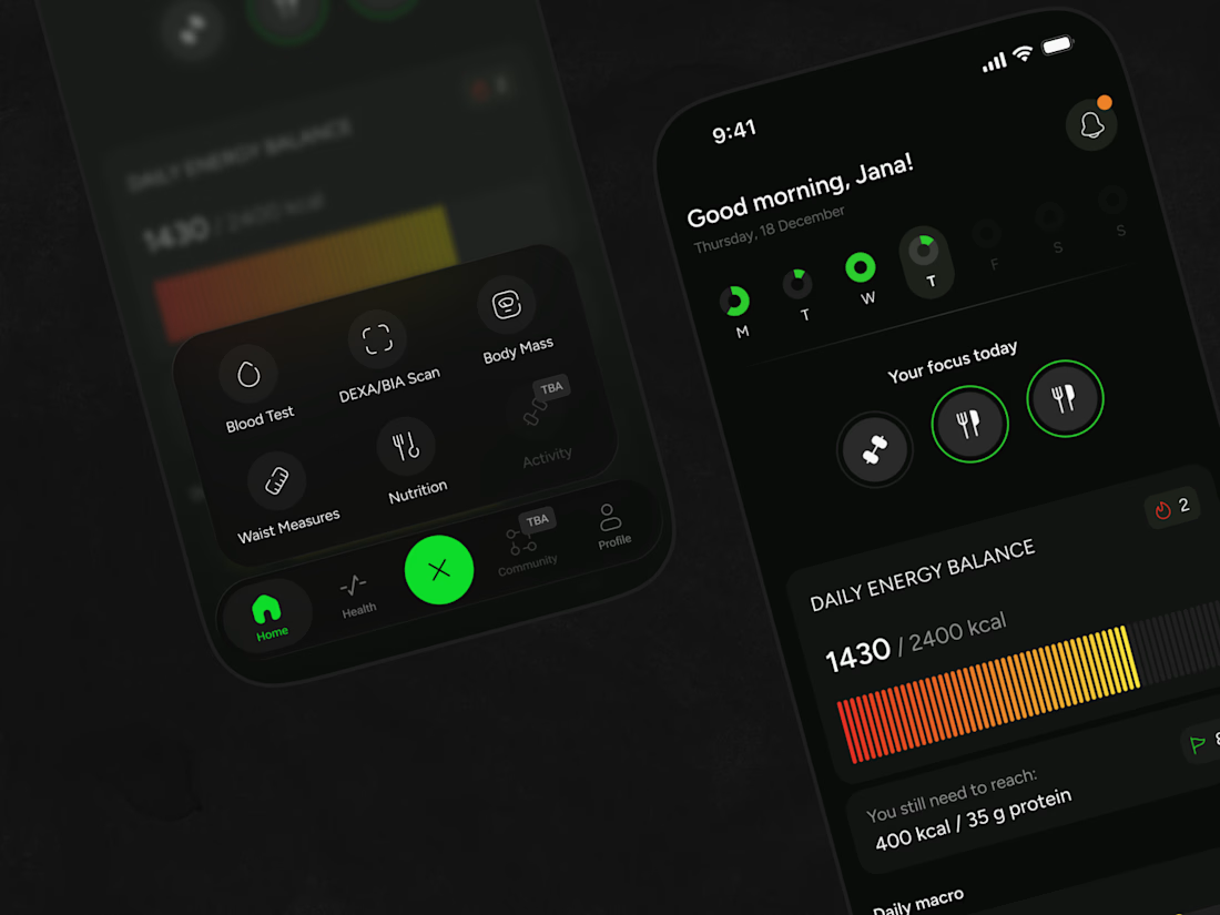
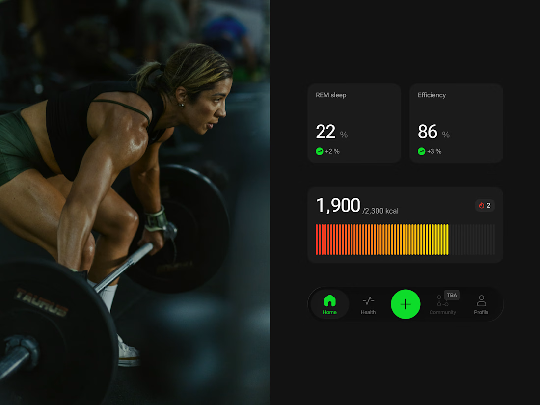
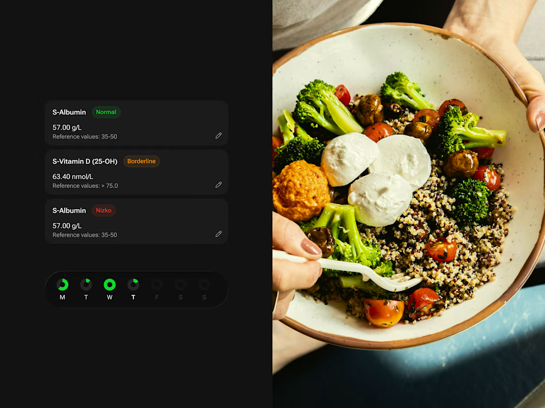
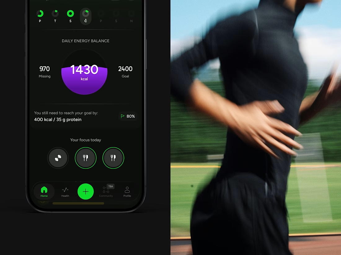
Love this! The invite-only approach is so smart - keeps it exclusive and focused. The dark UI with that green accent looks super clean and modern for a health app. Great execution! 👏