The network for creativity
Join 1.25M professional creatives like you
Connect with clients, get discovered, and run your business 100% commission-free
Creatives on Contra have earned over $150M and we are just getting started
Back to feedPost
Taste Test
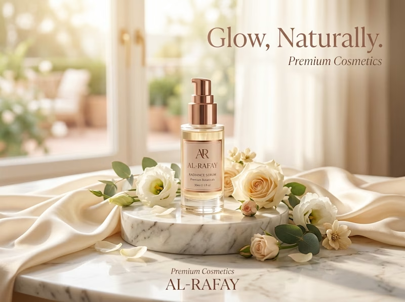
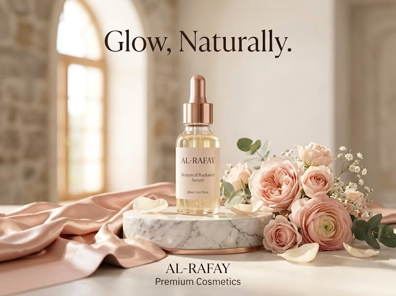
I gave ChatGPT and Gemini the exact same prompt to create a luxury skincare ad. No changes, no extra instructions.
Which one did it better? Look at the lighting, the text and the overall mood, then vote 👇

4 votes
Ends in 1d

I'm going with A. The warm tones and the bottle placement feel more premium, and the text sits cleanly in the empty space without competing with the product.

Thanks 💝 for the feedback, Ganesh! Good point on the text. Gemini ka product focus strong hai, par typography dono mein aur refine ho sakti thi. Agle round mein isi pe kaam karunga.
The network for creativity
Join 1.25M professional creatives like you
Connect with clients, get discovered, and run your business 100% commission-free
Creatives on Contra have earned over $150M and we are just getting started





Related posts

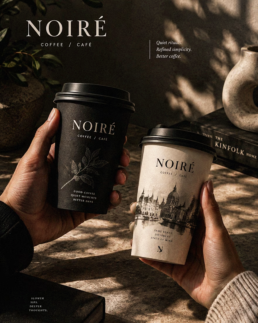
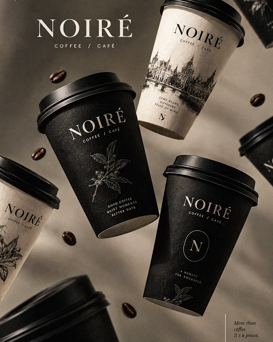
I Just Created NOIRÉ 🔥
A Coffee Brand Built Around the Pause.
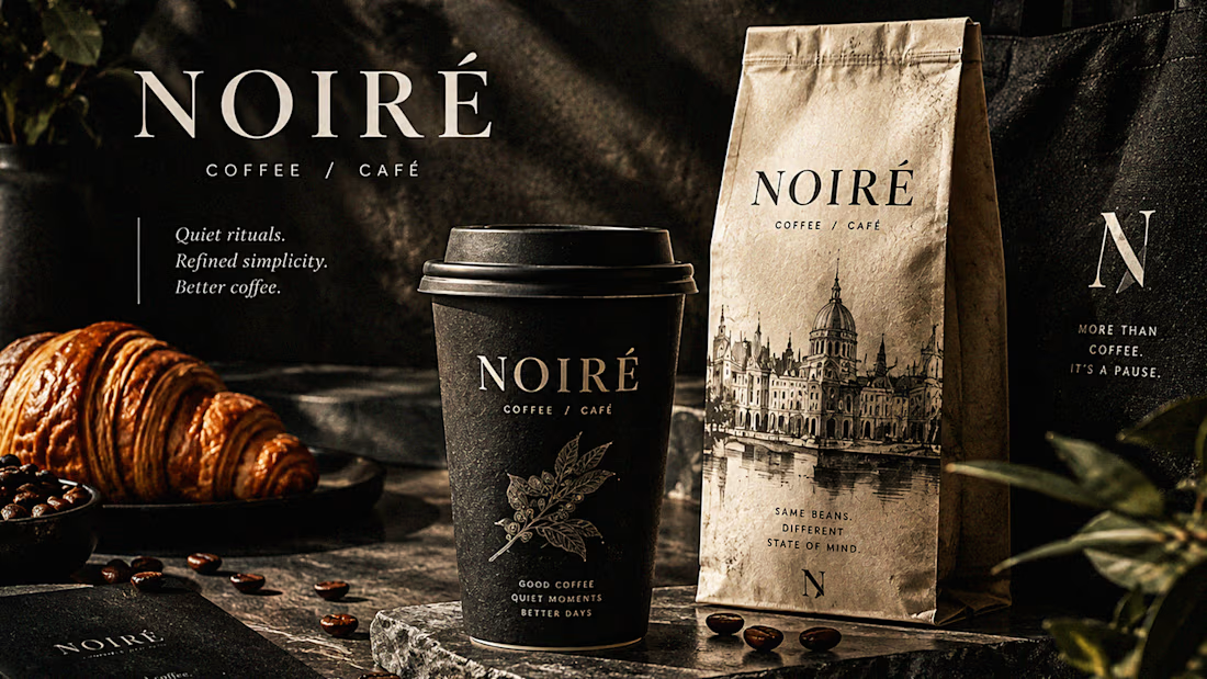
NOIRÉ is a premium café brand built around a simple idea:
Great coffee should feel like a moment of pause, not another part of the
routine.
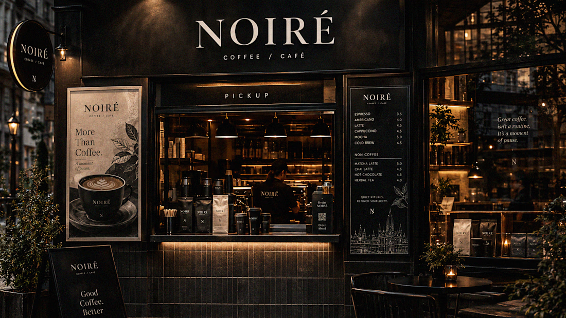
The project explores a complete visual identity, packaging
system, takeaway cups, coffee bags, tote bags, menu design, café applications and lifestyle campaign direction.
Instead of relying on the usual loud coffee aesthetics, I
built NOIRÉ around deep charcoal, warm ivory, soft graphite, refined
typography, subtle botanical illustrations and quiet editorial compositions.
The visual language is intentionally dark, tactile, and understated - giving every touchpoint the feeling of a slow morning, a quiet table, and coffee worth taking your time with.
From the cup in your hand to the café around you, every detail was designed to make the brand feel like a ritual.
Waiting for your thoughts in the comments 🙌🔥
branddesignertastetestBrand DesignGraphic DesignPackaging DesignAdobe IllustratorAdobe InDesignAdobe Photoshop




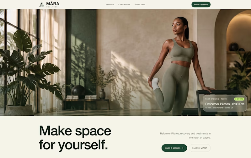
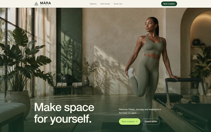
exploring some visual directions, which of this hero design looks better?
4 voted
40%
6 voted
60%
10 votes
Closed

Option 1 looks cleaner and more balanced. The layout feels more spacious and premium. ✨

When people try a demo of your product, they should be able to tell right away what belongs to the service and what is only there to help them demo it.
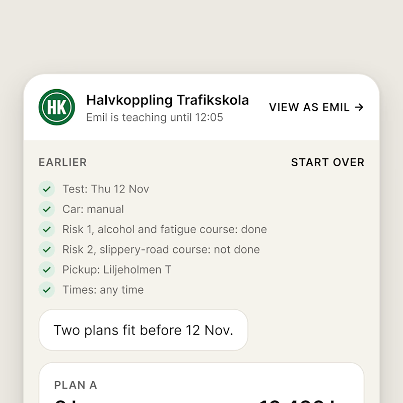
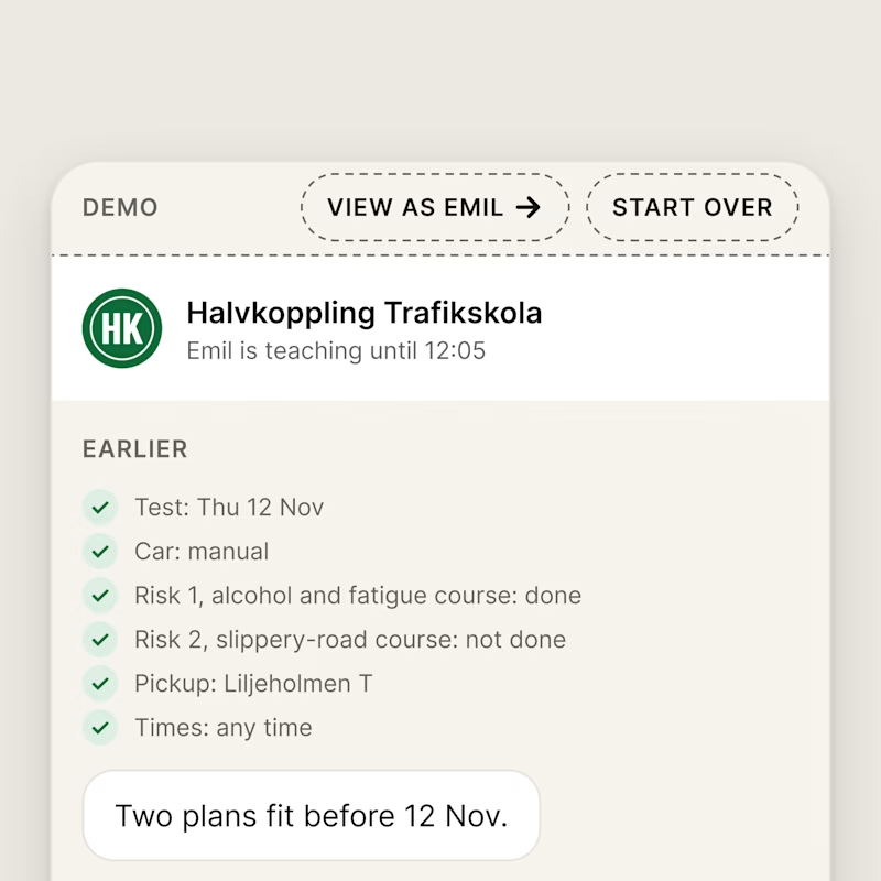
In my booking chat for a driving school, I noticed the tester links were a little confusing: VIEW AS EMIL sat in the chat header and START OVER next to the learner's answers, as if they were part of the service.
A is how it looked before. B is the change I made: I moved the demo controls into a DEMO bar on top, in their own dashed style.
Which screen is clearer?
0 voted
0%
5 voted
100%
5 votes
Closed

Demo bar for sure.