The network for creativity
Join 1.25M professional creatives like you
Connect with clients, get discovered, and run your business 100% commission-free
Creatives on Contra have earned over $150M and we are just getting started
Back to feedPost
Taste Test
When people try a demo of your product, they should be able to tell right away what belongs to the service and what is only there to help them demo it.
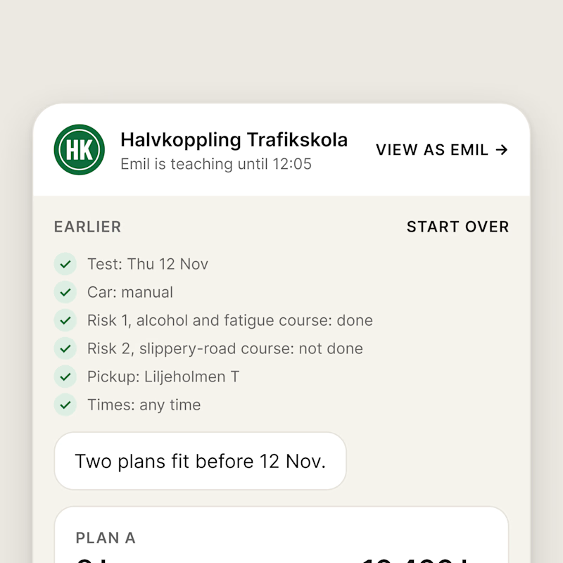
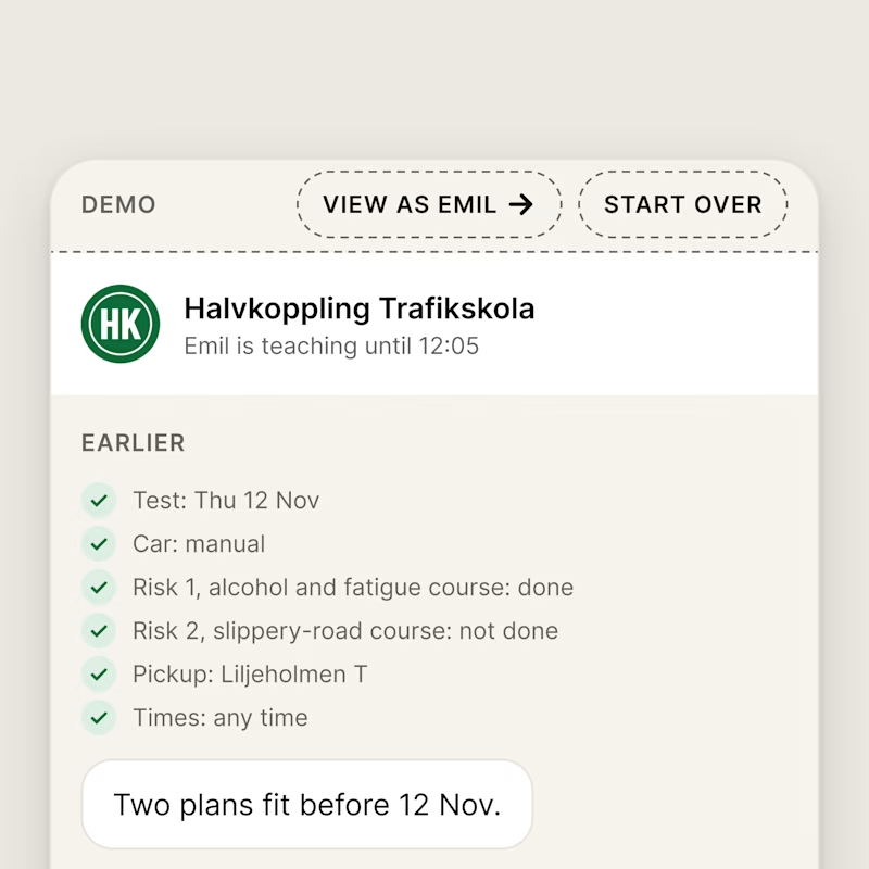
In my booking chat for a driving school, I noticed the tester links were a little confusing: VIEW AS EMIL sat in the chat header and START OVER next to the learner's answers, as if they were part of the service.
A is how it looked before. B is the change I made: I moved the demo controls into a DEMO bar on top, in their own dashed style.
Which screen is clearer?
0 voted
0%
5 voted
100%
5 votes
Closed

B, the demo bar. Making it obvious what is the real service versus what is only there to help them try it removes that split-second of confusion, and in a demo confusion is what kills conversion. A little persistent context bar is a clean fix. Good catch on the tester links.

thanks Aditya! yeah, the old links looked way too much like part of the chat. glad the bar makes it clearer

Demo bar for sure.
haha yeah, the before was pretty confusing
The network for creativity
Join 1.25M professional creatives like you
Connect with clients, get discovered, and run your business 100% commission-free
Creatives on Contra have earned over $150M and we are just getting started











Related posts


Your Hero Section Has One Job: Be Clear.
You don’t need huge headlines or long explanations. You need the right image + short headline + clear offer.
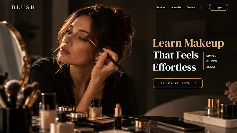
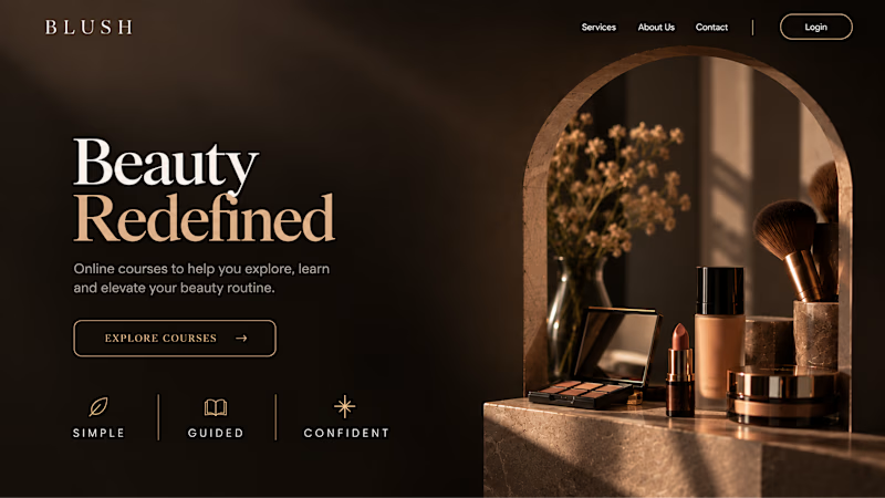
For the first version, we worked on the branding, the image and the copy together, so at first glance it’s clear: this is a makeup course, and here’s what you’ll get.
The second version is still beautiful and still feels like beauty. But what are you actually getting? A makeup course? Products? A store? That’s the problem with a Hero that looks good but isn’t thought through.
Your first screen doesn’t need to say everything. It just needs to say the right thing.

22 voted
61%
14 voted
39%
36 votes
Closed


AI can build the UI in minutes.
Bringing it up to a good standard, still needs a designer. Agree or disagree?

I see some of your work and honestly your work is really premium 🎉🎉
Great job Alex🎉🎉🔥🔥

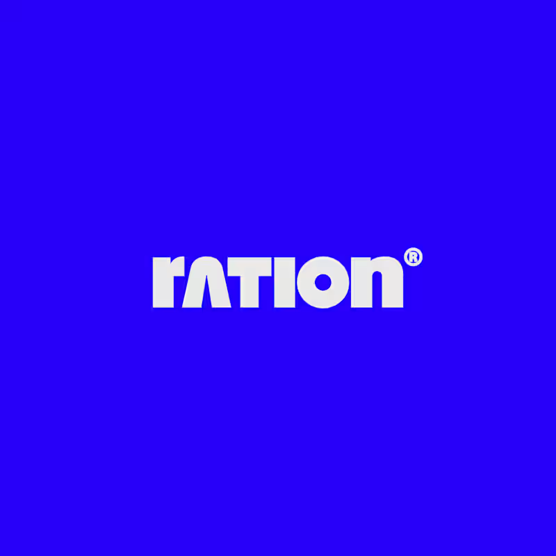
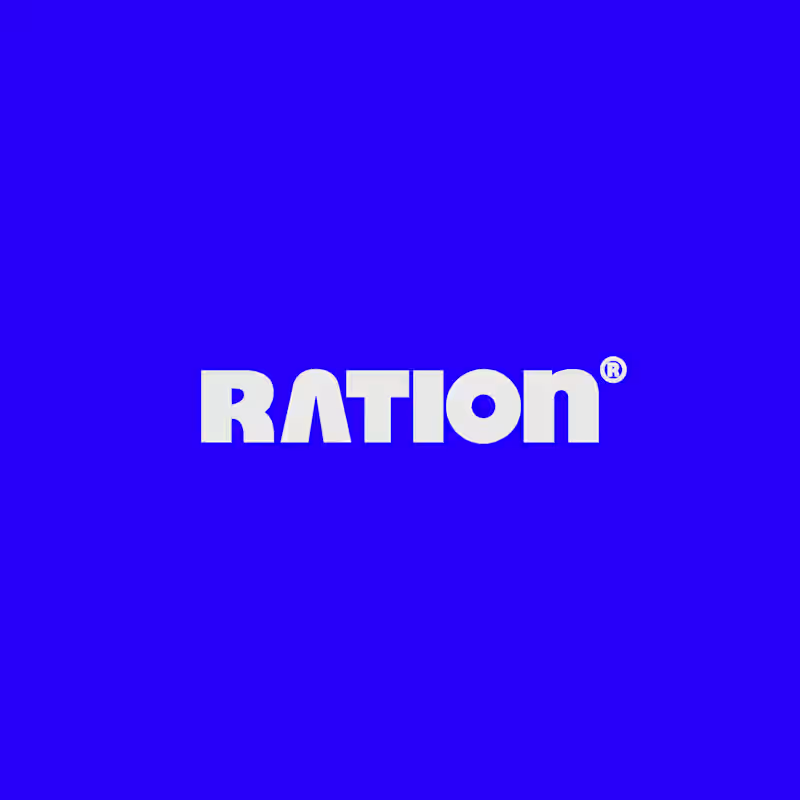
I’ve been working on a bold, modern-retro logotype and can’t decide between these two options.
🆘 Which one feels more aesthetically pleasing to you?

11 voted
26%
31 voted
74%
42 votes
Closed
CAPITAL is great but SMALL is unique great job Nawras 🔥🔥