The network for creativity
Join 1.25M professional creatives like you
Connect with clients, get discovered, and run your business 100% commission-free
Creatives on Contra have earned over $150M and we are just getting started
Back to feedPost

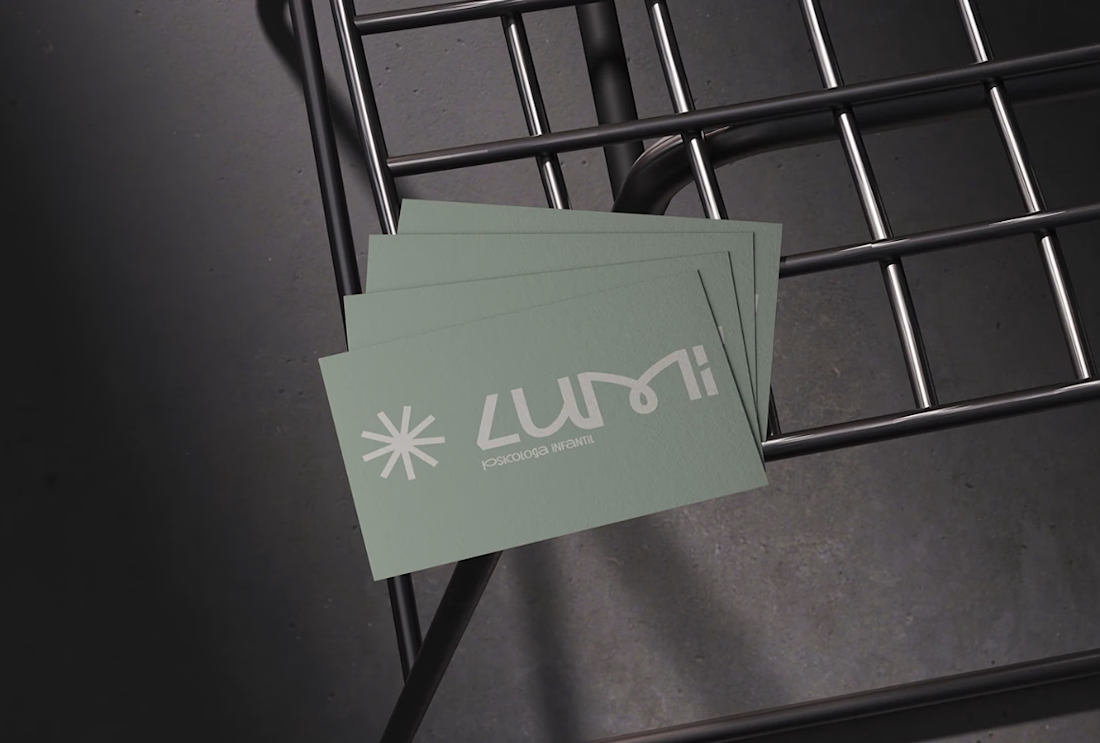
Lumi originates from the word lumen, meaning light.
The name represents emotional clarity, care, and guidance throughout child development.
In psychology, light symbolizes understanding, awareness, and attentive support.
Lumi reflects a sensitive yet professional approach, where each child is seen as unique, within a safe, calm, and human-centered environment inspired by contemporary European practices.

The network for creativity
Join 1.25M professional creatives like you
Connect with clients, get discovered, and run your business 100% commission-free
Creatives on Contra have earned over $150M and we are just getting started



Related posts

⁕ Full Brand Identity for Trace™
One of the project's greatest challenges was creating an identity that is instantly recognizable and inspires investor confidence, while balancing a futuristic aesthetic with the sense of reliability intrinsic to the brand's values.
The core concept draws inspiration from the cosmos and the brand's drive to transcend boundaries; no matter the distance, the delivery is guaranteed. We translated this visually through patterns forming paths that lead to a destination, a motif that extends to every corner of the visual language.


"The Trace" is one of your best branding works. fantastic execution man


Tash rendered in a custom holographic alphabet, built from patterned letterforms in Figma.

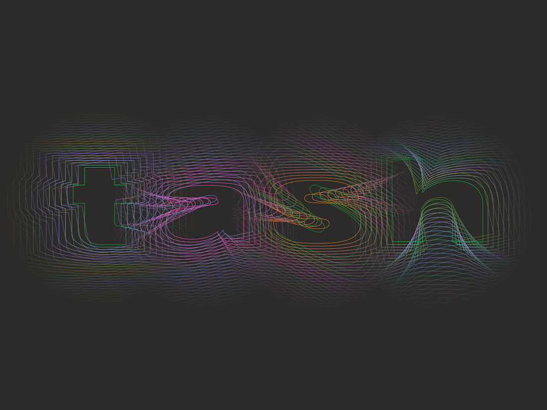

The holographic effect makes it really stand out.


cohestra’s journal in light and dark. which would you keep?

26 voted
41%
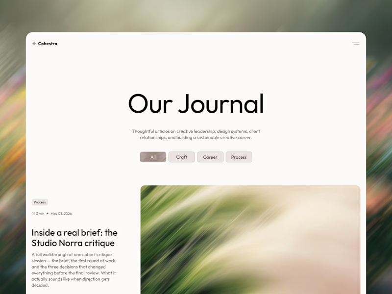
37 voted
59%
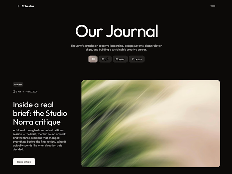
63 votes
Closed


light: more clear for me 🎉