The network for creativity
Join 1.25M professional creatives like you
Connect with clients, get discovered, and run your business 100% commission-free
Creatives on Contra have earned over $150M and we are just getting started
Back to feedPost
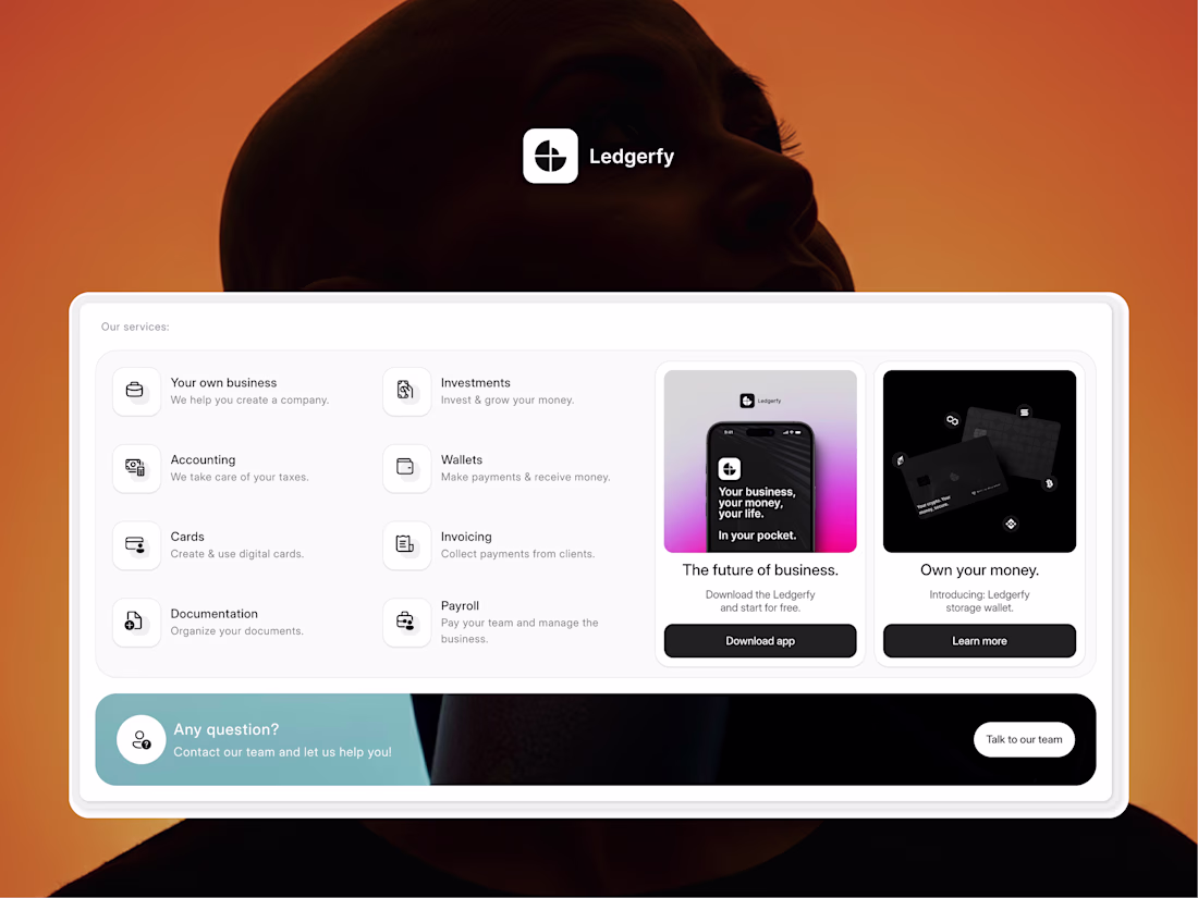
The final aesthetic on this one is satisfying
What do you think?
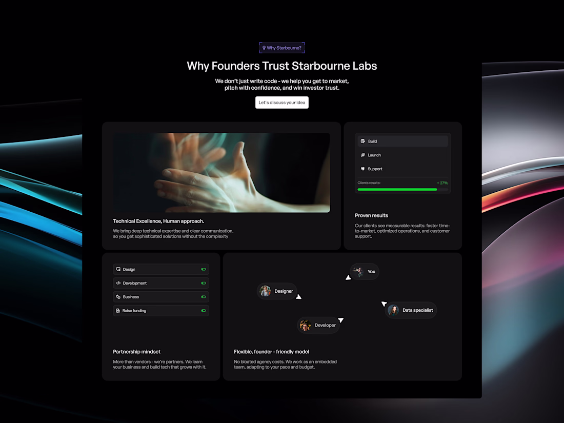
Looks very neat
Totally! 👍
Nice work
The dark palette with those gradient accents hits just right. Clean and polished!
Hierarchy, white space, everything seems in tandem
I like this 😍
Looks beautiful and minimal
image used is very optimum
Oh that's a very subtle color change I see there 🐐
I like it, the typography is really nice
The network for creativity
Join 1.25M professional creatives like you
Connect with clients, get discovered, and run your business 100% commission-free
Creatives on Contra have earned over $150M and we are just getting started
Related posts
Same here, man.
Sometimes I find this hover delay interaction a bit too lovely. See how it fades from orange to dark grey, slowly creating such a smooth color shift ✨
Make sense
That's ironic, I deleted all my work last night to do this and re-optimize.
Trending
Claude
Claude has entered the design space. How are you using Claude Design?
Contra University
Learn from expert creatives how to earn more using next-gen AI tools.
MagicPath
The canvas is infinite, and exploration is becoming the workflow. How are you using MagicPath?
creativeaiflow
Creative AI workflows are evolving. What tools do you use, and what are their strengths and weaknesses?
freelancerlife
Freelancer life is wins, pivots, and everything in between. What’s yours right now?