The network for creativity
Join 1.25M professional creatives like you
Connect with clients, get discovered, and run your business 100% commission-free
Creatives on Contra have earned over $150M and we are just getting started
Back to feedPost

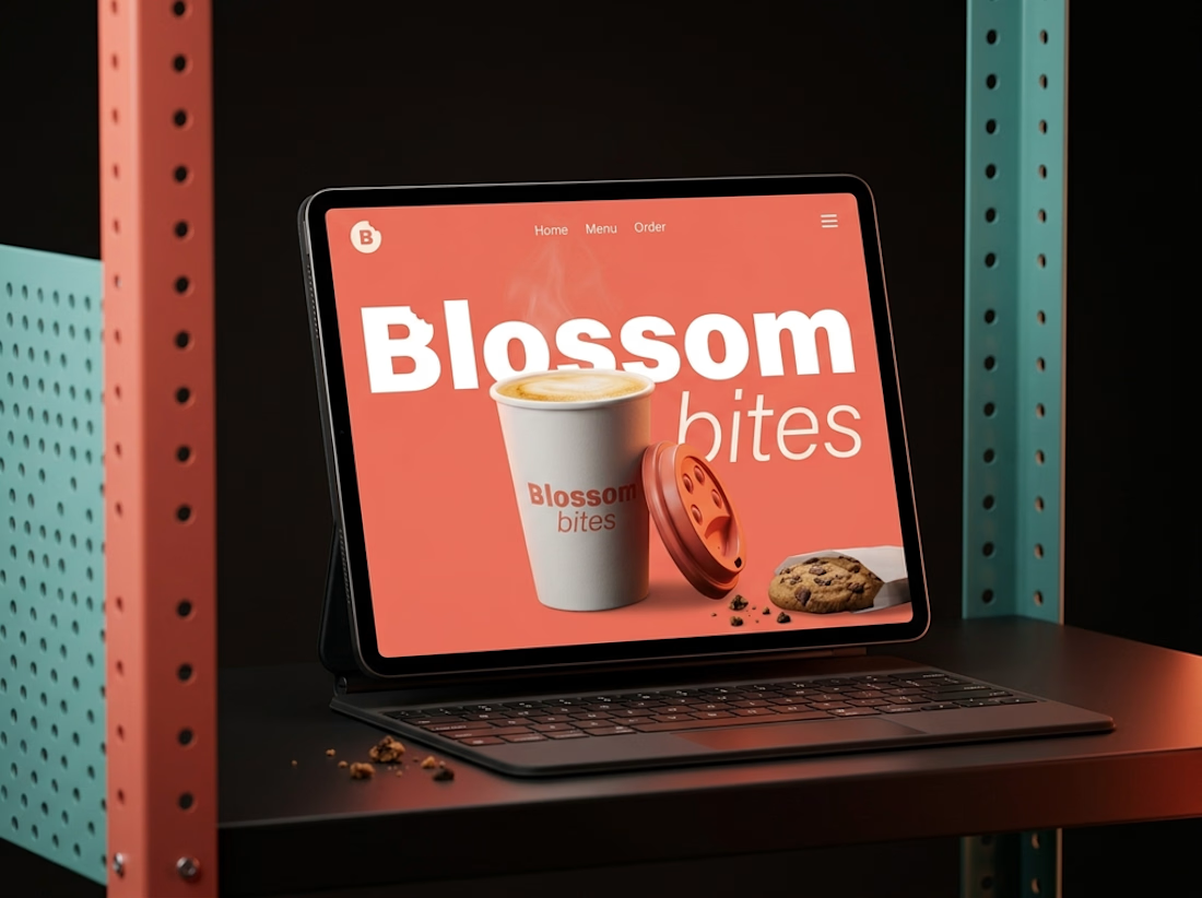
Some brands don’t need to shout to be memorable.
Blossom Bite started as an exploration of what a coffee-and-cookie brand could feel like if the identity focused less on “cute café” aesthetics and more on comfort, clarity and everyday ritual.
Warm color. Simple typography. Packaging designed to feel familiar without feeling generic.
A small identity system built around the feeling of taking a breather.
Explore the full case study ↗

It's really loud great job 🎉🎉

The coral and teal against the dark shelf make the Blossom Bites mockup pop.
The network for creativity
Join 1.25M professional creatives like you
Connect with clients, get discovered, and run your business 100% commission-free
Creatives on Contra have earned over $150M and we are just getting started





Related posts

Winder is a bold brand identity built around a geometric W-inspired symbol, combining sharp angles and forward movement to represent progress, speed, and direction.
The identity uses a striking red and deep burgundy palette, supported by clean typography and a consistent visual system across brand guidelines, digital applications, and product mockups.
Progress in Motion.



Great logo it feels it really has an identity 🎉🎉


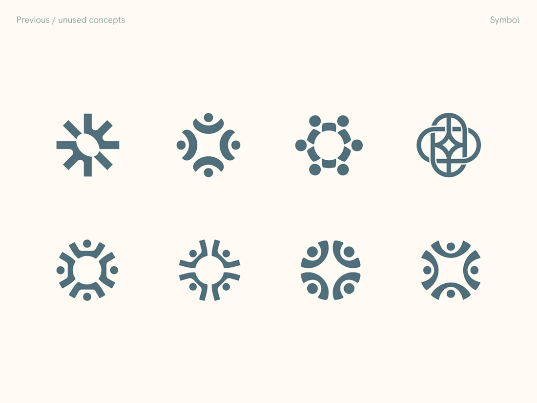
Rejected logo concepts exploring collaboration, shared expertise & working side by side


New case study: motion product film for a mobile streaming app. Some shots filmed on camera, some AI generated, the rest built in After Effects
Check it out


This is only high end