The network for creativity
Join 1.25M professional creatives like you
Connect with clients, get discovered, and run your business 100% commission-free
Creatives on Contra have earned over $150M and we are just getting started
Back to feedPost

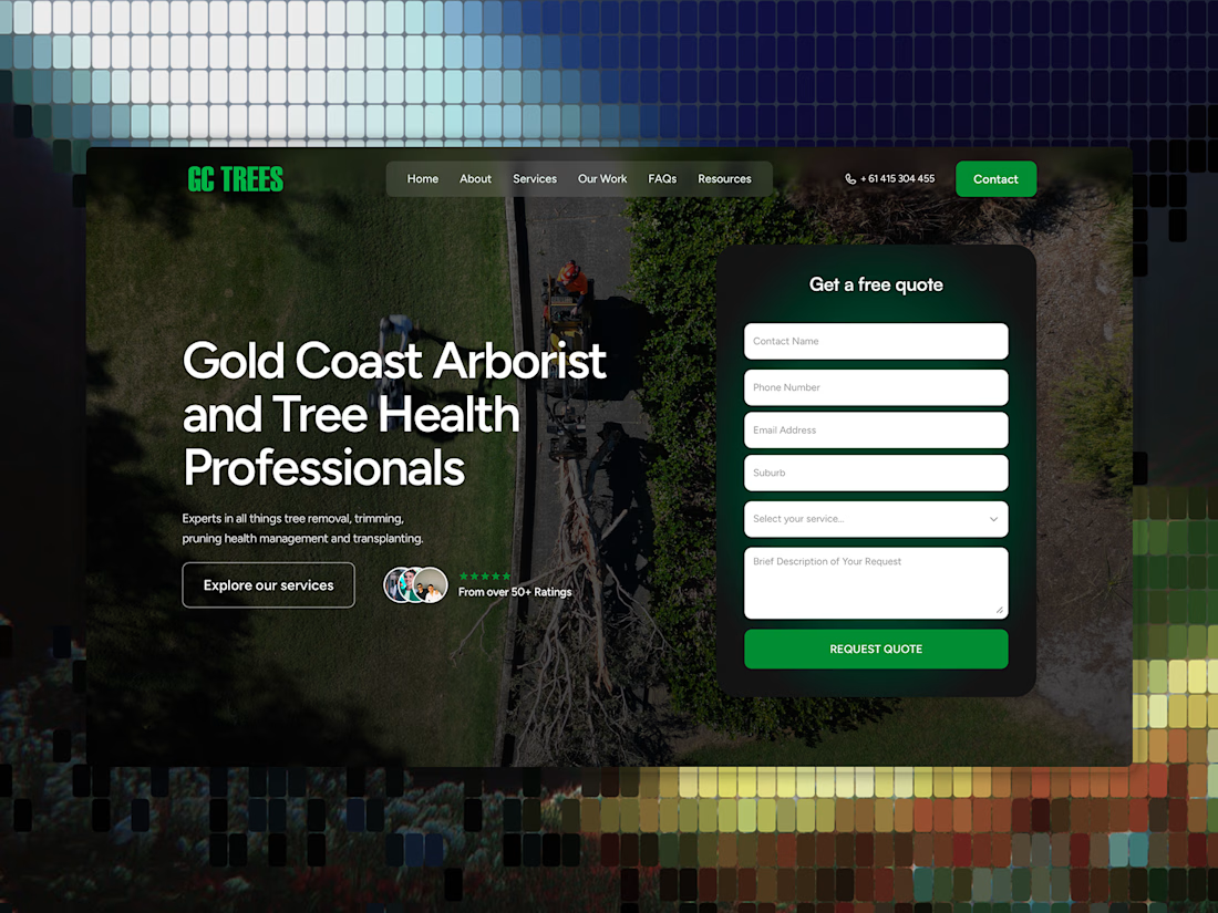
Client wanted a refresh, not a full rebuild. So we restructured it around the new logo and brand, moved the form right into the hero, built new pages and led with what actually converts.
The goal wasn't a new look. It’s making the existing site work harder.



Impresive work

form moved into the hero instead of a call cta, right call
The network for creativity
Join 1.25M professional creatives like you
Connect with clients, get discovered, and run your business 100% commission-free
Creatives on Contra have earned over $150M and we are just getting started


Related posts


The services menu from the Adara website, a residential architecture and planning practice in London.
One of our favourite details on this project. A tiny piece of a much bigger build, and it got the same attention as the hero.

The fact that you can view a visualization for each service right away is super cool. Another point to consider is what percentage of users will actually see this visualization, given that the navigation opens in a rather unpredictable way. I don’t mean this aggressively at all,...

Still obsessed with my first Framer template 👀
Editorial layouts, immersive visuals, and a little wanderlust built into every section.
Grab ElseWhere for freee!! 🌍
[Click Here]

Can AI create a professional-looking logo?
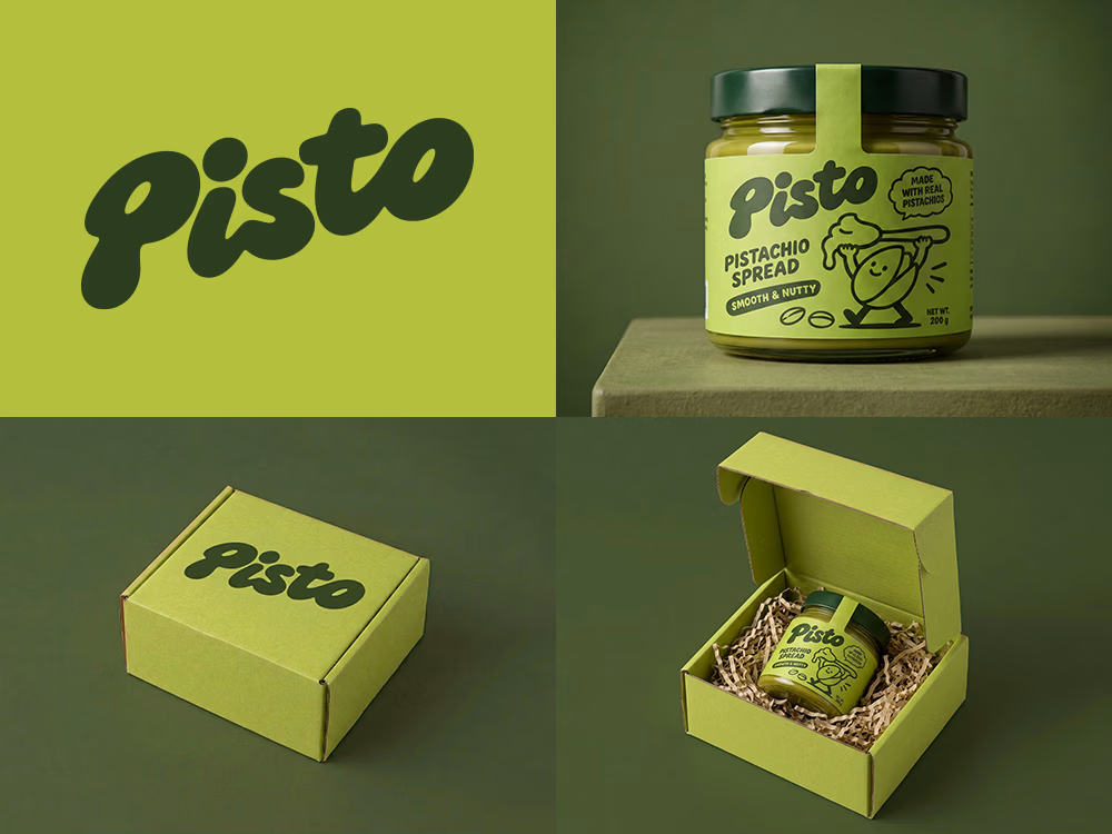
I tried to create a logo concept for a pistachio spread brand using Recraft Logo Maker.
After answering a few questions about the brand and going through several variations, I finally landed on a logo that felt right and captured the fun, fresh personality I had in mind.
But I didn't want to stop at just the logo.
I took it a step further by exploring how the identity could come to life through product packaging and a branded mailer box.
A quick process video is included in the comments.
What do you think?