The network for creativity
Join 1.25M professional creatives like you
Connect with clients, get discovered, and run your business 100% commission-free
Creatives on Contra have earned over $150M and we are just getting started
Back to feedPost

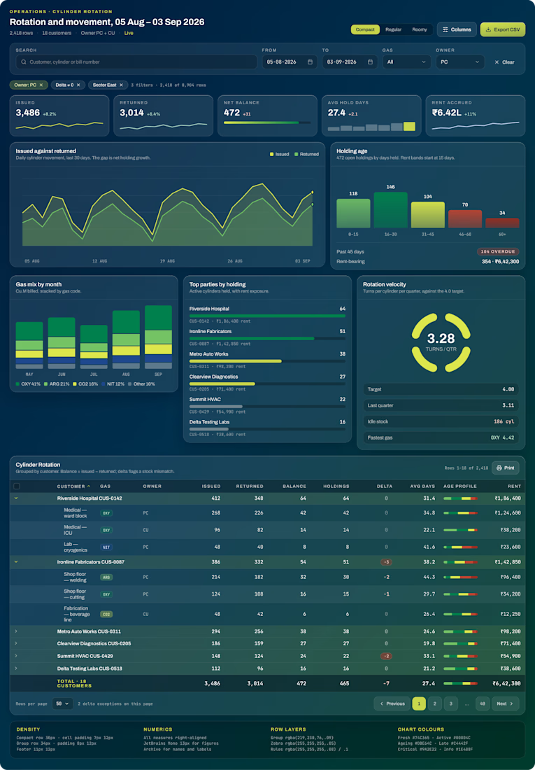
Cylinder CMS for tracking industrial gas cylinders: who's holding them, for how long, and what that costs. The people using it read dense data all day, so being clear mattered more than looking good.
The main table
Rows grouped by customer that expand to show each line item, with a totals row that stays visible as you scroll
A flag on any row that looks wrong, so problems show up without having to hunt for them
A small bar inside each row showing how long cylinders have been out
Numbers aligned so columns are easy to compare
Filters that tell you what you're seeing: "3 filters · 2,418 of 8,904 rows"
A Compact / Regular / Roomy toggle, because some people want to see more rows and others want room to breathe
Charts-
Cylinders issued vs returned, how long cylinders have been held, the gas mix, the top parties by holding, how fast cylinders come back, and overdue payments. Each chart answers one question an operator actually asks.
Admin dashboard-
A second screen with the dispatch queue, alerts, plant stock levels and quick actions.

The network for creativity
Join 1.25M professional creatives like you
Connect with clients, get discovered, and run your business 100% commission-free
Creatives on Contra have earned over $150M and we are just getting started





Related posts

New case study: the landing page for REVAI, a concept AI sales platform.
The brief I gave myself was structural, not decorative: design a page where every section earns the next one. Hero makes one claim and gets out of the way. The value proposition comes before any feature gets named — because a feature nobody understands yet is just noise. Proof (testimonial, logos) sits right before the final ask, not scattered earlier where it does nothing.
Art direction followed the same logic — high contrast where the page needs to make a claim, quieter and more editorial where it needs to build trust. The layout isn't there to look good in isolation. It's there to move someone from "what is this" to "I trust this" in one scroll.

Love the colors dude! Hell of a work🔥

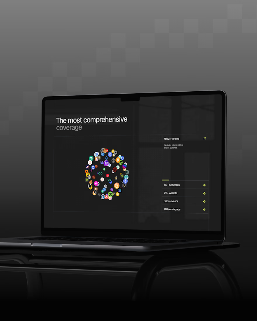
Just wrapped up a new redesign, and I’m really happy with how it turned out. 💻
Can’t wait to share more details and the live site soon...



Sitting on this before the reveal instead of rushing to post it says you're already happy with how it landed, so now I'm curious what part of the redesign you're most excited for people to see once the site goes live.

One of my earlier projects was creating an explainer video for MerchantSpring, showing how agencies can consolidate e-commerce analytics, reporting, and AI-driven insights onto a single platform.
Have a product launch coming up? Feel free to DM me.


nice pacing on this one