
Sumaiyya Mahinn
frontend dev specializing in crafting interactive sites.
Ready for work
Sumaiyya is ready for their next project!

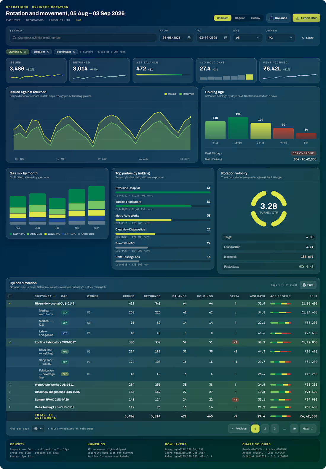
Cylinder CMS for tracking industrial gas cylinders: who's holding them, for how long, and what that costs. The people using it read dense data all day, so being clear mattered more than looking good.
The main table
Rows grouped by customer that expand to show each line item, with a totals row that stays visible as you scroll
A flag on any row that looks wrong, so problems show up without having to hunt for them
A small bar inside each row showing how long cylinders have been out
Numbers aligned so columns are easy to compare
Filters that tell you what you're seeing: "3 filters · 2,418 of 8,904 rows"
A Compact / Regular / Roomy toggle, because some people want to see more rows and others want room to breathe
Charts-
Cylinders issued vs returned, how long cylinders have been held, the gas mix, the top parties by holding, how fast cylinders come back, and overdue payments. Each chart answers one question an operator actually asks.
Admin dashboard-
A second screen with the dispatch queue, alerts, plant stock levels and quick actions.
0
9
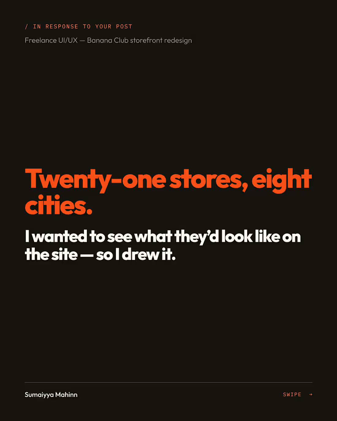
Banana Club is a Bengaluru menswear brand. They posted a freelance role for a storefront redesign. I messaged them and didn't hear back, so instead of waiting, I did the redesign.
This is a self-initiated concept-
What I made, in 3 days
- Business DNA: a strategy doc on who the brand is for, what it stands for, and where the current site loses people
- Brand guidelines deck: voice, colour, type and imagery rules
- Design tokens + UI kit: the system everything else is built from
- Component set: product cards, filters, size selectors, cart items and navigation
- 14 screens: desktop (1440) and mobile (390), covering Home (two directions, A and B), Collection, Product, Cart, Store locator and Store page
Why start with strategy
A redesign that only changes how things look is a reskin. I wanted every screen to trace back to a decision about the brand, so the strategy doc came before any UI.
What happened
I posted the work publicly instead of writing a cover letter. That post brought in an enquiry from a brand, about e-commerce UI work.
0
13
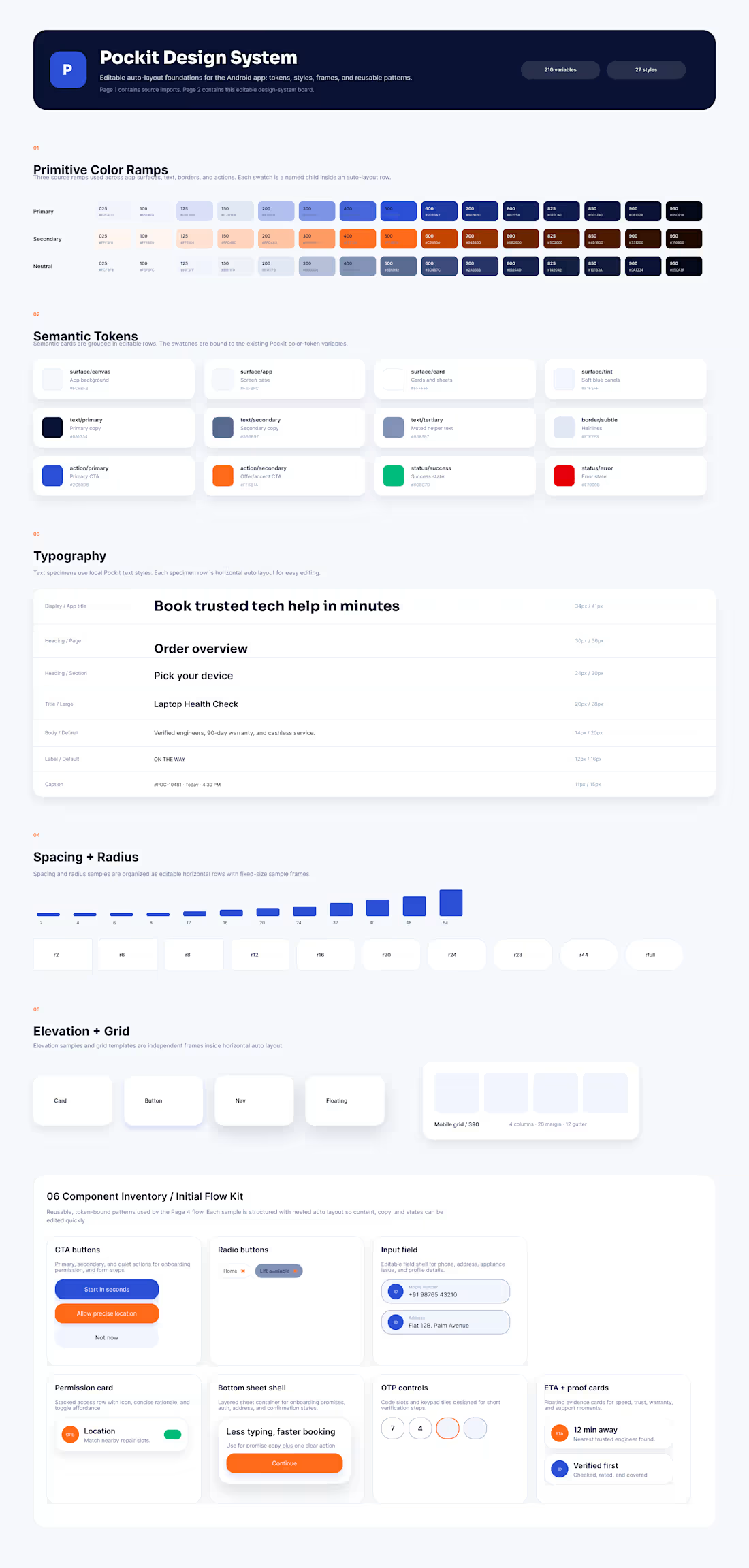
Pockit is a mobile app. They asked me to design one thing, the onboarding flow. I started with no design files at all, just the product and a brief.
What I delivered- The onboarding flow, as scoped. But while designing it, it was obvious the app had no system underneath it. Screens didn't match, and every new one would be a guess. So I built one.
Token architecture
- 200+ tokens in Figma variables, in three layers:
Primitives: the raw values (every colour, size and step)
Semantic: what each value is for, like "text-primary" or "surface-raised"
Component roles: what each part of a component uses
These are spread across six collections: colour, typography, spacing, radius, elevation and primitives. Change one value and it updates everywhere it's used.
Dark mode
Built as a proper mode from the start, not an inverted afterthought. Every semantic token has a light and a dark value.
How I work on undocumented products
I don't try to reverse-engineer everything. I work out what the slice I'm shipping needs, build that properly, and document the system as I go, so whoever comes next isn't starting where I did.
Status: engagement completed.
0
11
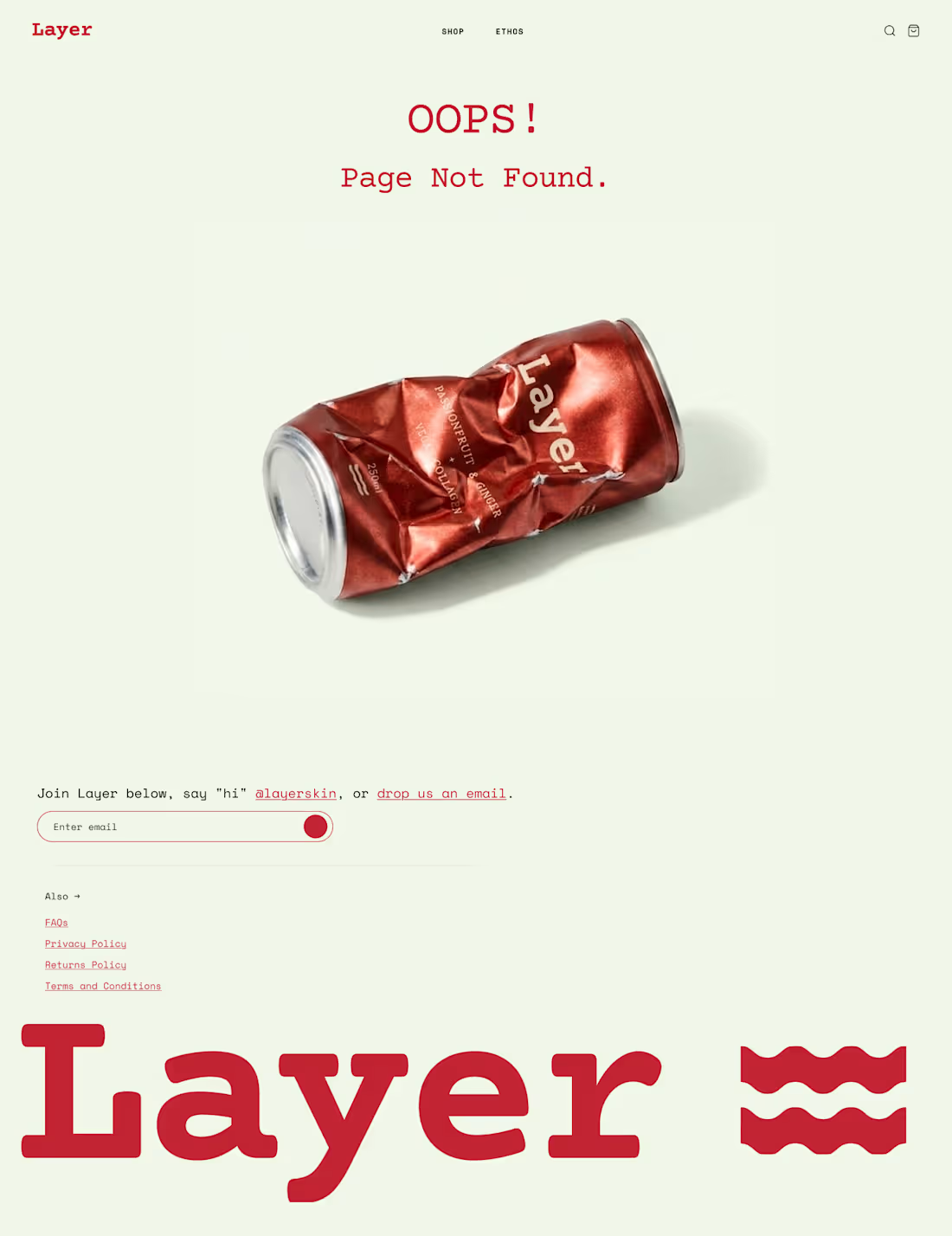
Layer is a collagen-drink brand getting ready to launch. I designed the storefront and built it myself on Shopify.
Homepage- A custom Shopify section on top of Dawn, re-skinned to Layer's brand: cream, ink and red, a mono typeface, and custom icons. Every block (hero, flavours, benefits) is editable in the Shopify editor, so the team can change the page without asking a developer.
Ethos section: the part I'm proudest of
The founders' story is set on a canvas, and the Layer can is your cursor. Move it, and the text re-wraps around the can every frame, in two columns, like a magazine layout that reacts to you.
There's no library behind it. I wrote the layout engine by hand. It measures every word and works out, line by line, how much room is left on either side of the can. Basically CSS shape-outside, but around something that moves.
Accessibility- Canvas text is usually invisible to screen readers and search engines. Here, the real copy lives in the page and the canvas just draws it. On phones, the canvas switches off and you get normal, selectable text.
Merchant controls- Can size, spacing around the can, font size, colours and images are all editable in Shopify.
Also explored
A scroll-driven GSAP timeline telling the two founders' stories side by side. It stayed a prototype and isn't in the final build.
Status: built and deployed, pre-launch.
0
6