The network for creativity
Join 1.25M professional creatives like you
Connect with clients, get discovered, and run your business 100% commission-free
Creatives on Contra have earned over $150M and we are just getting started
Back to feedPost
Integra RIPS – Logo Design for Healthcare Administration / Brand Identity.
Concept:
The mark combines data visualization and process validation. The lowercase "e" of "Integra" is built as a data node, representing the raw, unstructured information entering the system. A second node, placed subtly above the "I" of the acronym RIPS, symbolizes the verification and quality control stage. Finally, a check mark located between the "P" and "S" of "RIPS" acts as the certification seal —order achieved, report approved.
Typography:
The chosen typeface is a clean, geometric sans-serif with balanced x-height, conveying modernity, clarity, and trust. Its pure, unornamented shapes reinforce the message of simplicity and reliability.
Design approach:
Minimalist. Conceptual. Functional. Every element has a purpose, no decoration. The logo aims to transform the perception of a bureaucratic, tedious process into a calm, trustworthy, and efficient experience.
Role: Logo design, brand identity, visual concept.

The network for creativity
Join 1.25M professional creatives like you
Connect with clients, get discovered, and run your business 100% commission-free
Creatives on Contra have earned over $150M and we are just getting started
Related posts
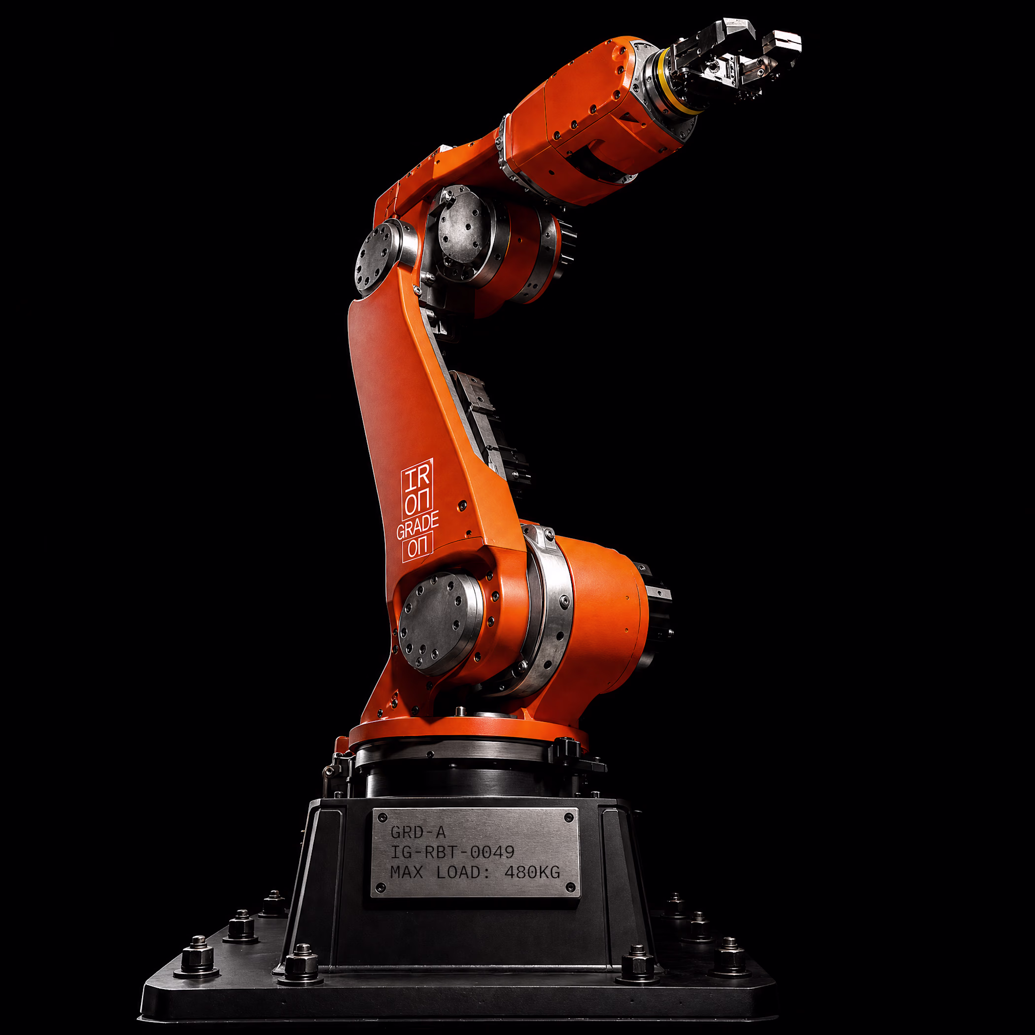
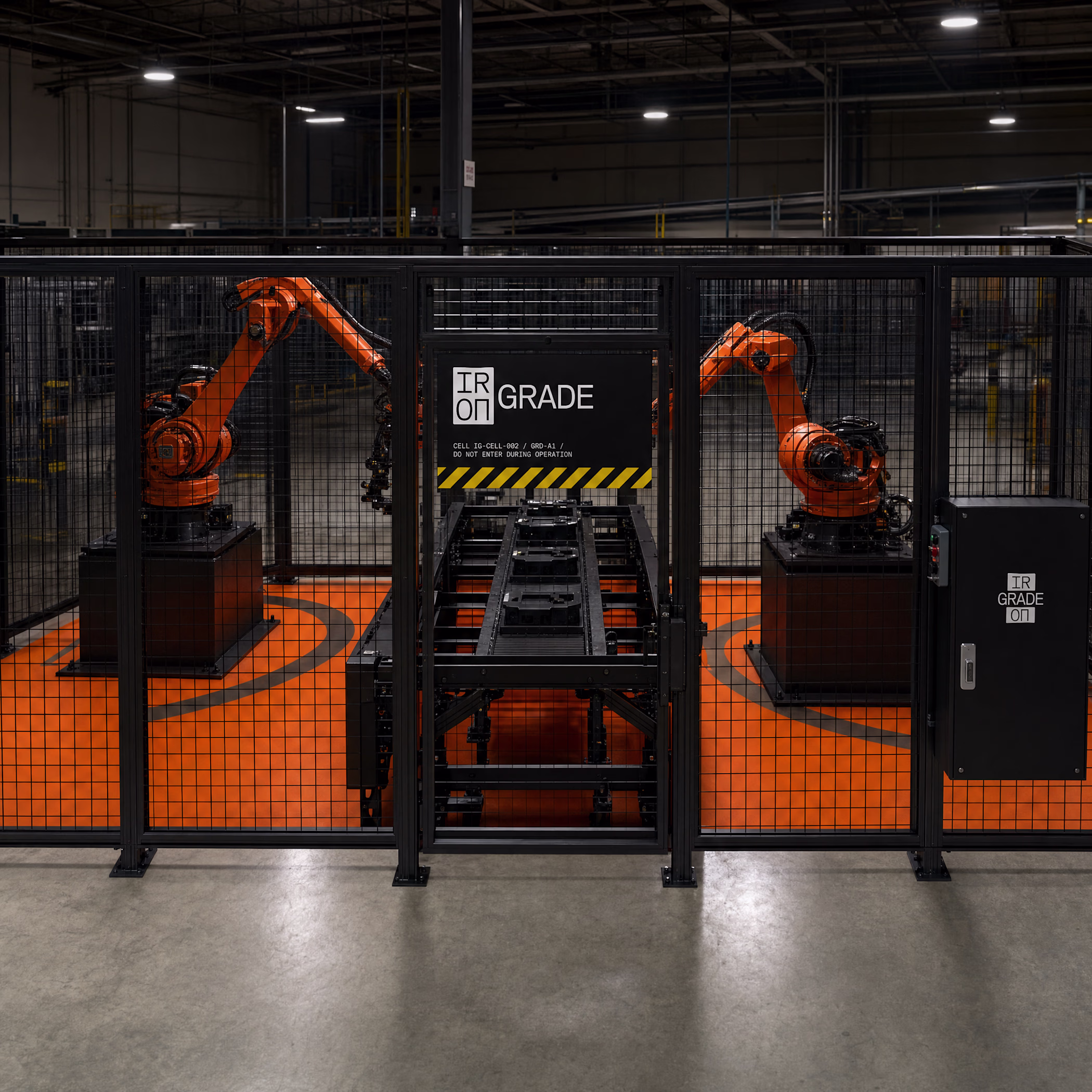
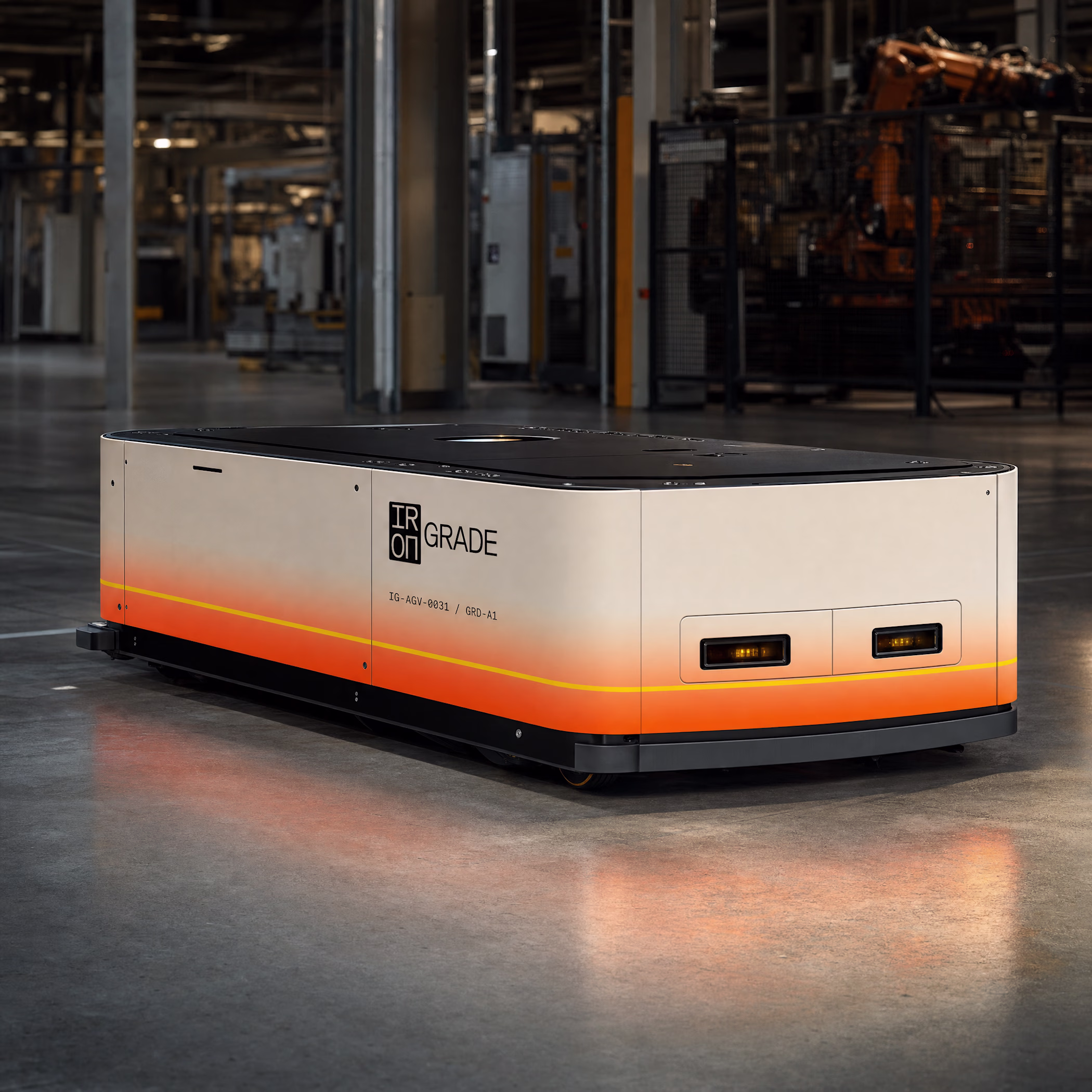
built a full brand identity for a robotics company that doesn't exist.
no client. no brief. just a hypothesis:
industrial hardware companies make some of the most visually powerful objects on earth — and then bury them under corporate blue and generic sans-serifs.
so I built IRONGRADE from scratch.
name. logo. color system. typography. 20 physical mockups. full landing page spec.
the rule: beauty is a byproduct of engineering, never the goal.
but this is amazing bro next level🔥
Created a professional advertising video using Canva, focused on visually engaging storytelling and clear brand messaging. The video was designed to promote products/services in a modern and attractive way, using smooth transitions, strong visuals, and effective text animation to capture audience attention and increase engagement.
Thats a banger presentation, awesome work! 🔥
Challenges
View allTrending
Claude
Claude has entered the design space. How are you using Claude Design?
Contra University
Learn from expert creatives how to earn more using next-gen AI tools.
MagicPath
The canvas is infinite, and exploration is becoming the workflow. How are you using MagicPath?
creativeaiflow
Creative AI workflows are evolving. What tools do you use, and what are their strengths and weaknesses?
freelancerlife
Freelancer life is wins, pivots, and everything in between. What’s yours right now?