The network for creativity
Join 1.25M professional creatives like you
Connect with clients, get discovered, and run your business 100% commission-free
Creatives on Contra have earned over $150M and we are just getting started
Back to feedPost
Taste Test

Which version feels more premium for a scented candle brand? 🕯️
Help me choose! 🕯️
Designing for MUTED - a premium scented candle.
A - Dark & Bold
B - Light & Clean
Vote below 👇
4 voted
67%

2 voted
33%

6 votes
Closed

The serif MUTED with the flame sitting in the counter already feels quiet and expensive. The rounded wordmark is friendlier, but it reads closer to a soap brand than a scent. I'd keep the serif if premium is the goal.


muted is such a good name for a candle

Light & Clean for me. The simpler wordmark feels calmer and suits the name MUTED really well.
The network for creativity
Join 1.25M professional creatives like you
Connect with clients, get discovered, and run your business 100% commission-free
Creatives on Contra have earned over $150M and we are just getting started

Challenges
View all


Related posts


Same content. Two completely different vibes.
What happens when you keep the course content the same, but change the structure, typography, and color palette?
Two hero sections. One course. Two different visual experiences.
Which one would you choose? 1 or 2?
29 voted
41%
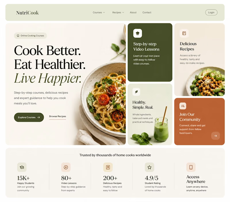
42 voted
59%
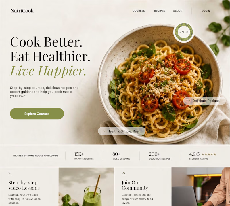
71 votes
Closed

Option 1 works well , the heirarchy and card layout on the hero is very smart


New Case 🙈
This time it’s BUDOVA — a next-gen real estate platform we designed from the product UX to the full brand identity and visual system.
Would love to hear what the Contra community thinks — what stands out to you most in this direction: Product Demo or Product Overview?


16 voted
41%
23 voted
59%
39 votes
Closed

PRO Design 😍

Which color direction feels stronger for CELVIA, a modern skincare brand blending biotechnology with nature - Bio Lime or Soft Violet?
8 voted
42%
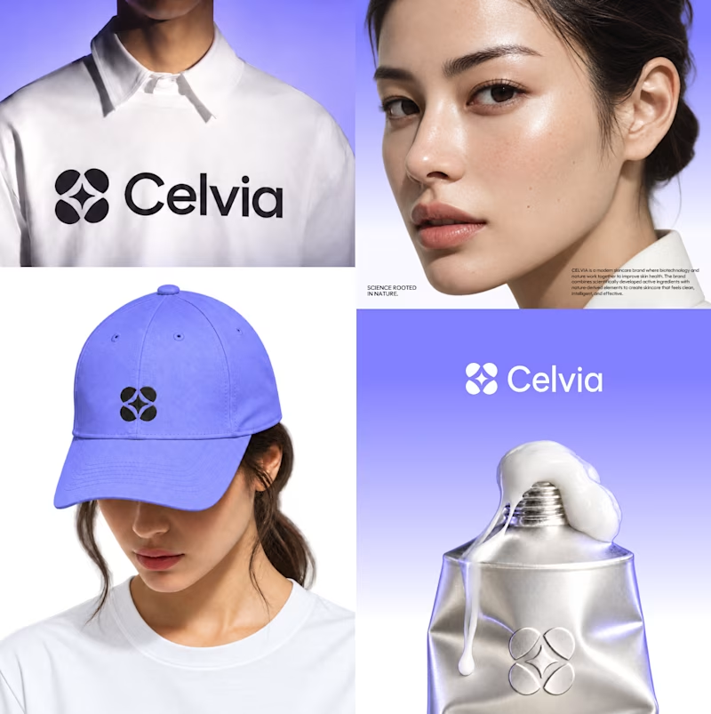
11 voted
58%
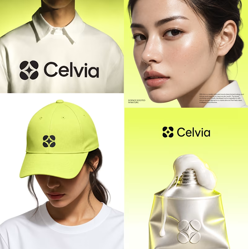
19 votes
Closed
Bio lime 🤩