The network for creativity
Join 1.25M professional creatives like you
Connect with clients, get discovered, and run your business 100% commission-free
Creatives on Contra have earned over $150M and we are just getting started
Back to feedPost
Taste Test

Two logo concepts for Stop. Coffee House, a premium café brand. Which one would you order a coffee under? 👇
5 voted
38%
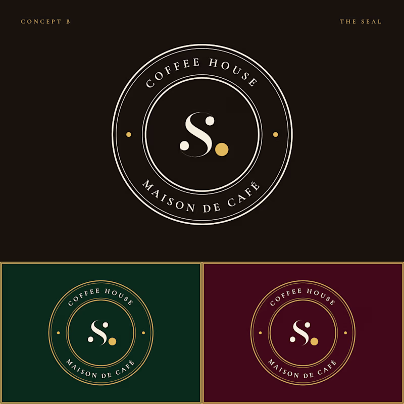
8 voted
62%
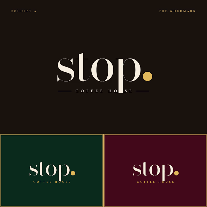
13 votes
Closed

Fantastic Job 🔥

Amazing job!🔥

Editorial wordmark is premium it's great nice job Farida 🎉🎉🔥🔥


I’d go with the Editorial Wordmark. It feels more refined and premium, which suits a high-end coffee brand.

The editorial wordmark reads more like a proper specialty-roaster mark — tight tracking and a quiet confidence that suits a coffee brand better than the heavier seal. If I were picking for shop signage plus a cup label, I'd lean to the wordmark and tighten the period kerning around the dot just a hair.

Gorgeous 😍

Beauty
The network for creativity
Join 1.25M professional creatives like you
Connect with clients, get discovered, and run your business 100% commission-free
Creatives on Contra have earned over $150M and we are just getting started







Related posts

Created the complete brand identity for Nerada, a natural tea brand — developing the visual direction and design elements that shape how the brand looks and feels across every touchpoint. The goal was a clean, organic aesthetic that reflects the brand's natural positioning and builds a consistent, recognizable identity.


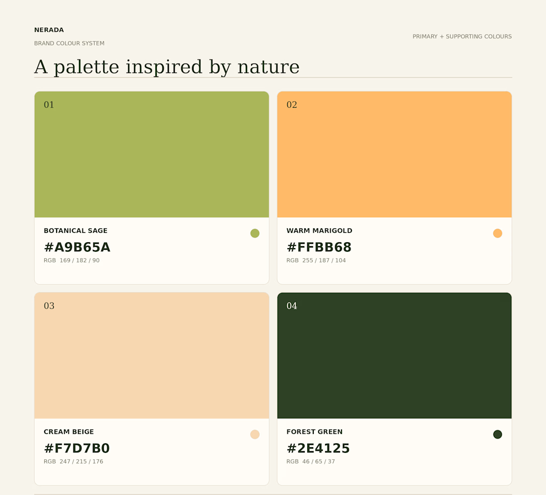
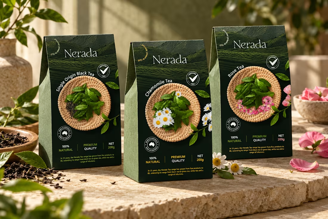
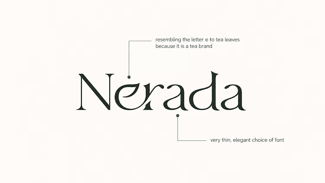
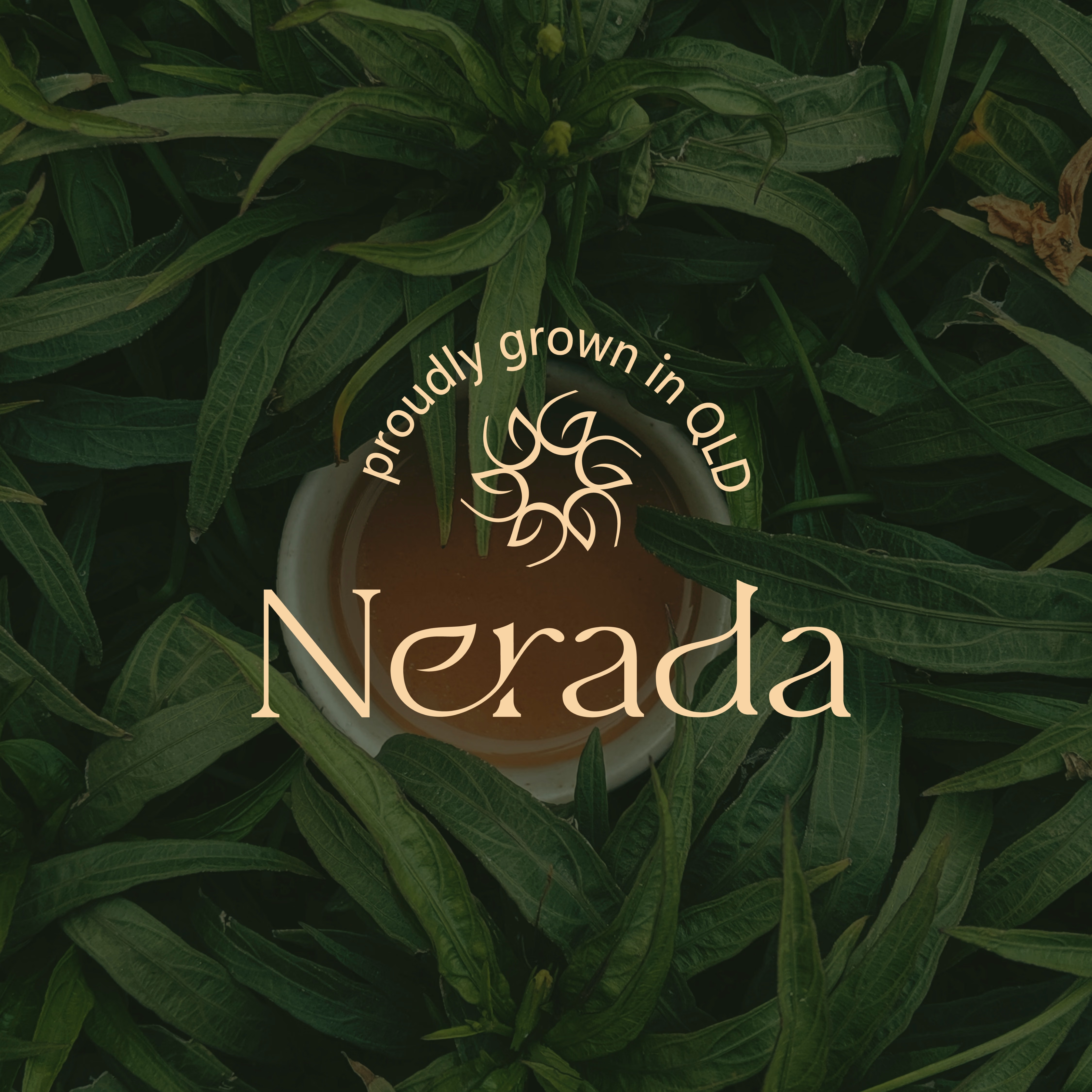

The mark feels grown rather than drawn, which is exactly right for a natural tea brand. Packaging is where tea brands win or lose. Does the identity change tone across blends, or stay one voice with different colours?

One brand, three different directions.
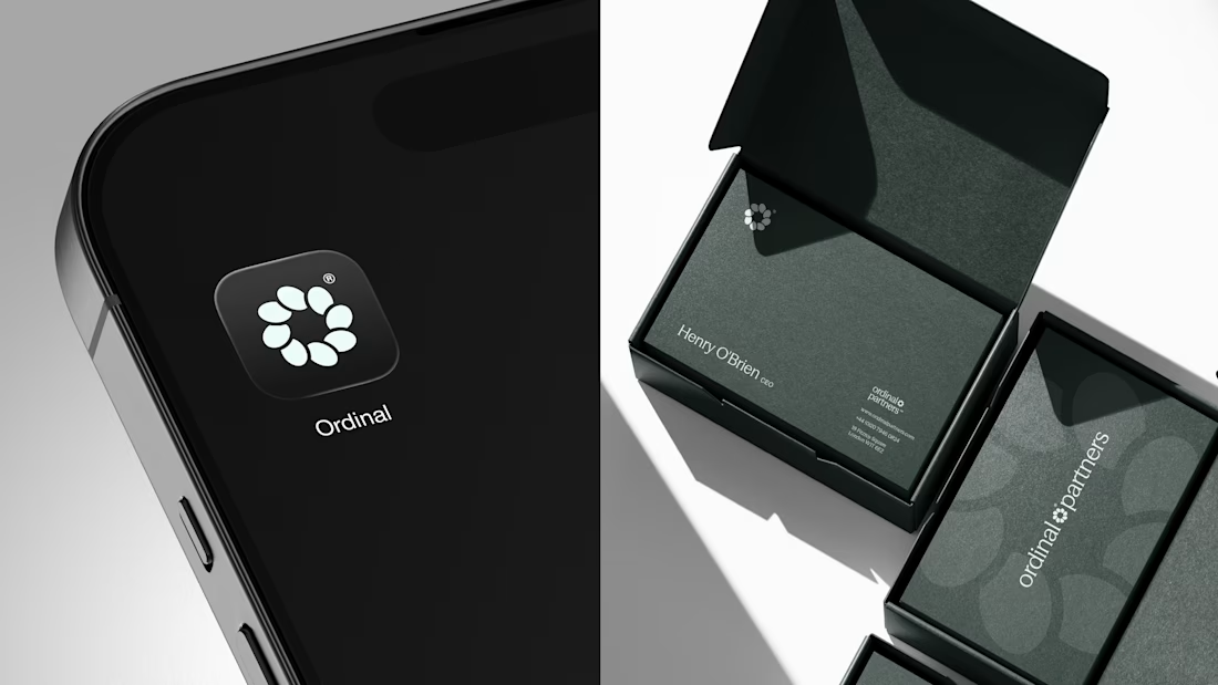
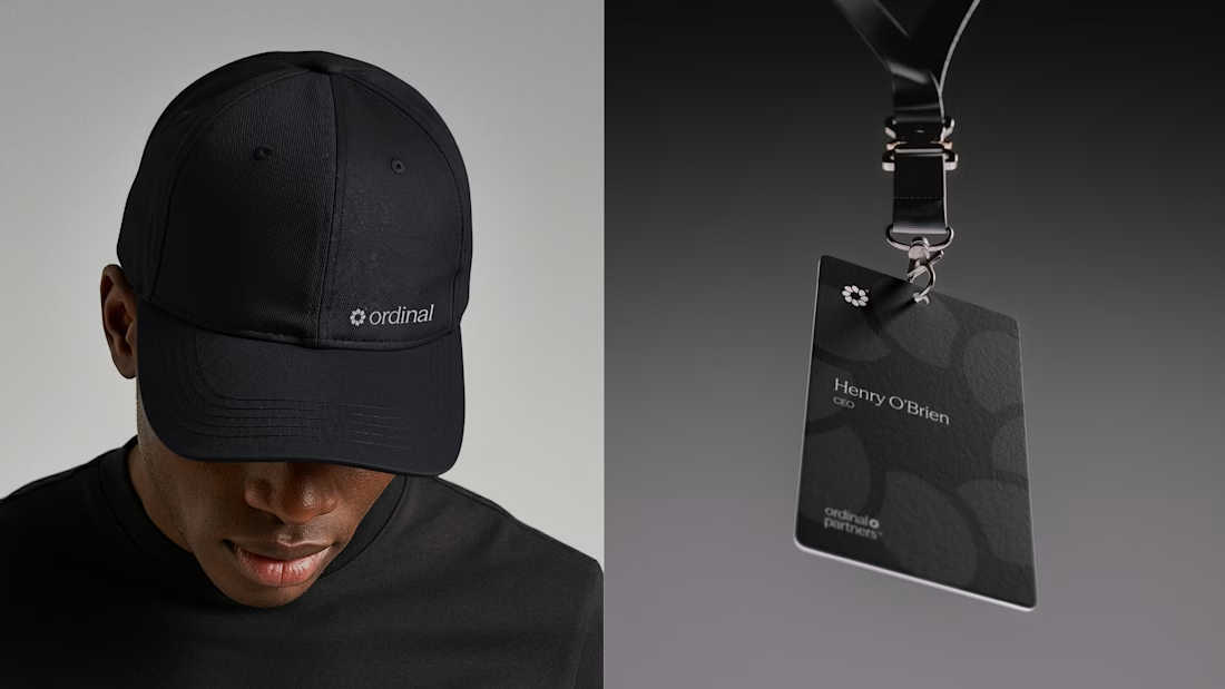
Sharing some of the logo exploration for Ordinal Partners.
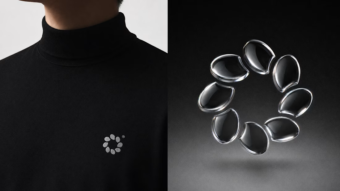
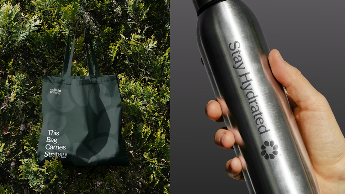

Visually appealing 🔥

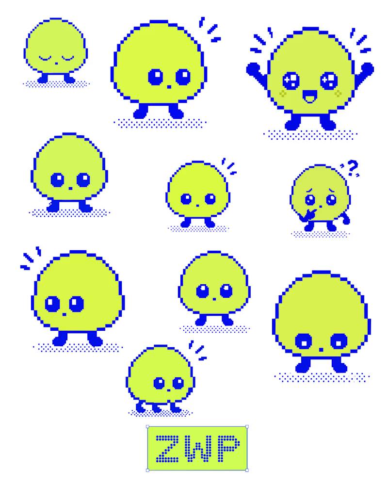
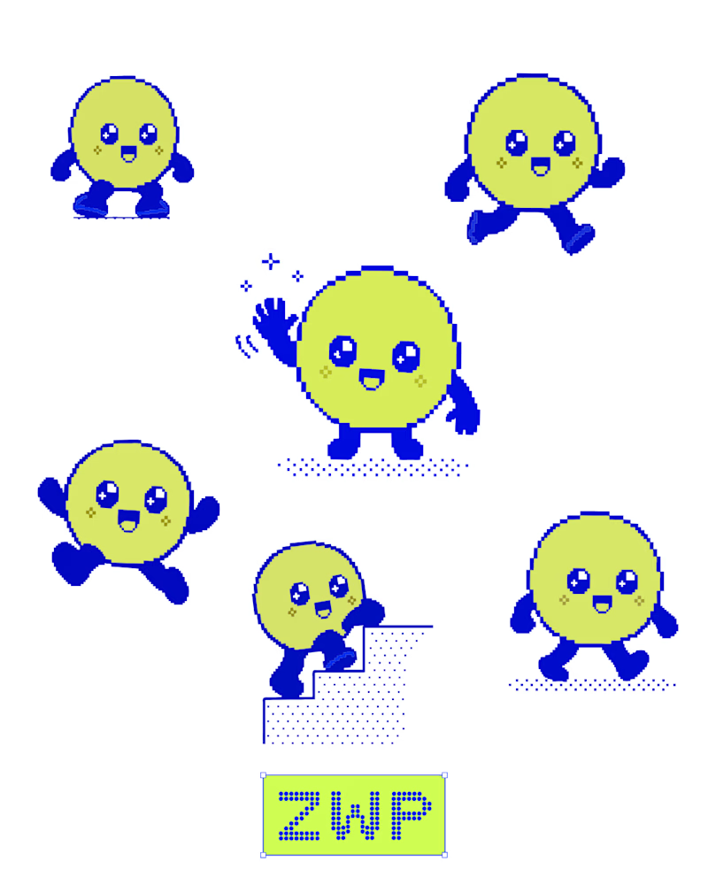
Been experimenting with pixel art and character design in Figma.
I explored different expressions, poses, and small details to give Zippy its own personality. Keeping the blue and neon-lime palette consistent helped bring the character set together.
Still experimenting, still refining. ⚡
What’s your favourite expression?
5 voted
42%
7 voted
58%
12 votes
Closed
Great character movement is better it feels alive ❤️