The network for creativity
Join 1.25M professional creatives like you
Connect with clients, get discovered, and run your business 100% commission-free
Creatives on Contra have earned over $150M and we are just getting started
Back to feedPost

Day 14 of building Flow — my UI/UX design project 🚀
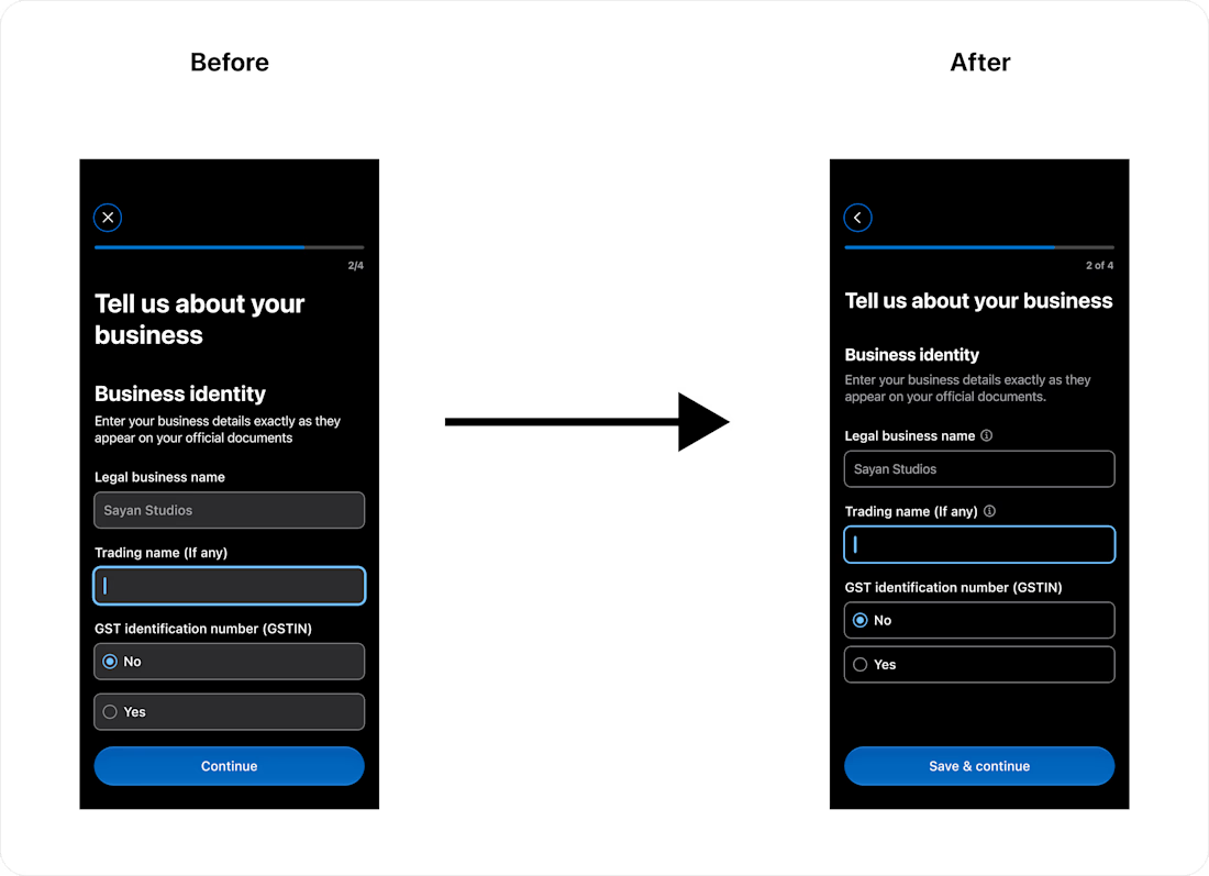
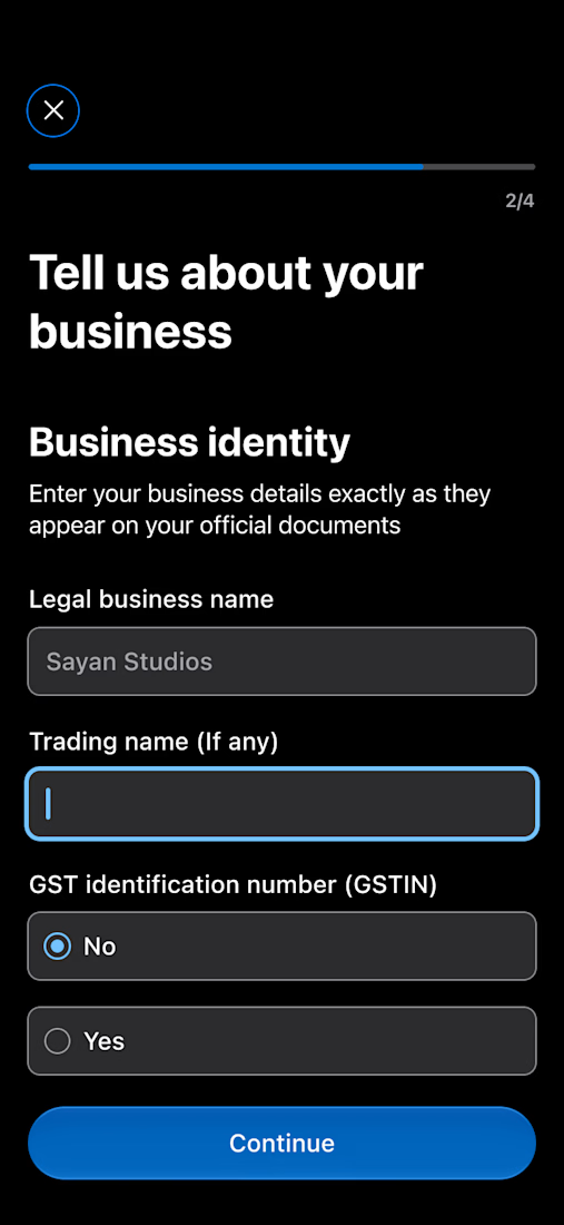
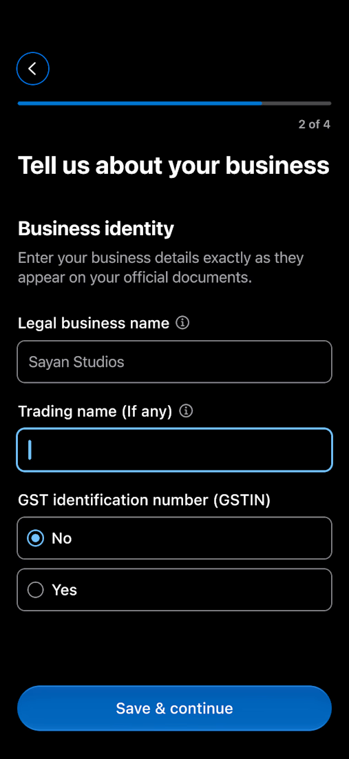
Today, I created more screens and revisited some of my earlier design decisions. I compared the first version (A) with the improved version (B) and refined several small details to make the experience clearer and more intuitive.
Changed the X (exit) button to a back button for clearer navigation
Changed “2/4” to “2 of 4” for better clarity
Improved typography and color hierarchy
Added info icons to explain unfamiliar fields
Refined states for a more subtle and premium look
Changed “Continue” to “Save & continue” to better match the context
Small iterations, but each one has a purpose.
Which design do you prefer — A or B? 👇


The network for creativity
Join 1.25M professional creatives like you
Connect with clients, get discovered, and run your business 100% commission-free
Creatives on Contra have earned over $150M and we are just getting started
Trending
retrofuturism
Share your favorite designs from the past exploring the distant future. Or your own take on the aesthetic 🚀
halftone
Dots. Texture. Grain. Let's see your designs using the halftone technique.

Midjourney
Creatives are showing off what they're making with Midjourney.
colorgrade
Video editors sound off: How do you enhance the mood of your video in color grading?





Related posts


🚨 6 FEATURES ON CONTRA. LUCK OR A PATTERN?
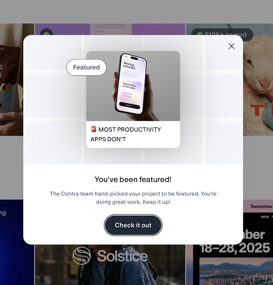
Another Asol Design project was hand picked by the Contra team.
And this is already the 6th time.
The interesting part isn’t the badge itself.
It’s that very different mobile concepts keep getting noticed while being built around the same principle:
Great mobile design should look exceptional and make the product stronger.
Not UX without visual craft.
Not beautiful UI without product logic.
The strongest work happens when product strategy, user behavior, growth thinking, and premium execution all support the same idea.
This featured concept explores exactly that
A productivity product designed not just to measure focus, but to protect the conditions required for deep work.
💬 WHAT MAKES A MOBILE PRODUCT FEEL TRULY PREMIUM TO YOU: VISUAL EXECUTION, PRODUCT LOGIC, OR BOTH?
📩 BUILDING A MOBILE PRODUCT AND WANT A STRONGER PRODUCT + UX DIRECTION? LET’S TALK.
#mobileappdesign #productdesign #uxdesign #growthdesign #iosdesign #asol_design #contra



wow, what a win! congratulations to you!


Most recovery apps count days, but watching a number reset doesn't make you feel anything in the iOS/Android healthcare app.
Sunflower visualizes sobriety as a growing garden in the mobile wellness app. Every sober day, your sunflowers bloom. Relapse means watching something you built wither, it's devastatingly effective. Psychological commitment through visualization.
Users get to personalize their sunflower garden before they even finish creating their account in the healthcare & wellness SaaS app. Depending on which style they choose, their sunflowers look different throughout the entire experience. By the time they finish, they've already invested in something that feels like theirs.
The founder came to us with a pre-alpha app and a concept driven by personal experience. We turned it into an onboarding that moved users from download to emotional investment in under 3 minutes.

Impressive branding and visual consistency.

Here is some of my recent exploration for the footer. Here I have used my Halftone Engine in the Duotone mode with ring shape cells and enable motion in them.
Hope you like it :) ♥️ Many things are on the way see you soon.


Such a solid footer man, I'm impressed.