The network for creativity
Join 1.25M professional creatives like you
Connect with clients, get discovered, and run your business 100% commission-free
Creatives on Contra have earned over $150M and we are just getting started
Back to feedPost

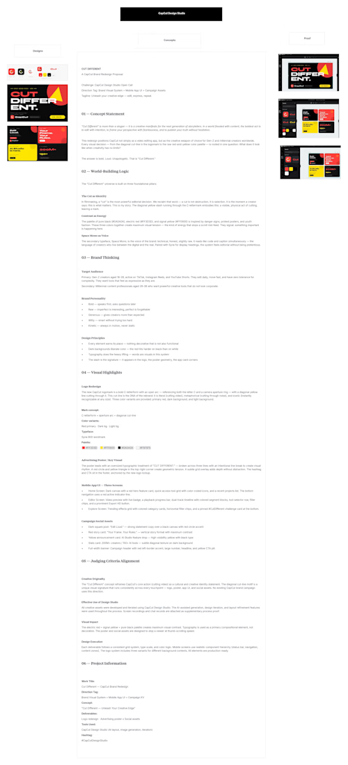
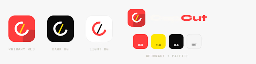
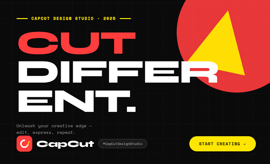
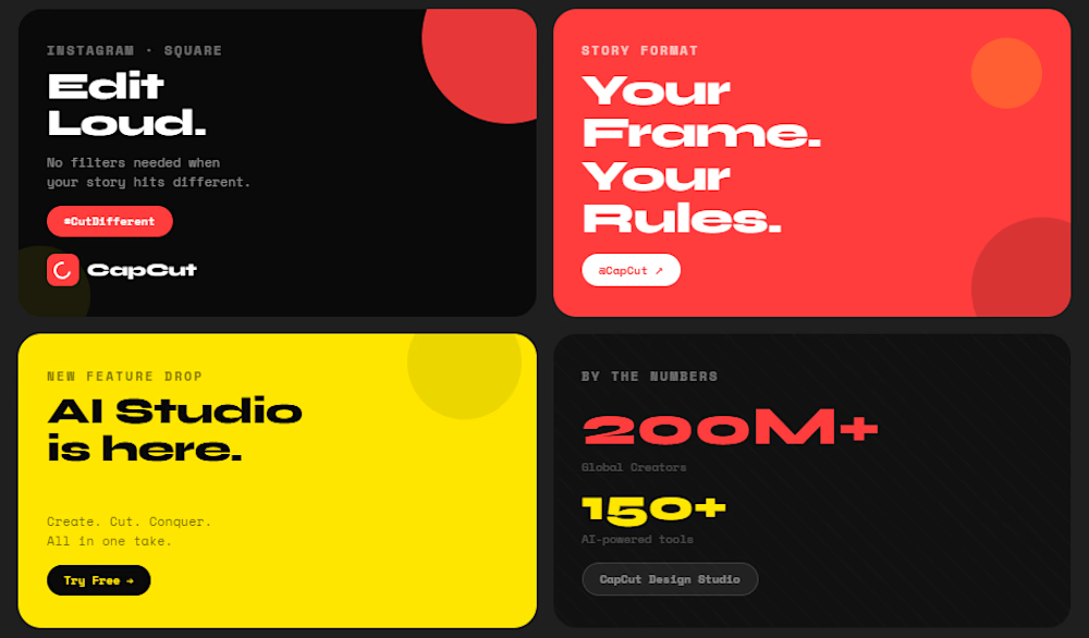
"Cut Different" is a brand redesign concept that celebrates creativity and self-expression. Using bold typography, vibrant colors, and clean layouts, I created a modern visual identity that reflects CapCut's mission to help creators stand out and unleash their creative edge,
Creator: Kausar Ali
Work Title: Cut Different — CapCut Brand Redesign
Hashtag: #CapCutDesignStudio
The network for creativity
Join 1.25M professional creatives like you
Connect with clients, get discovered, and run your business 100% commission-free
Creatives on Contra have earned over $150M and we are just getting started







Related posts

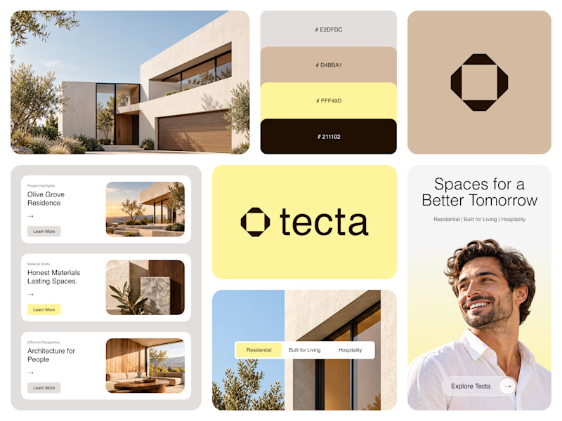
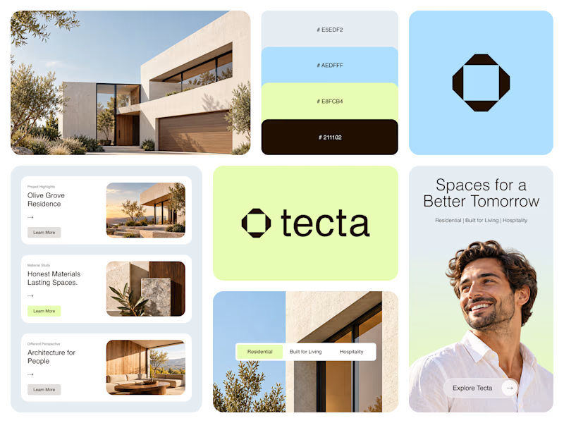
Color Direction Test - Tecta Architecture
Exploring two visual directions for Tecta, a contemporary architecture brand built around clarity, form, and human-centered spaces.
Direction 01 - Warm, calm, and timeless.
Direction 02 - Fresh, modern, and expressive.
Same identity. Different atmosphere.
Which direction feels stronger for an architecture brand - 01 or 02?
21 voted
38%
35 voted
62%
56 votes
Closed

Great branding! The presentation is top-notch. Learned something new from this.

I think 1 image design was great!


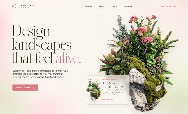
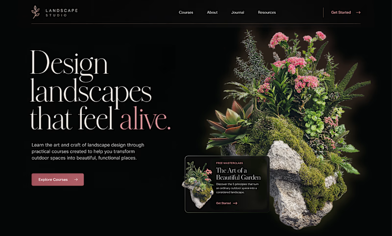
Color Changes Everything
Sometimes, all it takes is a change in color – and the exact same design can feel completely different.
The light version, with soft pink tones and natural textures, feels fresh, light, and airy. It creates a sense of calm, natural beauty, and a closer...
128 voted
66%
66 voted
34%
194 votes
Closed

Thank you to everyone who voted on the last post. Cyan/Blue came out as the preferred direction, and I've now taken that color system and built out the complete animated flow for the entire app, from the home dashboard through bill payment and confirmation.
Attaching the full video walkthrough below so you can see how the winning direction feels in motion, including real transitions, interactions, and pacing across the entire experience.
Would love to hear your thoughts on how it feels end to end.

