The network for creativity
Join 1.25M professional creatives like you
Connect with clients, get discovered, and run your business 100% commission-free
Creatives on Contra have earned over $150M and we are just getting started
Back to feedPost
Taste Test
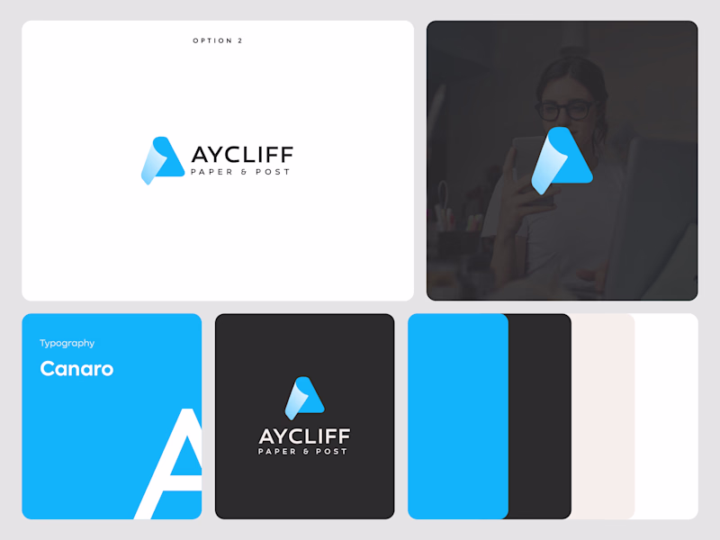
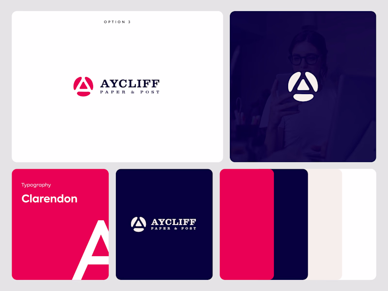
Exploring two logo directions for AYCLIFF Paper & Post and would love some feedback from the Contra community 👇
🔹 Option 1 focuses on simplicity and clarity, using a folded-paper-inspired symbol to reflect the brand’s industry in a modern way.
🔸 Option 2 takes a bolder approach with a custom geometric mark designed to create a stronger, more memorable brand presence.
Both concepts are built around the same brand values but communicate them differently.
If you were the client, which direction would you choose and why? 👀
I’d love to hear feedback from fellow designers, founders, and creatives in the Contra community.
7 voted
100%
0 voted
0%
7 votes
Closed
Thank you very much😊
Thanks.
Voting Option 1. The folded paper symbol actually communicates the brand's industry without having to explain it, which is hard to get right. Option 2 feels a bit more generic as a standalone mark.
Thank you very much for sharing your feedback!😊
The network for creativity
Join 1.25M professional creatives like you
Connect with clients, get discovered, and run your business 100% commission-free
Creatives on Contra have earned over $150M and we are just getting started
Related posts
Just dropped a new case study on my Behance profile 👇
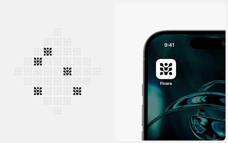
Guys, help me choose the right cover. For now, our team chooses first, but happy to hear feedback from the Contra community 😉
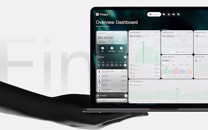
Full case - Finara Branding + UX/UI
38 voted
75%
13 voted
25%
51 votes
Closed
Dashboard preview
May was a busy one.
✓ 8 clients booked
✓ 5 logos delivered
✓ 5 projects delivered
✓ 3 projects still active
✓ 3 brandbooks delivered
✓ 6 packaging designs completed
June is already moving fast, but I’m starting to look ahead to the second half of the year and the new adventures, brands, and challenges that might come with it.
How is your 2026 looking so far?
I can’t wait to land my first gig🥹
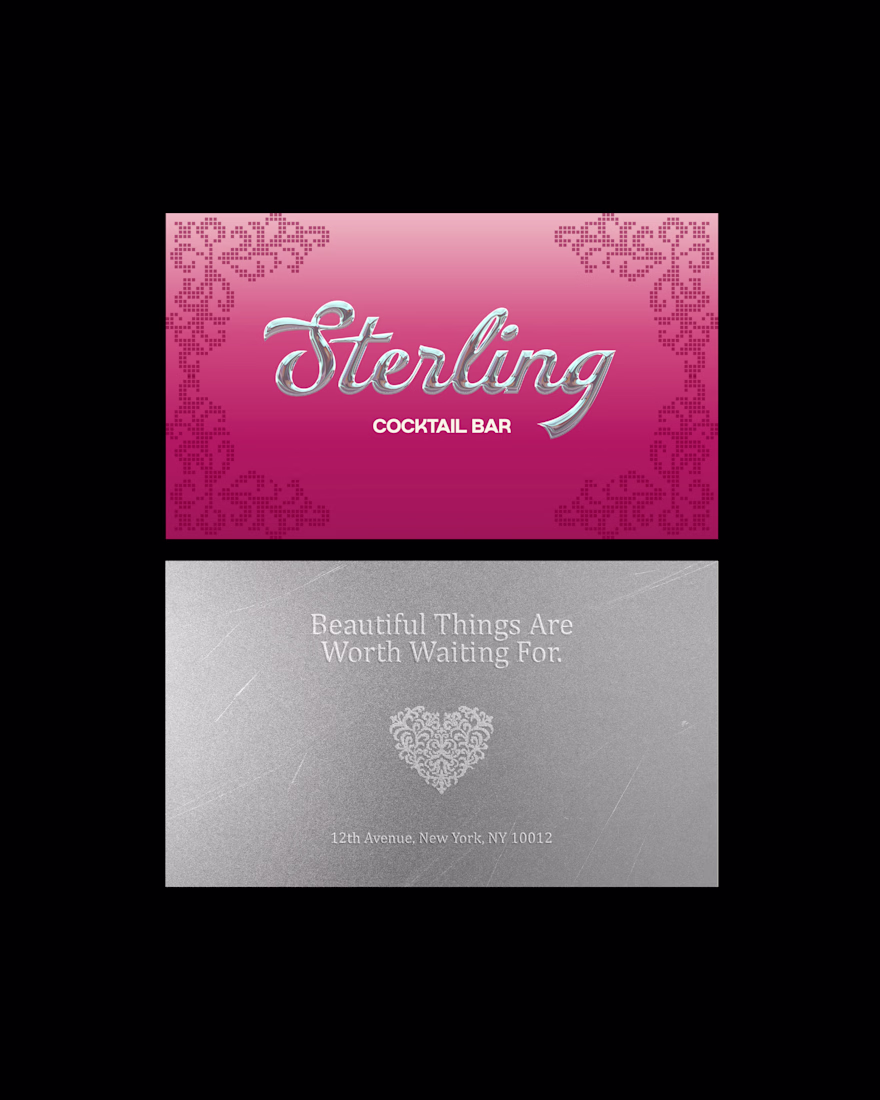
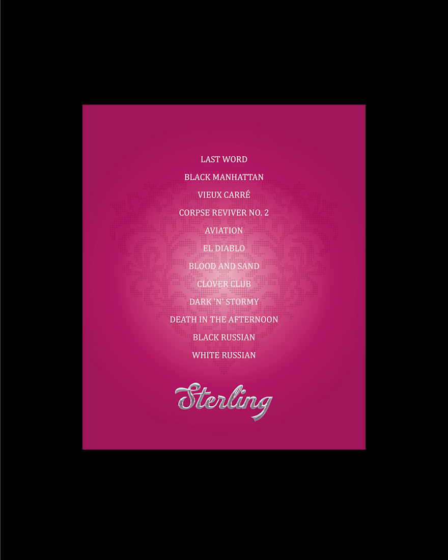
Sterling is a refined cocktail bar concept where luxury craftsmanship meets modern restraint.
The brand identity for this project is inspired by the album Razorblade Romance by H.I.M. 💕
One of my favorite albums of all time! I wanted to lean into the contrast of elegance and danger, devotion and destruction. Sterling feels less like a cocktail bar and more like a beautifully tragic love letter poured into crystal.
Let me know if you like it! 👇
Love this!
Challenges
View allTrending
Claude
Claude has entered the design space. How are you using Claude Design?
Contra University
Learn from expert creatives how to earn more using next-gen AI tools.
MagicPath
The canvas is infinite, and exploration is becoming the workflow. How are you using MagicPath?
creativeaiflow
Creative AI workflows are evolving. What tools do you use, and what are their strengths and weaknesses?
freelancerlife
Freelancer life is wins, pivots, and everything in between. What’s yours right now?