The network for creativity
Join 1.25M professional creatives like you
Connect with clients, get discovered, and run your business 100% commission-free
Creatives on Contra have earned over $150M and we are just getting started
Back to feedPost
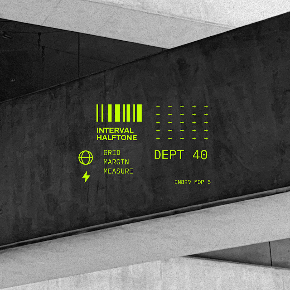
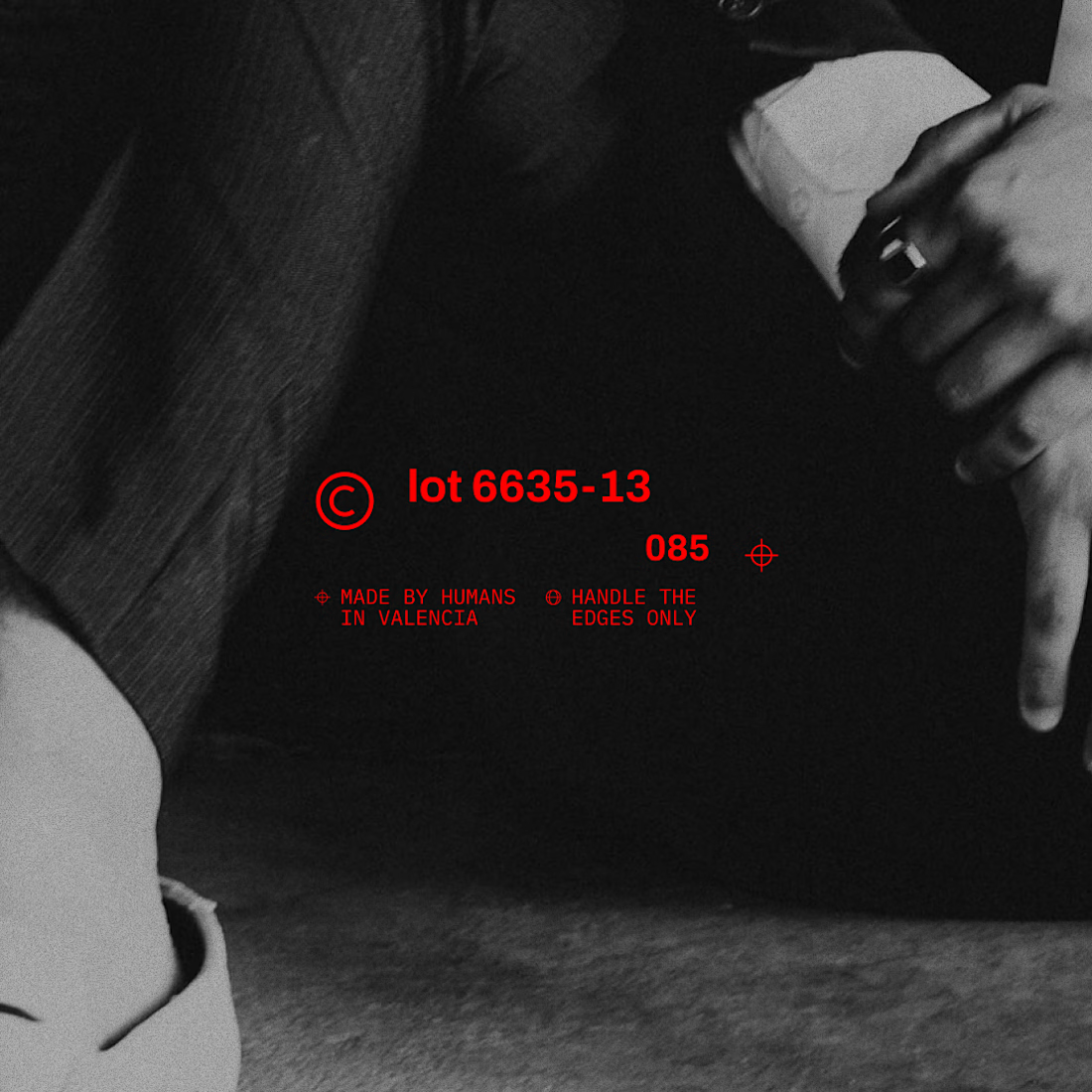
Taste Test

Which composition looks better and why?
I'm working on a microgaphiscs generator tool ... based on your reply I'm going to fintune the outputs! 🙏
21 voted
68%
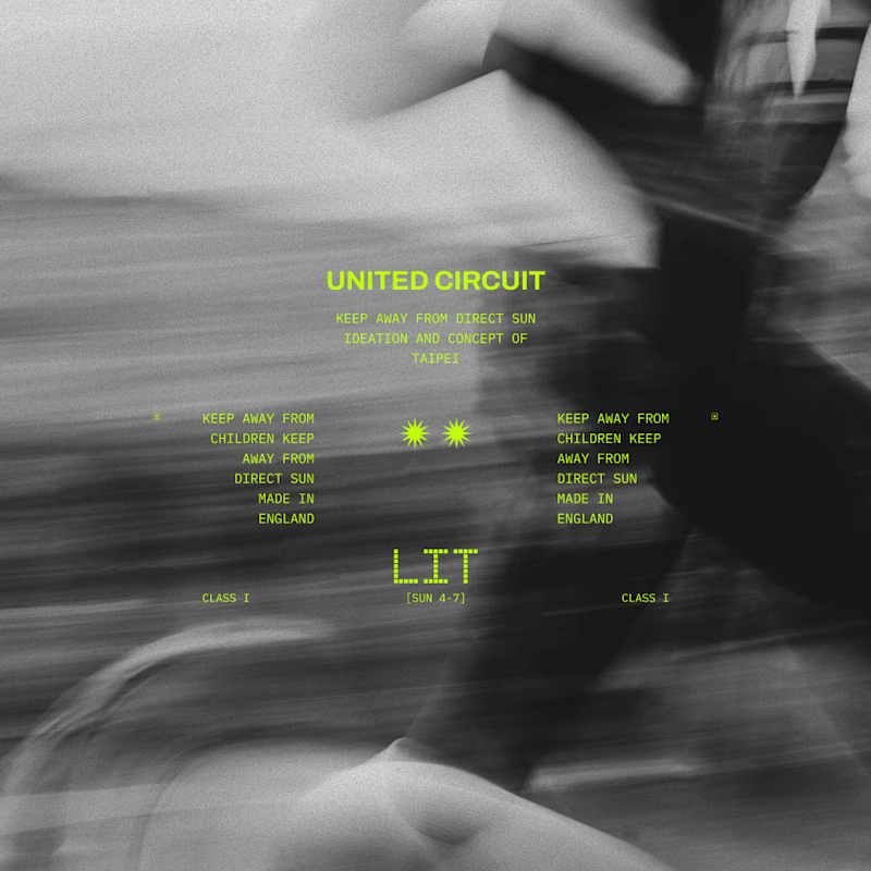
10 voted
32%
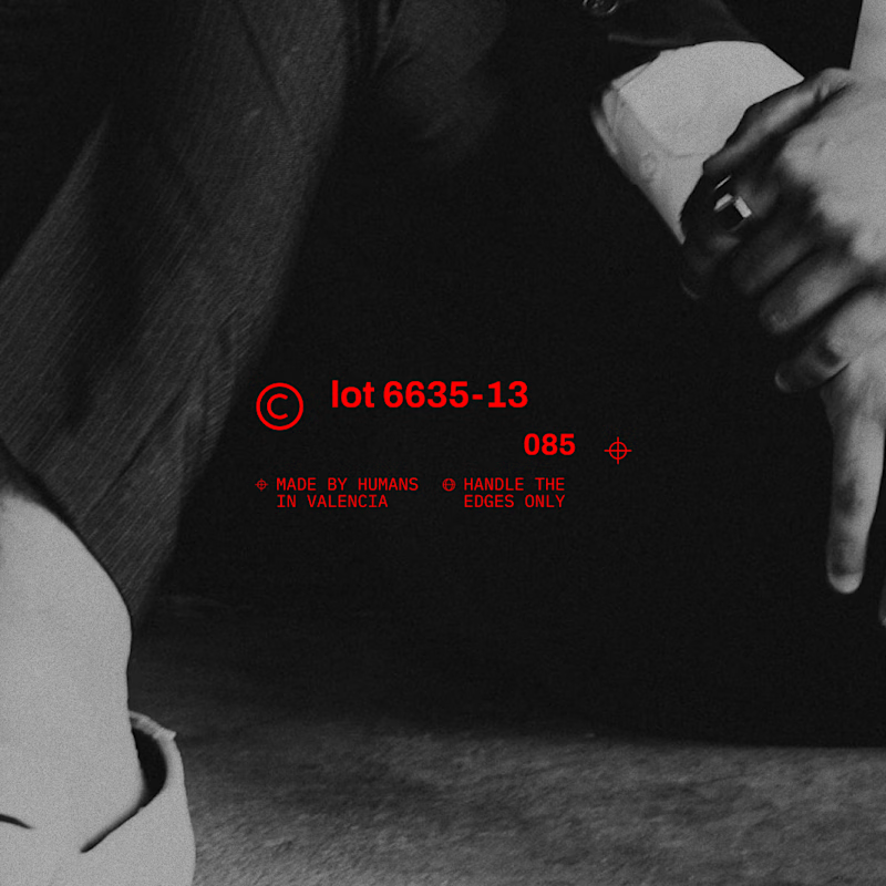
31 votes
Closed


A, feels more balanced

i love the blur of A, it really makes the text something you want to dial into.


the red type on the black frame is easy to notice.

A would be better in my opinion


A

Love the B

Love ❤️ B
The network for creativity
Join 1.25M professional creatives like you
Connect with clients, get discovered, and run your business 100% commission-free
Creatives on Contra have earned over $150M and we are just getting started
Trending
retrofuturism
Share your favorite designs from the past exploring the distant future. Or your own take on the aesthetic 🚀
halftone
Dots. Texture. Grain. Let's see your designs using the halftone technique.

Midjourney
Creatives are showing off what they're making with Midjourney.
colorgrade
Video editors sound off: How do you enhance the mood of your video in color grading?
Related posts

What if your media could assemble itself before your eyes? 👀
Here are two amazing components that make it possible for you :)
A: Vision Engine -- turns media into data through thousands of data points.
B: Lego Engine -- breaks media into pieces and rebuilds it through motion.
Which one would you pick ?
👇 A or B ?
7 voted
64%
4 voted
36%
11 votes
Closed


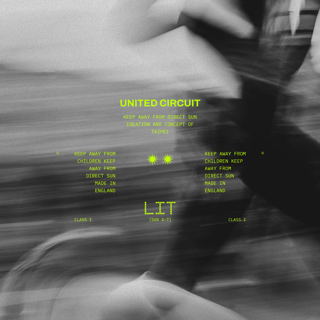
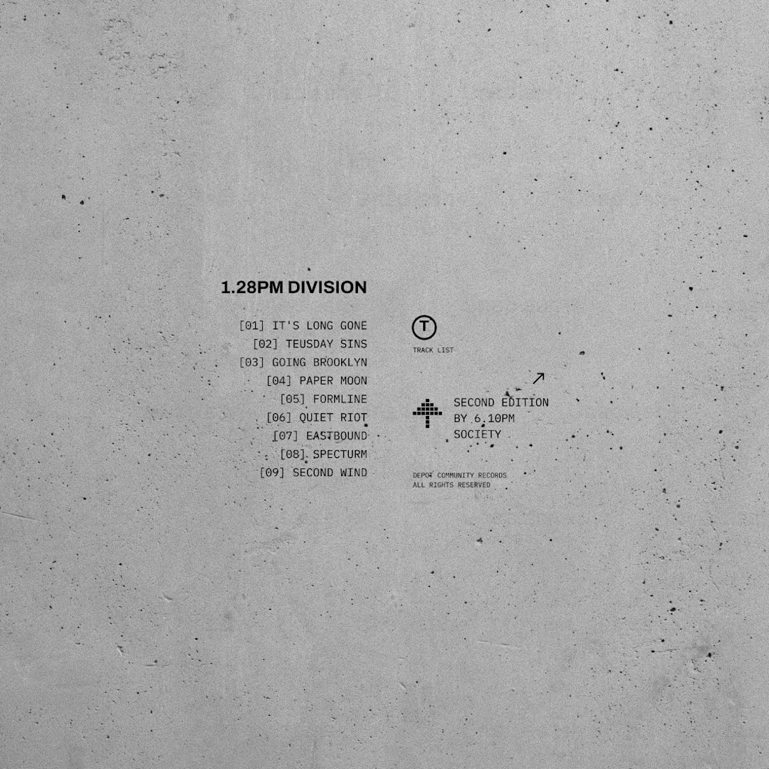

which one feels better? ✏️
15 voted
52%

14 voted
48%

29 votes
Closed

dark wins for me,





