The network for creativity
Join 1.25M professional creatives like you
Connect with clients, get discovered, and run your business 100% commission-free
Creatives on Contra have earned over $150M and we are just getting started
Back to feedPost


A beautiful website can still leave you completely unsure about what the company actually does. I’ve seen it happen with great typography, polished motion, and strong imagery.
Everything looks considered. The offer doesn’t.
For me, that’s usually a sign that the visual direction started too early.
Before designing the UI, I need to know what the page is promising, who it’s for, what makes it believable, and where the visitor should go next.
Once that’s clear, design can do its real job: give the message character, confidence, and a distinct point of view.
A premium website shouldn’t just look good in a mockup. It should make the business easier to understand.


Spot on. Aesthetics open the door, but clear positioning closes the deal. What's the #1 UX flaw you usually find in visually pleasing sites?
Thanks, Ilya! I’d say weak hierarchy. Everything looks polished, but too many messages and actions compete for attention, so visitors have to figure out what matters first and where to go next. The site looks great, but it makes the visitor do the prioritising.

Sleek! This is amazing
Thank you so much!
The network for creativity
Join 1.25M professional creatives like you
Connect with clients, get discovered, and run your business 100% commission-free
Creatives on Contra have earned over $150M and we are just getting started
Trending
retrofuturism
Share your favorite designs from the past exploring the distant future. Or your own take on the aesthetic 🚀
halftone
Dots. Texture. Grain. Let's see your designs using the halftone technique.

Midjourney
Creatives are showing off what they're making with Midjourney.
colorgrade
Video editors sound off: How do you enhance the mood of your video in color grading?





Related posts

Option 1 — Bold & Editorial
Two directions. One brand. Which one wins? 👀
I explored two different visual approaches for the same coaching website — each with its own personality, typography, color, and visual energy.
A — Bold, dark & editorial
B — Bright, elegant & modern
If you were the client, which direction would you choose?
Cast your vote and tell me what made you pick it. 👇
#UIDesign #WebDesign #Framer #WebDesignInspiration #DesignPoll #Framer

75 voted
72%
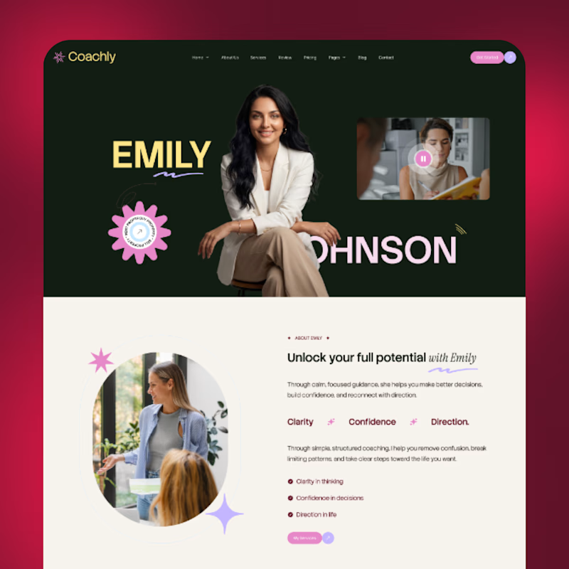
29 voted
28%
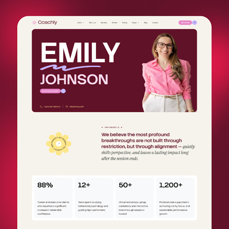
104 votes
Closed

Both directions look strong, but I’m leaning toward A Bold, dark & editorial 👀 It feels more distinctive and has a stronger visual personality. Would love to see where you take it next! 🔥

First web build with Claude Code.
Safe to say it's going very well.
Even building with AI, design taste is still the constant.


Coooooool.🔥





I’d go with 2. The cinematic image makes the brand feel more established.