The network for creativity
Join 1.25M professional creatives like you
Connect with clients, get discovered, and run your business 100% commission-free
Creatives on Contra have earned over $150M and we are just getting started
Back to feedPost
Why does every courier brand hide the people actually doing the work behind a stock photo?
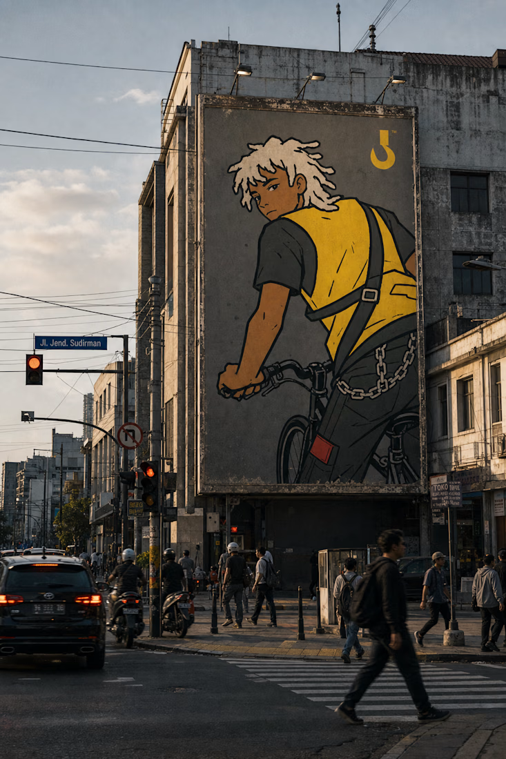
I built Dockhand around the opposite idea — the riders ARE the brand. Hand-inked, zero gradient, named on the roster, now live on a working site.
Live at dock-blade-reveal.lovable.app
One idea brand. No decoration allowed.

Great stuff tbh

Naming the riders on the roster gives the people-first idea something concrete. That feels like a stronger foundation for a courier brand than another generic delivery promise.


So fun and clean executed!

Naming riders on the roster is the part that's hard to walk back — once people are the brand, hiring and churn become brand problems too, not just ops ones. Does the roster page have a plan for riders who leave?

This deserves more than just liking, this deserves to be featured! 🏆 Hand-inked zero-gradient visuals putting actual riders front and center brings so much raw authenticity.


the yellow vest shots are so good


riders named on the roster, good call
Putting the riders at the center gives the brand a much stronger point of view than a generic stock-photo hero. The documentary-style frames also make the service feel human before you even get to the details.

Naming actual riders on the roster instead of hiding behind a generic delivery-guy stock photo is the kind of decision that sounds obvious after someone else does it first. Did any of the riders push back on being the face of the brand, or were they into it once they saw the illustrations?

Hand-inked, named riders instead of stock photos is such a strong differentiator. Feels like a brand with actual personality.

Love the concept!


Love the Vibe here..

Naming riders on the roster instead of using a stock photo is a strong stance. It turns the illustration style into proof of the idea rather than just decoration.

Love the design characters

amazing!
Putting the riders front and center gives the landing page a clear human hook; the visual direction makes that positioning instantly believable.
The network for creativity
Join 1.25M professional creatives like you
Connect with clients, get discovered, and run your business 100% commission-free
Creatives on Contra have earned over $150M and we are just getting started











Related posts

A flower that inflates arrives in the mail.
Next month, a phone made of shell.
STILL LIFE SERVICE. Case study dropping soon.
Which object earns your shelf? Reply below.
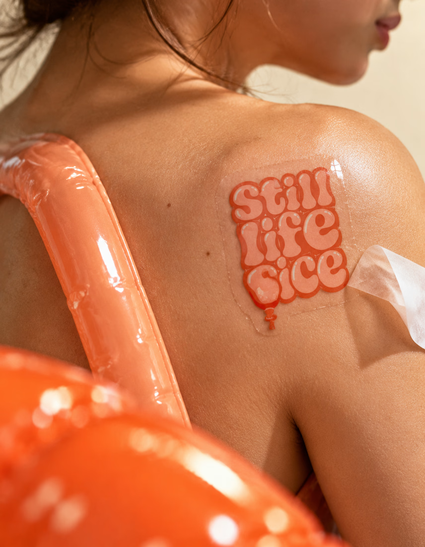

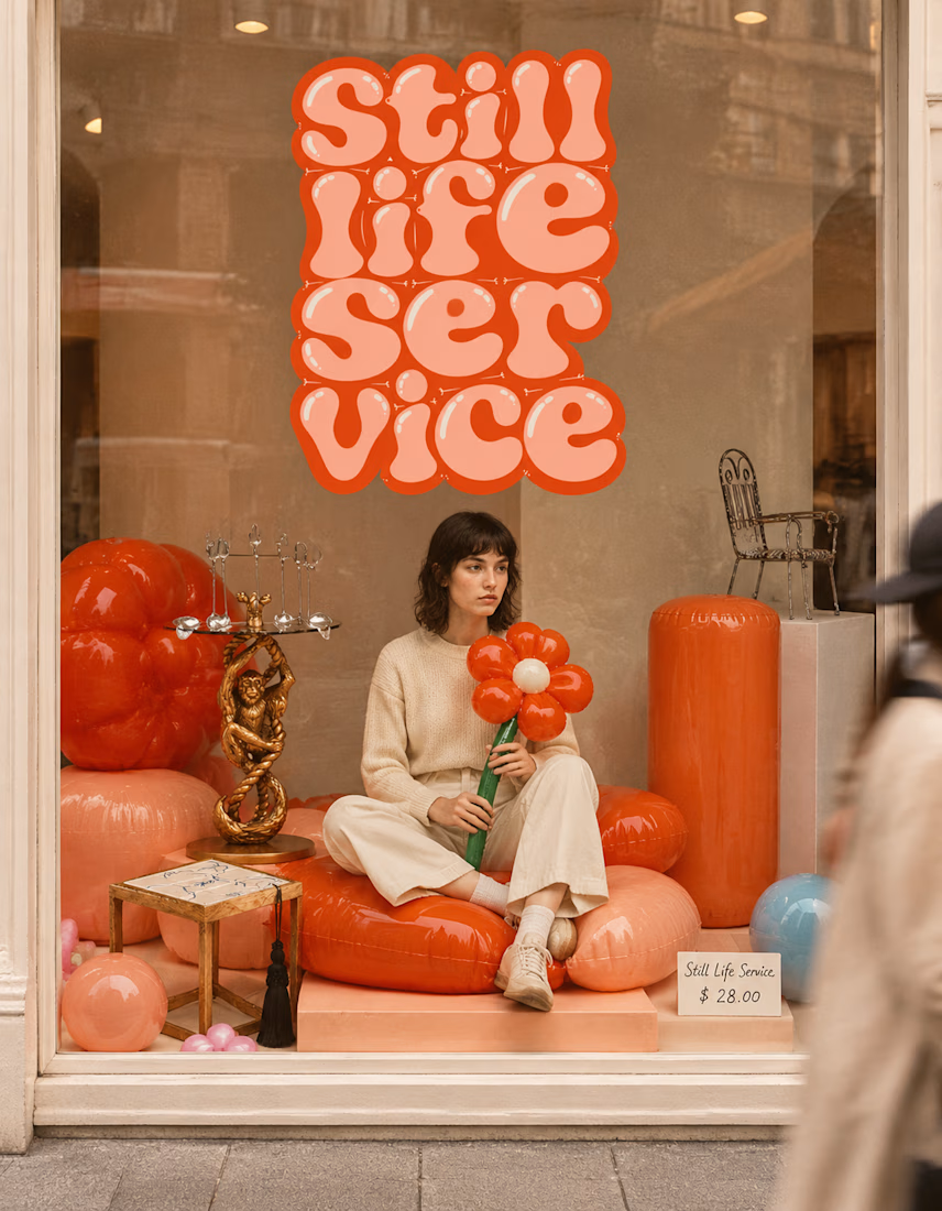

The inflatable flower. Only houseplant I'm guaranteed not to kill. Also, a new object every month is a sneaky good retention hook, people will stay subscribed just to see what's next.


Today I’m sharing something a bit different from packaging. This is the brand identity I designed for ALVA Industries, a Norwegian company developing electric motor technology.
I wanted it to feel modern and clear, but not too cold or impersonal. It’s a technical field, of course, but I think there’s still room for some character.
What do you think?

Incredible branding kit 🔥🔥🔥🔥
Great job Roberto❤️❤️

Pulse Athletics... Branding & App design✨
Check it out
#app #sport #productdesign #uiuxdesign #uidesigner #uxdesigner #pulse #branding #brandidentity #brandstrategy #brandguidelines #logo #homepage


That's really stunning app design🔥🔥🔥
Great job Ziva🎉🎉🎉


