The network for creativity
Join 1.25M professional creatives like you
Connect with clients, get discovered, and run your business 100% commission-free
Creatives on Contra have earned over $150M and we are just getting started
Back to feedPost

Great brands aren't just seen — they're remembered.
I create premium brand identities and visual experiences that help businesses stand out, build trust, and connect with their audience.
With 6+ years of international experience, I turn creative ideas into powerful brand visuals.
Looking to elevate your brand? Let's make it happen!
🚀 Visit my Contra profile to explore my work and let's create something exceptional.
The network for creativity
Join 1.25M professional creatives like you
Connect with clients, get discovered, and run your business 100% commission-free
Creatives on Contra have earned over $150M and we are just getting started



Related posts

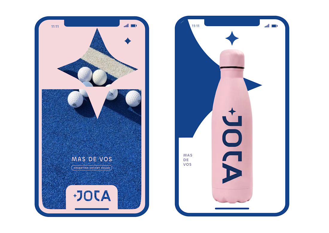
JOTA is an Argentine field hockey brand built for players who play with personality. The founder reached out to rethink how the brand shows up beyond the stick itself.


Wow project

Most rebrands start with a mood board. This one started with a punctuation mark.
For we make the slash in the name became the logo, the monogram, the layout tool and even the campaign line: "we make you grow."
When one small idea can carry a whole brand, every new touchpoint designs itself.
Founders does your name have a hidden idea like this?
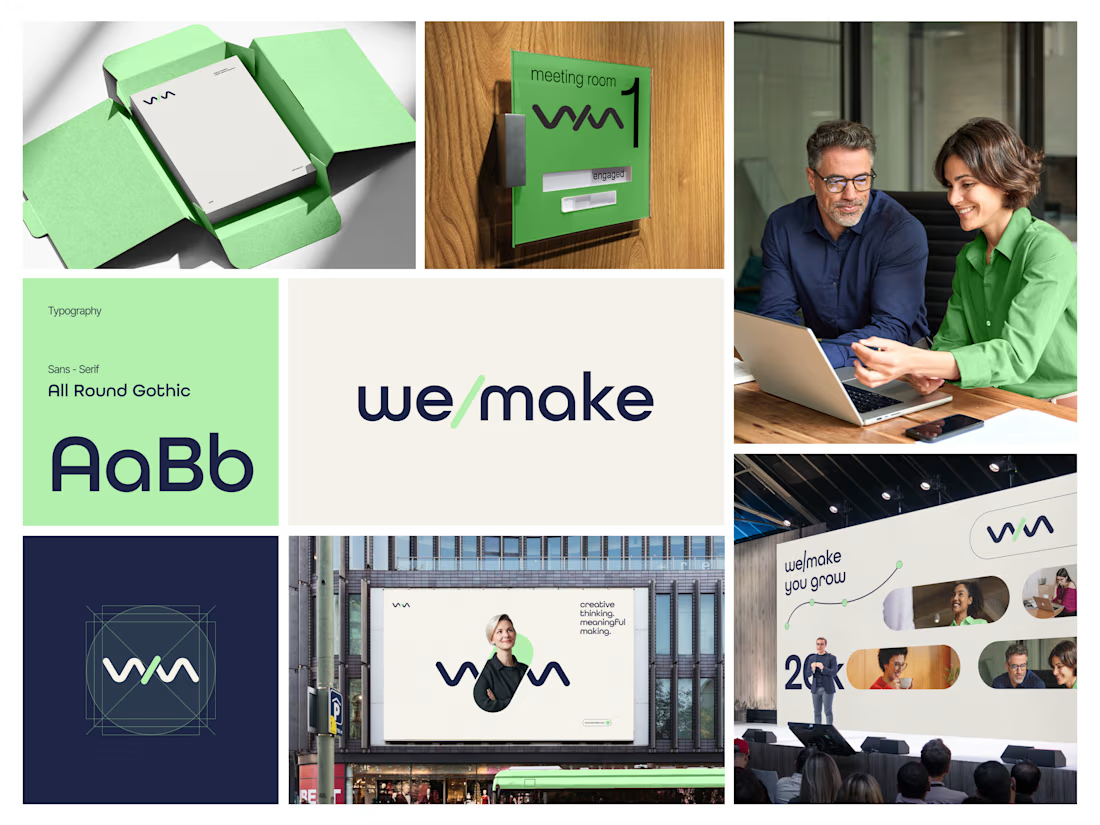

Turning the slash into the logo, monogram and layout device is such a smart move, and it feels wonderfully consistent across the mint-green packaging, signage and stage visuals. The rounded geometric type pairs beautifully with that fresh green and deep navy. Did the slash idea...

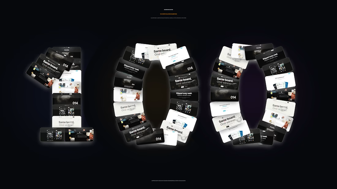
Just crossed 100 followers on Contra! ⚡
To celebrate, I didn't want a generic thank-you graphic, so I algorithmically arranged 49 tiles of my actual shipped work (Palm, Direct Edits, and recent client builds) into the number 100 using parametric squircle math.
Huge thank you to everyone following the journey, supporting my work, and trusting me to build fast, clean web apps that actually look good.
We’re just getting started. Onto the next milestone! 🚀



Seeing this makes me want to keep going. Congrats!