The network for creativity
Join 1.25M professional creatives like you
Connect with clients, get discovered, and run your business 100% commission-free
Creatives on Contra have earned over $150M and we are just getting started
Back to feedPost
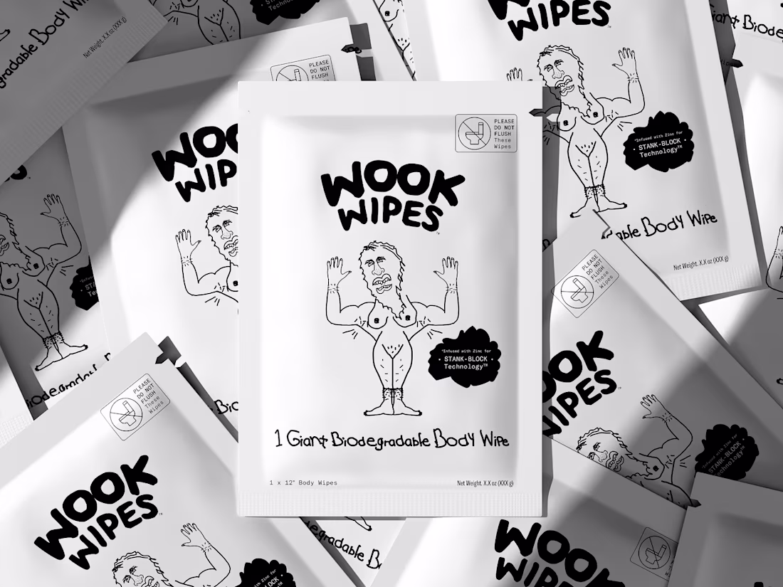
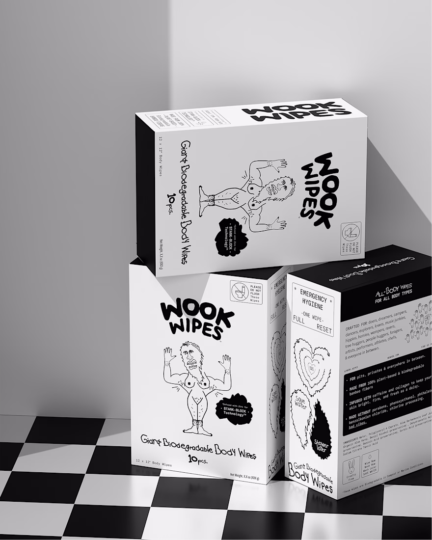
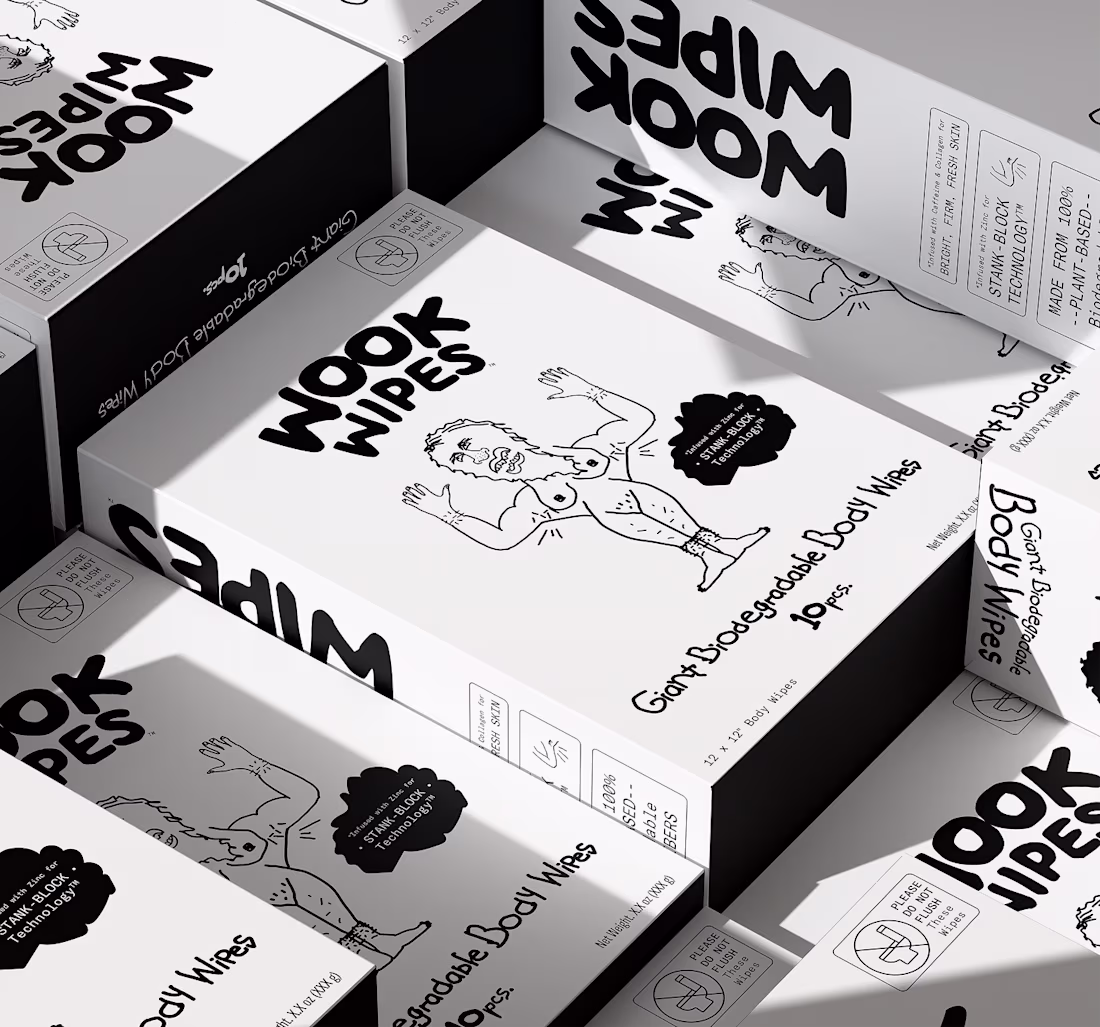
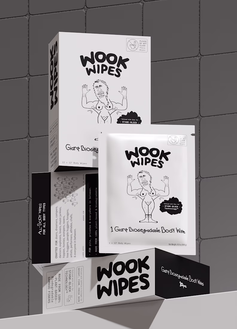
A bold packaging project built around the idea that personal care products don’t always have to look polished and predictable.
For WOOK WIPES, the goal was to create visuals that felt raw, unconventional, and impossible to ignore while still maintaining a clean premium presentation through 3D visualization.
Using monochrome tones, playful typography, and expressive compositions, we transformed the packaging into a striking visual experience with real shelf presence.
One of those projects where the attitude of the brand became the strongest design element itself.
Curious what’s a packaging design that instantly grabbed your attention the first time you saw it?
Explore more:
https://dribbble.com/shots/27385408-WOOK-WIPES-3D-Packaging-Visualization
The network for creativity
Join 1.25M professional creatives like you
Connect with clients, get discovered, and run your business 100% commission-free
Creatives on Contra have earned over $150M and we are just getting started
Related posts
Studying shapes and textures for a client project using @Spline ⛰️💎
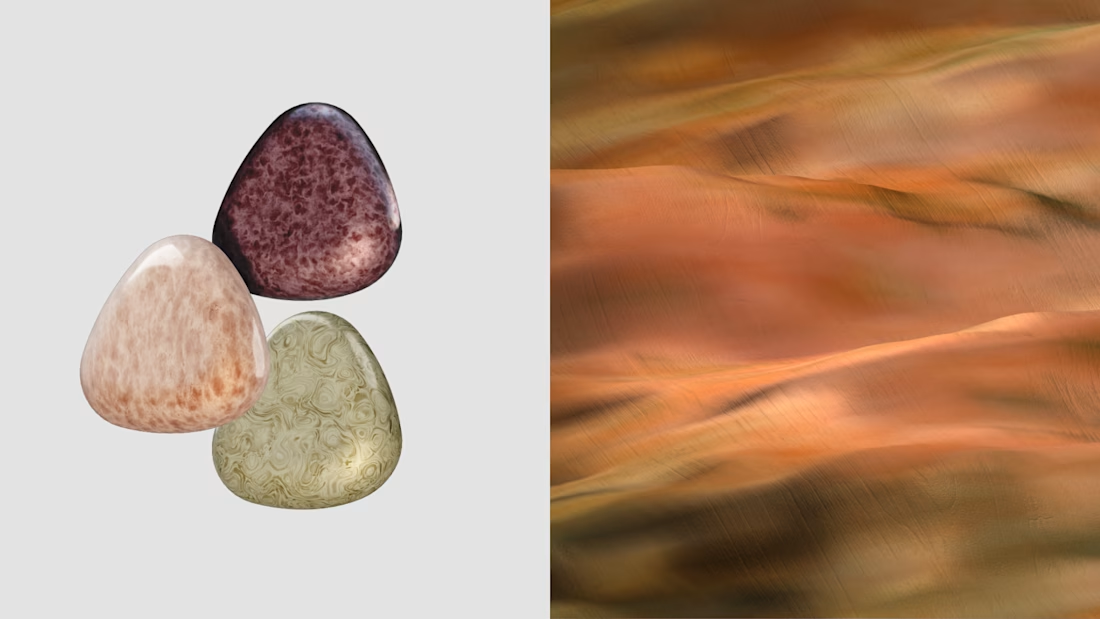
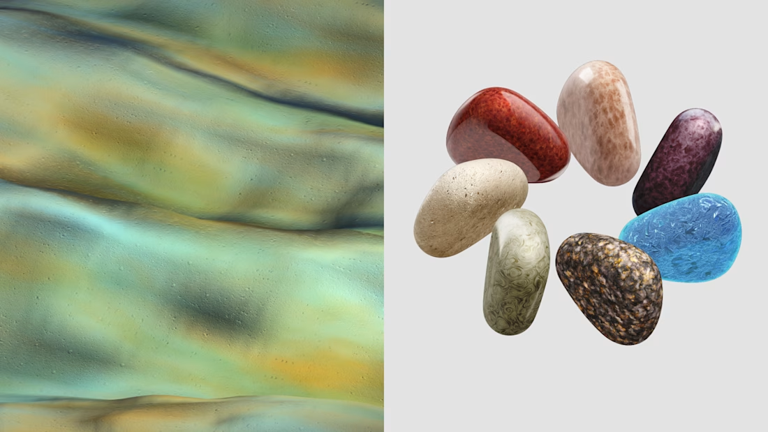
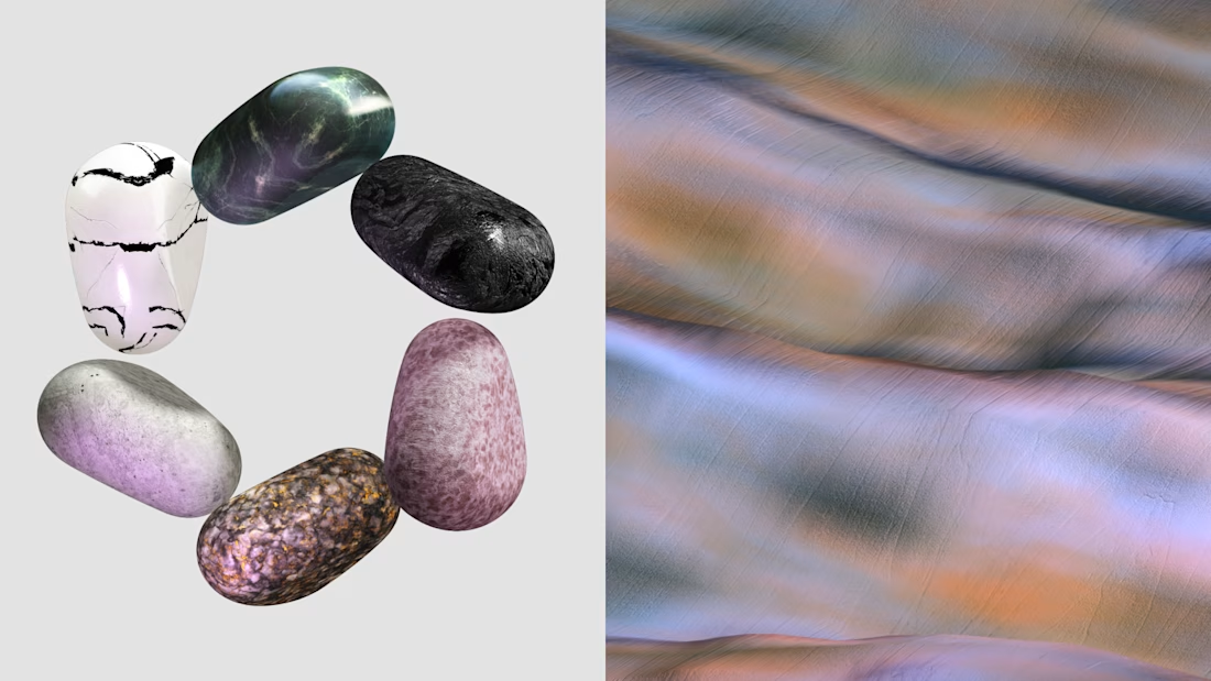
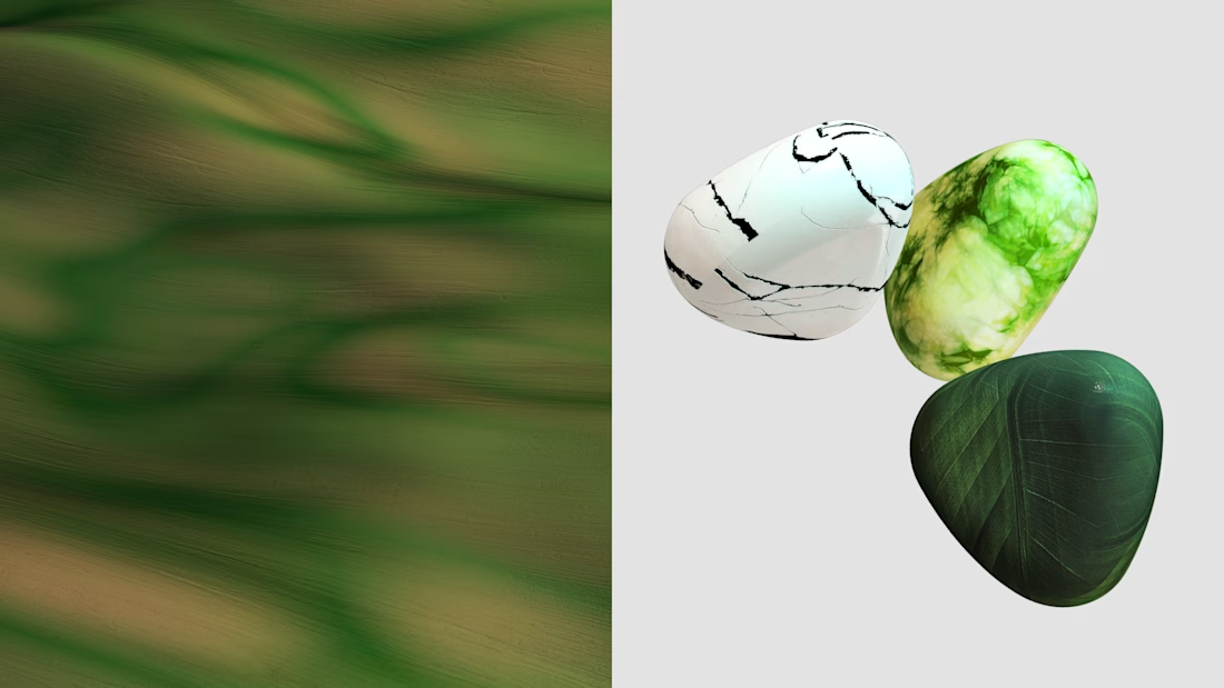
The material variation across the pebbles, matte stone next to that glassy blue one, is what sells the realism here. Good foundation to study before jumping into the actual client asset.
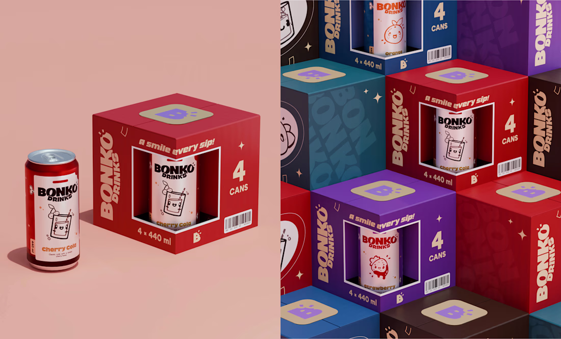
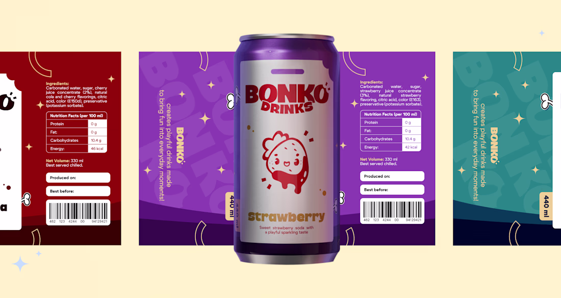
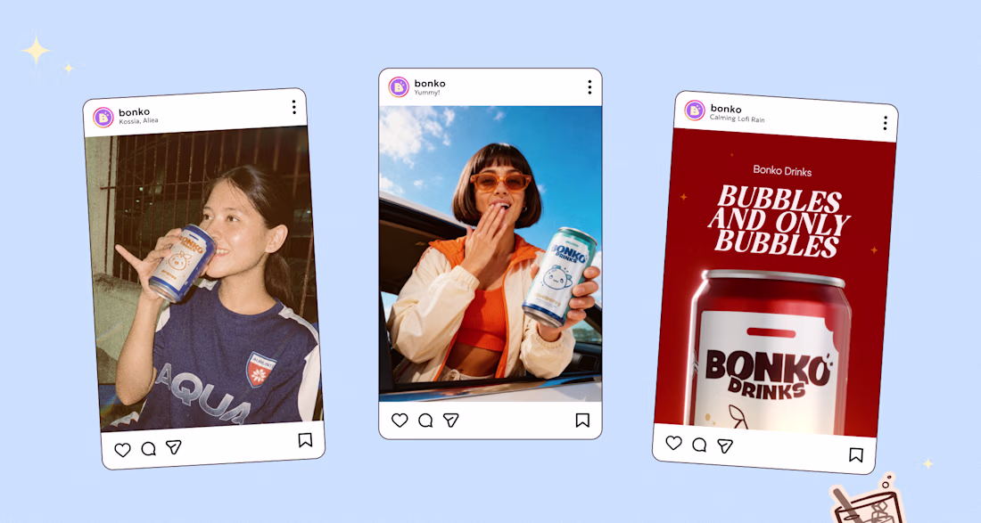
BONKO ✦ Brand Identity & Packaging 🥤✨
BONKO is a soft drink brand built with scalability in mind. Its visual identity was designed to easily expand across a wide range of products, including chips, candy, gummies, chocolate, and more.
Full case: https://www.behance.net/gallery/252217469/BONKO-Brand-Identity-Packaging
✦ Let's work together! ✨
Instagram: https://www.instagram.com/daisyvi.st
Telegram: https://t.me/daisyvi_st
Obsesseddddd
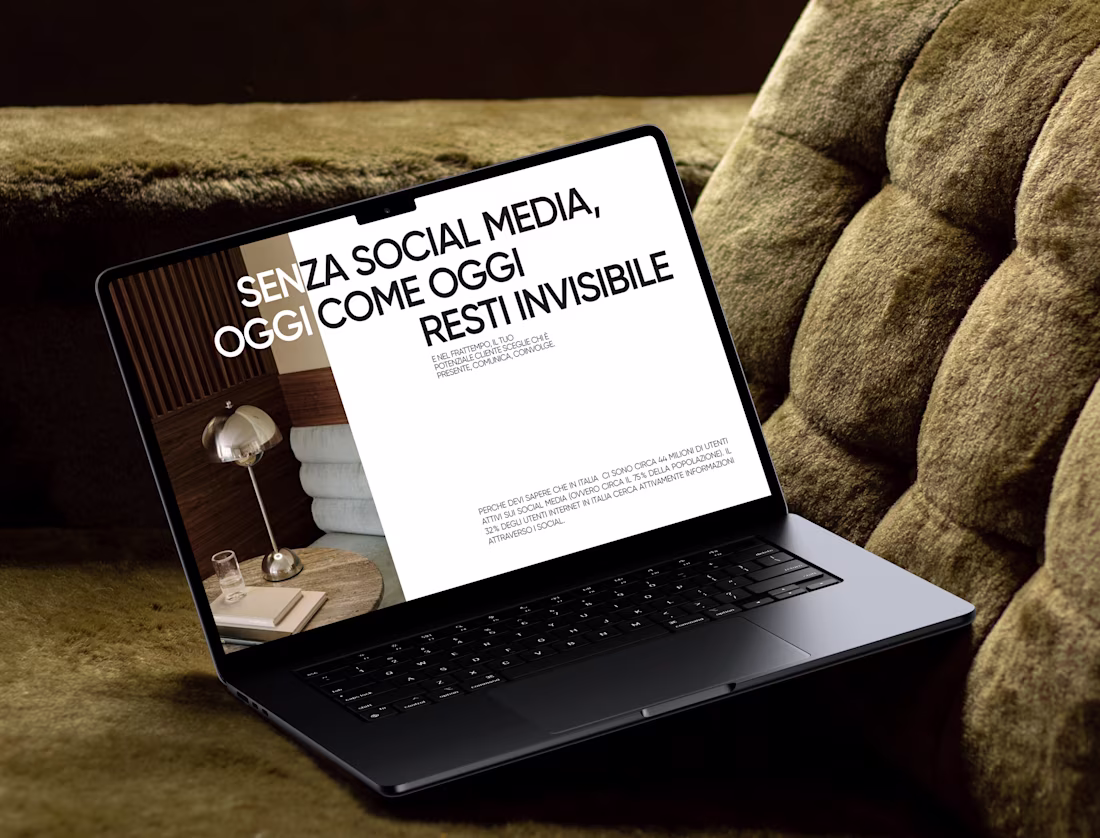
A presentation isn't just slides – it's part of your personal brand.
Recently, I designed a presentation for a digital marketer who wanted something clean, but not too minimalistic. The goal was to create a design that feels premium and modern while still keeping every slide visually engaging.
The biggest challenge was finding that balance—avoiding unnecessary decoration without making the presentation feel empty.
For this project, I focused on: editorial-inspired layouts, bold typography, thoughtful image composition, clear visual hierarchy, just enough visual details to keep every slide interesting
I believe presentations should support the story, not compete with it. When the balance is right, people stay focused on both the message and the visuals.
Love this approach. The best presentations always let the story shine🙌
Trending
Claude
Claude has entered the design space. How are you using Claude Design?
Contra University
Learn from expert creatives how to earn more using next-gen AI tools.
fifaworldcup2026
The World Cup is here and the whole world's watching. How are you designing for the world stage?
creativeaiflow
Creative AI workflows are evolving. What tools do you use, and what are their strengths and weaknesses?
freelancerlife
Freelancer life is wins, pivots, and everything in between. What’s yours right now?