The network for creativity
Join 1.25M professional creatives like you
Connect with clients, get discovered, and run your business 100% commission-free
Creatives on Contra have earned over $150M and we are just getting started
Back to feedPost
A presentation isn't just slides – it's part of your personal brand.
Recently, I designed a presentation for a digital marketer who wanted something clean, but not too minimalistic. The goal was to create a design that feels premium and modern while still keeping every slide visually engaging.
The biggest challenge was finding that balance—avoiding unnecessary decoration without making the presentation feel empty.
For this project, I focused on: editorial-inspired layouts, bold typography, thoughtful image composition, clear visual hierarchy, just enough visual details to keep every slide interesting
I believe presentations should support the story, not compete with it. When the balance is right, people stay focused on both the message and the visuals.


Beautiful balance between editorial aesthetics and usability. The typography, whitespace, and image composition work together to create a premium feel without distracting from the message. Great work! 👏

Really appreciate your thoughtful feedback! Happy to hear the design communicates the feeling we were going for.✨

Love this style! 🔥
Thanks🤍


The balance between premium visuals and clear storytelling is so well explained. Cool work! 🙌
Thank you so much! Really appreciate your kind words! 🙌

I like this project so much ☺️❤️
Thanks🤍

Love this approach. The best presentations always let the story shine🙌
Thank you 🤍
The network for creativity
Join 1.25M professional creatives like you
Connect with clients, get discovered, and run your business 100% commission-free
Creatives on Contra have earned over $150M and we are just getting started
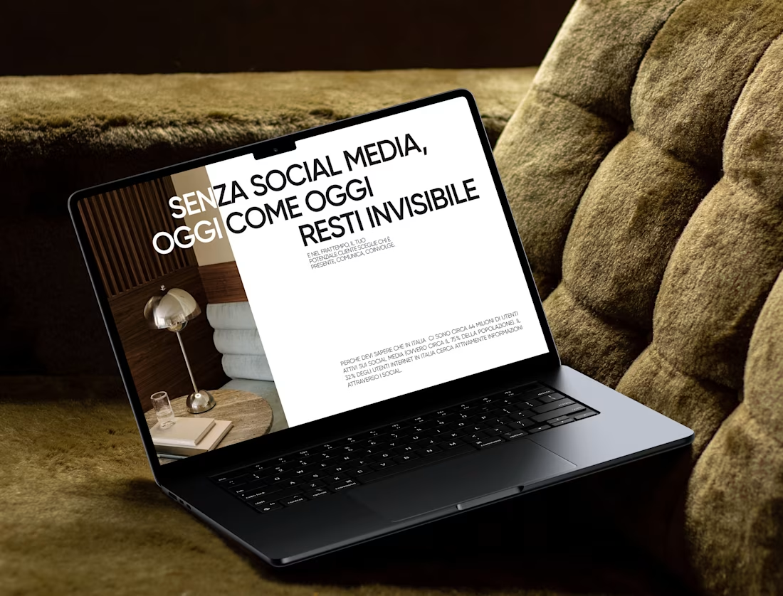
Marketing Presentation Design
Adobe Photoshop

Adobe XD

Figma

Graphic Design
Presentation Design
Web Design



Related posts

wow, this looks sharp. Amazing work

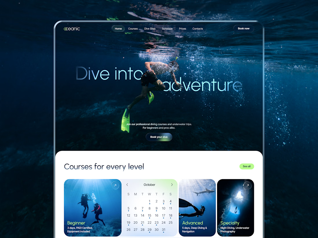
New concept for diving center 🌊
What do you think?


nice work!

Which one feels more like a brand you’d buy from?

4 voted
80%
1 voted
20%
5 votes
Closed

Loud and playful for me. The bold prints suit a small run tee brand better than a quiet layout would.

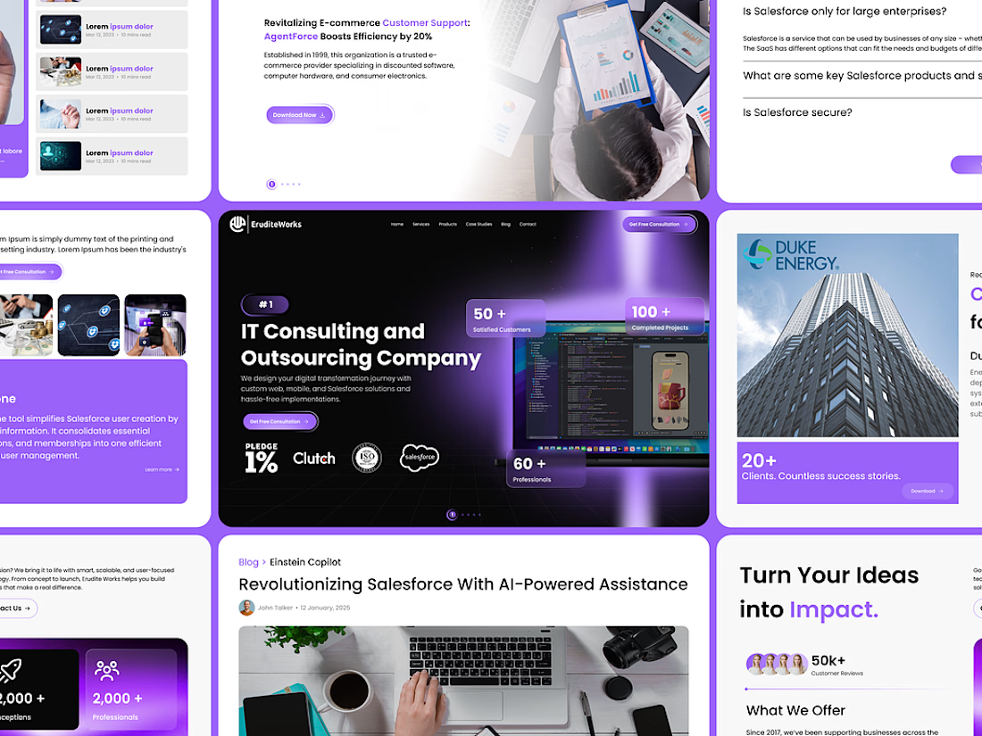
Designed a high-converting, premium enterprise landing page for EruditeWorks, an IT consulting and outsourcing firm.
The Problem: Many corporate tech websites feel flat, text-heavy, and fail to immediately convey tech authority or client trust metrics.
The Solution: I engineered a layout that balances visual richness with strategic information architecture:
• Structured a high-impact hero header featuring validation metrics (100+ Completed Projects, 60+ Professionals).
• Implemented seamless trust badges underneath the core value proposition.
• Created visually engaging secondary layouts for client success stories, AI tools (Einstein Copilot), and intuitive FAQ components.
• Maintained an authoritative yet bleeding-edge aesthetic using a dark palette with premium glowing gradients.
Deliverables included full high-fidelity desktop UI designs and a responsive component system ready for developer handoff.