The network for creativity
Join 1.25M professional creatives like you
Connect with clients, get discovered, and run your business 100% commission-free
Creatives on Contra have earned over $150M and we are just getting started
Back to feedPost

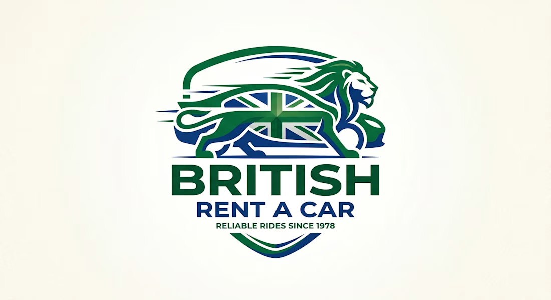
For BRITISH RENT A CAR, I designed a powerful heritage-inspired logo that communicates strength, speed, and British reliability.
Concept & Story: The core icon combines three strong British symbols into one cohesive mark:
The British Lion for power, prestige, and leadership
The Union Jack integrated inside the lion's body for authentic British identity
A sleek car silhouette with motion lines to show speed and modern service
Color Palette: Deep British Racing Green and Royal Blue - both colors instantly connect with the UK heritage while conveying trust and professionalism.
Typography Hierarchy:
BRITISH - Bold, dominant, uppercase to establish the brand
RENT A CAR - Medium weight, clear service definition
RELIABLE RIDES SINCE 1978 - Small tagline to build legacy and trust, showing 45+ years of experience
This logo is designed to work perfectly on car doors, uniforms, website, and stationery. It balances heritage with modern minimalism - perfect for a rent-a-car company that wants to stand out in a competitive market.
Deliverables: Primary Logo, Secondary Mark, Color Palette, Typography System, Mockup Presentation.
Tools: Adobe Illustrator, Photoshop
Logo DesignBrand DesignAdobe IllustratorAdobe PhotoshopCorelDrawBlog WritingContent CreationSearch Engine OptimizationAhrefsGoogle Search ConsoleSEMrush


The network for creativity
Join 1.25M professional creatives like you
Connect with clients, get discovered, and run your business 100% commission-free
Creatives on Contra have earned over $150M and we are just getting started



Related posts


Which brand showreel preview design would you choose - Silver & Ropes or Purple Stones? ⚡
Lynksen is cooking something fire...
and we need your expert eyes on this one 🔥😎
Vote and tell why! 👇


12 voted
24%
37 voted
76%
49 votes
Closed

Going with Purple Stones. It feels more distinctive and memorable for a showreel, Silver & Ropes is clean but a bit safer.

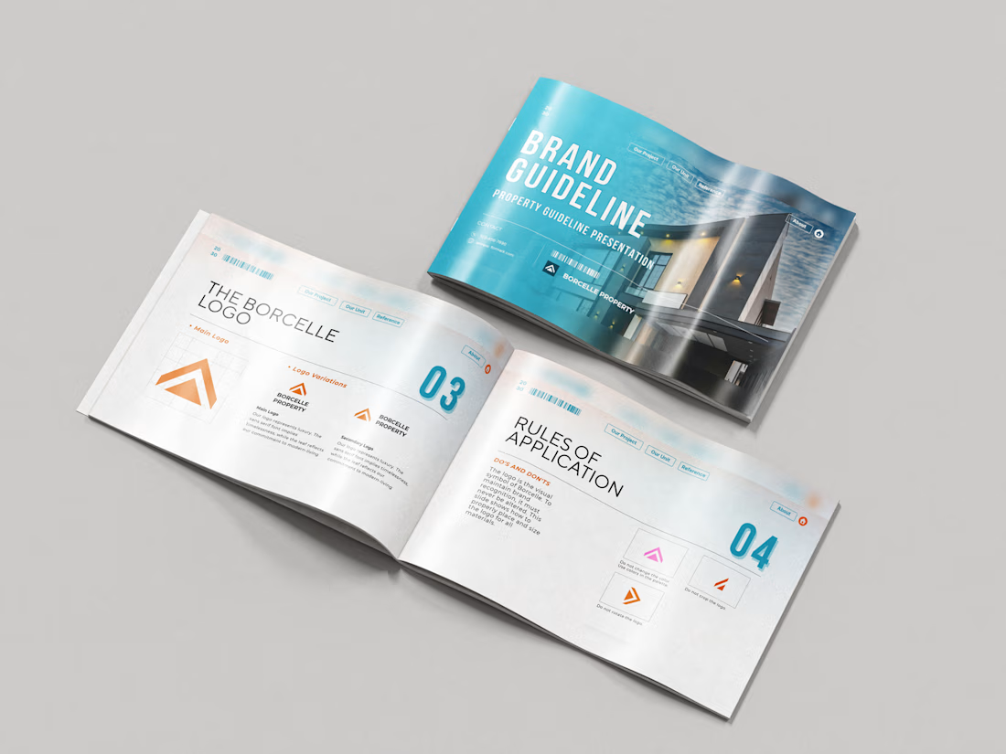
Just wrapped a brand identity concept for Haven Ridge Properties, a real estate developer selling to first-time buyers and investors.
The challenge: feel premium without feeling cold.
The answer was two ideas shelter and growth.
The mark is a roofline that doubles as an upward arrow: home and long term value in one symbol.
What's inside the guidelines:
• Primary and secondary logo lockups
• Logo usage rules
• Typography system
• Colour palette with clear roles
• Imagery direction
• Digital and print applications
Which detail stands out most to you?
#branding #brandidentity #logodesign #brandguidelines #realestate


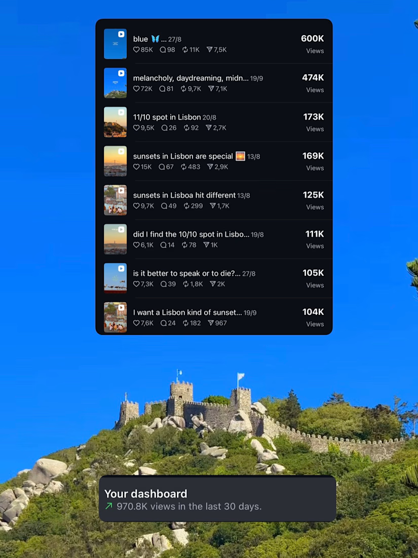
3 months of just posting what I like and apparently the algorithm likes it too


Nice!