The network for creativity
Join 1.25M professional creatives like you
Connect with clients, get discovered, and run your business 100% commission-free
Creatives on Contra have earned over $150M and we are just getting started
Back to feedPost

Archon — Architecture Studio Landing Page
Designing a bold digital identity for an architecture studio
Archon is a conceptual landing page for a contemporary architecture studio focused on creating spaces that balance light, time, form, and human experience.
The goal was to create a website that feels like an extension of the studio's architectural philosophy—not just a portfolio filled with project images.
The Challenge
Architecture portfolios often depend heavily on photography.
While strong imagery can communicate the quality of a project, I wanted to create an experience where the layout, typography, imagery, and interactions work together as part of the storytelling.
The main challenge was balancing three things:
Visual impact
The website needed to immediately communicate the studio's creative character.
Clarity
Visitors should quickly understand the studio's disciplines and capabilities.
Storytelling
The portfolio shouldn't feel like a simple gallery. It should guide visitors through the studio's philosophy and work.
The Design Direction
I approached the website like designing a physical architectural space.
Each section has a specific purpose and acts as a transition to the next part of the story.
The visual language combines:
Editorial typography
Architectural photography
Strong geometric compositions
Generous whitespace
Minimal navigation
Muted architectural imagery
The result is a visual identity that feels contemporary, editorial, and architectural without becoming overly corporate.
Building the Experience
01 Establishing the Identity
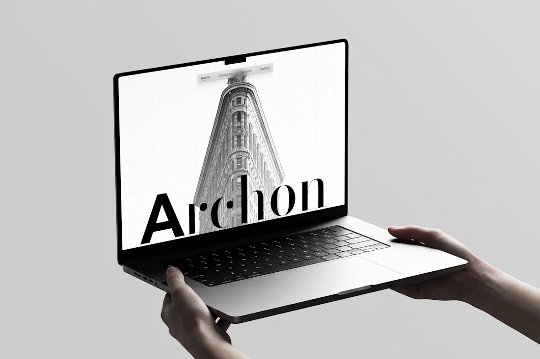
The hero section immediately introduces Archon through oversized typography layered over an architectural photograph.
Instead of using a traditional hero layout with a large headline and CTA, I treated the brand name almost like an architectural element.
The typography becomes part of the composition.
02 Introducing the Philosophy
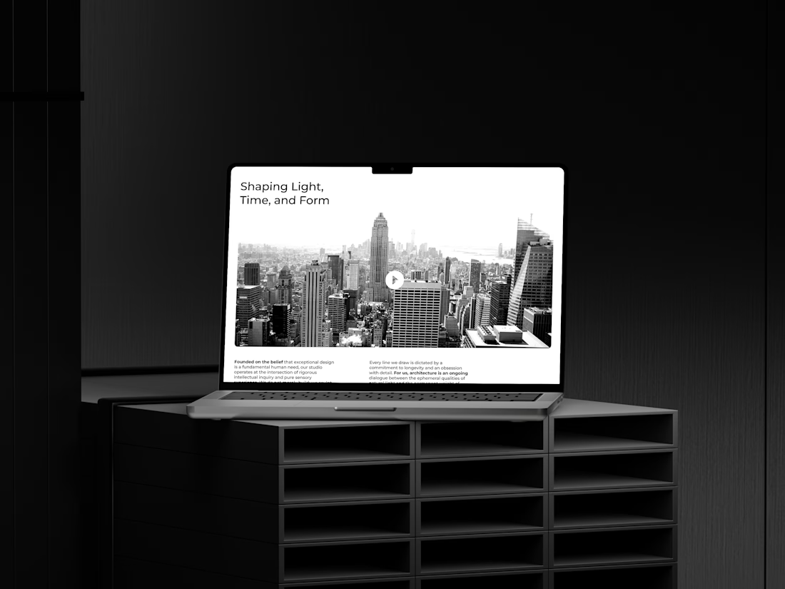
The next section introduces the idea behind the studio:
Shaping Light, Time, and Form
A large cityscape image establishes the studio's relationship with the built environment, while supporting copy explains its approach to architecture.
The goal was to make the introduction feel more like an editorial spread than a typical agency website.
03 Architectural Disciplines
The services section translates the studio's capabilities into three visual categories:
Residential Architecture
Commercial Architecture
Landscape Design
Rather than presenting services as a conventional text list, each discipline is paired with its own architectural imagery.
This makes the information easier to scan while keeping the visual storytelling intact.
04 Creating Human Connection
The Alliance section introduces testimonials through an experimental visual composition.
Large architectural forms become the background while testimonials float above them.
This section breaks the rhythm of the previous content and creates a more immersive moment in the experience.
05 Letting the Work Speak
The portfolio section intentionally uses large-scale imagery.
Instead of placing multiple small project cards on screen, the design gives each architectural image enough space to communicate its material, geometry, light, and atmosphere.
The photography becomes the primary content.
06 The Final Invitation
The final CTA uses a full-width architectural photograph with a simple message:
Let Us Build the Future You Inhabit.
The intention was to end the experience with a statement rather than another generic "Contact Us" section.
The CTA feels like a natural continuation of the studio's philosophy.
Visual System
Typography
Large display typography creates hierarchy and gives the website an editorial character.
The oversized Archon wordmark in the hero acts almost like a physical structure within the composition.
Color
The primary interface stays minimal and neutral, allowing architectural photography to dominate.
Cyan and orange are introduced selectively to create contrast and give the visual identity a more contemporary character.
Imagery
Architectural photography is treated as a core design element rather than decoration.
Images are selected based on:
Geometry → Light → Material → Composition
The User Journey
The page follows a simple narrative:
Identity
↓
Studio Philosophy
↓
Disciplines
↓
Social Proof
↓
Portfolio
↓
Call to Action
This creates a natural progression from "Who are they?" to "What do they do?", then finally to "Let's work together."

The network for creativity
Join 1.25M professional creatives like you
Connect with clients, get discovered, and run your business 100% commission-free
Creatives on Contra have earned over $150M and we are just getting started











Related posts

FOCUS — Creative Portfolio & Digital Art Website 🌸✨
A visually expressive website concept for a creative portfolio, built around digital art, bold imagery, and visual storytelling
The design combines vibrant pink tones, soft gradients, experimental typography, and immersive photography to create a distinctive editorial experience
Special attention was given to:
• Bold editorial hero composition
• Vibrant pink and dark color palette
• Experimental typography and visual details
• Immersive photography and digital artwork
• Creative project gallery and navigation
• Responsive mobile experience
• Clean layouts with a strong visual identity
The result is an expressive digital experience that puts creativity, emotion, and visual storytelling at the center of every screen 💗
Looking to create a standout portfolio or website for a creative brand? Let’s connect 🚀





The vibrant pink against the dark palette gives this such a bold editorial feel. The experimental typography is the star here.

A little peek at the brand work we did for Elio Mortgage.
A warm, approachable identity full of warm vibrant colors paired with soft sun rising inspired gradients, inner glows and custom illustrations & more. Loved this direction!
Full case study coming soon, from process to final identity.
Plenty of logo explorations to share too!


That color palette takes the whole identity to a different level!! I loove it.

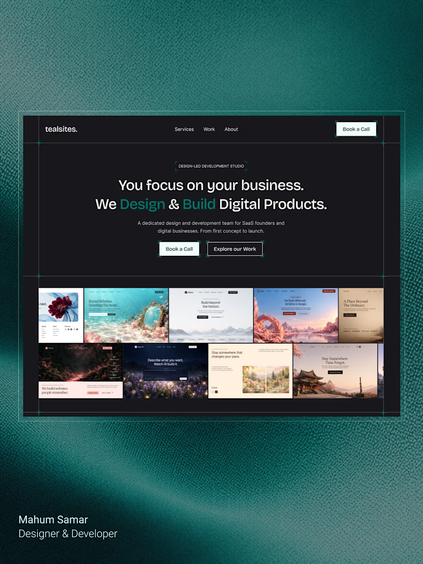
Final hero section for TealSites, a web design & development agency.
Designed in Figma.
The thinking behind the design was simple:
Clear messaging that communicates the agency's value right away.
A project showcase directly below the headline, letting the work speak for itself.
Subtle grid lines, corner brackets, and teal accents to create a distinct visual identity.
Two clear CTAs, one for potential clients ready to connect and another for those who want to explore the work.
The goal was to balance visual appeal with clarity, structure, and usability.
Clean design, thoughtful details, and a clear purpose behind every element.
What do you think?

Excellent