The network for creativity
Join 1.25M professional creatives like you
Connect with clients, get discovered, and run your business 100% commission-free
Creatives on Contra have earned over $150M and we are just getting started
Back to feedPost

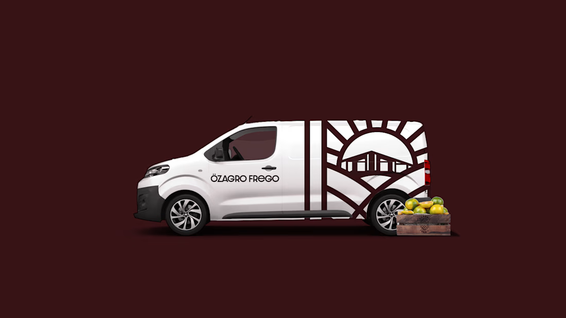
Özagro Frego marks a new chapter in agricultural solutions. Launched in October 2023, we created a lasting and versatile identity that conveys trust and innovation built to scale across every touchpoint.
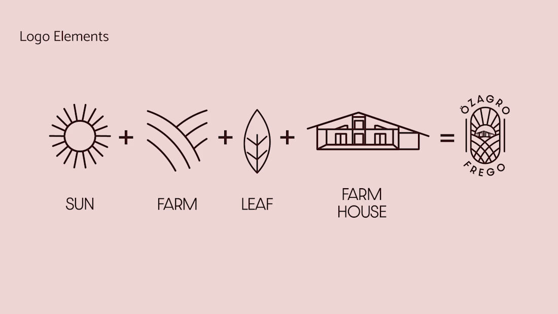
The visual story is based on authenticity. The central farmhouse icon is not a generic stock image but a stylized version of Özagro Frego’s actual guest house in Tekirdağ. This detail links the brand identity to its physical roots, fostering a personal connection between the company and its heritage.
I crafted the logo to serve as a visual metaphor for the agricultural cycle.
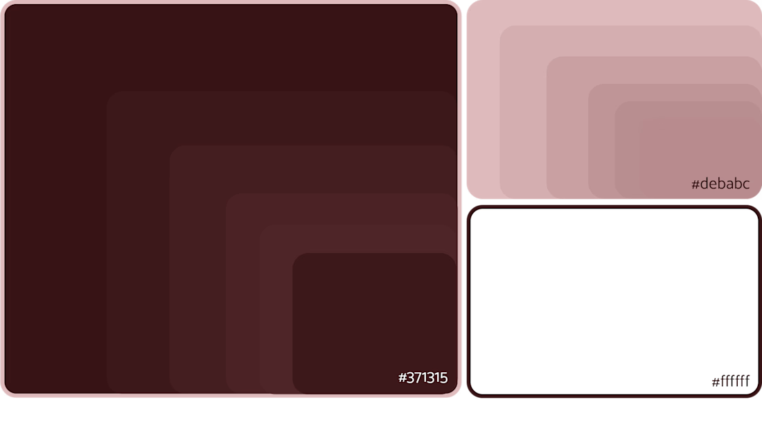
Instead of the usual “eco-green” clichés, I chose deep Dark Brown as the primary brand color. This choice represents the soil itself, the foundation of agriculture. It highlights the brand’s reliable nature and emphasizes the organic source of its products.


The network for creativity
Join 1.25M professional creatives like you
Connect with clients, get discovered, and run your business 100% commission-free
Creatives on Contra have earned over $150M and we are just getting started



Related posts


The little green dot moving through the grid is so satisfying

Are you still designing Brand Guidelines presentations from scratch?
I created this Mini Brand Guidelines template as a modular, editorial-style system built to help designers and studios present brand identity work with structure and clarity in no time.
Whether you’re delivering a new identity to a client or documenting internal brand assets, this template provides a confident, consistent framework.
Tap the link above to get it.

Clean and smooth, love it

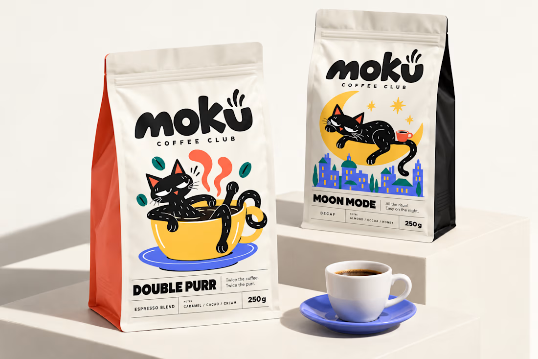
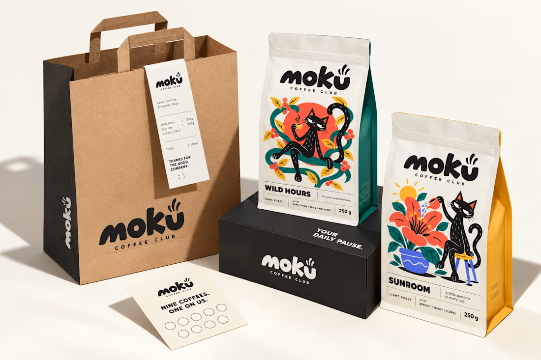
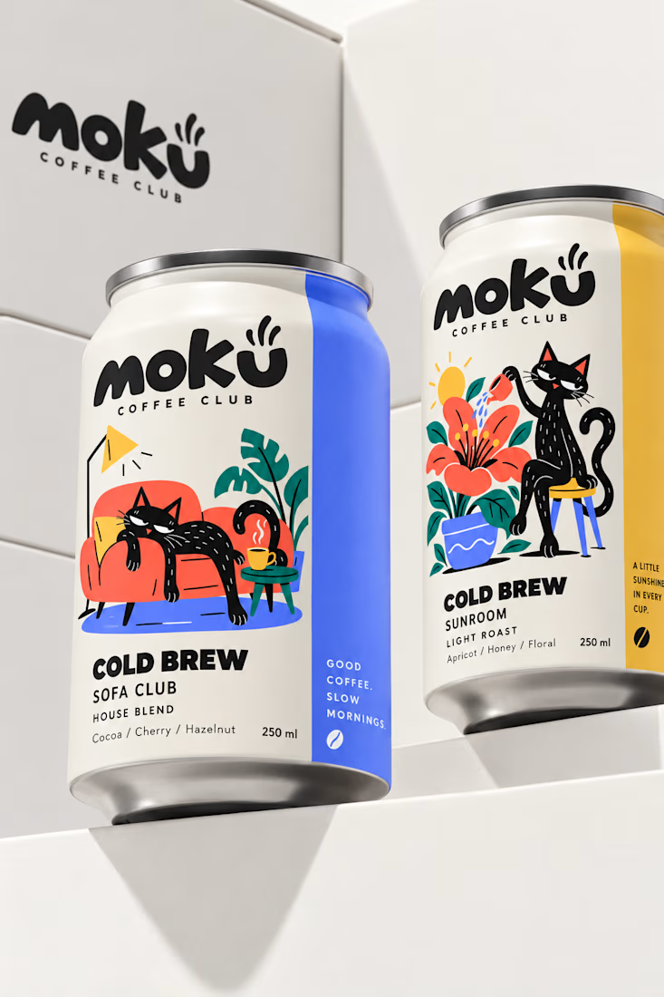
What if coffee packaging had a personality? 🐾
I designed Moku’s whole world, from bags and cold brew cans to drip packs and cups, around a cat who’s always having a better day than you.
See the full project and let me know what you think!

Woow Jerin that's stunning🔥🔥
The colors was so vibrant that's unbelievable