
Shipped my first commercial After Effects plugin: Comp Resizer.
It resizes any composition to any aspect ratio. Presets, Fill/Fit/Stretch modes, pixel-precise alignment without touching a single layer by hand. It also does something I couldn't find in any other resize tool: reframes 3D layers without distortion, using a camera-based method I built for it.
Built it because I was tired of rebuilding the same comp five times for five deliverables.
Live now on Adobe's Creative Cloud Marketplace, Contra, and Gumroad →
https://exchange.adobe.com/apps/cc/205590/compresizer
https://aliazem.gumroad.com/l/compresizer?layout=profile
1
134
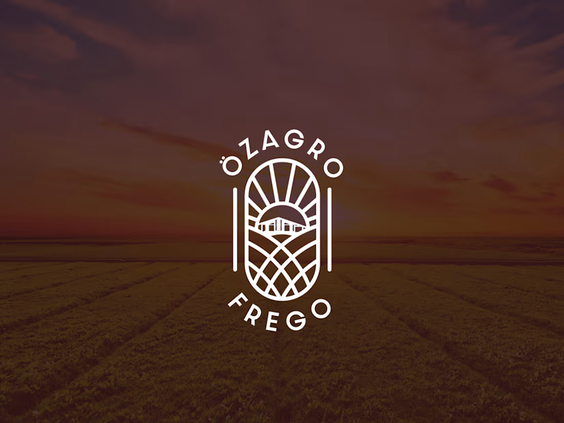
Özagro Frego marks a new chapter in agricultural solutions. Launched in October 2023, we created a lasting and versatile identity that conveys trust and innovation built to scale across every touchpoint.
The visual story is based on authenticity. The central farmhouse icon is not a generic stock image but a stylized version of Özagro Frego’s actual guest house in Tekirdağ. This detail links the brand identity to its physical roots, fostering a personal connection between the company and its heritage.
I crafted the logo to serve as a visual metaphor for the agricultural cycle.
Instead of the usual “eco-green” clichés, I chose deep Dark Brown as the primary brand color. This choice represents the soil itself, the foundation of agriculture. It highlights the brand’s reliable nature and emphasizes the organic source of its products.
1
83
Leading Therabody's expansion into the Turkish market, I led the effort to localize the brand's social media presence. The goal was to build a culturally attuned visual identity that resonated with local audiences while maintaining strict alignment with Therabody's global image.
Theragun’s percussive therapy sends waves through muscle tissue and the visual language mirrors that. Waveform shapes and flowing gradients run through every layout, translating the device’s physical impact into a design system that moves the same way the product does.
In order to create a work consistent with the brand’s global corporate identity, I set Therabody’s global corporate identity as a guide for myself and used the color palette and corporate font in the localization. For localized flair, I leaned on subtle gradient highlights in headlines to emphasize flow and dynamism. This system has been scaled efficiently from digital to print for a unified brand experience.
1
64

I executed the visual localization of Kaspersky's social media presence in Türkiye by connecting the global brand standards with the dynamics of the local market. The main goal was to develop a design language that would organically feel native in the Turkish digital landscape, while strictly following the international identity guidelines of Kaspersky.
Anchored by Kaspersky’s core elements, the signature hexagonal motif, a specific corporate color palette, and Midori, the brand mascot, these assets served as visual connectors that would ensure, whether technical or humorous, a post was instantly recognizable as Kaspersky.
1
58