The network for creativity
Join 1.25M professional creatives like you
Connect with clients, get discovered, and run your business 100% commission-free
Creatives on Contra have earned over $150M and we are just getting started
Back to feedPost

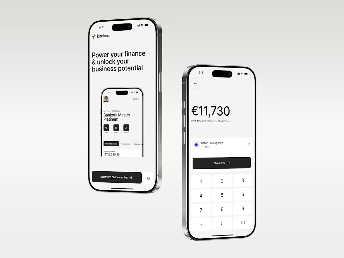
Business banking is already complex. The product shouldn’t make it feel even harder.
That was the thinking behind Bankora.
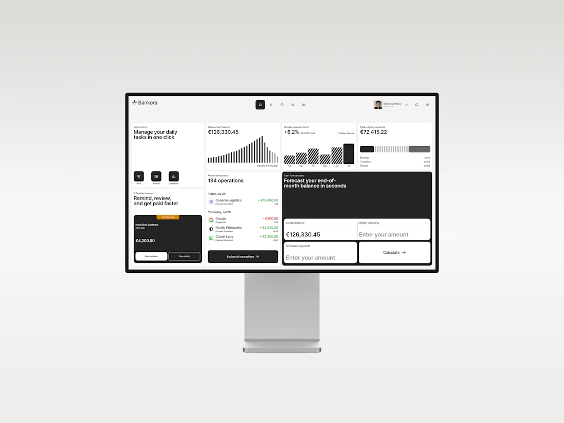
Payments, invoices, cash flow, financial overview. These are things business teams deal with constantly, yet many banking products still bury simple actions under dense data, long paths, and complicated navigation.
So I started with the workflows, not the screens.
I looked at the tasks people need to complete most often, where unnecessary steps appear, and what information actually needs attention first.
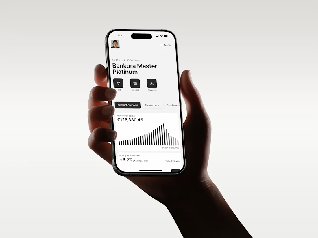
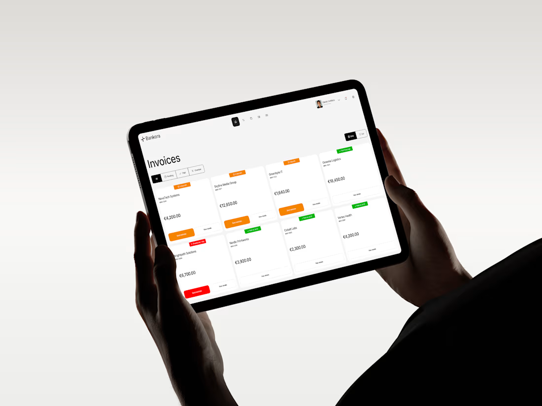
From there, I built the experience around clearer priorities: key actions available quickly, predictable navigation, structured financial data, and modular UI that makes things like pending and overdue invoices easier to understand at a glance.
I also designed an interactive cash flow calculator to help users see where the business may be heading, not just what has already happened.
The goal wasn’t to make financial operations simpler than they really are.
It was to make interacting with them feel simpler.
Less searching. Less cognitive load. More confidence in what to do next.
And it was especially nice to see Bankora later featured by Contra.
The network for creativity
Join 1.25M professional creatives like you
Connect with clients, get discovered, and run your business 100% commission-free
Creatives on Contra have earned over $150M and we are just getting started
Related posts

Back to reality..
In this era of AI, understanding UX should be a must-have skill for every designer, not just a bonus.
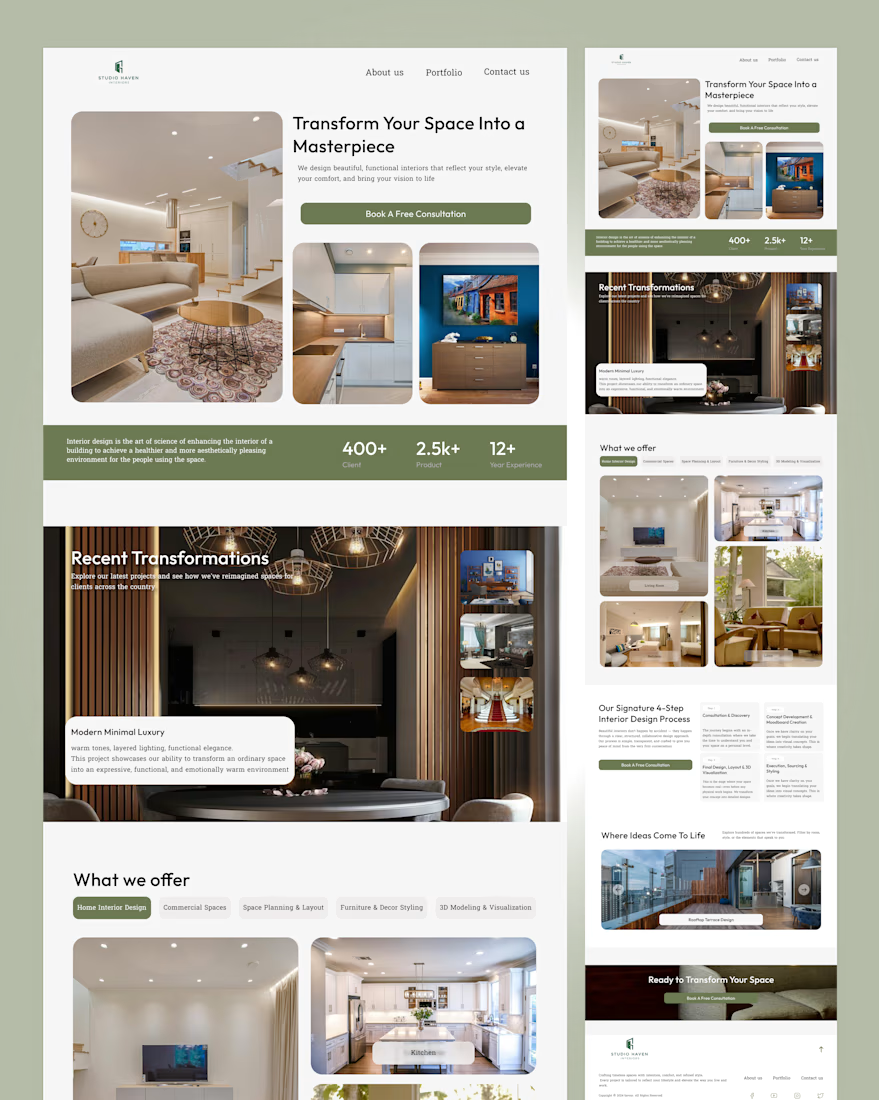
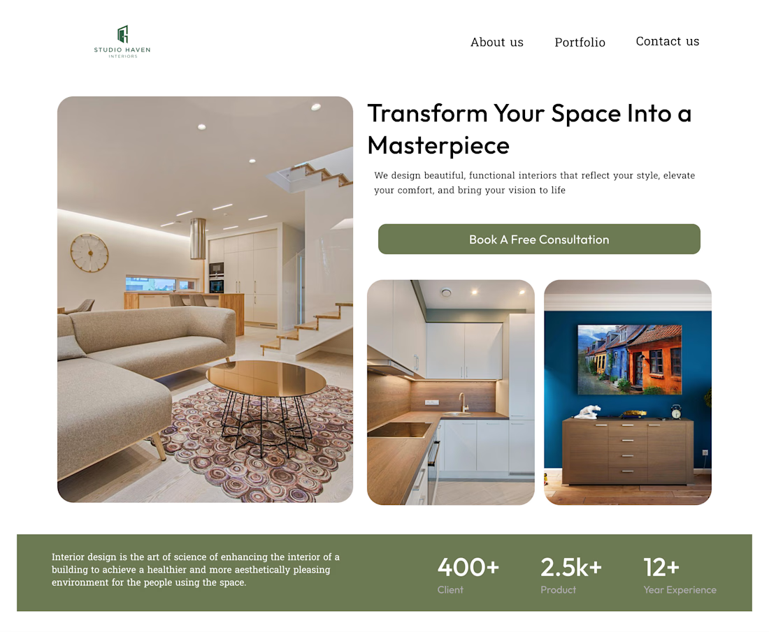
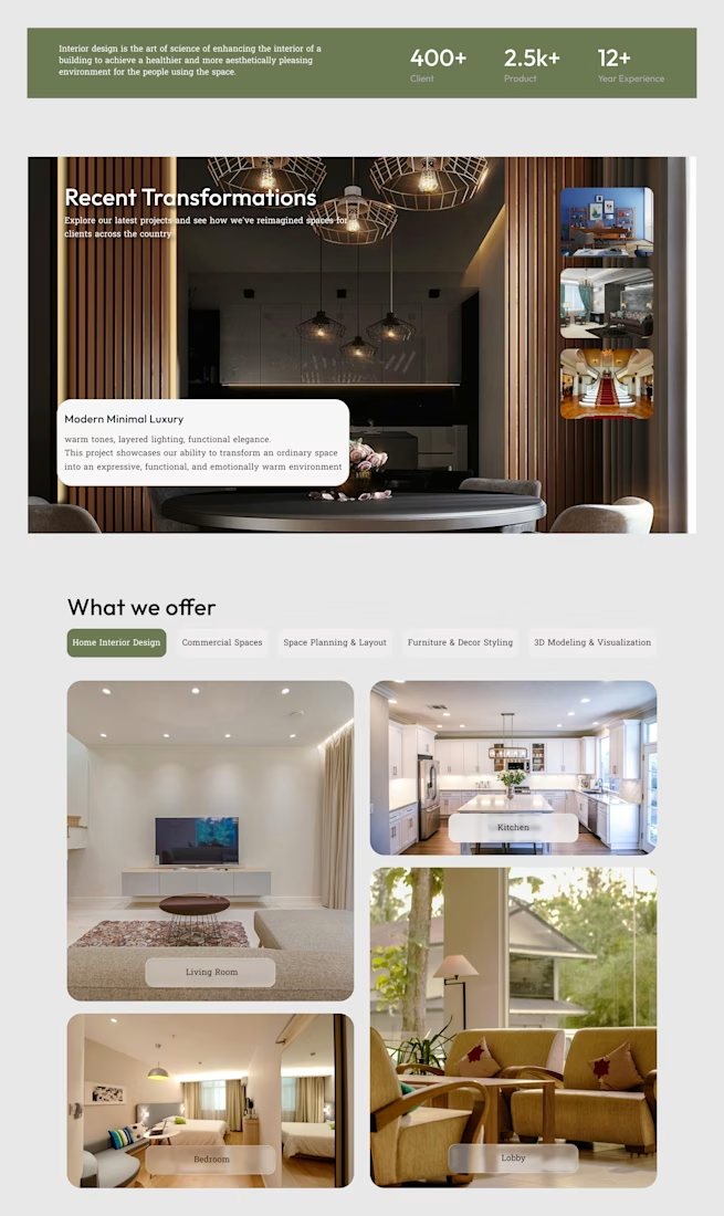
Here's a peek at my Studio Haven website design.

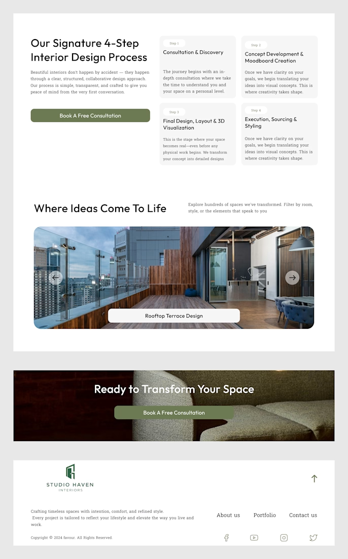

Completely agree that UX shouldn't be a bonus skill anymore, especially now that anyone can generate a good-looking layout in minutes. The thing that still sets a site apart is how clearly it guides someone from the first scroll to the action you want. Nice peek at Studio Haven,...

Serious numbers, calm design.
512Financial is an Austin-based firm that steps in as the finance, HR and hiring team growth-stage companies don’t have yet. Their world is board meetings, due diligence and funding rounds, which can feel heavy and intimidating for founders.
My goal with the website was to make it feel the opposite: clear, steady and human. Deep green tones, lots of breathing room, and a “Readiness by Stage” section that lets every founder find their next step in seconds, from Seed to Series B and beyond.
Live now: 512financial.com


The Readiness by Stage section is a smart conversion move. Founders self-qualify before they even book a call.

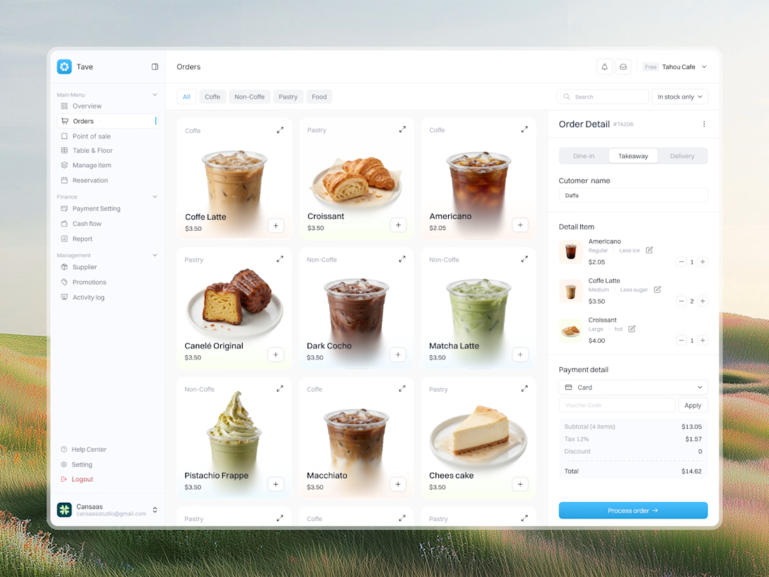
Tave is a modern Coffee Shop POS System designed to make order management, product selection, and payment processing faster and more intuitive. The interface combines a clean product catalog, high-quality food and beverage photography, category filters, customizable orders, and a streamlined checkout panel in one organized workspace. With minimalist light-mode UI, soft pastel accents, clear typography, and intuitive navigation, Tave brings a refreshing approach to café management and point-of-sale dashboard design.
📩 Collaborate with Us? Contra Cansaas Agency