The network for creativity
Join 1.25M professional creatives like you
Connect with clients, get discovered, and run your business 100% commission-free
Creatives on Contra have earned over $150M and we are just getting started
Back to feedPost
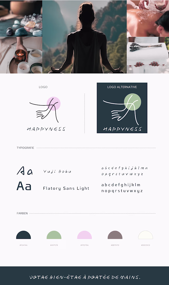
A visual identity designed for a contemporary wellness brand rooted in calm, balance, and human connection.
The concept explores the idea that well-being is something tangible — something we can literally hold in our hands. The logo symbol illustrates two hands gently meeting, suggesting care, trust, and support. The organic line evokes softness and fluidity, inspired by body movement in yoga and therapeutic gestures.
The visual language blends minimalism with warmth. Soft pastel tones and natural shades create a calming atmosphere inspired by spa rituals, meditation spaces, and holistic therapies.
The typographic pairing combines a handwritten expressive font with a modern sans-serif typeface, balancing emotion and clarity. This contrast reflects the brand philosophy: human, sensitive, yet contemporary and professional.
The network for creativity
Join 1.25M professional creatives like you
Connect with clients, get discovered, and run your business 100% commission-free
Creatives on Contra have earned over $150M and we are just getting started
Related posts
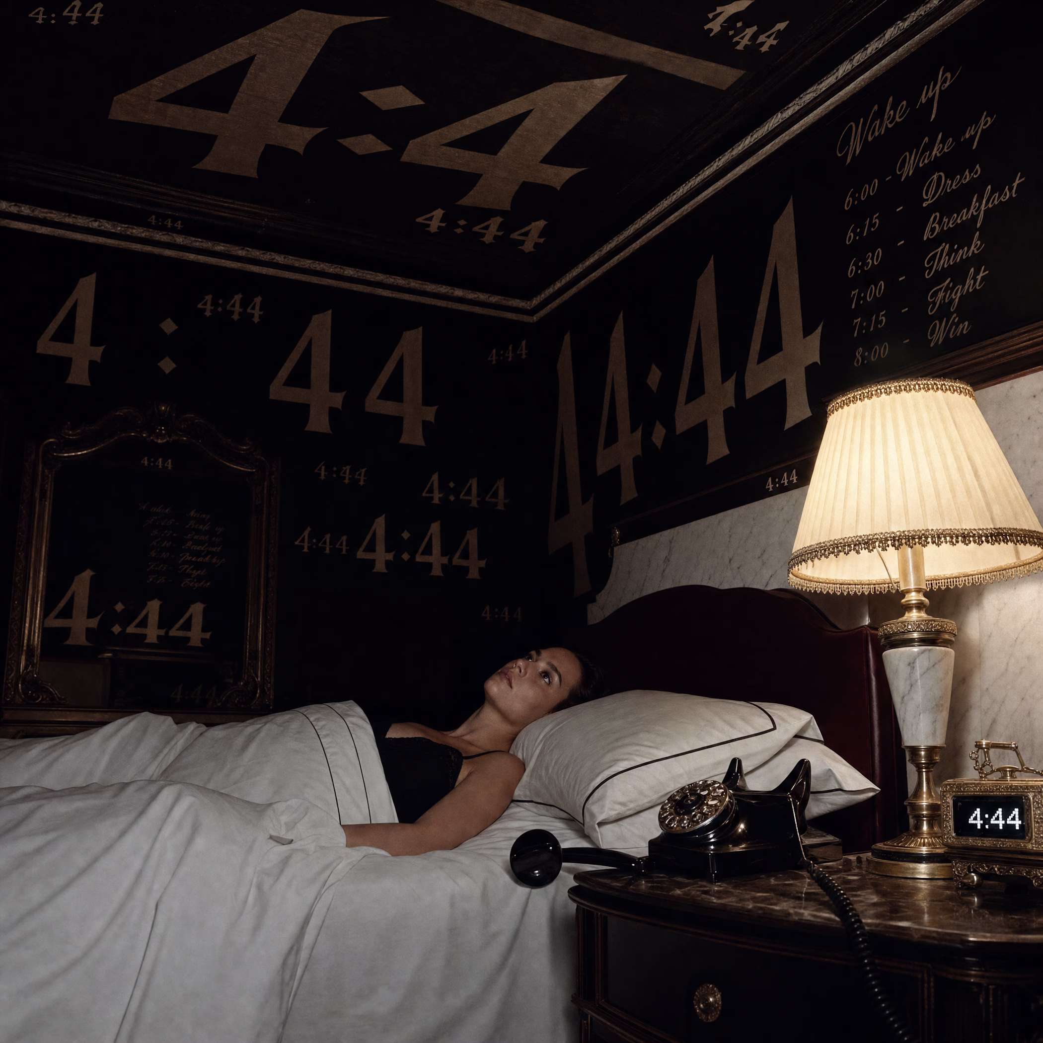
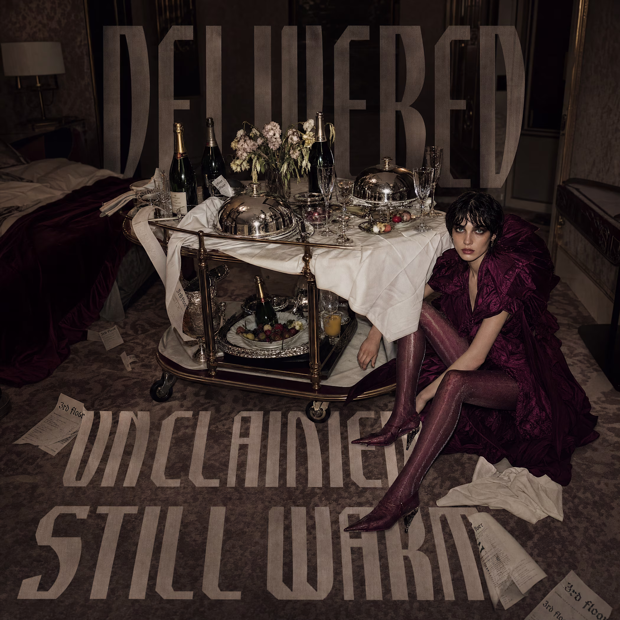
3rd floor, a fashion house that lives inside a grand hotel operating without guests. 30 campaigns, a merch line, a website.
This one matters to me more than most.
The website is live: Enter the hotel
obsessed.
😊 Can't wait to see what everyone's building.
this is will fun and kreative
FlowGen AI build in Framer.
A modern, conversion-focused AI landing experience designed and developed in Framer. Built with a strong emphasis on clean visual hierarchy, refined interactions, and performance-driven UI.
Crafted to feel premium, intuitive, and product-ready from the first interaction.
Check it out
Great work🔥👏👏
Challenges
View allTrending
Claude
Claude has entered the design space. How are you using Claude Design?
Contra University
Learn from expert creatives how to earn more using next-gen AI tools.
MagicPath
The canvas is infinite, and exploration is becoming the workflow. How are you using MagicPath?
creativeaiflow
Creative AI workflows are evolving. What tools do you use, and what are their strengths and weaknesses?
freelancerlife
Freelancer life is wins, pivots, and everything in between. What’s yours right now?
