The network for creativity
Join 1.25M professional creatives like you
Connect with clients, get discovered, and run your business 100% commission-free
Creatives on Contra have earned over $150M and we are just getting started
Back to feedPost

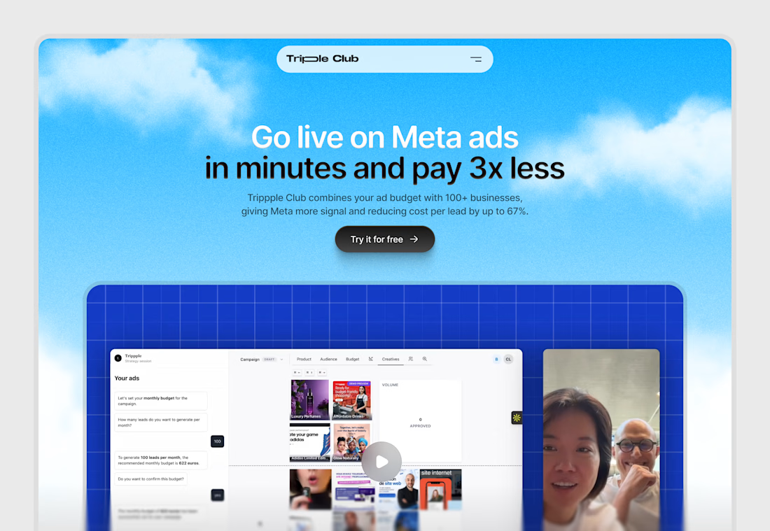
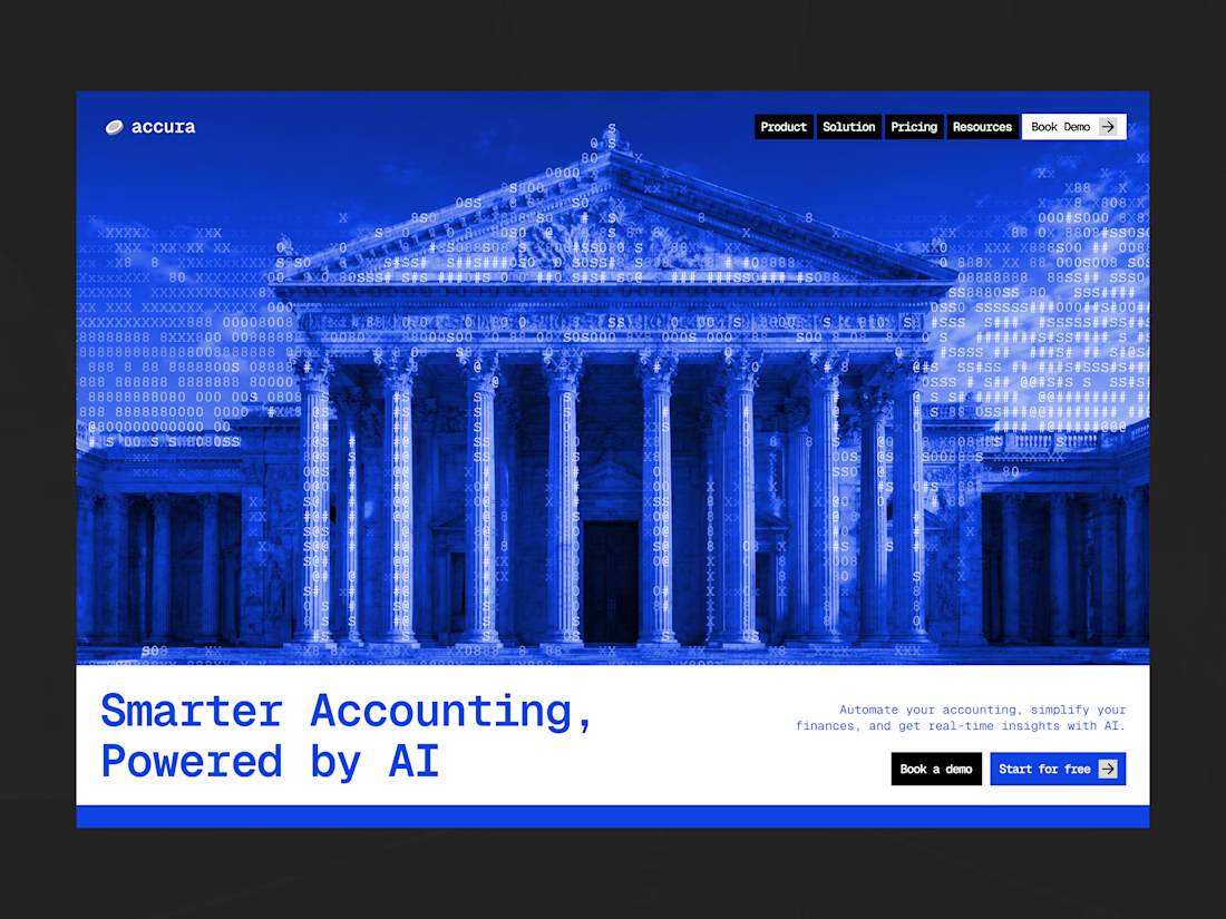
Hero redesign exploration for a website

Nice work

One of the best designs I’ve seen today. Really solid work 👏 keep pushing.
The network for creativity
Join 1.25M professional creatives like you
Connect with clients, get discovered, and run your business 100% commission-free
Creatives on Contra have earned over $150M and we are just getting started











Related posts



Great job Fairs 🎉🎉🔥🔥

Redesigned the loading screen of my portfolio ✨ I wanted the first second of the site to feel like an introduction, not a wait.
→ An "SS" monogram drawn inside an amber ring with an orbiting dot
→ My name types itself out in serif italic, with a blinking cursor
→ A terminal-style status line: "Loading Sujay's story..."
→ It flows straight into the hero, where a code window types new Developer() and the stats count up
Warm near-black, a single amber accent, and serif + monospace type, because my work sits between design and code. Live at sujay-singh.vercel.app

We're starting a little experiment at ideapeel.
10 YC startups. 10 website redesigns.
Over the next few weeks, we're picking recently funded Y Combinator startups and looking at their websites through a product and conversion lens.
Not just:
“How can we make this look better?”
But:
Is the product immediately clear?
Does the hero communicate why it matters?
Is the hierarchy helping or slowing people down?
Does the visual direction fit the product?
And is the next step obvious?
For some, we'll redesign the hero.
For others, it might be positioning, product storytelling, UX, or the conversion path.
And sometimes, the right answer might be that we wouldn't change much at all.
We'll share the original, what we noticed, what we'd change, and why.
YC Redesign 01 coming next.
Which YC startup should we put on the list?