The network for creativity
Join 1.25M professional creatives like you
Connect with clients, get discovered, and run your business 100% commission-free
Creatives on Contra have earned over $150M and we are just getting started
Back to feedPost
Taste Test




i love the lavender / blue combo! not to mention, the color contrast doesn't clash at all, especially thanks to that violet exclamation point. it feels calming, mindful, & friendly.
Thank you, Nicolette. As always, a very insightful and valuable observation.


the illustration one, feels more human
Thanks, Nazar

Went with Option 2 mentally before even reading the caption, the teal feels calmer for a healthcare context. Did Jane give a reason for testing both, or was this purely your gut check?
Mary, That's the character's name. But to answer your question, it's more of our desire.

Thanks, Alina for so detailed opinion
Go ahead

Option 2 for me
Thanks 🙏
The network for creativity
Join 1.25M professional creatives like you
Connect with clients, get discovered, and run your business 100% commission-free
Creatives on Contra have earned over $150M and we are just getting started
Trending
retrofuturism
Share your favorite designs from the past exploring the distant future. Or your own take on the aesthetic 🚀
halftone
Dots. Texture. Grain. Let's see your designs using the halftone technique.

Midjourney
Creatives are showing off what they're making with Midjourney.
colorgrade
Video editors sound off: How do you enhance the mood of your video in color grading?
Related posts

Hero A vs Hero B. Same real estate concept, small but deliberate differences. Vote below and tell me why.
1 voted
20%

4 voted
80%

5 votes
Closed

B has more clarity

Which design looks better to you — Left or Right? 👀
I’d really appreciate your honest feedback. Please vote and let me know which one you prefer!
0 voted
0%

7 voted
100%

7 votes
Closed


The hero sets the tone for the whole page.
Exploring a couple of ways to get it right.
38 voted
68%

18 voted
32%
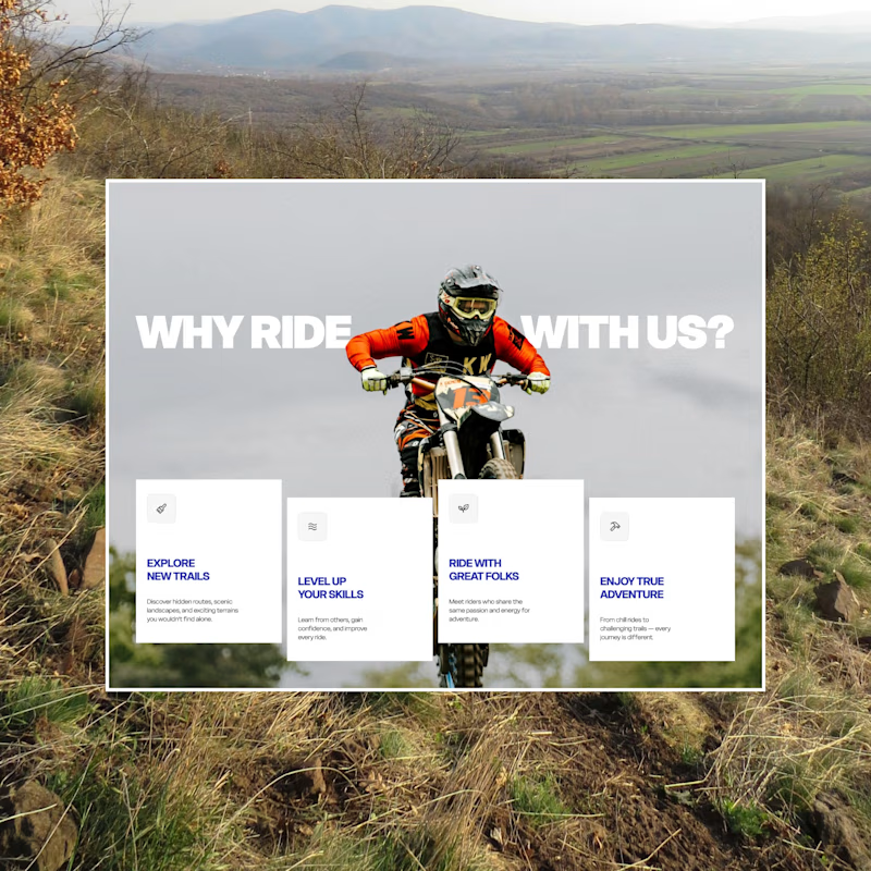
56 votes
Closed
I can go with A