The network for creativity
Join 1.25M professional creatives like you
Connect with clients, get discovered, and run your business 100% commission-free
Creatives on Contra have earned over $150M and we are just getting started
Back to feedPost

Migrating a live product to a monorepo taught me more than any tutorial did
A few months back I inherited a codebase where the web app, mobile app, and backend all lived in separate repos separate configs, separate CI pipelines, separate everything. Every shared type or util got copy-pasted (and drifted) across all three.
We moved it into a Turborepo monorepo. Here's what actually mattered, in order:
Shared types first, shared UI later. The moment our API types and mobile types came from one source, an entire category of "why is prod broken" bugs disappeared.
CI pipeline changes hurt more than code changes. Rebuilding GitLab CI to only test/build what actually changed (not the whole repo every time) saved us more engineering hours than any refactor did.
Docker + monorepo is a trap if you do it lazily. Getting image builds scoped to the right package instead of shipping the whole workspace was the difference between a 40-second build and a 6-minute one.
None of this shows up in a portfolio screenshot. But it's the stuff that actually separates "can build features" from "can own a system."
Curious what others have run into , anyone else made this jump from polyrepo to monorepo, and did it actually pay off for your team?


The network for creativity
Join 1.25M professional creatives like you
Connect with clients, get discovered, and run your business 100% commission-free
Creatives on Contra have earned over $150M and we are just getting started

Challenges
View all


Related posts

did some home cleaning - works page is now my homepage
i've lost over 50% of traffic because people dropped off on my previous homepage (about now) that didn't give any value
check it out yourself: https://seb-astian.com


looking great! i love that loading animation.

When your landing Page is so goated that you no longer need a launch video.


Thats what a landing page do for you hahahaah

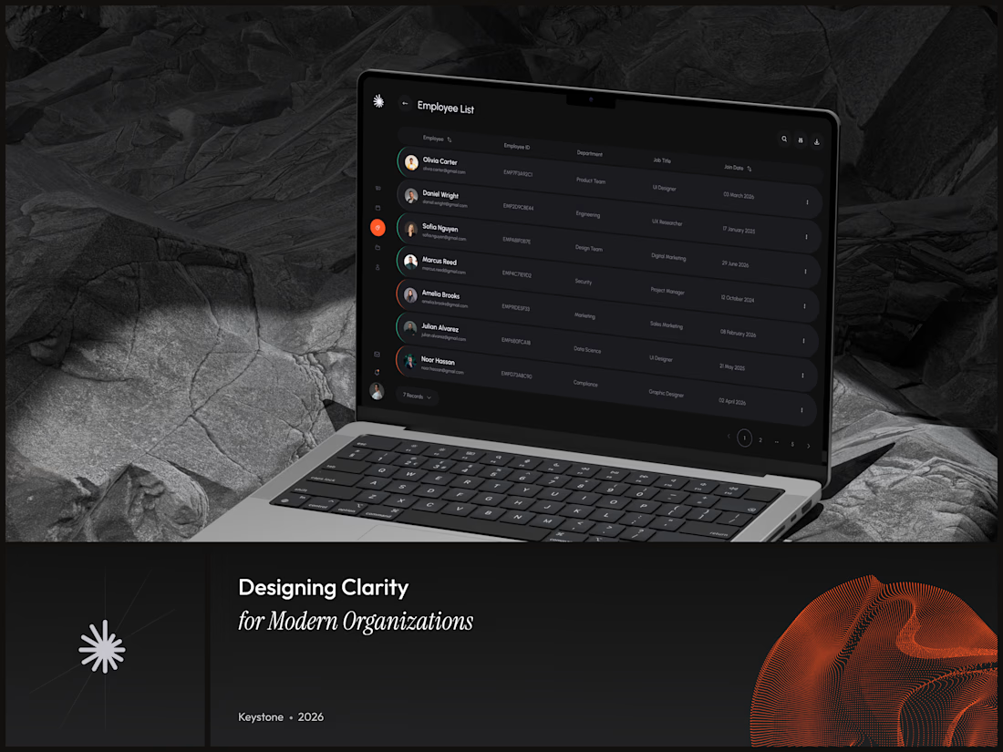
Keystone - HR Management Platform
Employee list screens are the homework assignment of SaaS design. A table is a table is a table. Nobody's winning an award for this view and that's exactly why it matters.
The restraint here is the point. No colored tags, no status badges fighting for attention, no dashboard widgets crammed into the sidebar. Just the data, breathing in a dark container with enough row spacing that your eyes don't blur at record five.
That split between a bold brand identity and a restrained product UI is one of the hardest things to get right in B2B SaaS.
#SaaS #DashboardDesign #DarkUI #B2BTech #ProductDesign

"A table is a table" is the harder argument to make internally than the design itself - most teams would've shipped colored status tags just to have something to show in a review.