The network for creativity
Join 1.25M professional creatives like you
Connect with clients, get discovered, and run your business 100% commission-free
Creatives on Contra have earned over $150M and we are just getting started
Back to feedPost
Primetube - Visual Identity for a Video Streaming Platform
When I started on Primetube, the brief was simple but sharp: this is a platform for real videos that pull users in — the brand needed to say that before a single word was read.
So I built the mark around one idea — merge the "P" with a play button. It's a small piece of visual logic, but it's the kind of detail that makes a logo feel inevitable once you see it, and forgettable if you don't nail it.


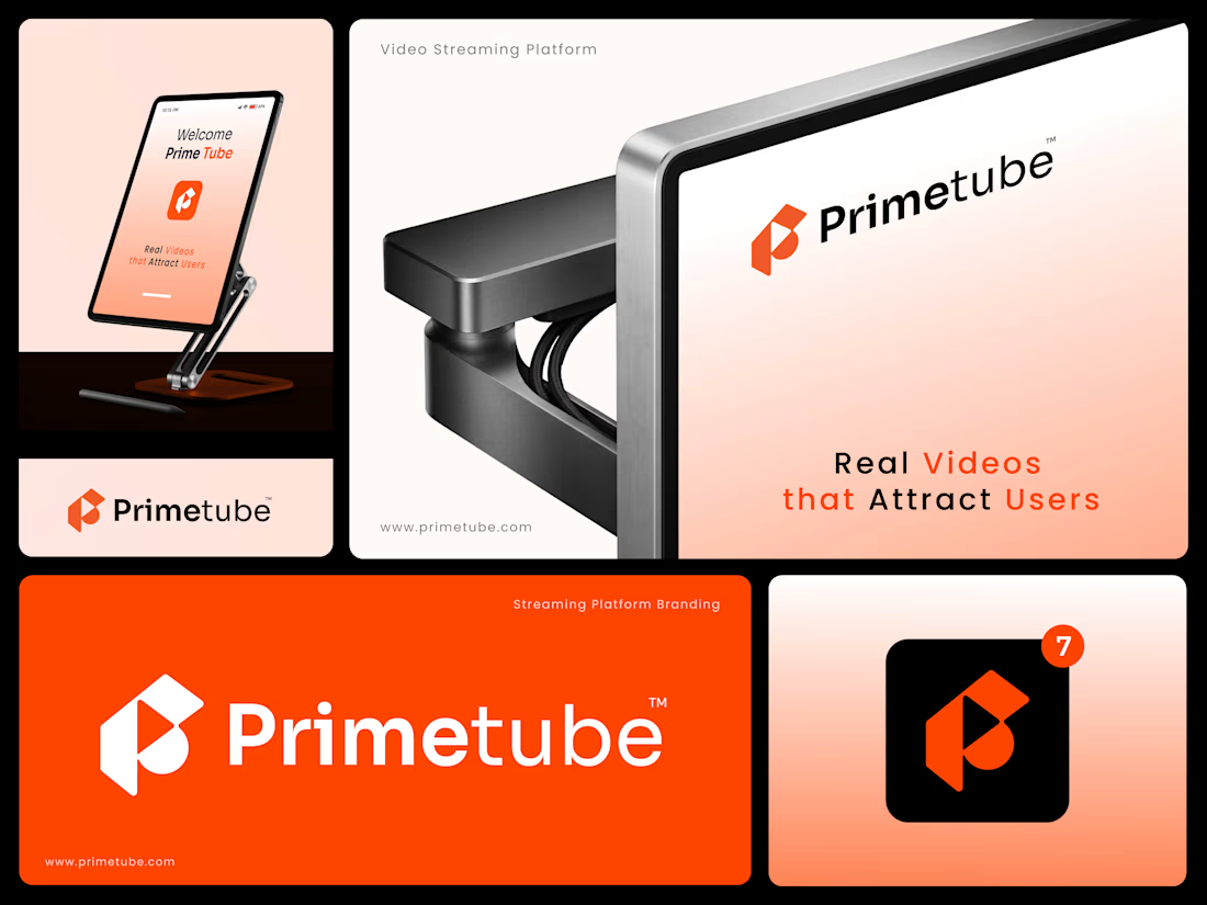


Color gradients and that orange looks very cool, the high quality hardware and clean logo system fitted reallybwell together. Good work!

Thank you.

The P-plus-play merge is a crowded corner of the map - half the streaming apps on a phone have some play triangle folded into a letter - so the thing that actually separates Primetube here is the app icon, where the cut-through counter gives it a shape the others don't have. If...
Appreciate the sharp read, Artur. You're right the triangle-in-a-letter space is crowded, that's exactly why the cut-through counter is the anchor here, not just a stylistic touch. It's meant to be the one thing that doesn't reduce to another play-shape logo.

Really impressive UGC project! 👏 I like how you turn product features into a clear, relatable customer experience while keeping the content authentic. As a Localization & Linguistic QA professional, I’d love to connect with creators and brands looking to adapt product content...
The network for creativity
Join 1.25M professional creatives like you
Connect with clients, get discovered, and run your business 100% commission-free
Creatives on Contra have earned over $150M and we are just getting started











Related posts

A flower that inflates arrives in the mail.
Next month, a phone made of shell.
STILL LIFE SERVICE. Case study dropping soon.
Which object earns your shelf? Reply below.
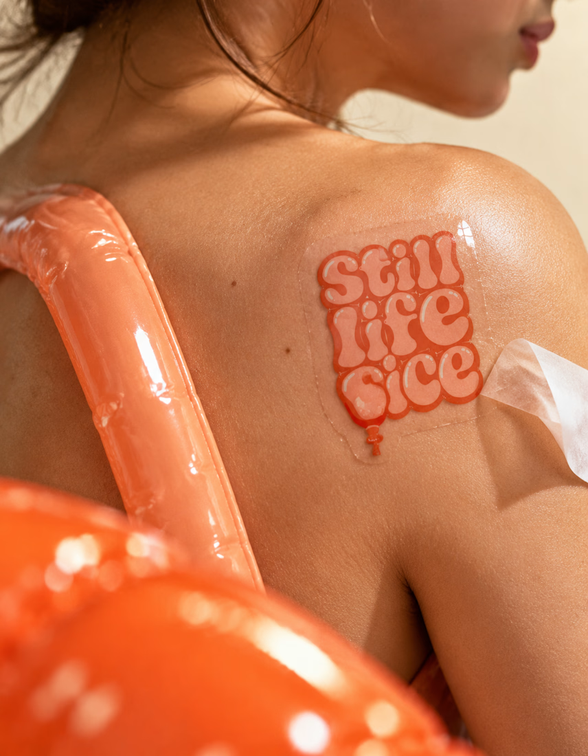
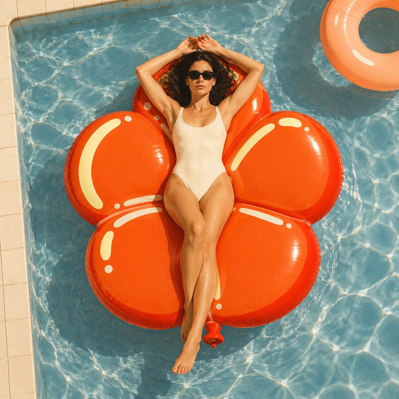
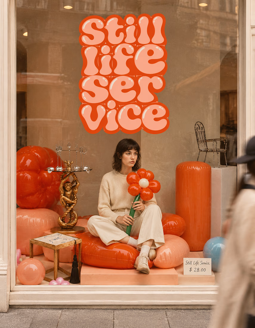

The inflatable flower. Only houseplant I'm guaranteed not to kill. Also, a new object every month is a sneaky good retention hook, people will stay subscribed just to see what's next.

Pulse Athletics... Branding & App design✨
Check it out
#app #sport #productdesign #uiuxdesign #uidesigner #uxdesigner #pulse #branding #brandidentity #brandstrategy #brandguidelines #logo #homepage

That's really stunning app design🔥🔥🔥
Great job Ziva🎉🎉🎉

Same design. Which palette? 👀
You picked your favorite preview last time. This time, I’m putting the colors to the vote.
One body-care packaging concept, with the same typography and composition:
A · Rose Cream, Strawberry Sorbet + Plum Jelly
B · Lime Mousse, Coconut Cream + Plum Jelly
Which would you choose and what does it make you feel about the brand?
Both palettes use colors and matching ingredient textures from DCS 654, my library of 654 dessert-inspired colors.
Take a closer look: dcs.mariya.design
7 voted
44%
9 voted
56%
16 votes
Closed
B is absolutely stunning 🎉🎉🎉🎉
Great job Mariya❤️


