The network for creativity
Join 1.25M professional creatives like you
Connect with clients, get discovered, and run your business 100% commission-free
Creatives on Contra have earned over $150M and we are just getting started
Back to feedPost

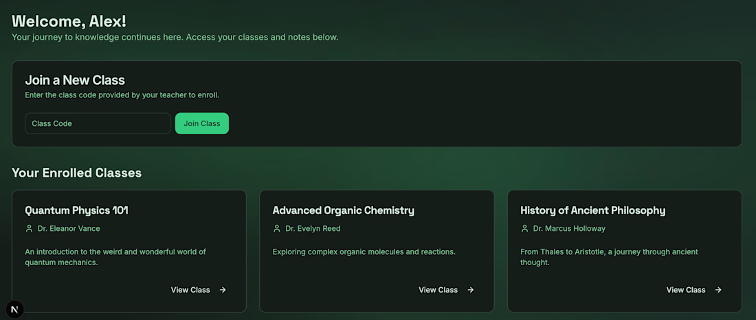
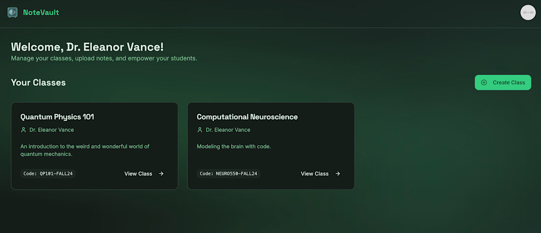
NoteVault – Product & Workflow System Design
Overview
NoteVault is a structured note and workflow management tool designed to improve clarity and task organization.
The Problem
Users struggle with fragmented knowledge management and lack of structured workflows.
My Role
• Defined product structure and core use-case positioning
• Designed onboarding flow for intuitive adoption
• Structured information hierarchy for usability
• Identified activation and retention triggers
Growth Perspective
• Focused on user activation within first session
• Reduced friction in setup and workflow creation
• Designed usage loops to encourage retention
• Aligned product features with long-term engagement
Skills Demonstrated
User Journey Mapping · Activation Strategy · Product Structuring · Workflow Optimization · Retention Thinking


The network for creativity
Join 1.25M professional creatives like you
Connect with clients, get discovered, and run your business 100% commission-free
Creatives on Contra have earned over $150M and we are just getting started











Related posts

sentences
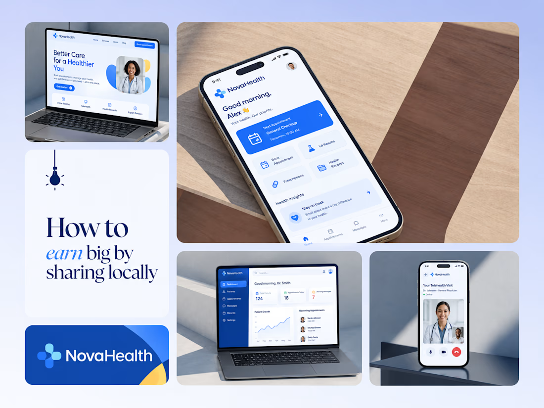
One brand, three screens: patient, doctor, and the video call between them.
NovaHealth is a healthcare brand and product system I designed from logo to apps. Healthcare software tends to feel either cold and clinical or too cluttered to open. I wanted something calm for a worried patient and quick for a doctor between appointments.
The logo breaks the classic medical cross into soft, rounded blocks in two blues, so it reads as “health” without feeling sterile.
The patient app opens with one thing: a solid blue card showing your next appointment. It’s the only fully saturated block on the screen, so nothing competes with it.
The doctor dashboard is built for a glance. Total patients, today’s appointments, and pending messages come first, in the same blue and rounded style as the patient app.
The telehealth screen has almost no UI. The doctor’s face fills the screen, with just three controls: mic, camera, and a red end-call button, the only red in the whole system.
One rule ties it together: blue means action, white space means calm, and yellow is a small spark of warmth.
Which screen should I break down next? 👇



Great medical brand design specially the phone app UI and top left laptop dashboard 🔥🔥🔥
great job Joshua ❤️🎉

Pulse Athletics... Branding & App design✨
Check it out
#app #sport #productdesign #uiuxdesign #uidesigner #uxdesigner #pulse #branding #brandidentity #brandstrategy #brandguidelines #logo #homepage


That's really stunning app design🔥🔥🔥
Great job Ziva🎉🎉🎉

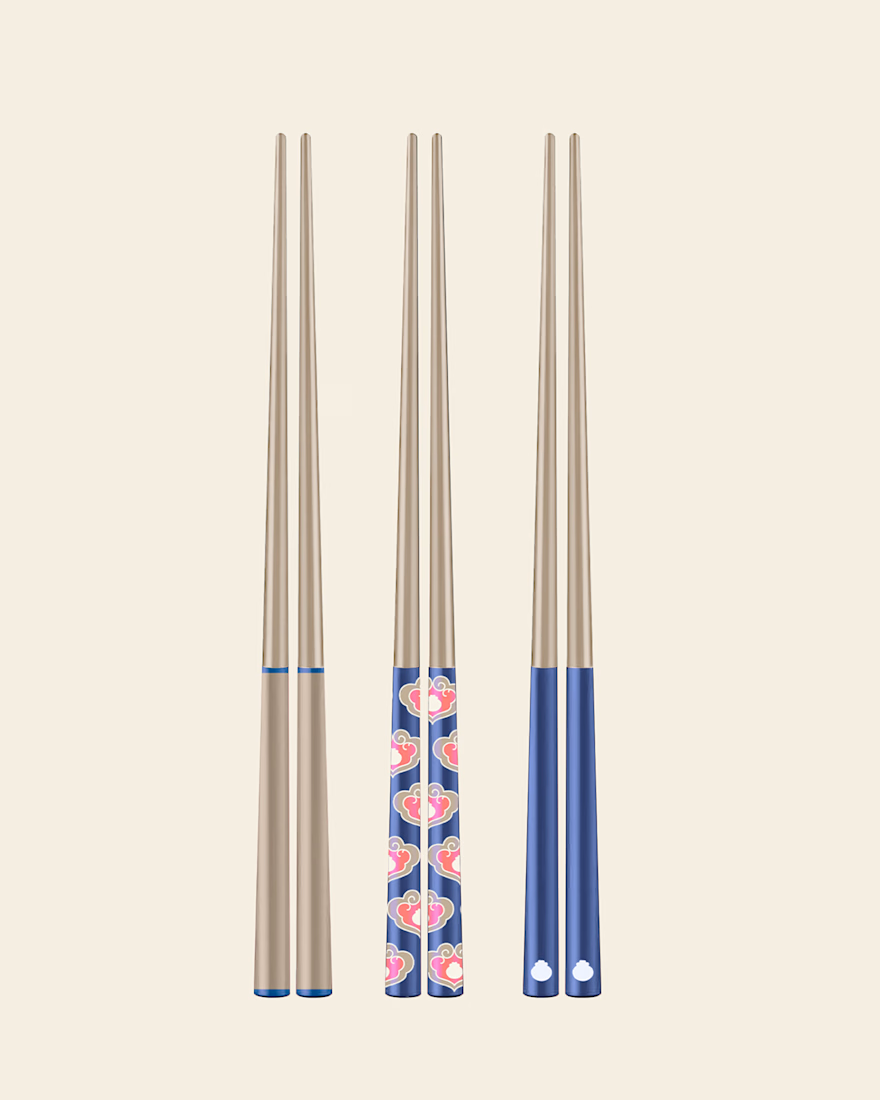
A closer look at The Art of Dining, a collection of original illustrations, decorative patterns, and product designs inspired by traditional Chinese dining culture
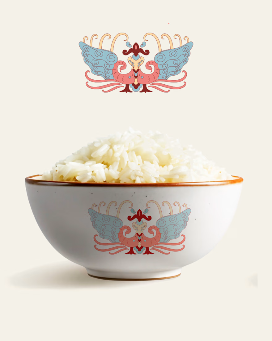
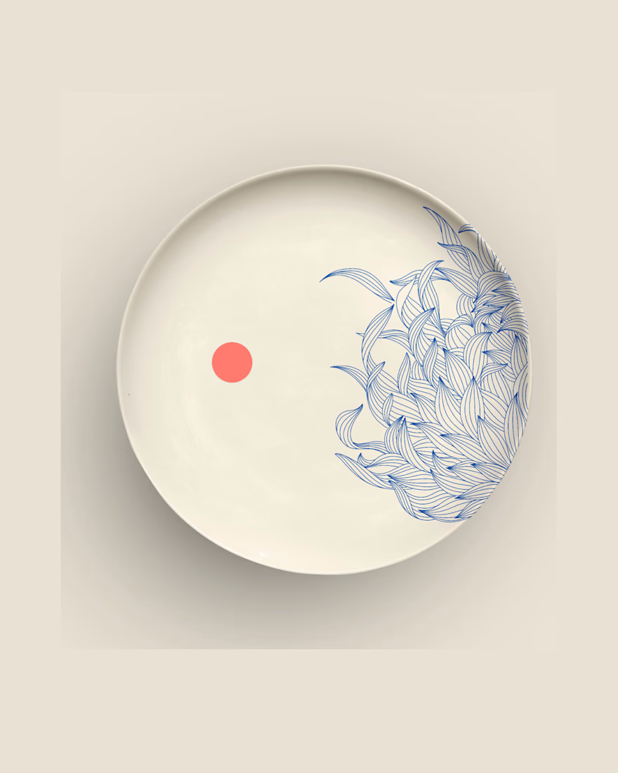
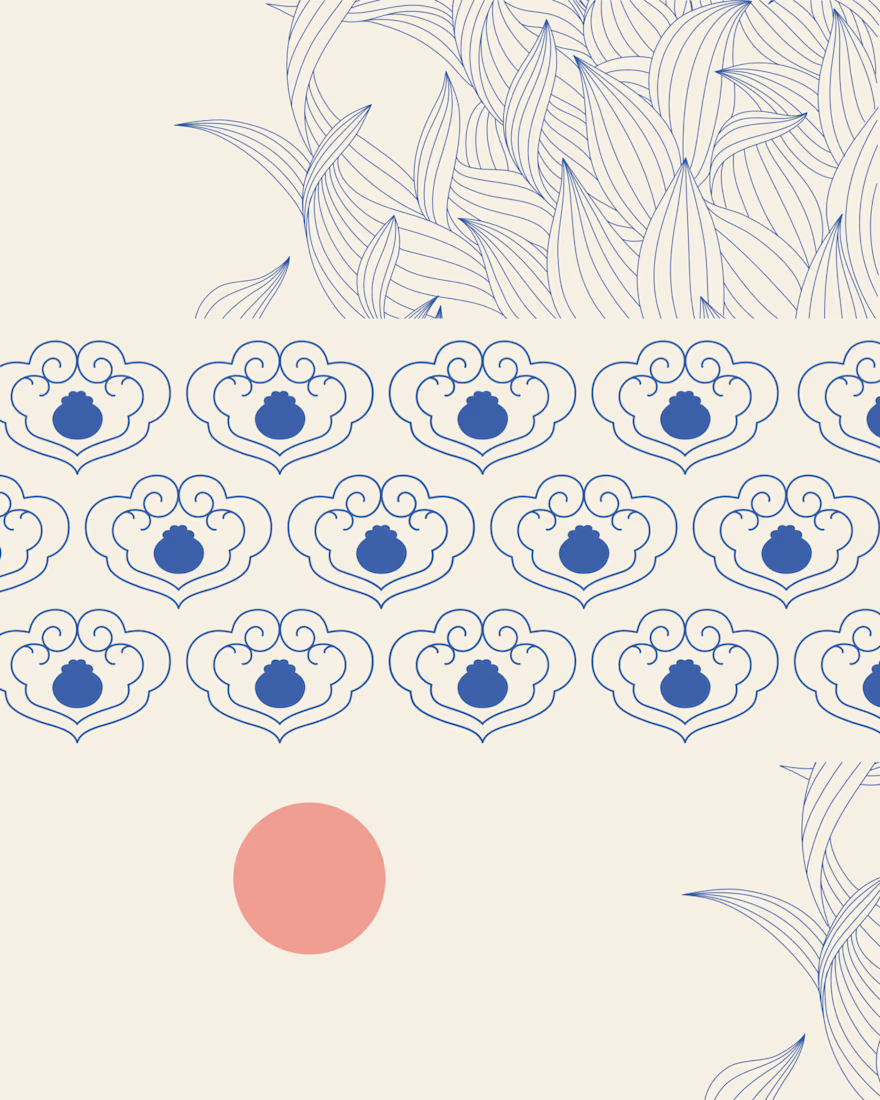
Great design it feels soft❤️
Great job Anja🎉🎉🔥🔥


