The network for creativity
Join 1.25M professional creatives like you
Connect with clients, get discovered, and run your business 100% commission-free
Creatives on Contra have earned over $150M and we are just getting started
Back to feedPost

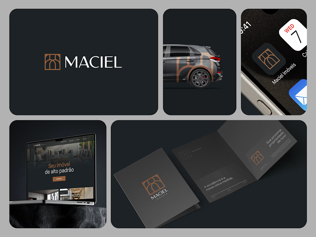
Maciel Imóveis is a real estate company founded by a couple in Torres, a coastal city in southern Brazil, focused on high-end residential properties.
The challenge was to create a visual identity that reflected the elegance and exclusivity of the properties they represent while establishing a distinctive presence within a competitive local real estate market.
The identity was built around a refined and sophisticated visual language, designed to communicate trust, quality, and a premium positioning to an audience with high purchasing power.
Rather than following the visual conventions commonly found among real estate agencies in the region, the project aimed to create a more distinctive and contemporary brand presence — one that could feel at home in the high-end real estate market of Torres.


The network for creativity
Join 1.25M professional creatives like you
Connect with clients, get discovered, and run your business 100% commission-free
Creatives on Contra have earned over $150M and we are just getting started



Related posts

Solar Energy Website
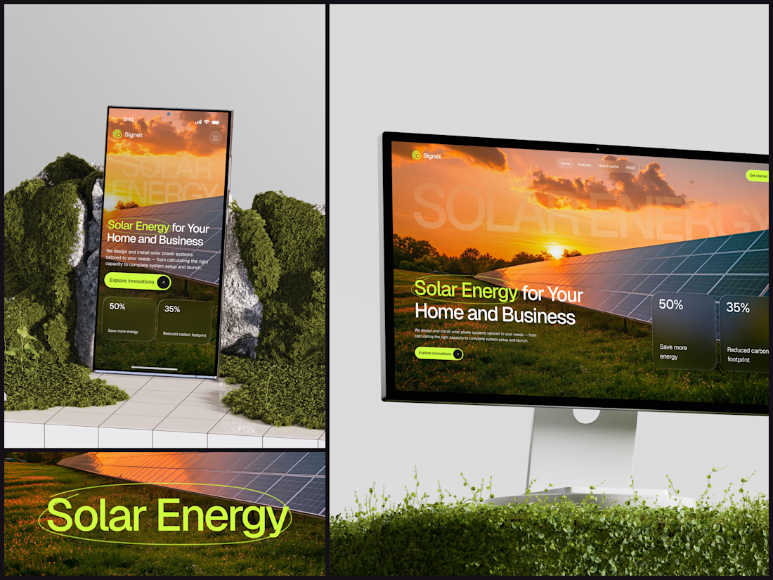
A thin lime circle tells you which two words this page is about.
The headline sits over a sunset photo of a panel field. The "Get started" and "Explore innovations" buttons share the circle's lime, so the eye moves from the circled words straight to the next step.
Large faded capitals repeat those two words across the sky, faint enough to stay inside the photo. On mobile they break onto two lines, and the headline and button stack above two frosted cards.
Only two words of "Solar Energy for Your Home and Business" are lime, and the whole page follows them.
Designed by the Hue & Machine team.
#SolarEnergy #RenewableEnergy #CleanTech #WebDesign #LandingPage #HeroSection #UIDesign #ResponsiveDesign #MobileDesign #FigmaDesign



This is really cool, Nice job Dmytro


Which brand showreel preview design would you choose - Silver & Ropes or Purple Stones? ⚡
Lynksen is cooking something fire...
and we need your expert eyes on this one 🔥😎
Vote and tell why! 👇

12 voted
24%
37 voted
76%
49 votes
Closed

Going with Purple Stones. It feels more distinctive and memorable for a showreel, Silver & Ropes is clean but a bit safer.

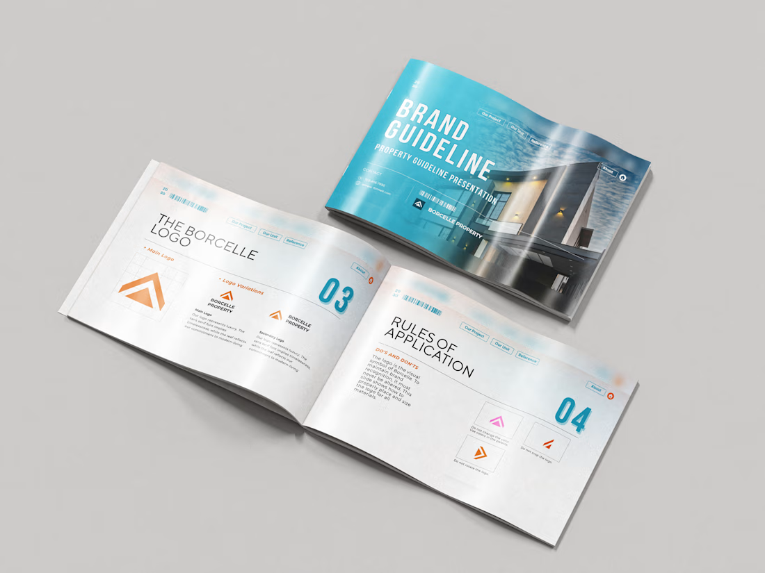
Just wrapped a brand identity concept for Haven Ridge Properties, a real estate developer selling to first-time buyers and investors.
The challenge: feel premium without feeling cold.
The answer was two ideas shelter and growth.
The mark is a roofline that doubles as an upward arrow: home and long term value in one symbol.
What's inside the guidelines:
• Primary and secondary logo lockups
• Logo usage rules
• Typography system
• Colour palette with clear roles
• Imagery direction
• Digital and print applications
Which detail stands out most to you?
#branding #brandidentity #logodesign #brandguidelines #realestate