The network for creativity
Join 1.25M professional creatives like you
Connect with clients, get discovered, and run your business 100% commission-free
Creatives on Contra have earned over $150M and we are just getting started
Back to feedPost

What's better than having a fox at your side?
Sharing my character illustration studies for a fintech app for their own avatar.
I love Mochi character design so much that Koro was the one who got approved T_____________T
Give a high five or message me for design inquiries 😄


The network for creativity
Join 1.25M professional creatives like you
Connect with clients, get discovered, and run your business 100% commission-free
Creatives on Contra have earned over $150M and we are just getting started
Related posts

🍨 Meet MORA — artisanal gelato with a softer side.
Bold typography, creamy tones, and playful flavor-inspired packaging designed to make every scoop feel special.
Explore the full project on my Contra profile and let me know your thoughts!
#BrandIdentity #PackagingDesign #FoodBranding #GraphicDesign #BrandDesign


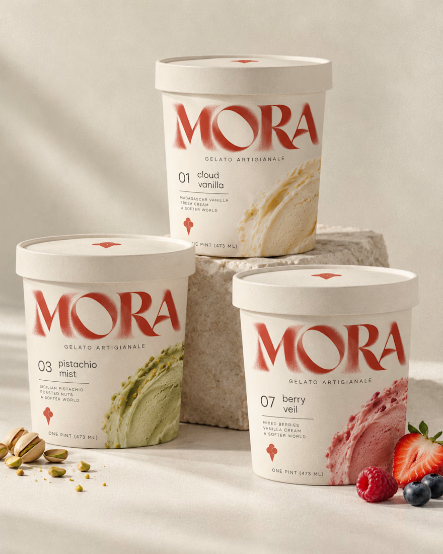
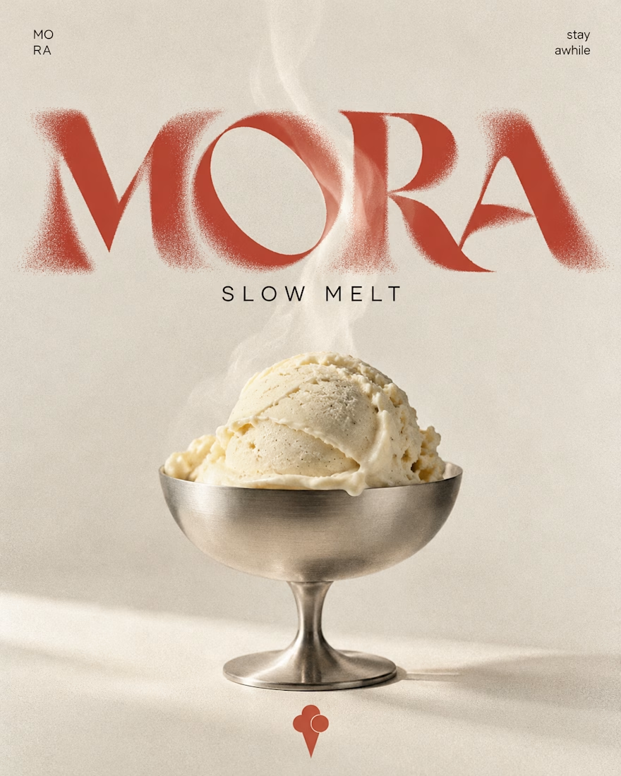
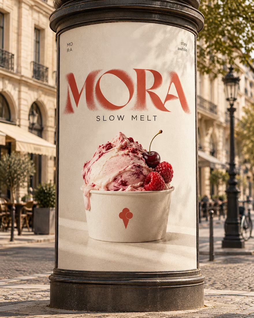

Love this MORA identity! 🍦 The bold typography against the creamy tones is such a perfect balance - feels artisanal yet playful. The flavor-inspired packaging with the watercolor smears for cloud vanilla / berry veil is a really nice touch, makes each scoop feel special as you...

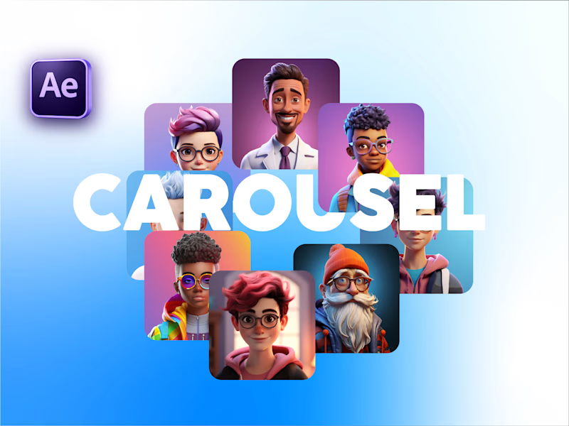
Carousel Animation vs Thumbnail
Description: A quick test to see how the animation and thumbnail work together. What do you think?


5 voted
71%
2 voted
29%
7 votes
Closed
Nice test Salman! The thumbnail to carousel transition works really well - that blue gradient is smooth and the character cards pop nicely. The animation preview feels clean and engaging, definitely works together with the thumbnail. Great After Effects execution!🔥♥️

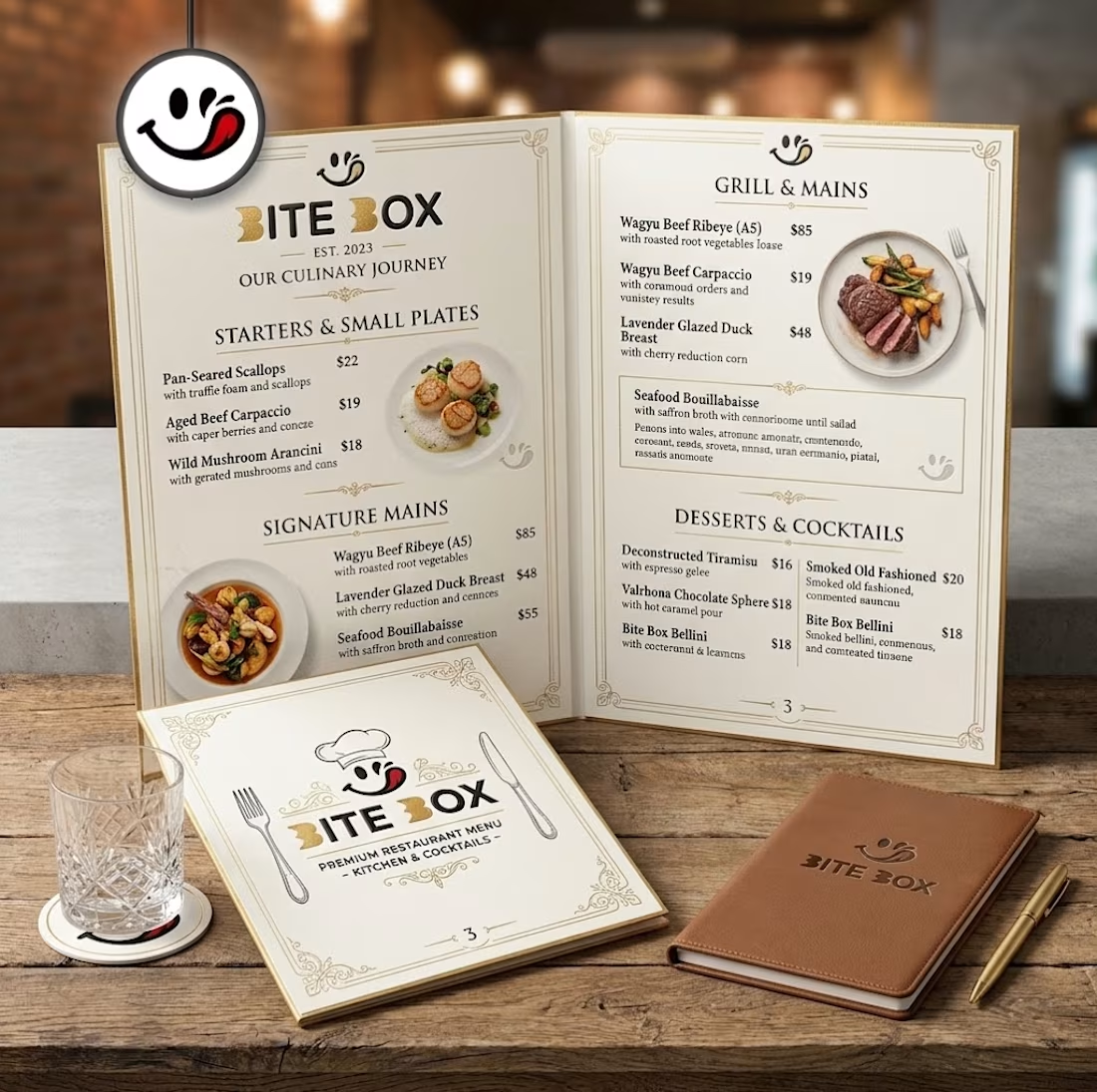
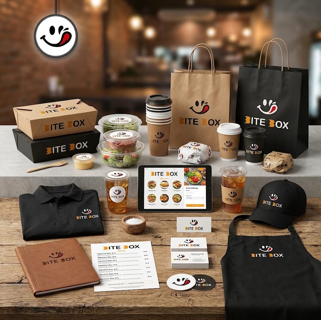
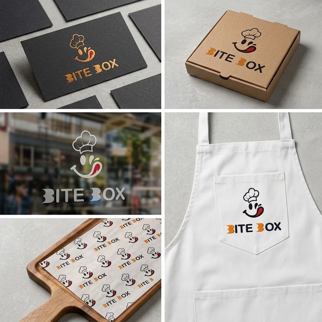
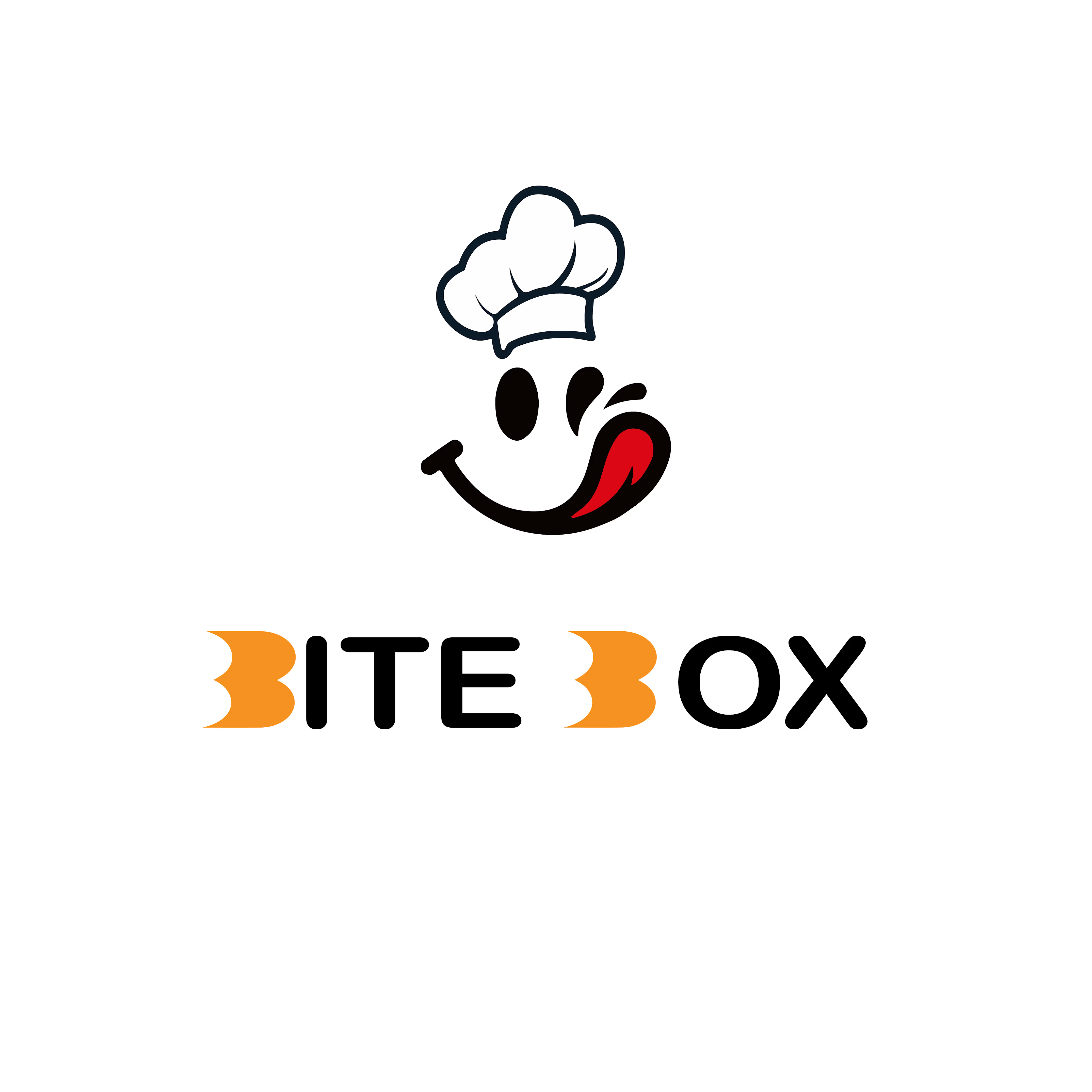
🍔 BITE BOX — Where Every Bite Brings a Smile! 🧡
A fun, fresh, and memorable logo concept designed for a modern fast-food brand. The smile icon represents happiness, while the bold typography creates a friendly and recognizable identity. 🍟✨
#LogoDesign #FoodBranding #GraphicDesign #BrandIdentity #LogoDesigner


Creative concept with a fun and memorable brand identity!