The network for creativity
Join 1.25M professional creatives like you
Connect with clients, get discovered, and run your business 100% commission-free
Creatives on Contra have earned over $150M and we are just getting started
Back to feedPost

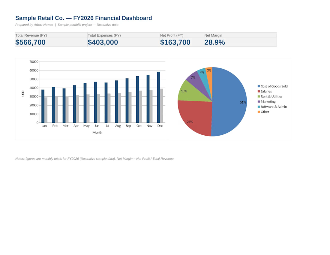
A one-page financial dashboard built for a retail business case study,
summarizing a full fiscal year at a glance.
The dashboard tracks total revenue, total expenses, net profit, and net
margin, alongside a month-by-month revenue vs. expenses chart and an
annual expense breakdown by category (COGS, salaries, rent, marketing,
software, and other costs).
Built to give business owners a fast, visual read on financial health
without digging through raw ledgers — the kind of reporting I'd set up
monthly for a bookkeeping client.
(Note: figures are illustrative sample data for portfolio purposes.)


The network for creativity
Join 1.25M professional creatives like you
Connect with clients, get discovered, and run your business 100% commission-free
Creatives on Contra have earned over $150M and we are just getting started

Related posts

Most people set a budget once and forget it exists until it's too late.
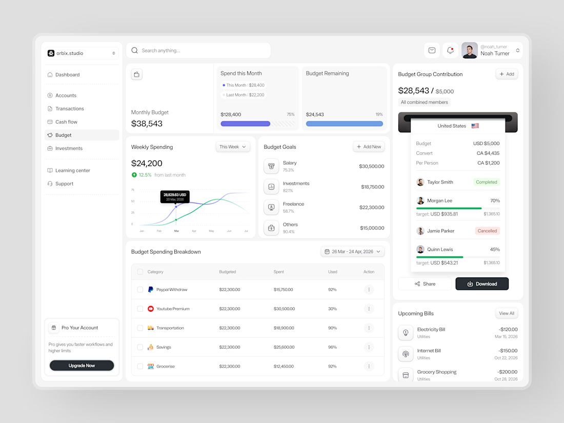
This dashboard was designed to fix that. Weekly spending at $24,200, up 12.5% from last month. Monthly budget at $38,543 with 75% already allocated. Budget goals tracked by category salary, investments, freelance, and others each with a completion percentage and a dollar target that makes progress visible before the month ends.
The group contribution panel takes it further. Four members. One shared budget of $5,000. Taylor completed. Morgan at 70%. Quinn at 45%. Jamie cancelled. A collaborative finance tool that makes shared budgeting feel as clean as personal budgeting should.
Upcoming bills electricity, internet, grocery listed before they hit. A spending breakdown table that shows exactly what was budgeted, what was spent, and how much is left in every category.
This is what budget management looks like when the design treats users like they actually want to be in control of their money.
Does this feel like a dashboard that would change how a team manages their finances together? 👇
Designed by Orbix Studio
Tools: Figma
#DashboardDesign #FintechUI #BudgetApp #UIDesign #WebDesign #ContraFreelance #ProductDesign #SaaSUI


This caught my attention immediately. Great use of contrast and visual hierarchy.

Made the dashboard for web application and used task management systems like Jira or Asana to improve efficiency and speed of work.
🤔 The problem was simple: new users opened the app, saw an empty workspace and had no idea where to start. So I turned the home page into a place that tells you what to do next. It allows to pick a template and you're set up in one click, follow a short checklist to finish onboarding, and check your inbox to see who's working on what without digging through boards.


Great fix for empty workspaces. Any plans to add a step-by-step walkthrough on first login to guide them through each section?

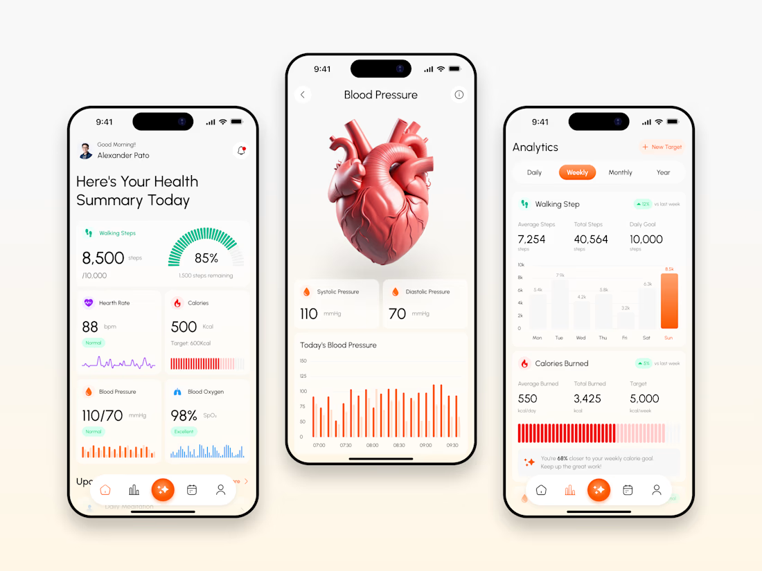
Every health app makes the same mistake: cluttering dashboards with raw data instead of clear insights. We avoided it on the VITARA™ redesign. Here's how
🧵 (1/5)
#ui #ux #appdesign #healthtech #designsystem
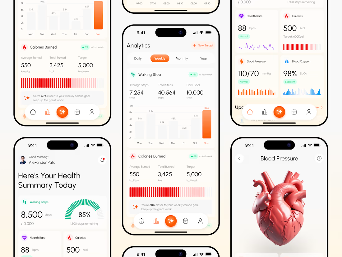
The final mobile UI. Built around scannable vital metrics, instant blood pressure analytics, and clear daily tracking.
(2/5)