The network for creativity
Join 1.25M professional creatives like you
Connect with clients, get discovered, and run your business 100% commission-free
Creatives on Contra have earned over $150M and we are just getting started
Back to feedPost

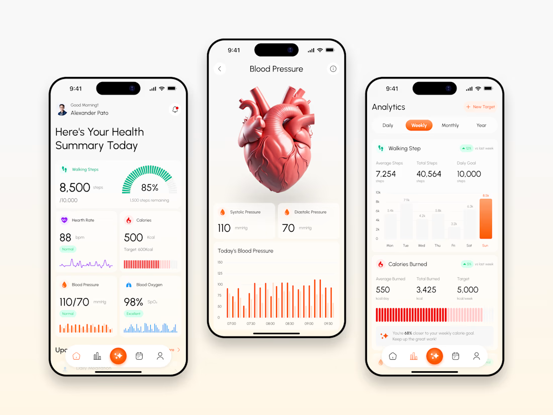
Every health app makes the same mistake: cluttering dashboards with raw data instead of clear insights. We avoided it on the VITARA™ redesign. Here's how
🧵 (1/5)
#ui #ux #appdesign #healthtech #designsystem
The final mobile UI. Built around scannable vital metrics, instant blood pressure analytics, and clear daily tracking.
(2/5)
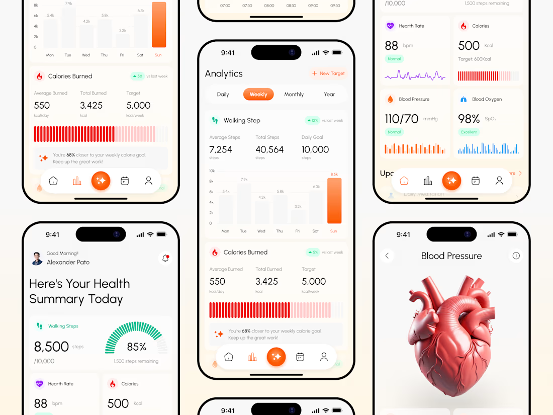
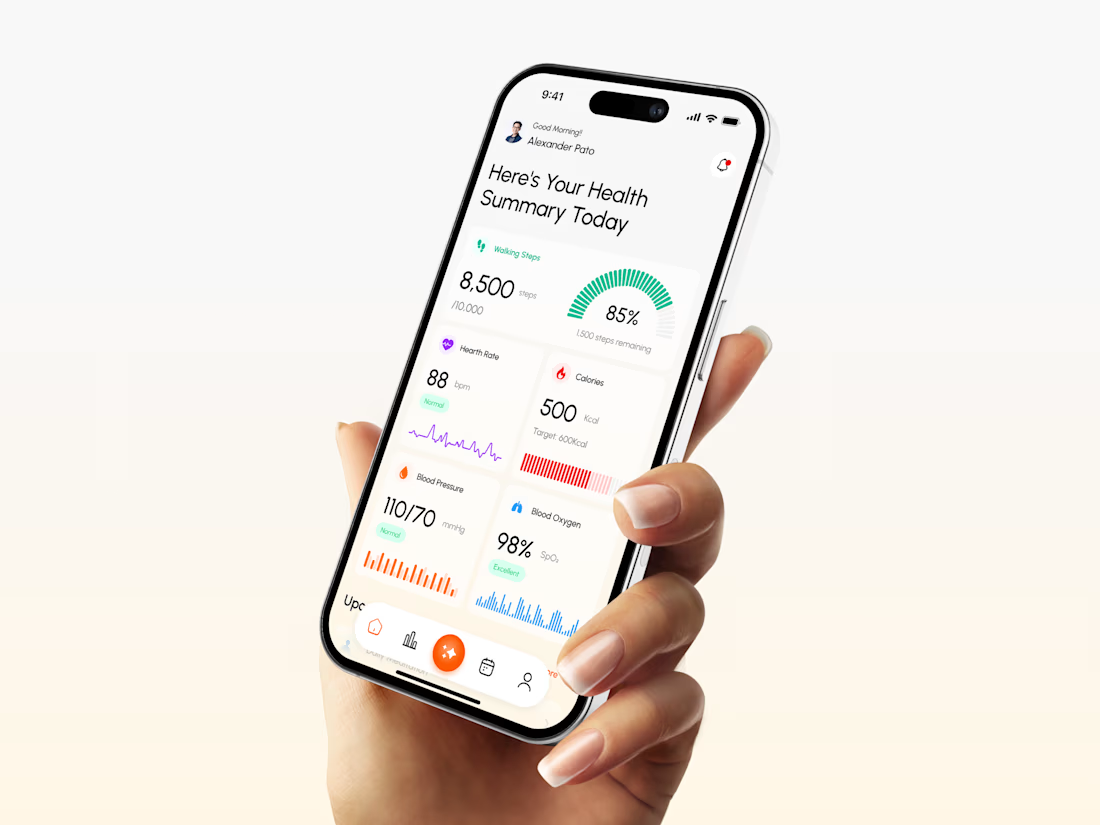
On real devices. Designed mobile-first so users can check health summaries and daily activity effortlessly on the go.
(3/5)
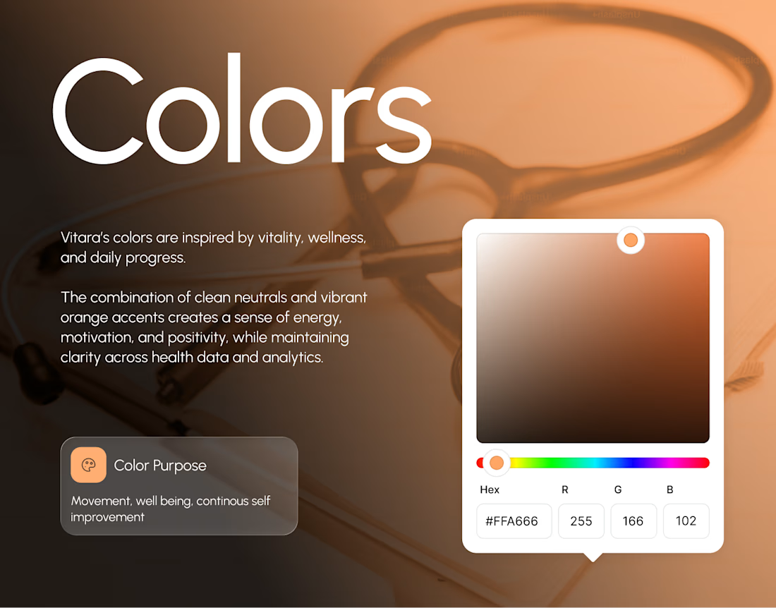
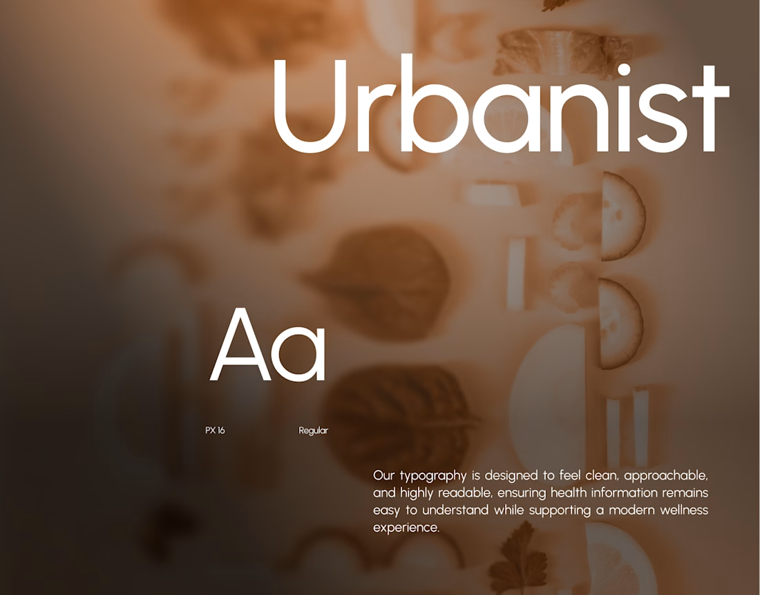
Brand system, applied. High-contrast color hierarchy and clean typography paired for high-trust health tracking.
(4/5)
Full case study on Behance: https://behance.net/gallery/254110425/Vitara-Health-Tracker-Vitals-Monitoring-Mobile-App
Working on health tech or mobile apps? Reach out to us!
(5/5)

Clean!
The network for creativity
Join 1.25M professional creatives like you
Connect with clients, get discovered, and run your business 100% commission-free
Creatives on Contra have earned over $150M and we are just getting started







Related posts


Nice work, Miguel!!

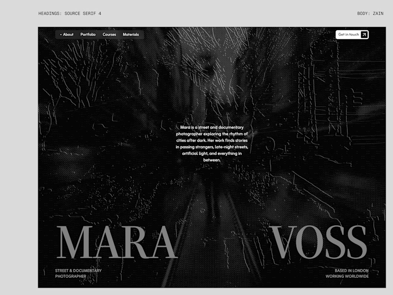
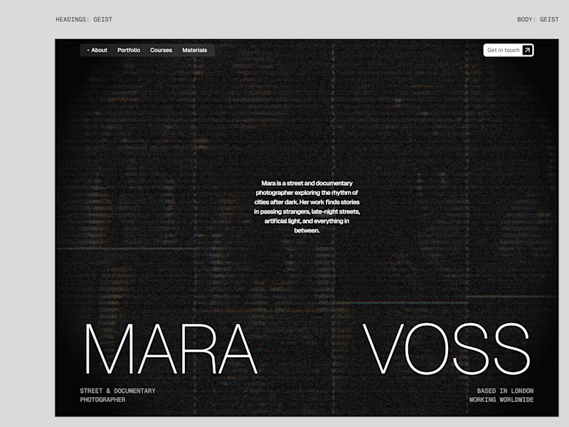
I tried experimenting a little with my previous design. I changed the fonts and background a bit. Which version do you like better?
22 voted
73%
8 voted
27%
30 votes
Closed

New design for sure. The distressed texture in the type makes it feel like actual street photography lives inside the letters. The previous version is clean but this one has grit.

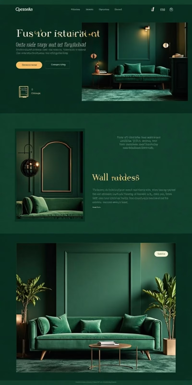
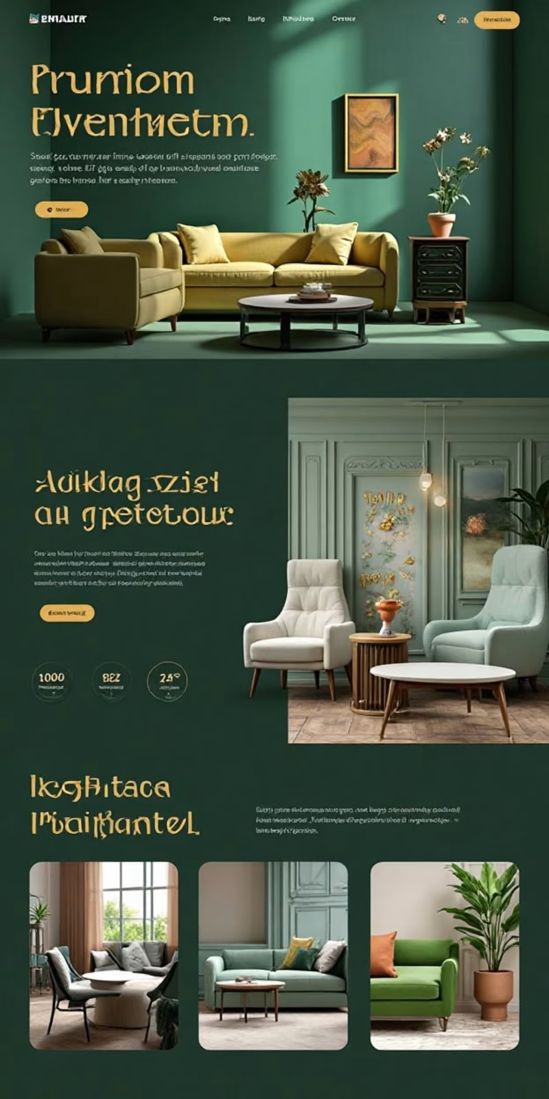

Option 2 closes on a four-up room grid while Option 1 keeps one full-width room per section — the grid suits browsing a catalogue, the stacked version suits selling a single look.