The network for creativity
Join 1.25M professional creatives like you
Connect with clients, get discovered, and run your business 100% commission-free
Creatives on Contra have earned over $150M and we are just getting started
Back to feedPost
Taste Test
Redesigned this Tilt Pay App store design and I think the difference speaks for itself. Curious, which option feels best to you ?
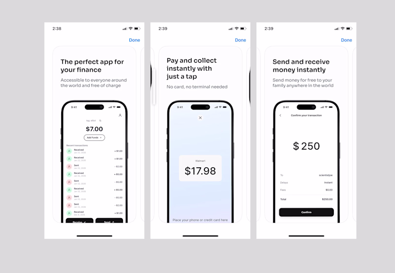
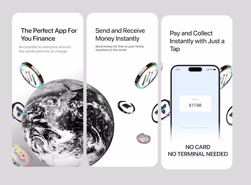
26 votes
Ends in 1d
Option 2 got my Upgoat
Thank you
Team Option 2 here. The continuous background graphic makes the three screenshots feel like one cohesive, premium banner as you scroll.
Thank you
Option 2 all the way!
Thank you
Option 2 is definitely way better, but i think there's some alignment issues to the margin and consistency issues with the subtext.
Thank you very much
Option 2 to the wayy
I'll go with option 2. Everything fits together really well.
Thank you
Love Option 2, it looks unique!
Thank you
Option 2. It really captures interest
Thank you
The network for creativity
Join 1.25M professional creatives like you
Connect with clients, get discovered, and run your business 100% commission-free
Creatives on Contra have earned over $150M and we are just getting started
Related posts
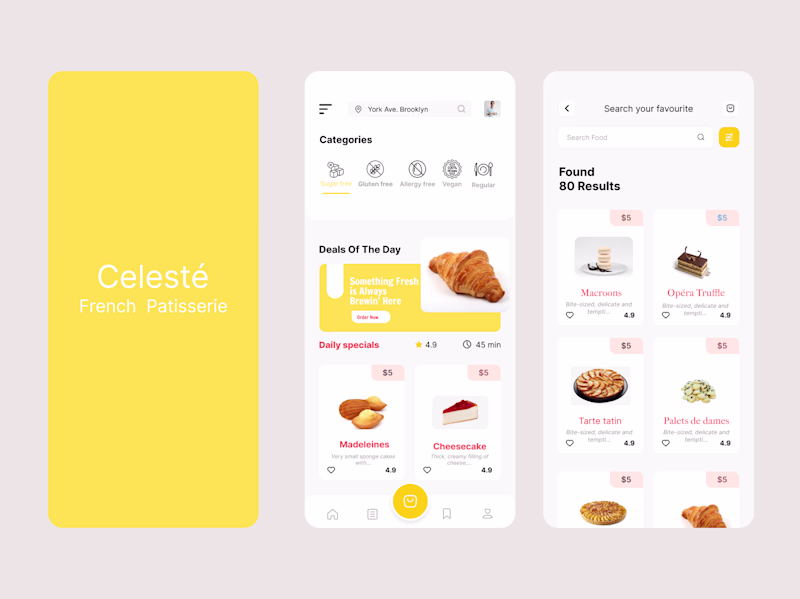
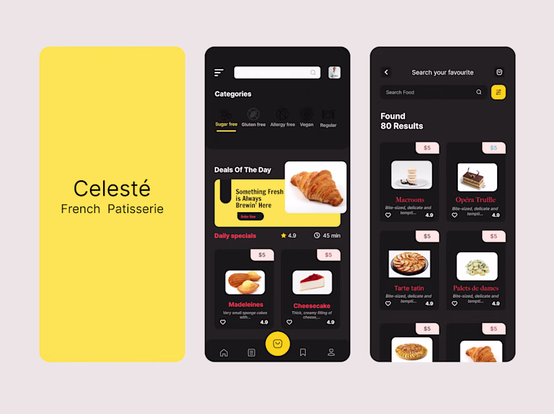
Exploring two visual directions for a French patisserie mobile app concept
Same product, same flow but two completely different moods
11 voted
35%
20 voted
65%
31 votes
Closed
Light mode but to improve accessibility a bit I would tweak the white text to black on the yellow background.
Taste test 👀
Two simple versions of the same scene.
No huge changes - just different feeling and pacing.
Funny how even small tweaks completely change the vibe.
Been switching between them for too long now.
Which one works better to you - and why?
12 voted
36%
21 voted
64%
33 votes
Closed
I prefer Version B.
Even though the scene is visually very close to Version A, the caption placement changes the read of the moment. It gives the viewer context earlier, improves the hierarchy, and makes the sequence feel more intentional within the short runtime.
Curious about...
Healthcare has always been complex. The dashboards built around it never made it feel any simpler until now.
CareNest is a healthcare management dashboard designed for clinicians, wellness coaches, and care teams who need every patient insight, appointment, and alert visible the moment they log in. Every interaction built to feel as calm and precise as the care it supports.
Overwhelming appointment lists. Critical alerts buried in noise. Patient flow with no visual clarity. Provider availability that takes too long to find.
Wellness progress tracking with daily and weekly views. Stress and recovery balance mapped across the full week. HRV and glucose biomarker monitoring. Patient flow capacity at a glance. Healthcare provider availability visible instantly. Aria, your personal AI assistant, answers clinical questions in real time.
A dashboard experience that matches the precision and calm that healthcare professionals need every single day. Clear. Actionable. Ready to scale.
Designing a healthcare platform, medical SaaS, or wellness dashboard that needs to feel this considered? Let's build it together.
Impressive
Trending
Claude
Claude has entered the design space. How are you using Claude Design?
Contra University
Learn from expert creatives how to earn more using next-gen AI tools.
creativeaiflow
Creative AI workflows are evolving. What tools do you use, and what are their strengths and weaknesses?
portfolioreview
The best portfolios tell a story, not just show a grid. Share yours for feedback.
freelancerlife
Freelancer life is wins, pivots, and everything in between. What’s yours right now?