The network for creativity
Join 1.25M professional creatives like you
Connect with clients, get discovered, and run your business 100% commission-free
Creatives on Contra have earned over $150M and we are just getting started
Back to feedPost


Same product, different backgrounds. Which mood fits best?


The network for creativity
Join 1.25M professional creatives like you
Connect with clients, get discovered, and run your business 100% commission-free
Creatives on Contra have earned over $150M and we are just getting started


Related posts

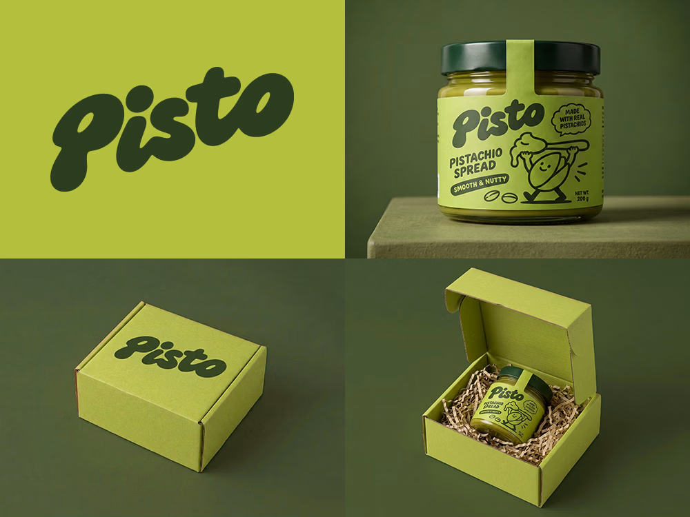
Can AI create a professional-looking logo?
I tried to create a logo concept for a pistachio spread brand using Recraft Logo Maker.
After answering a few questions about the brand and going through several variations, I finally landed on a logo that felt right and captured the fun, fresh personality I had in mind.
But I didn't want to stop at just the logo.
I took it a step further by exploring how the identity could come to life through product packaging and a branded mailer box.
A quick process video is included in the comments.
What do you think?


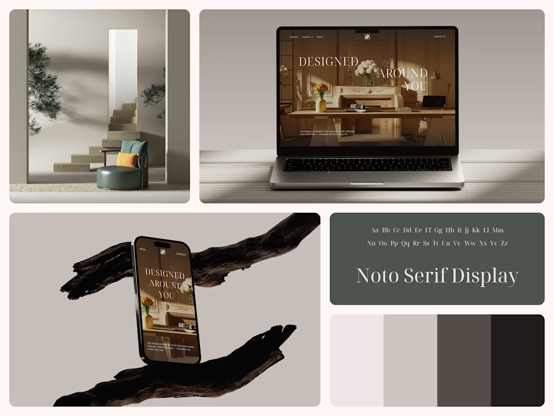
Interior Design Website
The white flowers on the mantel overlap the headline.
Thin Noto Serif Display capitals step down across one warm photo of a paneled room, so the space stays in view between the words. On the phone, the three words stack in a centered column, with Menu and Contact on either side of the monogram.
The palette runs from soft white to near black, which leaves the color to the photo: orange tulips and warm light on the walls.
The headline reads "Designed Around You", and the hero takes it literally, with the wall behind the type and the flowers in front of it.
Designed by the Hue & Machine team.
#InteriorDesign #InteriorStudio #WebsiteDesign #HomepageDesign #WebDesign #ResponsiveDesign #Typography #EditorialDesign #UIDesign #FigmaDesign


Nice!

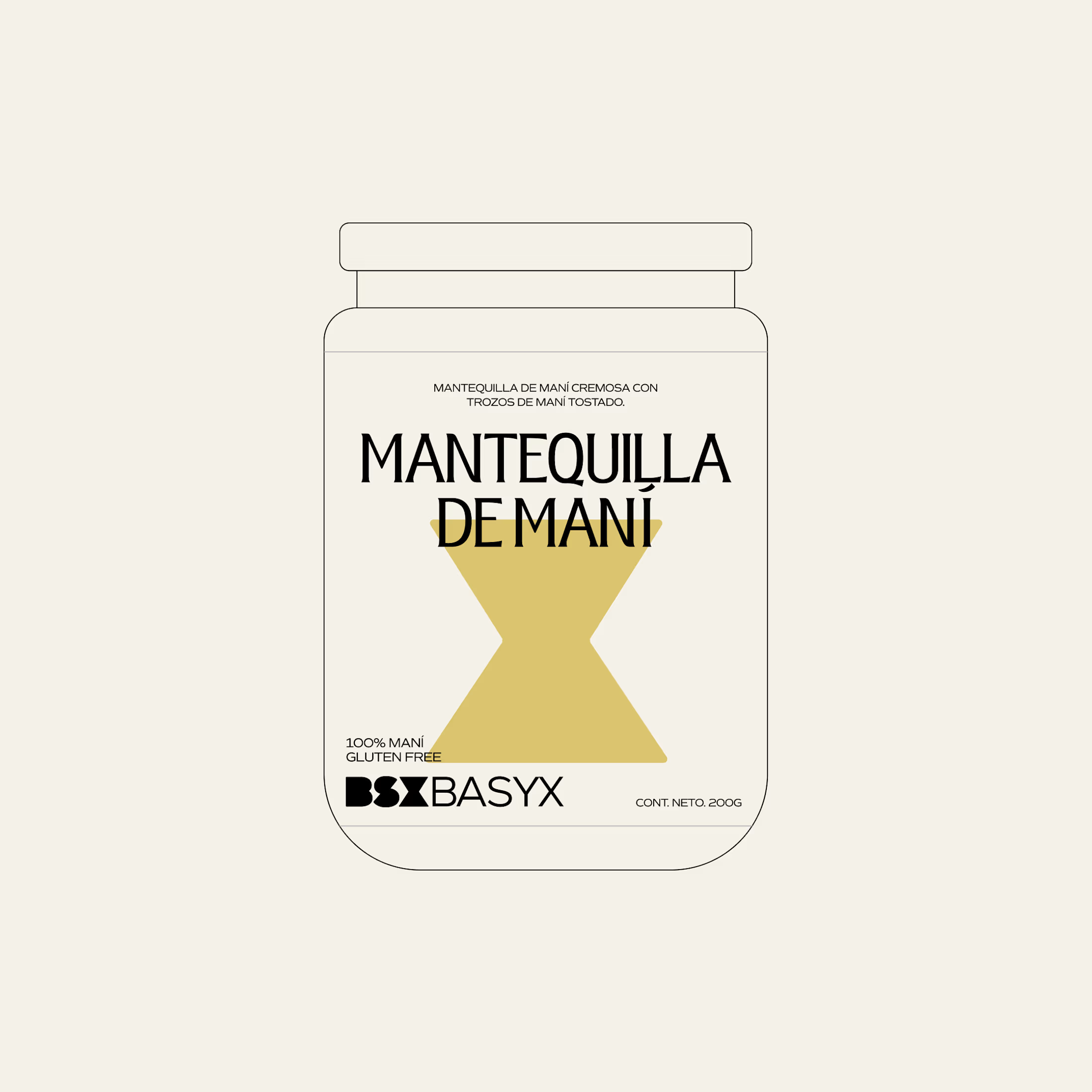
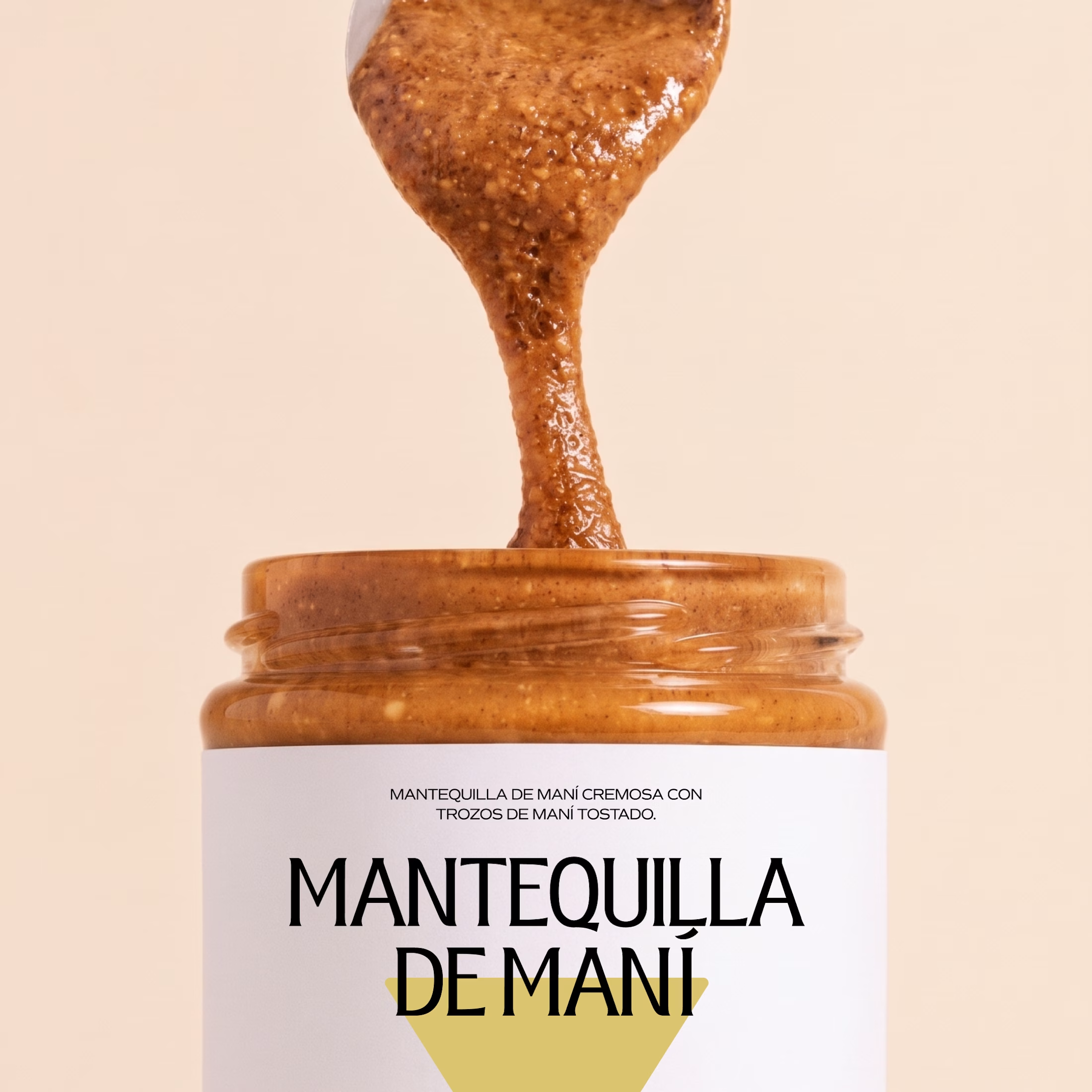
Minimal packaging is not less work. It’s MORE decisions 🤍
On a recent project, I spent a whole day on one thing: the spacing between two phrases in a label. Nobody will ever notice it. But everyone will feel it.
When there is nothing else on the label, every small adjustment has to carry the brand.
Do you also lose hours on details no client will ever mention? 😅

So true. A whole day on the spacing between two phrases sounds about right, and it's exactly why good packaging just feels right.