The network for creativity
Join 1.25M professional creatives like you
Connect with clients, get discovered, and run your business 100% commission-free
Creatives on Contra have earned over $150M and we are just getting started
Back to feedPost


Nice work! excellent

Thanks!
The network for creativity
Join 1.25M professional creatives like you
Connect with clients, get discovered, and run your business 100% commission-free
Creatives on Contra have earned over $150M and we are just getting started
Related posts

AREA — Minimal Brand Identity
AREA’s identity began with a simple idea: structure can make a brand more distinctive.
We explored it through bold typography, geometric forms, and a restrained monochromatic palette, bringing clarity and consistency to every touchpoint.

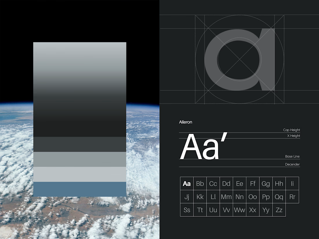
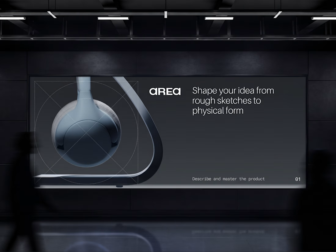

Monochrome can feel cold, but the big type keeps this sharp. Did you start with the type or the shapes?


Creativity!

Testing two hero illustration directions for Syncora, an all-in-one team collaboration platform.
Which one fits a collaboration tool better? 👇
3 voted
43%
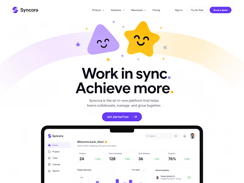
4 voted
57%
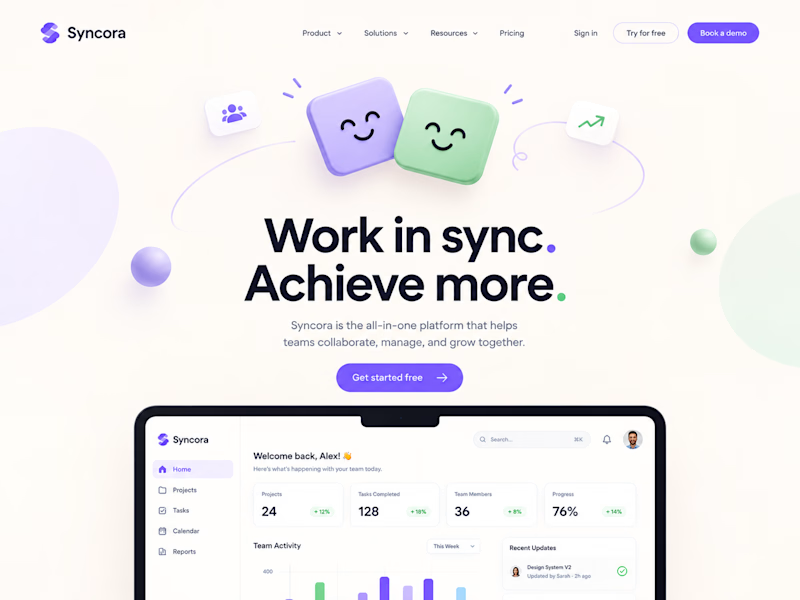
7 votes
Closed

Definitely Soft Sync. It looks clean, friendly and professional for work. The first one with the star and rainbow feels a little too much like a kids' app for a team business tool.