The network for creativity
Join 1.25M professional creatives like you
Connect with clients, get discovered, and run your business 100% commission-free
Creatives on Contra have earned over $150M and we are just getting started
Back to feedPost
Would this make you book a ticket to Korea? 🇰🇷
Korea Is Calling! is a faceless cinematic journey through Seoul and Busan, from the quiet architecture of Gyeongbokgung Palace to Gwangandaegyo Bridge, the Han River, and Cheonggyecheon Stream after sunset.
My #HumanByDesign moment came when AI interpreted “palace gate” as European architecture. It looked polished, but it was completely wrong for Korea. I rejected it, researched the exact landmarks and architectural details, and rebuilt every direction with cultural and geographic accuracy.
This project reminded me that generating something with AI is easy. Knowing when it is wrong, and deciding how to make it better, is the creative work.
Which location would you visit first? 🇰🇷


I wanted to create a tourism film where Korea was the main character, without showing any faces. My first prompt was simply ‘a palace gate.’ The result looked polished, but the architecture was completely wrong.
I researched Gwanghwamun Gate and rebuilt the prompt using its exact...
The network for creativity
Join 1.25M professional creatives like you
Connect with clients, get discovered, and run your business 100% commission-free
Creatives on Contra have earned over $150M and we are just getting started

Challenges
View all


Related posts

Do you agree? That a stronger business deserves a brand that looks the part...
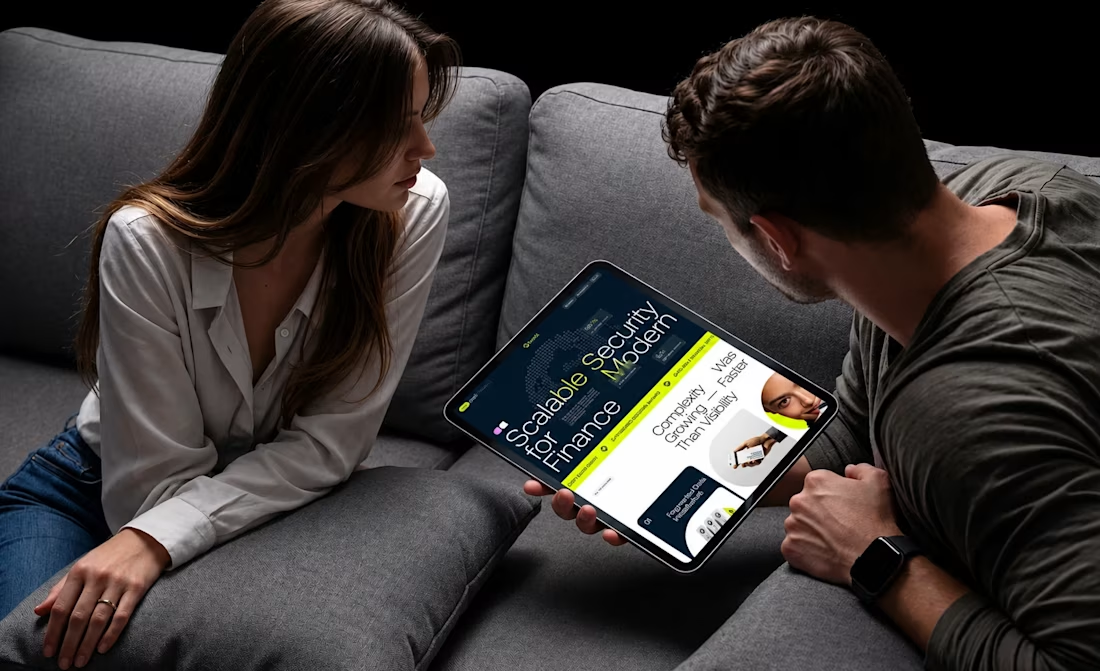
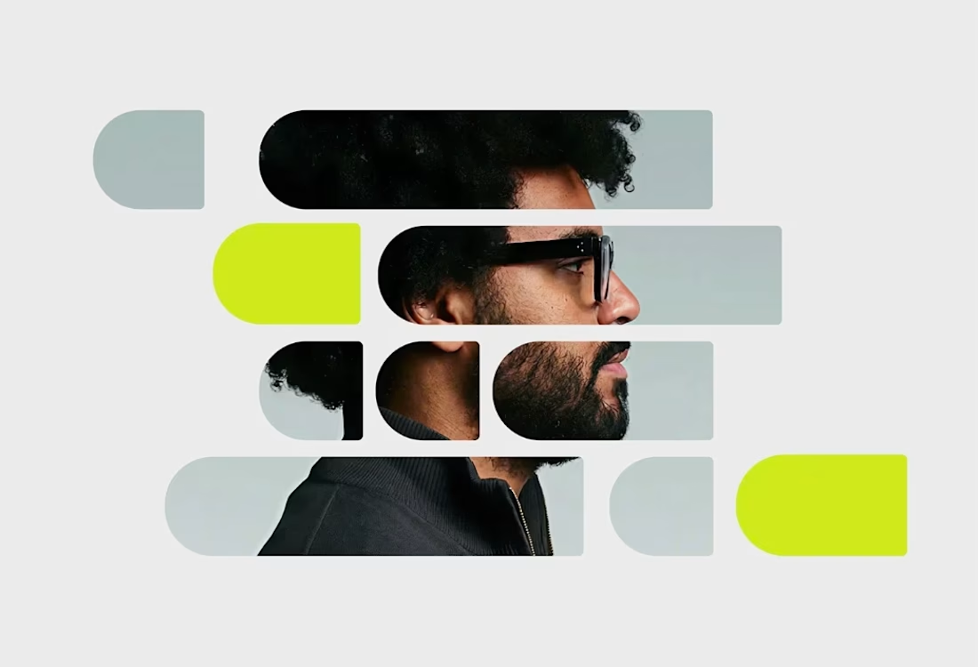
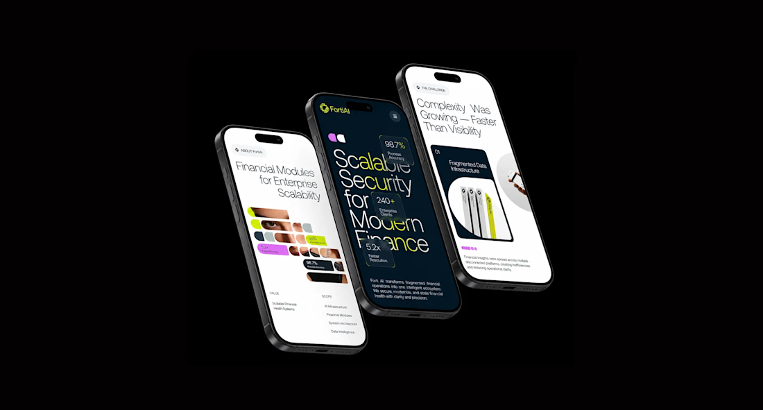
Forti AI had the techand ambition. Our job was to make sure the way the company presented itself reflected the business it was becoming.
We started with positioning and strategy before touching the visuals, clarifying what the brand needed to communicate, who it needed to speak to and how it could stand apart in an increasingly crowded AI market.
From there, we developed the visual identity and translated it into the website and wider digital experience.
Strategy → Positioning → Identity → Website
Not just a new look. A clearer, more credible foundation for the business to grow from.


I love the vibe man, great job!! 🙌

What's your one-rule brand? Tell me.
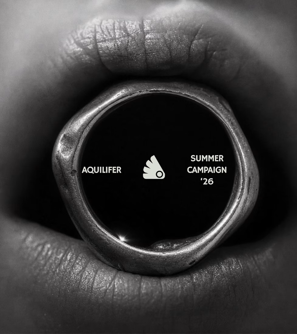
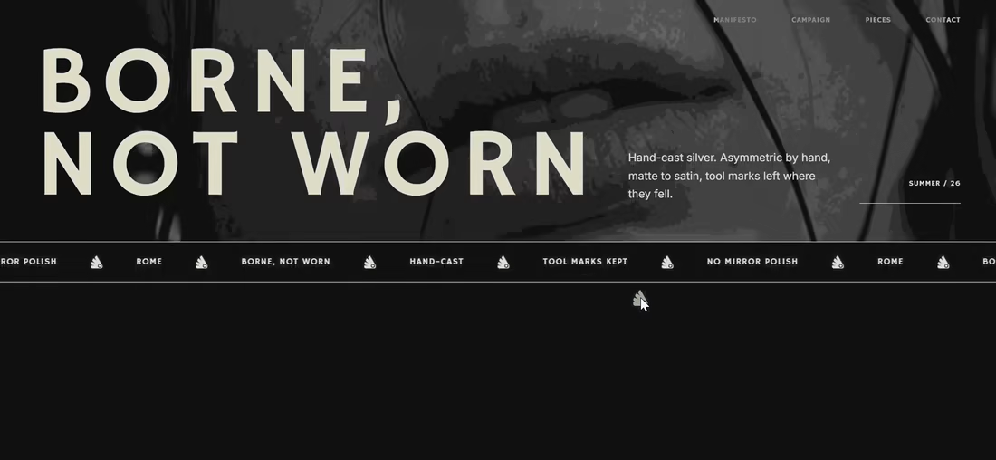
Most jewelry brands photograph the object. This one photographs the grip.
AQUILIFER — a brand I built around one idea: jewelry as something carried, not worn.
Case study + full site now live.
The name comes from Roman military rank. The aquilifer carried the standard — the one thing the legion couldn't afford to drop.
That single word killed my first direction before I'd finished it.
No polish. No faceted stones.
Hand-cast, asymmetric pieces, tool marks left visible.
Photography went extreme macro, unretouched skin, hands gripping the face instead of posing near it.
Color system: two darks instead of one dark + accent.
#1E1E1E and #27331A let the brand shift register — campaign world to product world — without ever going light.
#D9DED4 stays structural only. Never a fill.
Motion rule on the site: diagonal masks only. No rotation, anywhere.
A spinning object reads as being shown off. This brand is about weight, not display.
Same angle, same easing, top to bottom.
One idea, held all the way through — name, object, photography, palette, motion.
That's the whole pitch for how I work.

Absolutely love your works!

Crafted a few surreal frames with GPT 2.5 Sunburst, then brought them to life using Seedance's multiframes feature.
