Elisabeth T.
Product Engineer | Crafting user-centered experiences
Ready for work
Elisabeth is ready for their next project!
A bazaar should feel exciting, not exhausting.
For the #GiveItAGlow challenge, I created When the Booth Calls (https://whentheboothcalls.base44.app/), a live queue-free ordering experience for local bazaars.
Before: visitors had to walk from booth to booth to discover menus, then wait in crowded lines to order.
After: they can browse every tenant, explore menus, order ahead, track preparation, and collect their order only when it is ready.
Vendors receive and manage orders through their own dashboard, while organizers can monitor booth availability and event activity. Automated confirmations and ready-for-pickup notifications help keep everyone in sync.
Built, designed, and published with Base 44
From crowded to coordinated.
Try it here!
When the Booth Calls (https://whentheboothcalls.base44.app/)
4
5
182
What if joy had a place?
I’ve always loved the feeling of stumbling into someone’s good news and letting it warm me for a second.
So for the Config Makeathon, I built Joy Garden with Figma Make.
Joy Garden is a collaborative digital garden where people plant flowers for the small things that make them happy.
Try it here:
warmth-agate-62816876.figma.site (https://warmth-agate-62816876.figma.site)
Each flower is not just a post. It is a place: a little patch of simple happiness someone chose to share.
Morning pancake with my sister
A tiny walk before sunrise
My dad laughing at old songs
Finding a new song on repeat
As people visit, water, and send warmth to one another, the garden becomes a living map of shared happiness.
Joy Garden is a place for those small moments to take root.
Because when joy is shared, it does not get smaller.
It grows 🌱
3
4
141
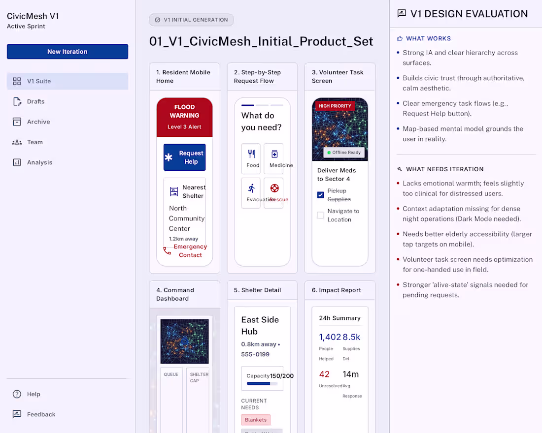
I did not manually revise every screen after generation.
For the #GoogleStitchChallenge, I wanted to test Google Stitch as part of a real creative and product workflow, not just as a screen generator. I connected Google Stitch through MCP with Codex and gave it one CivicMesh product brief plus a reusable iteration framework.
CivicMesh (https://stitch.withgoogle.com/projects/12788939117159957928), a flood response coordination platform for Jakarta connecting residents, volunteers, shelter managers, and city coordinators.
In about 22 minutes, the workflow moved from idea -> thesis -> V1 product architecture -> design evaluation -> visual directions -> final context-specific screens.
The best part: the design critique became part of the workflow. Stitch helped surface what worked, what was missing, and what needed to change for real-world contexts like weak connectivity, elderly accessibility, field volunteers, shelters, and night operations.
Stitch turned one brief into an adaptive civic design system.
Stitch made UI design feel like conversation: initial prompt, generate, evaluate, redirect, refine ✨🖌️
3
5
219
If you ask an AI to "Architect the backend for a real-time messaging app," it will hand you an 8-paragraph wall of text. Trying to mentally piece together API Gateways, WebSockets, and Databases from a vertical chat log requires massive mental gymnastics 🧠
So I connected it to Paper (https://paper.design/) and made it visually draw out its thoughts instead.
The coolest part? I added visual effects to show how hard it's thinking:
🟦 Calm blue = "I got this" (confident)
🟥 Boiling red = "This is tricky"
The Impact:
You don't have to read 1,000 words to understand a complex architecture. You can look at the canvas and instantly feel which parts of the system are easy, and which parts are under immense structural pressure.
I am not just making AI visual. With Paper (https://paper.design/), I am completely removing the cognitive load of complex system design.
Why read the architecture when you can watch it think? ⚡
5
5
229
A group of friends went to 🇭🇰. 4 people, 4 expenses, and it became too chaotic to figure out who owed who what.
So I built a Notion agent that does it in seconds.
Paste your bills. Mention the agent. Done.
No spreadsheet. No argument. Just: who pays who, and exactly how much.
FairShare is now live on Notion's Marketplace. Try it!
https://www.notion.so/marketplace/custom-agents/fairshare
4
194
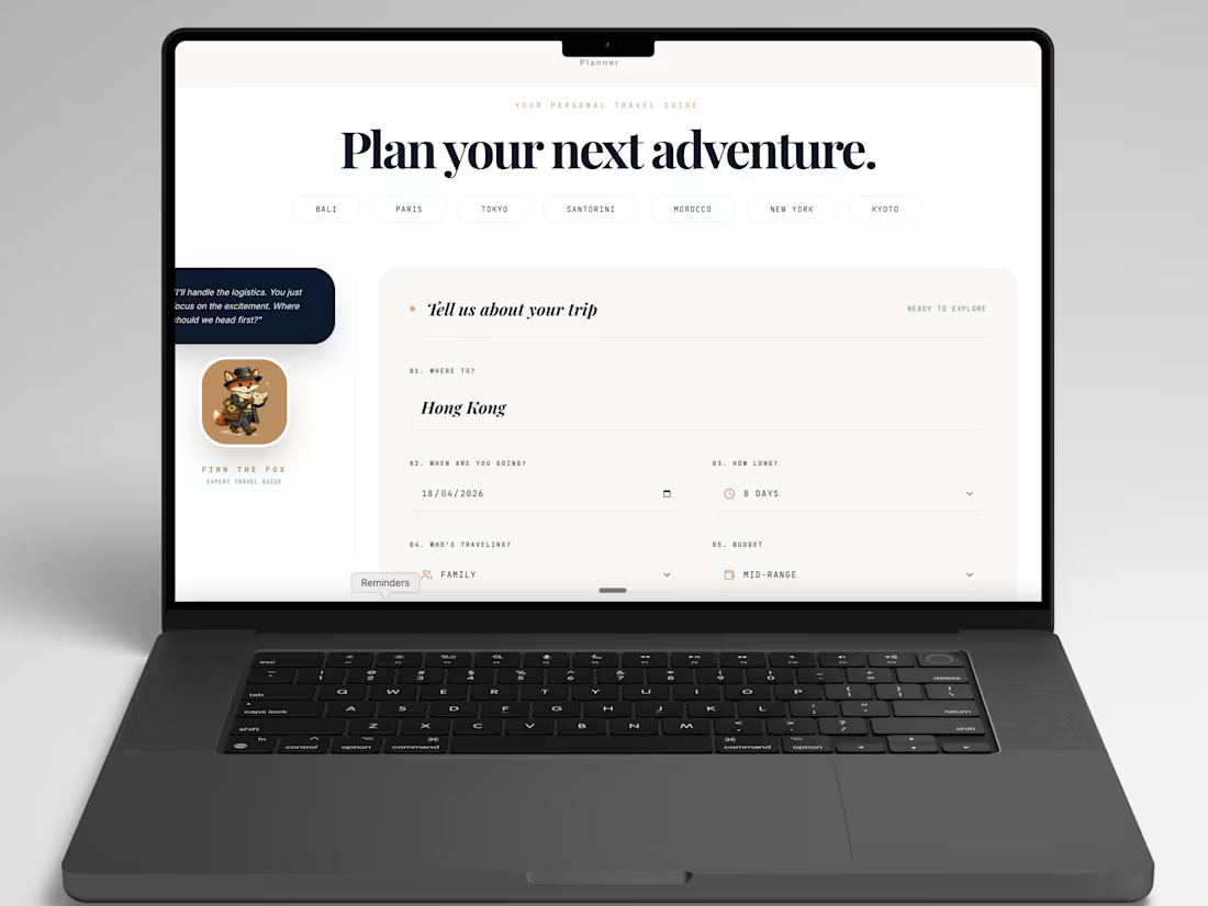
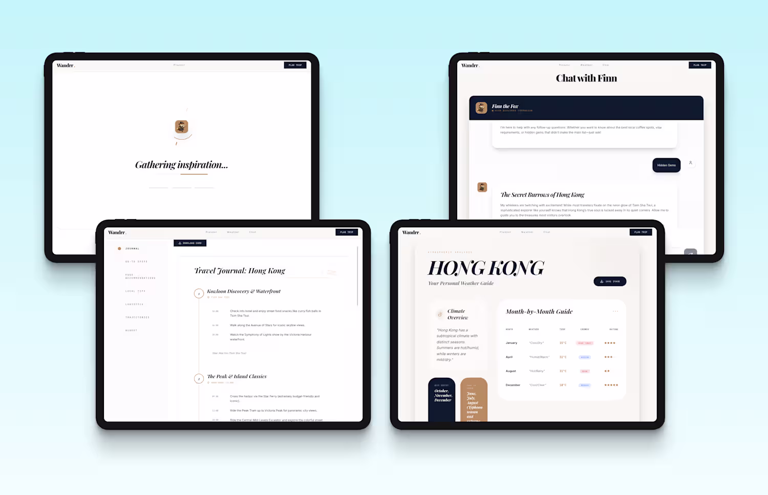
With AI tools, anyone can spin up a web app in minutes. But making it feel premium and intuitive? That’s where the real work is.
For the challenge, I built Wandrr (https://wandrr-travelplanner.web.app/), a luxury AI travel planner. Because the technical execution is so fast now, I spent my time where it actually matters: studying UX patterns on Mobbin.
My biggest takeaways from this "Inspo → Build" process:
AI still needs your taste. My first AI-generated draft was cluttered and felt like a basic "tool."
To elevate the app to a "luxury experience", I used my secret weapon, Mobbin, to study a beautifully structured app. Feeding its layout as my UX baseline completely transformed the design.
The future of building isn't writing better code, it's curating better design! 🎨
2
11
894
You came back from holiday with 1,000 photos. You said you'd sort them "later."
That was three months ago.
And somewhere along the way, we stopped doing the other thing too. Sitting on the couch, flipping through a photo album. "Oh, I remember that day". We don't do that anymore. Our best photos live in a scroll we never finish.
Momentous (https://lunar-zip-53930512.figma.site/)
This brings that feeling back. And made it easy to finally go back. Drop your photos in and swipe through them like a deck of cards — right to keep, left to skip. The ones you keep land in a scrapbook that makes you feel it all over again when you see it, or a flipbook you can play through page by page, like a real album!
Built with Figma Make, because the right interaction doesn't just handle your photos. It gives the moment back to you ⏳
2
4
198
I built BloomNote (https://bloom-note-cards.replit.app/), a Valentine’s card experience with Replit using Wispr Flow, where flowers, long used to symbolize emotions like love and affection, come together with words to say what’s hard to express.
Create one and share it with your loved ones! 🌸💐
3
6
259
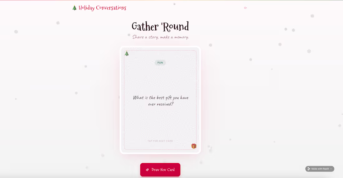
I made a small holiday app to make family gatherings more lively.
It’s basically a deck of question cards.
You tap one, read it out loud, and the conversation usually takes off.
There are 100 random questions, mostly fun and light, with a few deeper ones mixed in.
Give it a try and let me know what you think! ☺️
https://holiday-chatterbox--withlofe.replit.app
2
3
224
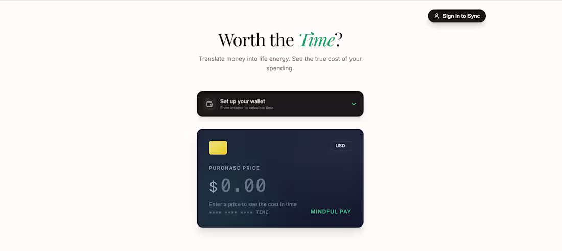
Spending often feels lighter than it really is. Not because we’re careless, but because we lose our sense of cost.
Worth the Time? isn’t about spending less. It’s about spending with awareness.
By translating prices even when traveling in a different currency, into work hours, the app reconnects spending to the time it took to earn that money ⏳
You can still enjoy buying things. Just with clarity instead of regret.
Because spending isn’t the problem. It’s about keeping awareness present when you say yes ✨
https://epxxaaewpu.youware.app/
3
2
206
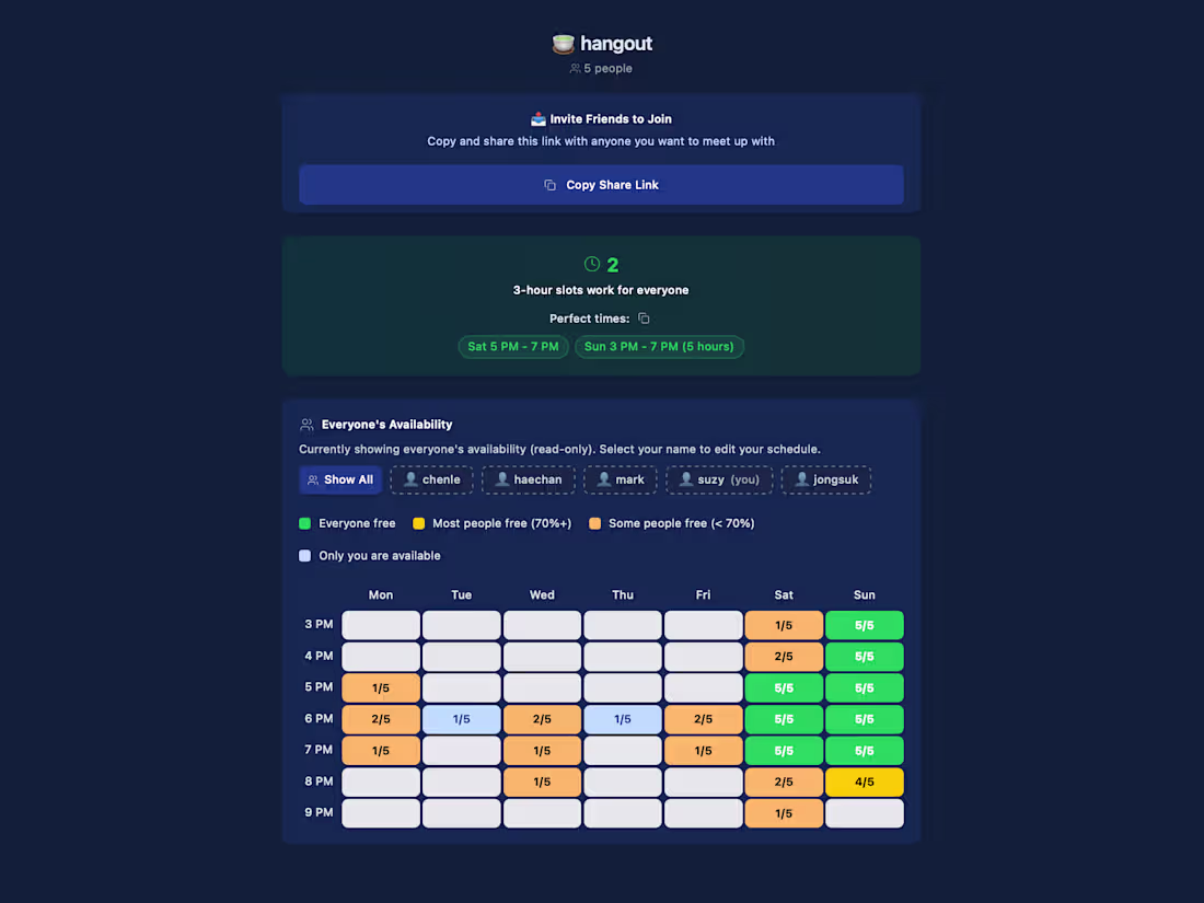
Effortless Group Scheduling: Discover When to Hang Out Easily!
0
3
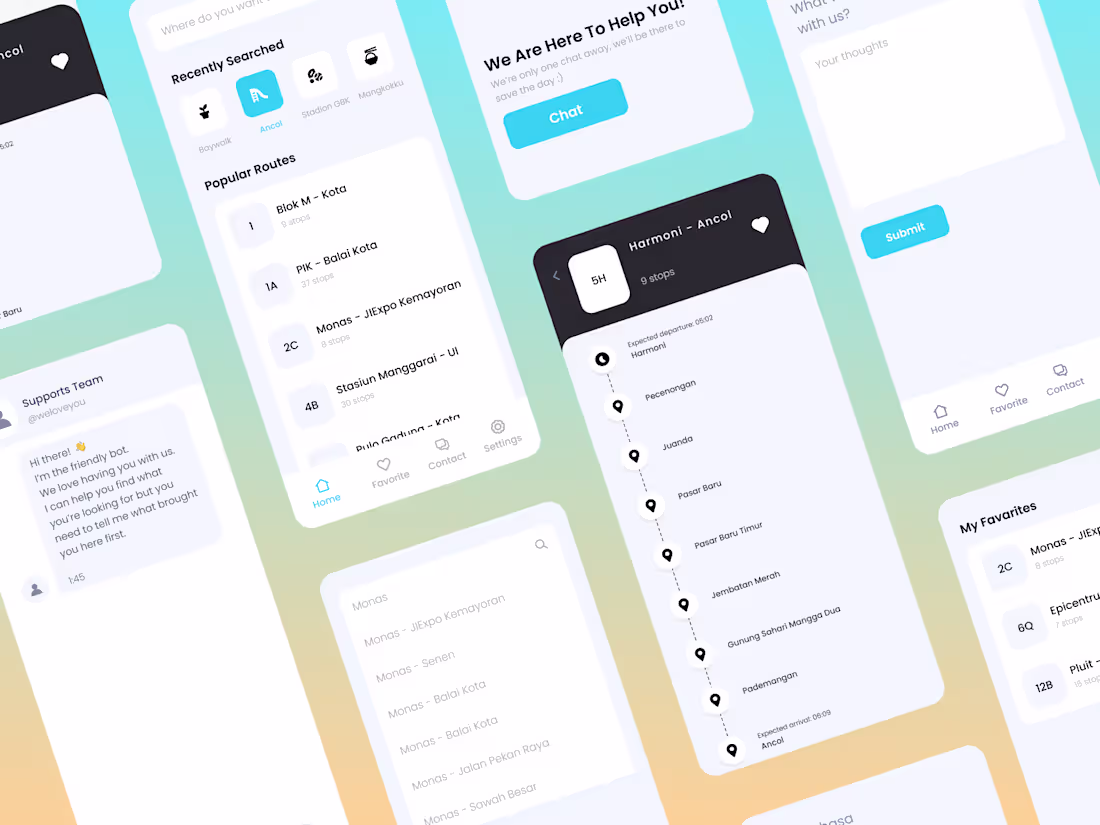
UI Design for TransJakarta Route Mobile App
0
3
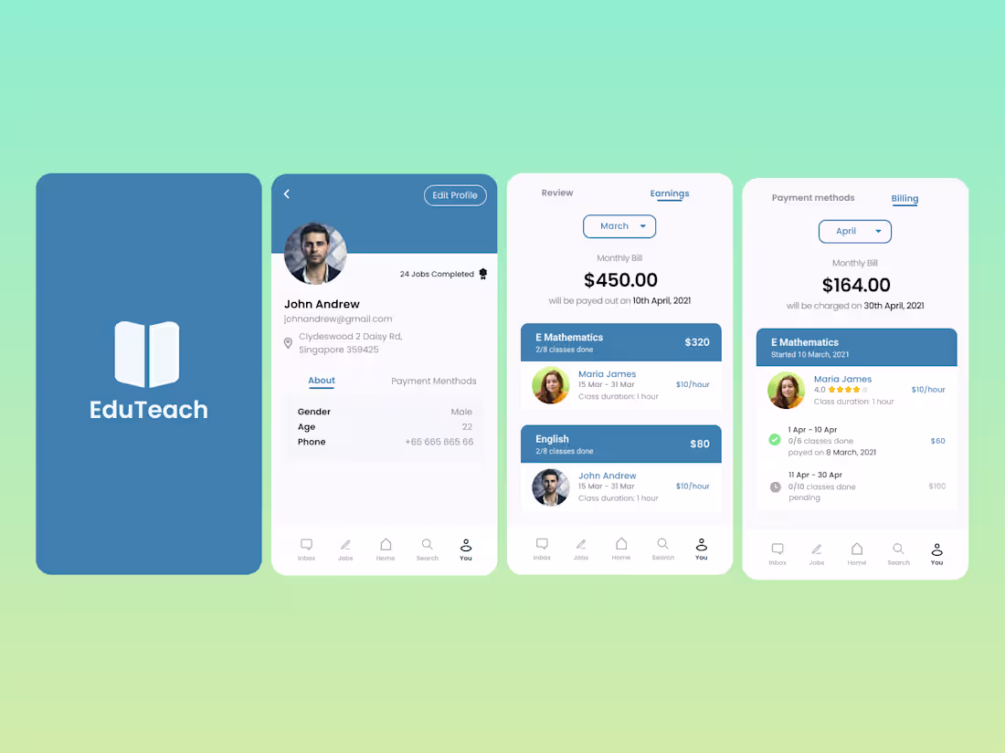
UI Design for EduTeach Mobile App
0
3