The network for creativity
Join 1.25M professional creatives like you
Connect with clients, get discovered, and run your business 100% commission-free
Creatives on Contra have earned over $150M and we are just getting started
Back to feedPost
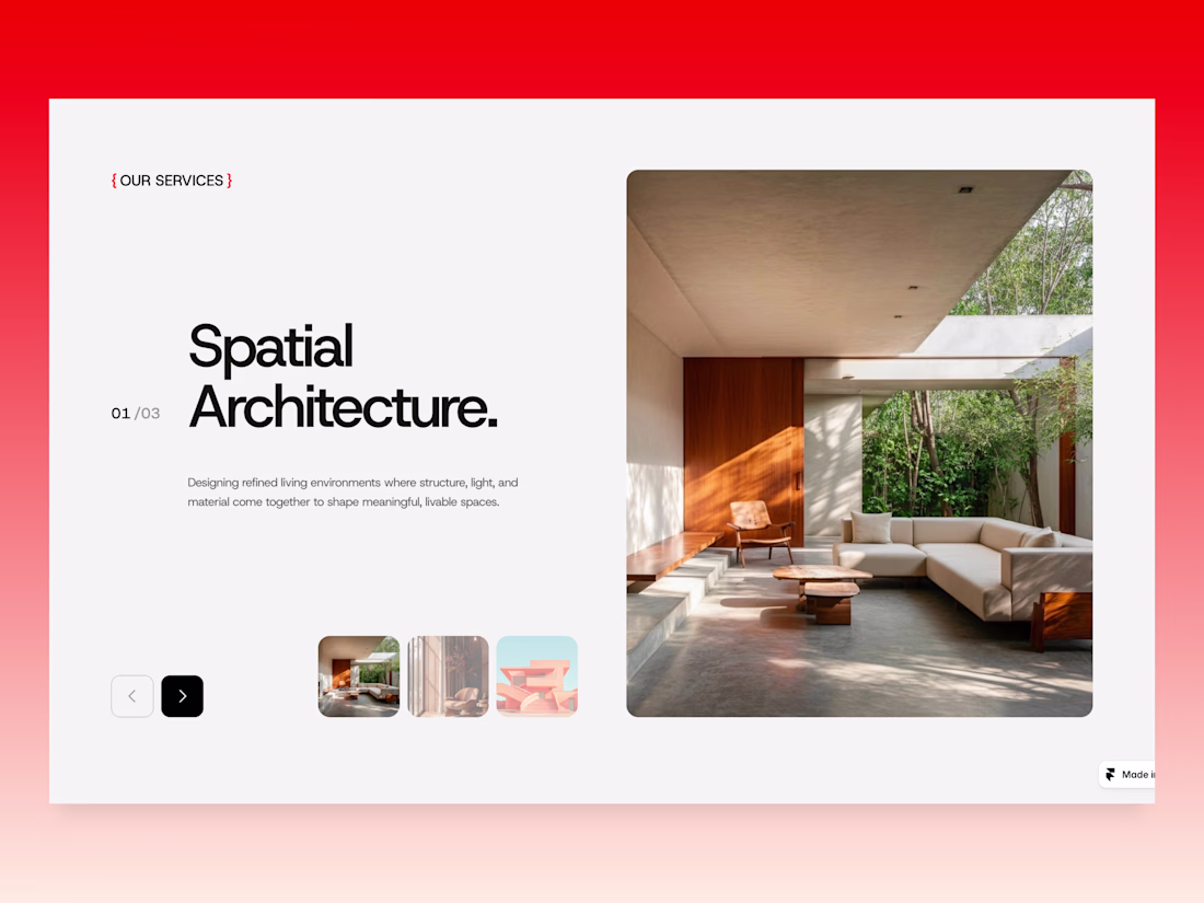
Quick note on my process for Design. ID:
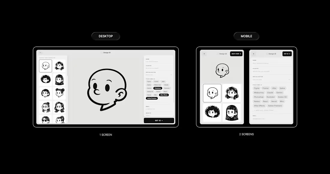
Responsiveness was one of my first concerns when I started building. A project like this lives on social media; people share it on their phones, so getting the mobile experience right wasn’t optional, it was the whole point.
The biggest decision was screen 2.
On desktop, it has everything in one place: avatar selector on the left, form on the right, and the character in the middle. It works because there's space for it.
On mobile, that same layout just didn’t hold up, so I split it into two dedicated screens. One for picking your character, and one for filling in your details. Same content, same flow, just given the space it actually needed to breathe.
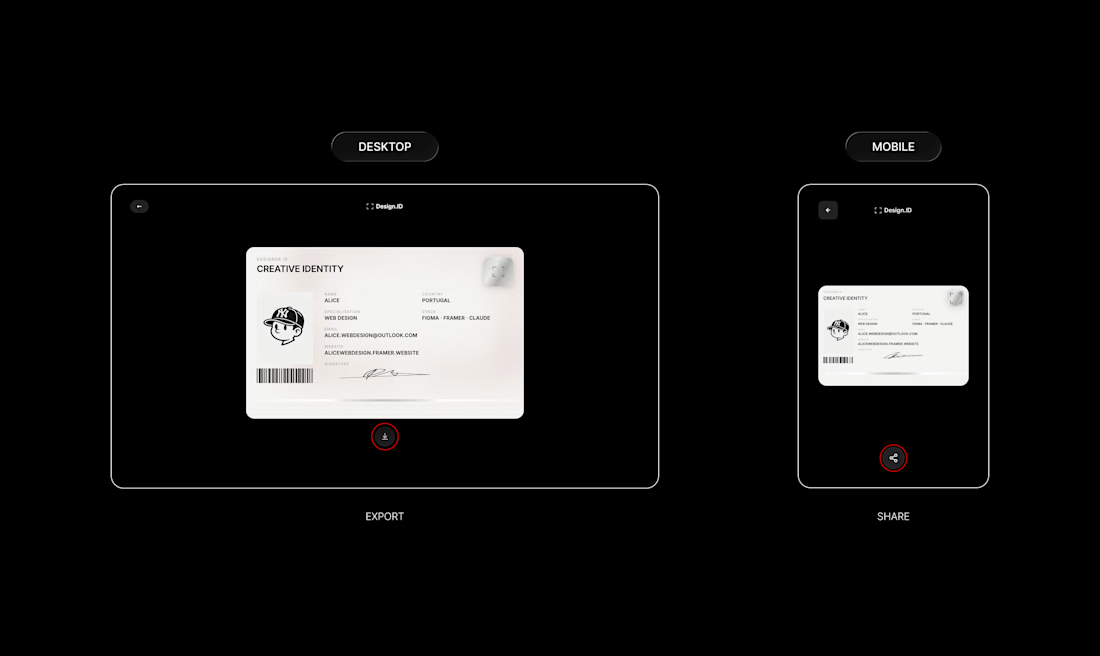
The same thinking applied to smaller details too.
On desktop, the button below the ID card downloads your card as a JPEG.
On mobile, that same button opens the native share sheet, so you can save it straight to your camera roll or drop it in your stories without any extra steps.
Same button, same output, different behaviour depending on how you are using it.
Check my original post: https://on.contra.com/TmqH6L
How did you guys approach responsiveness on your builds?
The network for creativity
Join 1.25M professional creatives like you
Connect with clients, get discovered, and run your business 100% commission-free
Creatives on Contra have earned over $150M and we are just getting started
Related posts
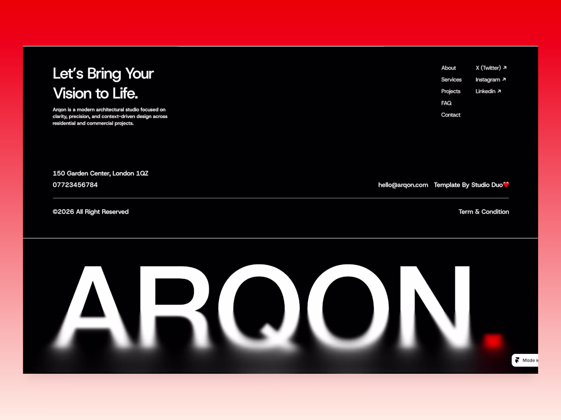
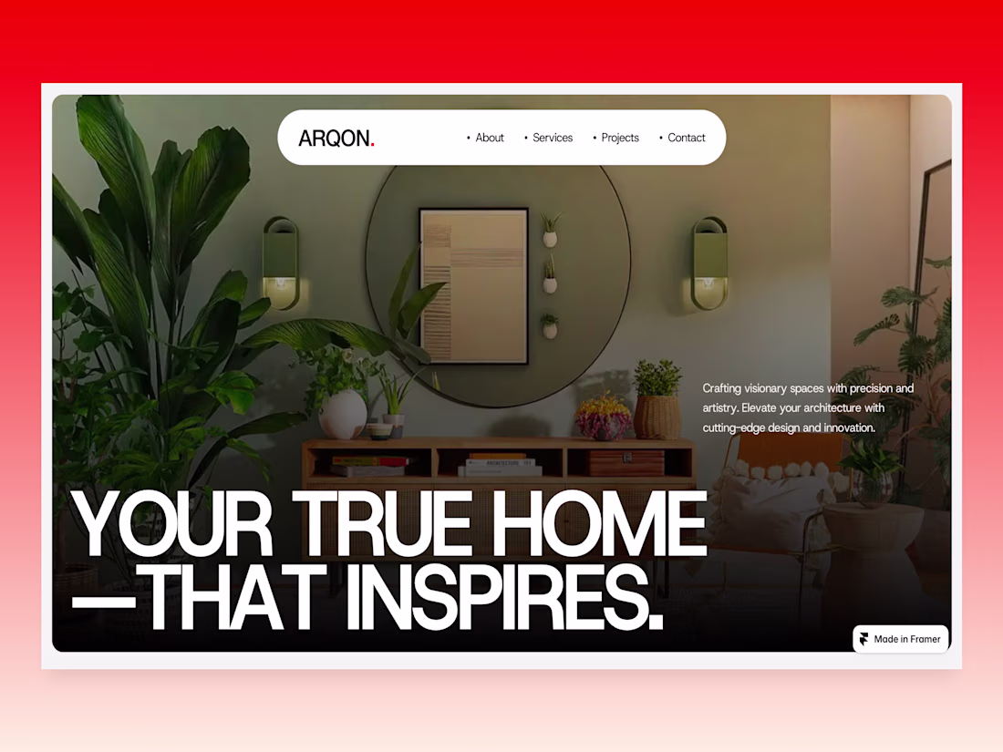
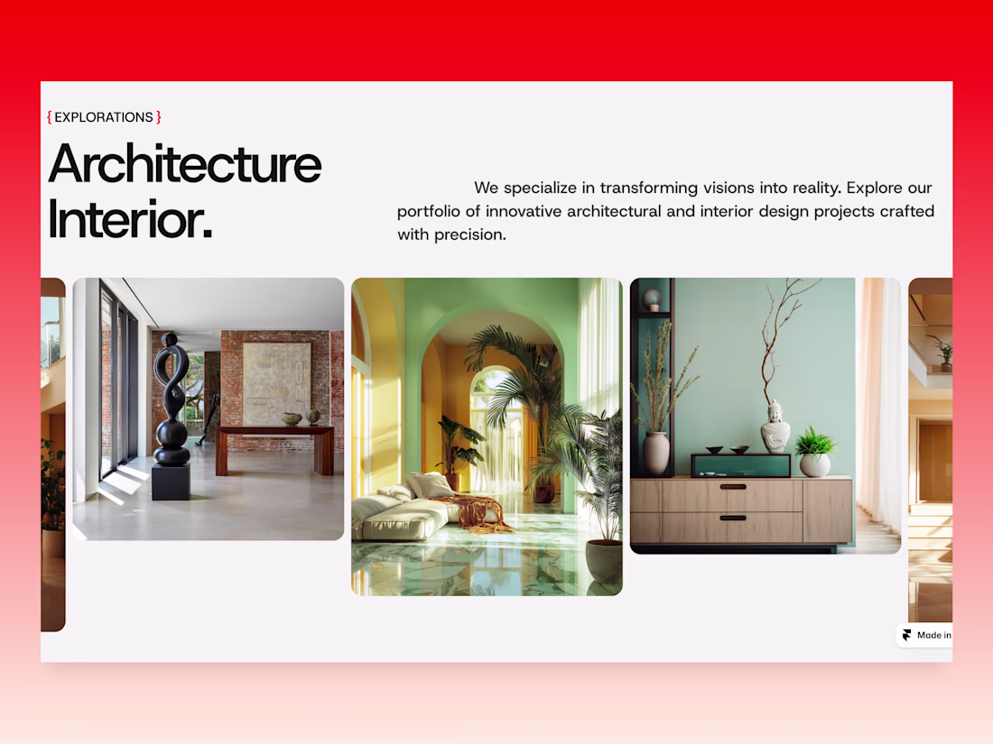
New Framer template WIP at Studio Duo
Arqon Studio approaches architecture as a dialogue between space and lifestyle.
Creating homes that inspire through thoughtful design and modern simplicity.
Wow, really nice layout
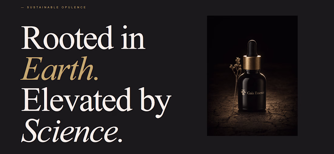
Does setting the vibe before the prompt actually change what Lovable builds?
I configured typography, color, and layout density before writing a single line — then let it build a full brand world page for a fictional luxury skincare brand, Gaia Essence.
Cormorant Garamond + DM Sans Light + parchment + obsidian + burnished gold. Set in the aesthetics panel. Not in the prompt.
What landed: the font pairing alone shifted the output from generic template to editorial. The tool made creative decisions — roman numerals, gold italic treatment, dark/light section contrast — without being asked.
What surprised me: "no buttons, pure brand world" was interpreted correctly on the first run.
What I'd change: more control over line height and surface hierarchy within the color token system.
The aesthetics update changes the quality ceiling, not just the starting point.
What are you building with it? Drop it below.
nice work
How to make a light beam effect in Framer ⚡️
1. Go to @framer
2. Prepare your web section layout
3. Go to Framer University
4. And find this component
5. Just hit copy and paste to your Framer canvas
6. Here you can easily style to fit your web styleAnd even adjust the beam properties
👉 Use code JAN to get free month of Framer Pro!
Thanks 😊
Trending
Claude
Claude has entered the design space. How are you using Claude Design?
Contra University
Learn from expert creatives how to earn more using next-gen AI tools.
creativeaiflow
Creative AI workflows are evolving. What tools do you use, and what are their strengths and weaknesses?
portfolioreview
The best portfolios tell a story, not just show a grid. Share yours for feedback.
freelancerlife
Freelancer life is wins, pivots, and everything in between. What’s yours right now?